By Alexandra Goldman
Pictured Above: Natasha Roberts Kay Photographed by Jeanne Paradiso for THE KNOW
As both New York’s Art Week and Fashion Week come to a close, a recent project came to mind that tastefully married the two worlds: A Room Just So, an exhibit of twenty international artists curated by Natasha Roberts Kay at Bergdorf Goodman.

Audrey Schilt, Behind the Scenes at Ralph Lauren (Claudia Being Fitted), Acrylic paint on canvas, 42 x 48 in. Courtesy of the curator.
Roberts Kay—a fashionista herself—wears many hats including curator, sought-after art advisor, new mom, and powerhouse publicist for the Public Art Fund. She can always be found pushing forward courageously with her vision, including regularly curating art exhibitions in New York City’s tallest skyscraper. While some in the art world shy away from embracing the connection between fine art and luxury retail, Roberts Kay orchestrates consonance between the two.
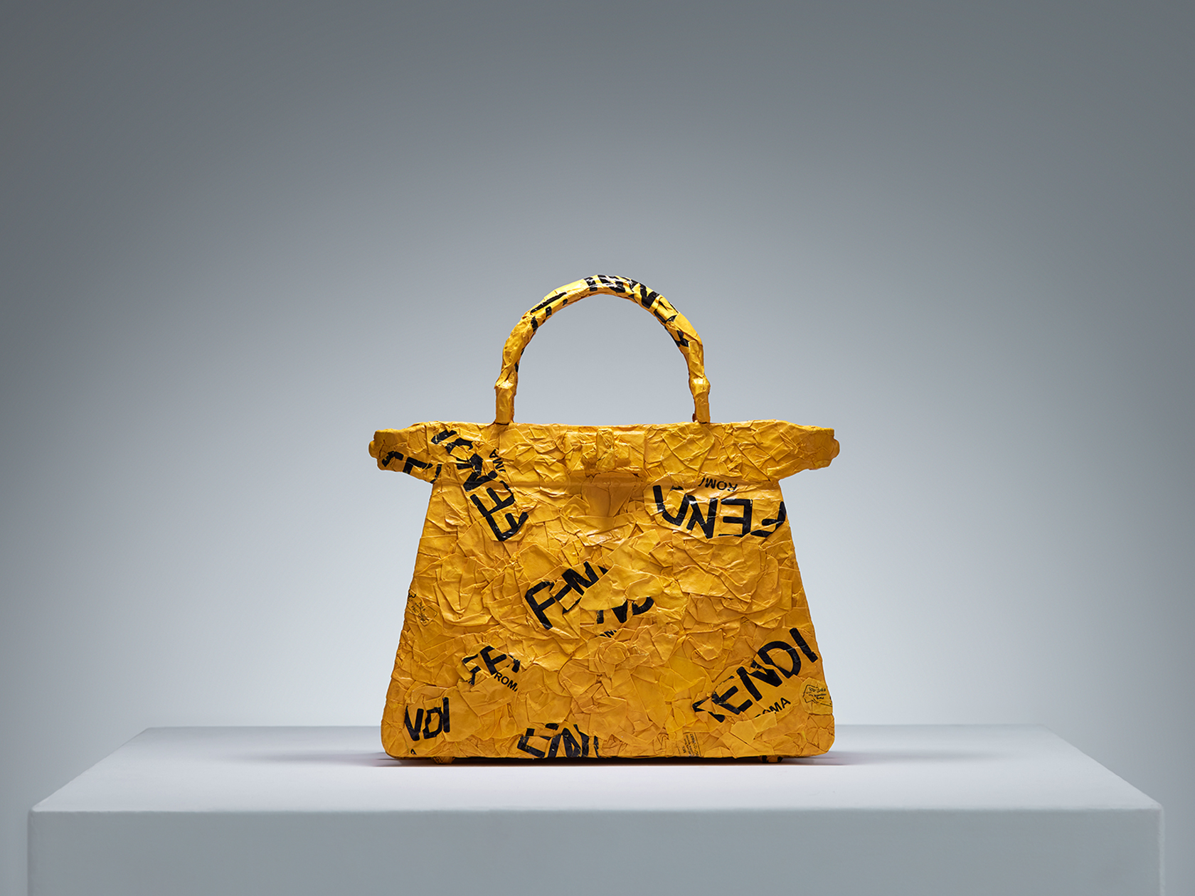
CHiNGLiSH WANG, CHiNGLiSH Brands (Fendi Peekaboo), Paper shopping bags and metal wire, 11 x 4.4 x 11.5 in. Courtesy of the curator.
This was clear to me as soon as I stepped onto the seventh floor of Bergdorf Goodman to see Roberts Kay’s curated summer art exhibition, A Room Just So. Naturally, an environment like Bergdorf’s that successfully blurs the lines between retail and art is an inviting setting for the right exhibit. For A Room Just So, appropriately located on Bergdorf’s interior design floor, Roberts Kay “reimagined domestic spaces as living galleries, where paintings, sculpture, furniture, and design objects seamlessly intertwined with the art of home décor”.

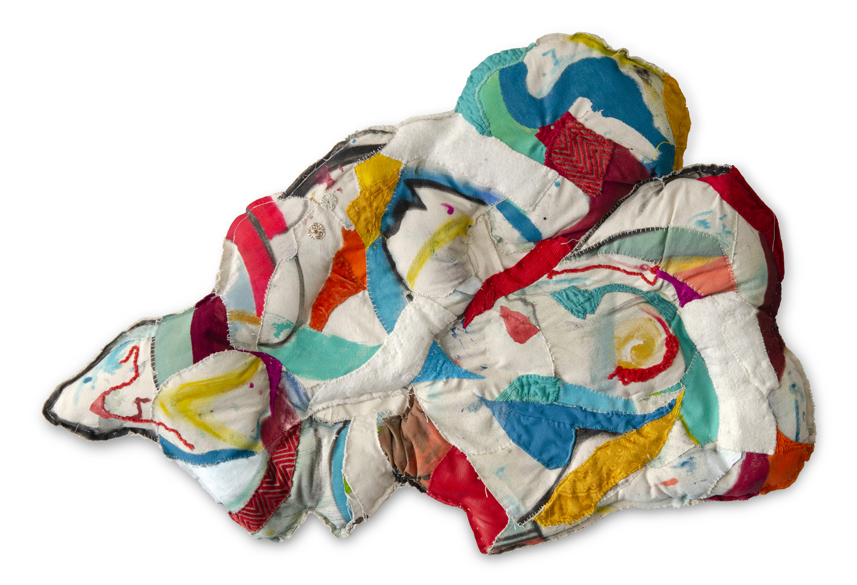
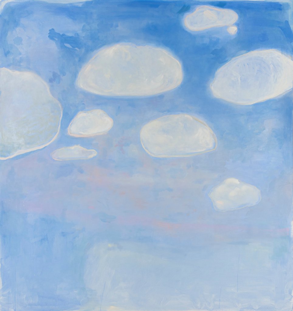
Erin Kono, Persimmon I + II, Egg tempera on shaped board, 9.5 in. tondo each. Courtesy of the curator.
The exhibit, which included sixty sculptures, paintings, photography, textiles, and design objects by Alex Anderson, Vicky Barranguet, Edgard Barbosa, C.J. Chueca, Jane Dashley, Jen Dwyer, Kamiesha Garbadawala, Leia Genis, Manuela Gonzalez, Katie Hector, Erin Kono, Kouros Maghsoudi, Thérèse Mulgrew, Hannah Polskin, Gerardo Pulido, Audrey Schilt, Jeremy Silva, CHiNGLiSH WANG, Darryl Westly, and Avery Wheless, added new depth of creative storytelling to the department store’s seventh floor. The works, which ranged from abstraction, to surrealism, to figuration, to functionality, spoke to how art, design, and interior space have the capacity to shape our state of mind. Roberts Kay’s inclusion of thorough information about each artist on view with an impressive detailed audio guide elevated the show to the standards of a top commercial art gallery, while its setting at Bergdorf’s infused it with warmth by simulating living at home with the artworks. A Room Just So positioned the twenty artist’s works in a salable environment with exposure to new clientele, without diminishing their value as original works of art fit for a traditional gallery or museum.
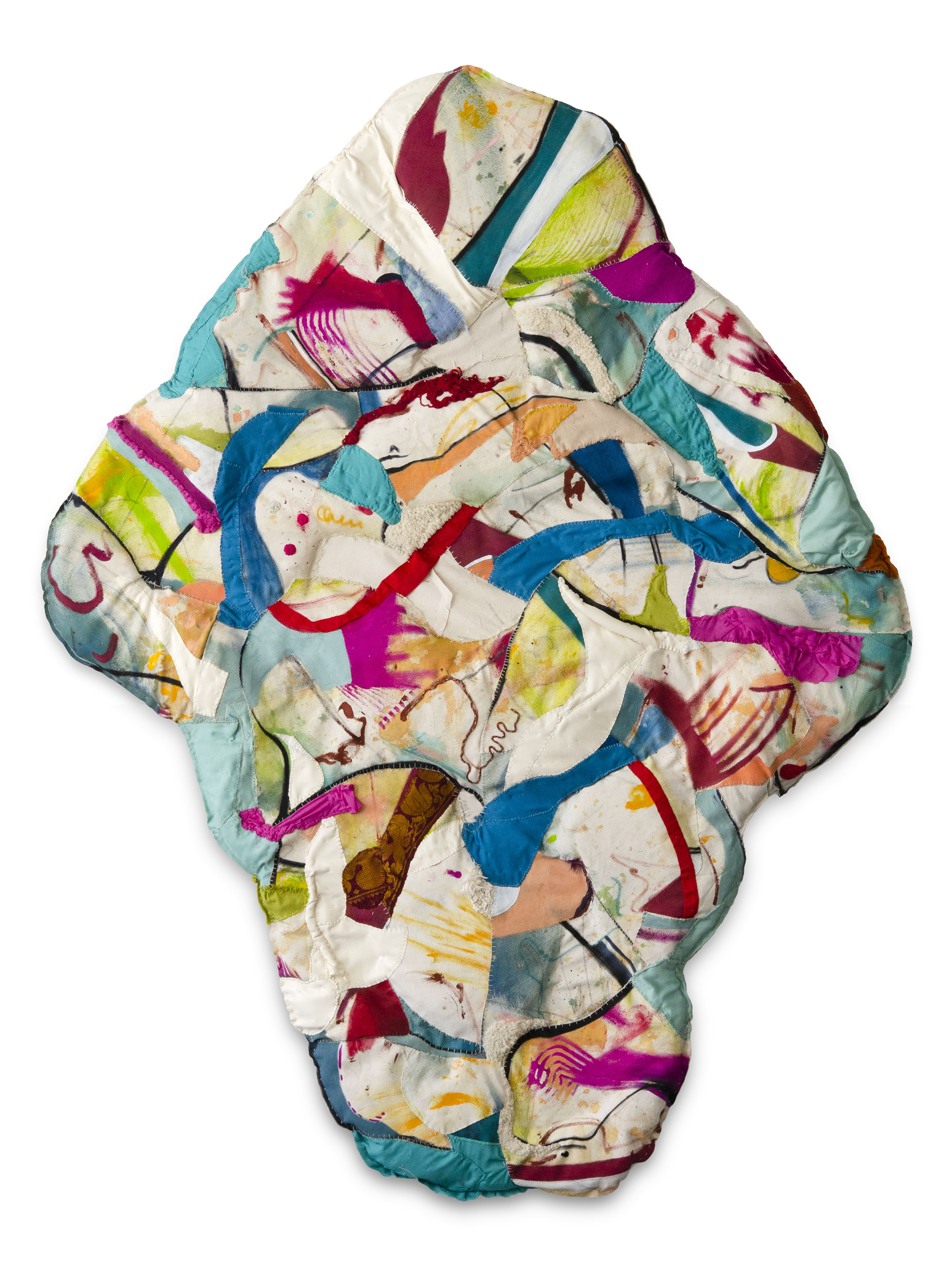
Roberts Kay shared: “With the exhibition, my intention was to assemble a group of traditional artists who are stylish and fashion-forward. For example, Audrey Schilt started her career as Halston’s illustrator at Bergdorf’s—she even sketched Jackie Kennedy in a fitting for her iconic Pillbox hat—and now Schilt paints works inspired by her time in fashion, including her Behind the Scenes at Ralph Lauren series. Artists Leia Genis and Manuela Gonzalez works featured draped and woven textiles that were painted and dyed. CHiNGLiSH WANG sculpted iconic handbags using several major brands’ own shopping bags as material. Many of the works in A Room Just So directly demonstrated a relationship between fine art and design.”

Gerardo Pulido, Set of #25, Gouache, watercolor, and marker on paper, 12 x 9 in. Courtesy of the curator.
Anecdotally when I entered Bergdorf’s to see A Room Just So on a quiet Friday morning this summer, I overheard a shopper speaking on the phone in the jewelry section to my left, “Hi, I’m at Bergdorf’s,” she said, “…it’s really the last of the great department stores.” Hearing this, I thought to myself, wow, that really is true, isn’t it. Bergdorf Goodman is iconic; it has its own deeply-rooted historical weight as a bastion of elegance in New York City culture that allows it to seamlessly incorporate a foray into fine art that—with the right people like Roberts Kay on board—can be taken seriously.

Alex Anderson, Rose Vessel, Earthenware, glaze, gold luster, 10 x 12 x 12 in. Courtesy of the curator.
While A Room Just So has come to a close, currently on view in Bergdorf’s seventh floor gallery space is a new exhibit expertly organized by Tribeca-based art and design firm, Todd Merrill Studio, in partnership with de Gournay handpainted wallpaper. This new show features additional artists I love who cross over between the art and design spaces, including Andrea Marquis and Jamie Harris. Bergdorf Goodman’s seventh floor home decor space is open to view seven days a week.


 John Torreano, “Sea Sky Gold,” 2018. Acrylic paint and gold leaf on plywood 45 x 180 inches. © John Torreano courtesy Lesley Heller Gallery.
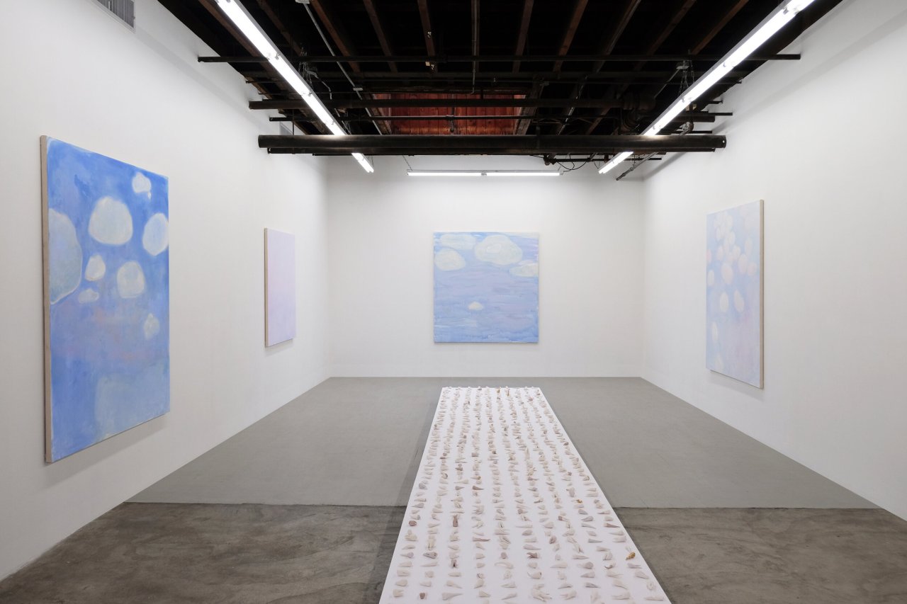
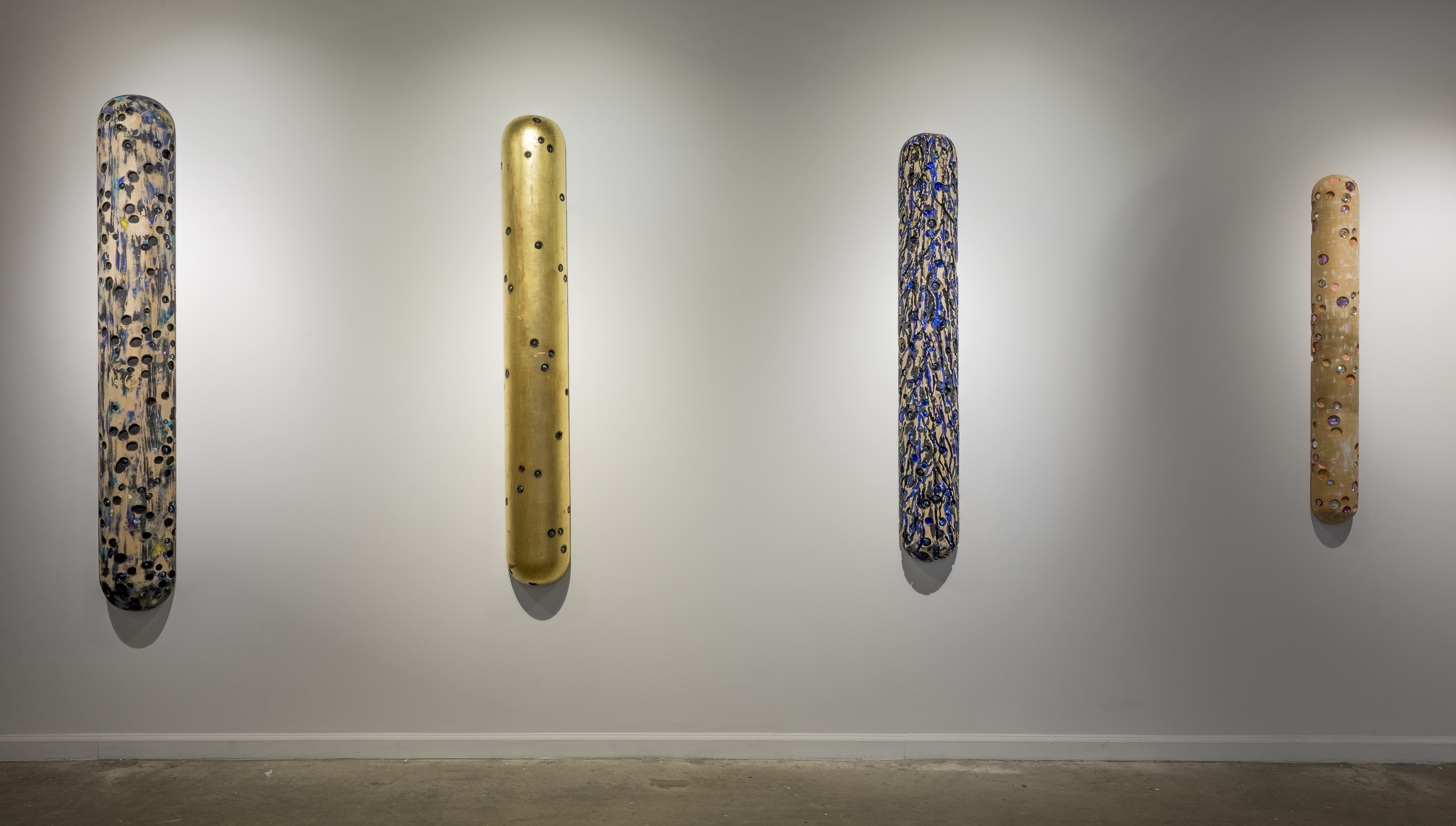 John Torreano: Dark Matters Without Time (installation view, Lesley Heller Gallery, New York, 2018). © John Torreano courtesy Lesley Heller Gallery.