Virtual Studio Visit: Emma Balder

Above: Emma Balder, Harmony, 2020. Recycled fabrics, rope, bungee, paper, acrylic, and thread on canvas, 40 x 81 x 3″. Courtesy of the artist. Photo by Jay Marroquin.

By Alexandra Goldman

This month I was excited to be connected for a virtual studio visit with Houston-based artist Emma Balder by my friend, colleague, and mentor, Dr. Jose Falconi, Lecturer of Latin American art at Brandeis University.

Balder was born in Boston in 1990. She grew up curiously watching her mother sew costumes for her and her siblings, and as a young teen experimented with cutting up and sewing her own clothing. She later earned her BFA from SCAD with a background in painting, and has since shifted toward heavily incorporating sewing and fiber art into her practice using recycled materials.

Emma Balder’s studio, Houston, TX. Courtesy of the artist.

She began integrating textile waste into her practice during her formative year-long residency at the Vermont Studio Center, where she was given bags of the recycled scrap cloth material as a gift by a fellow resident who had an excess of it and couldn’t take it traveling overseas. Since then, Balder has continued to collect textile waste from seamstresses and fashion designers. “There is so much waste, and it bothered me, but I saw beauty in it,” Balder noted. Additional examples interesting artists who work with recycled textiles include Tamara Kostianovsky and Linda Friedman-Schmidt. The interpretations of the medium by these three artists is vastly different, showing off its vast potential.

Her colorful organically shaped works fall into two main categories: “Pinglets”, which are (often stuffed) three-dimensional wall pieces that Balder creates by completing a painting, cutting it up, and re-stitching it together in new compositions mixed with other recycled textiles, and “Fiber Paintings”, in which Balder “paints” on paper and panel with colorful thread, using the thread itself as the paint. A fervent environmentalist, working with recycled fiber materials is of utmost importance to Balder.

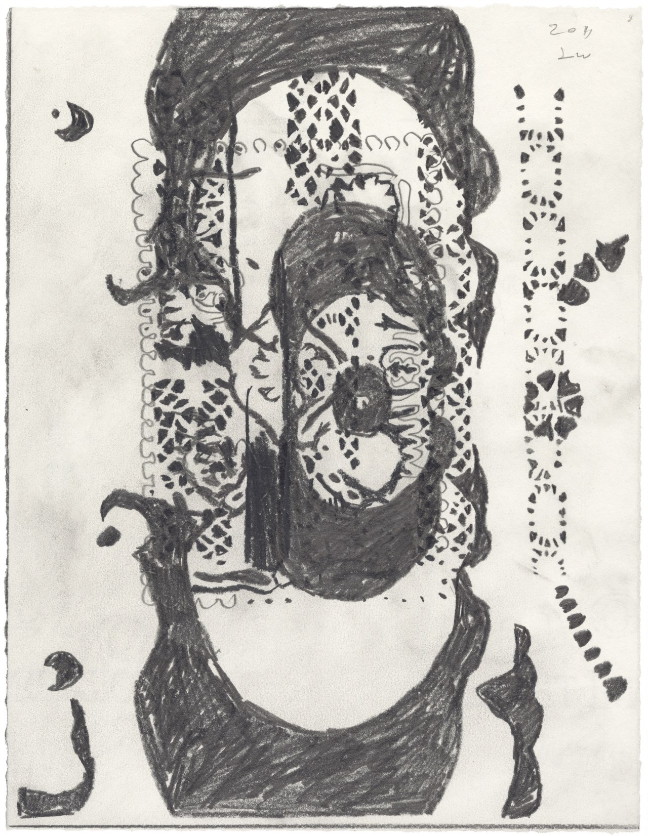
Emma Balder, Magnet of Hope (detail), 2019. Fibers, graphite, acrylic and micron on paper, 30 x 40″. Photography © Jay Marroquin; Artwork © Emma Balder

On her website, Balder notes, “The Pinglet project documents a process of regeneration. This project began with the physical deconstruction of one painting, the Ping. The disjuncture of parts were then rearranged and reconstructed with needle and thread to form small baby paintings, called Pinglets.” Pings are usually abstract landscapes of around 12 x 8 ft. Balder knows to cut up the Ping at the moment she is satisfied with it, believing the moment that you become complacent, it is time to catalyze change and reignite the creativity that comes from vulnerability.

Following our studio visit I’ve come to understand why Balder has named one of her main artwork styles a made up word such as a “Pinglet”: Balder is principally interested in creating artwork as a manifestation of her own world on her own terms: a place to escape to and live in; both a new world and a new home. In a Derridean sense, this logically begins with creating and defining her own language to refer to her new world without relying on preexisting terms. In her work she creates a beautiful synergy by deconstructing and reconstructing both the physical materials she is utilizing to create the works, and the language she uses to describe them.

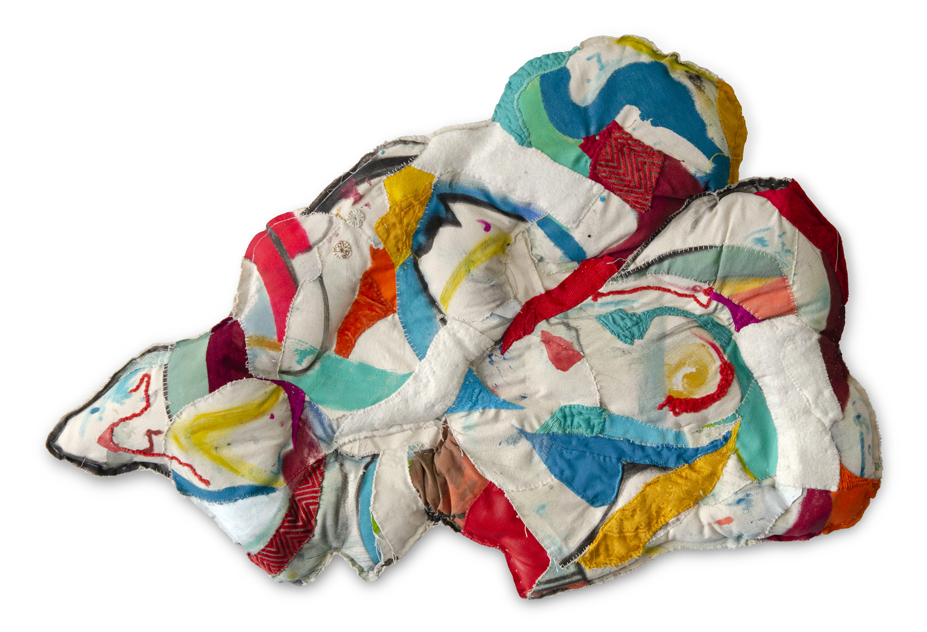
Emma Balder, Remains 2, 2020. Fabric, paper, wool, yarn, acrylic and thread on canvas and linen, 29 x 38 x 3″. Photography © Jay Marroquin; Artwork © Emma Balder

Pinglets are filled with vibrant bursts of shape and color caught in a balancing act throughout the composition channeling an unlikely yet successful combination of Vasily Kandinsky and Howardena Pindell. The Pinglets look like stuffed animals in the shapes of clouds, human organs, puddles, or the symbols for hills in Aztec Codices. Balder’s work also visually recalls the legacy of Marta Minujín and her stuffed, bright hanging wall pieces that look like Fruit Stripe gum got into a pillow fight. The difference is that Balder’s gum is chewed.

Both Balder’s Pinglet and Fiber Painting abstractions appear to be dancing or blowing in the wind. They are free, and Balder found both freedom and home in the creation of her own combinations and interpretations of media that don’t stick to traditional definitions of painting or sculpture.

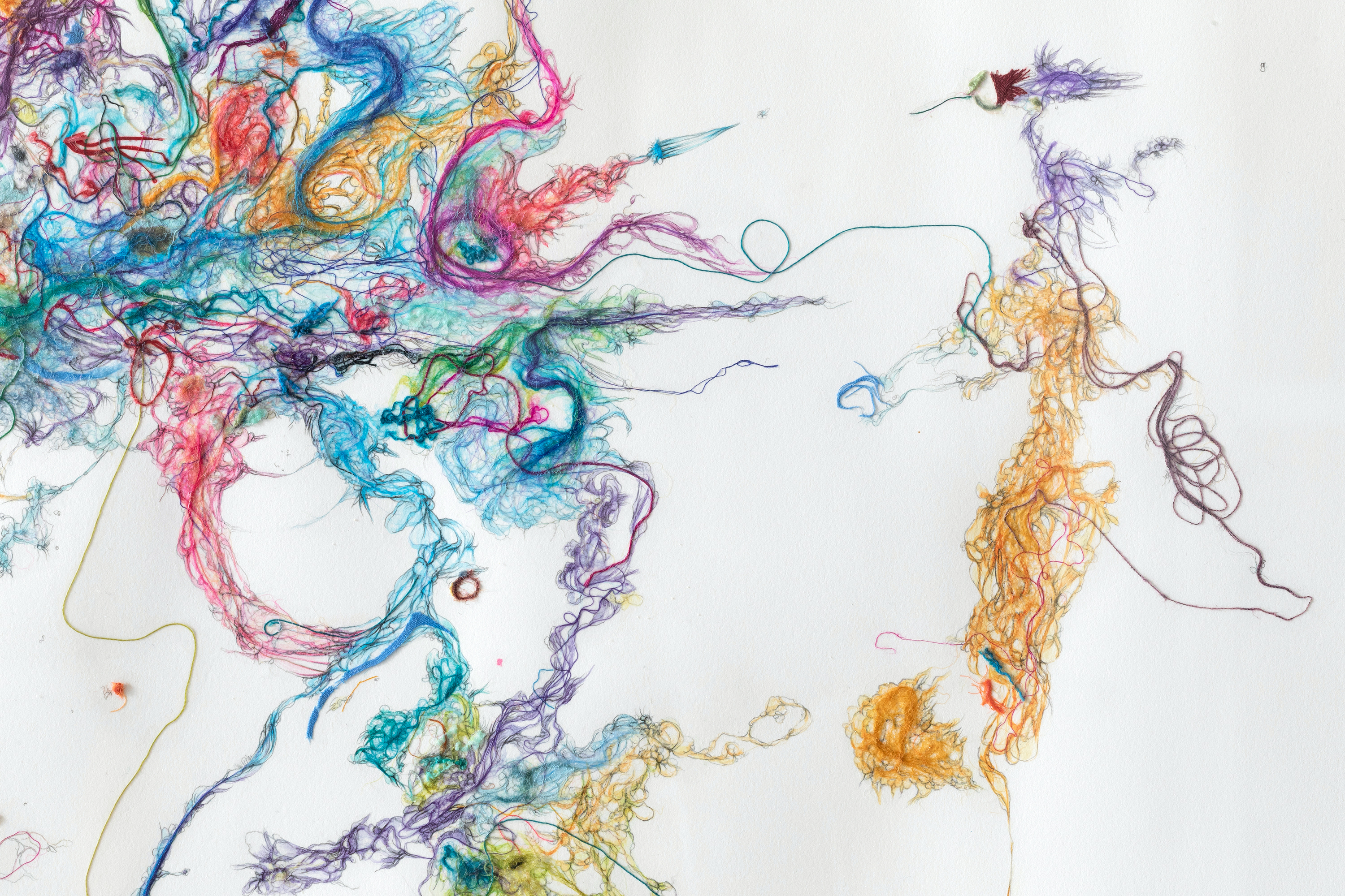
Emma Balder, Juggling, 2020. Fibers, graphite, acrylic, and micron on paper, 22 x 30″. Photography © Jay Marroquin; Artwork © Emma Balder

Interestingly, when asked about her main artistic inspiration or influence, Balder, without hesitation, mentioned that she is often thinking about and inspired by Catalan architect Antonio Gaudi. As a Barcelonaphile who has experienced Gaudi’s architecture in person, this resonated with me on multiple levels: bright playful colors, organic forms, structure, and the fact that architecture can be a site where art, home, and nature coalesce. Balder’s works are each like small architectures.

Through our conversation, I learned that Balder intends to generate the abstract feeling of home throughout her oeuvre. I asked her if she wouldn’t mind revealing the source of the importance of home in her work. She mentioned she moved around a few times as a child, and what she always missed most and returned to in her mind was her favorite place: the natural environment that surrounded her first house, where she would play amidst a cluster of trees, have secret meetings with friends or siblings, and carve into or decorate the tree trunks. She felt at home in nature, in these trees, more than the house itself. If you look at Balder’s Pinglets, they are formally reminiscent of horizontal slices of tree trunks.

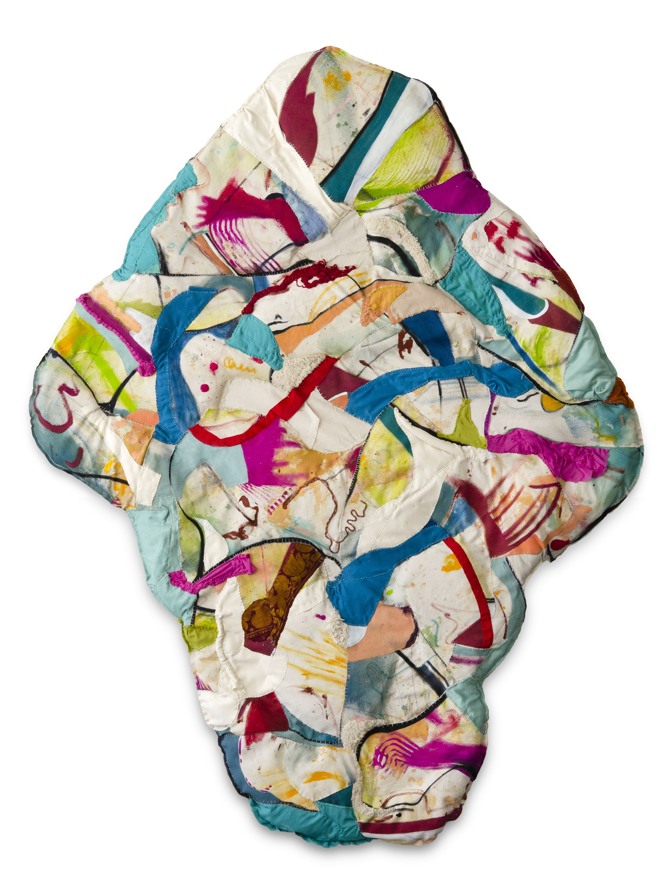
Emma Balder, Remains 3, 2021. Recycled fabric, wool yarn, graphite, embroidery, ink, acrylic and thread on canvas, recycled fiberfill and foam filling, 30 x 42 x 3″. © Emma Balder

Balder’s commitment to the environment has also attracted the attention of large brands. She was selected in 2019 by PepsiCo as one of the three environmentally-focused artists chosen to have their artwork featured on the series of 100% recycled plastic LIFEWTR water bottles. Sweeping visuals of Balder’s Fiber Paintings can still be found on the bottles today. The series marked a moment of transition for LIFEWTR to go from using regular plastic bottles to recycled ones. While it is still not good for the environment to have single-use plastics in circulation, the massive shift of a company like Pepsi to transition their bottles from new to recycled materials is a step in the right direction. Last week I serendipitously came across Balder’s LIFEWTR bottle at JFK Airport en route to Miami, and was thrilled to have the chance to take in the visual of it with in-depth insight into Balder’s practice, rather that looking at it as an image on a product without context.

LIFEWTR Series 9.3 “The Art of Recycling”, Emma Balder, Image courtesy of the artist.

Looking ahead as Balder continues to develop her practice, she desires to focus even more intently on creating space, and inviting viewers in. “I don’t know how much longer the wall is going to serve me. I have been playing around with sculpture, and I would really like to create an immersive space where the viewer can feel like they are part of that world, and feel that sense of coming home,” she revealed. I look forward to seeing the worlds Balder has in store.

Emma Balder, Watching the World Turn, 2021. Recycled fabric, webbing, wool yarn, paracord, thread, hand embroidery, acrylic on canvas, recycled foam filling, 78 x 60 x 3”. © Emma Balder

Terry Winters: Facts and Fictions at The Drawing Center

Above: Terry Winters, Untitled (Page), 2011, Graphite on paper, 11 x 8 1/2 inches. Courtesy of the artist and Matthew Marks Gallery, New York.

By Jonathan Goodman

Terry Winters, one of our very best abstract artists, quietly achieves a genuine difference in effect in his works on paper, beautifully on show now at The Drawing Center. It is quite difficult to characterize this bit of originality available in the works, which manage to be both geometric and organic at the same time. Perhaps it has to do with an organizing intellectual principle that shows up regularly in the the body of work. This has been remarked upon before; the design, then, of the images tends to read rationally even more than we see the pattern as an intuitive construction. Working like this, generally within the idiom of the New York School, makes Winters look analytically perceptive in a field that doesn’t always take such a point of view to heart. At the same time, this body of work brings up conceptual notions of pattern and organization that we don’t associate at all with the expressive abstraction that has come, more or less, to take over much of the recognized image-making available in New York. Indeed, it is best to understate the long arm of the New York School, which, tentacle-like, has established a domain that many may feel constrained by. This has nothing to do with the genuine achievements of the style, but its current ubiquity has a lot to say about the vagaries of the market, which everyone downplays but no one can afford to ignore.

But, even so, even if we acknowledge the unusually strong achievement by an artist like Winters–and we should do so–we also need to recognize the need for a new idiom, one that would neither supplant nor replace what we already have, but would rather add to the tightening conditions that have resulted from the obligation to promote sales and maintain the market. What the details of this new style might be seems impossible to imagine ahead of its time; one might argue for a hybrid recognition of figuration and abstract insight. But this is only a guess, and our chief focus here is the very good work of Winters, whose combinations of styles and patterned phenomena begin an argument for difference–even when we acknowledge his late stage of lyric abstraction. This kind of work, like all the abstraction we see today, has its origins in the consequences of modernism and its investigations into a language that would resist realism yet be visually stimulating within the innate paradigms of the genre: color, shape, line. Winters’ work is so very good it can be thoroughly enjoyed even though it is not committed, on a conscious level, to a visual idiom that repeats thinking in love with the past, nor does it demand social equity, the major focus of much art today.

The task facing the New York art community–artists, curators, gallerists, and viewers–is to engender a language that will not plummet in the face of already established visual vernaculars. The same is true in poetry–which offers a sorely needed expressiveness that is ignored because of its inability to generate assets that could yield profits greater than the high two figures! We are all more or less in a standstill in the arts, but that doesn’t mean imagery and language can’t continue to develop. Still, it is extremely hard to cut a path out of so deep, and so monetarily oriented, a forest. Some work making use of comic-book imagery, as happens in the art of Robert Williams, offers an alternative to the stranglehold of gestural abstraction, and it is also true that ambitious artists such as Nicole Eisenman and Dana Schutz are establishing a striking, if also highly idiosyncratic, style whose rawness rejects almost all historically established approaches in realism. In counterpoint, Winters clearly seems content to work out a point of view that is both intuitive and analytic, with a conceptual edge directing the overarching design he submits his individual elements to. It is the conceptual edge–a form of analytic intelligence–that saves Winters from the vapid repetition characterizing so much contemporary abstraction. It is clear he is smart, and it is clear that his intelligence saves him from a romantic emotionalism–now, sadly, keyed to the bank.

1.UntitledPage2011

Terry Winters, Untitled (Page), 2011, Graphite on paper, 11 x 8 1/2 inches. Courtesy of the artist and Matthew Marks Gallery, New York.

In one 2011 work, Untitled (Page), consisting of graphite on paper, the patterns are particularly evident. Looking overall like a flower, the image is composed of small diamond-shaped forms arranged in slightly curving rows. They elaborate an image of true elegance and vibrancy; the center of the bloom bulges slightly, giving the image its three-dimensional cast. This kind of drawing is deliberately arranged, so that its composition relates to systems theory as well as natural phenomena, like a beehive, that present an ordered facade. Images such as this one play with differing means of organization, both tight and free. In many of these drawings, Winters does lean toward imagistic cohesion resulting from an organized architecture. Usually, we think of lyric abstraction as something intended to be emotionally free–even liberating for a studious audience. But good art can also belong to rational procedure, which can stabilize emotion so that it does not turn wild. Perhaps we can build a point of view that serves as an opposition to the supposed liberation of feelings focused on alone. In this case, the imagery would be influenced by moderation and restraint–virtues that are suggested, if not overly weighted, in Winters’ art.

Schema57

Terry Winters, Schema (57), 1985–86. Graphite and watercolor on paper, 12 x 8 1/2 inches. Private collection.

But the argument for a rational outlook can only be taken so far. It is as much a wish as it is a perception; the extravagance of feeling often seen in art of the New York School cannot be evaded in the way Winters works. In one recent drawing, Schema 57 (1985-86), we see a dark sphere whose surface is covered with equally spaced, darker holes. Above it is a quincunx of sorts–five dots, each a different color, surround an outline of a circle. There is little overarching organization–merely a suite of dots just above a rough ball of an image. We are hesitant to openly determine meaning in this case, or in the rest of works on paper. Visual abstraction, fervent or muted, cannot have its message unpacked like a symbolist poem. It exists on its own terms, without a visible social reality accompanying it. Critics can try to socialize the conditions of formalism, but it looks like this movement is best considered on its own terms, rather than being politically contextualized.

Untitled2

Terry Winters, Untitled (2), 1999, Gouache on paper, 44 1/4 x 30 1/2 inches. Private collection.

The last image to be discussed in this review is Untitled (2) (1999), a stack of four horizontally oriented lozenges, outlined and partially filled with thin lines that are drawn on a monotone ground. It is a fine, resolutely nonabstract image–one that asserts the primacy of esthetic independence. Maybe Winters’ autonomy underlies the strength of his art; he is not easily joined to other artists’ styles. The best art both reflects and transcends the Zeitgeist, and perhaps this is the case with regard to the work we see here. To summarize, Winters is important to contemporary art, but his competence–indeed, his excellence–also indicates how stuck we have become in the protracted pursuit of a style that, like all styles, is constrained by a limited trajectory. If this point has been repeated a bit too often, it is because the need to move on is reflected in the history of the New York School–Sean Scully’s merger of abstract expressionism and minimalism is a good example of a painter’s refusal to walk the same terrain. So it can be done. Winters looks original still, but within a history we know exceedingly well. We may have had too long a romance with newness for its own sake, but this is the demand we currently place on the imagination. Winters’ very fine show demonstrates the real need to make use of a language that not only looks backward but ahead.

View Terry Winters: Facts and Fictions at The Drawing Center through August 12, 2018.

Screen Shot 2018-03-28 at 11.55.18 AM.png

Jonathan Goodman is an art writer based in New York. For more than thirty years he has written about contemporary art for such publications as Art in America, Sculpture, and fronterad (an Internet publication based in Madrid). His special interests have been the new art of Mainland China and sculpture. He currently teaches contemporary art writing and thesis essay writing at Pratt Institute in Brooklyn.