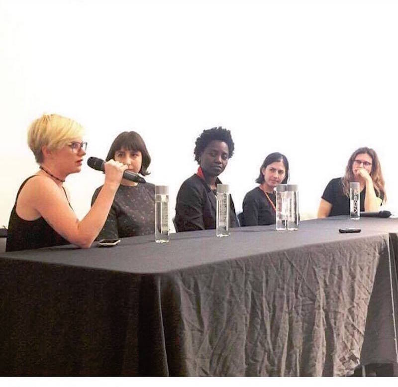
(Above, L to R: Deianira Tolema, Founder, D/Railed [Photo Credit Francesca Ciri], Katy Diamond Hamer, Founder, Eyestowardsthedove)
By Noah Becker, publisher of Whitehot Magazine.
When I started publishing about art in 2005, it felt like there were no art magazines on the web. But rather than stake a claim at being the founder of online contemporary art publishing, I’ll keep it an active playing field and let history do its thing. I’ve always been a successful oil painter, so my perspective as an artist and publisher has spoken to this generation of art interested readers in a voice they recognize. I’m also a Jazz saxophonist – I read and write music. This understanding of time-based art has assisted me a great deal in my writings. But when I say art magazines I mean the development of websites devoted to contemporary art (in the sense of) and presentation of a print magazine online. My favourite art website at the time I started publishing was Artnet.com, where writers like Jerry Saltz, Charlie Finch, Ana Finel Honigman and Walter Robinson wrote regular columns. Paul Laster was another regular Artnet contributor at that time. As some of you know, since 2005 and the founding of my magazine called Whitehot Magazine, I’ve published over 300 writers. Now there are numerous multiple contributor based platforms devoted to writing about art. School of Visual Arts even started an art writing program for young art writers.
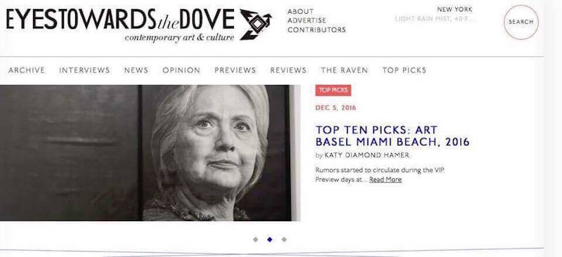
Some examples of semi-recent and long term platforms are: Art F City, Hyperallergic, Artnet, Artforum and so forth. Now in 2016, I find myself discovering new publishers who are dedicated to art and run their owns new platforms. Writer/publisher Katy Diamond Hamer and her site Eyestowardsthedove is worth looking at. Also publisher/writer Deianira Tolema with her site D/Railed is another that comes to mind.
My interest in their motivations for pursuing art publishing inspired me to speak with them for Artifactoid.
Noah Becker: Why do you write and publish about art?
Katy Diamond Hamer: I first started Eyes Towards the Dove in 2007 as a platform for my own writing and used it as a way to project my written voice into the global sphere. Not writing about art was never an option. Initially I used the space to write about my own art practice as well as the work of others. Self-publishing became a way for me to truly learn about my own text-based practice and in doing so informed my taste and understanding of contemporary art. Having a blog which has evolved into more of a magazine format, is the entry point that has catapulted my presence in the art world and without having to deal with restrictions put forth by others.
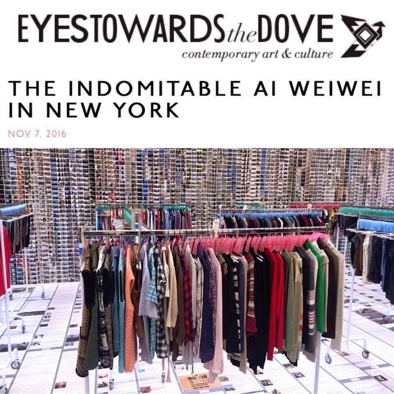

Ai WeiWei and Katy Diamond Hamer
Deianira Tolema: Art has been used as a reflection of hierarchical imperatives in relation to the concepts of luxury and power, to demarcate the social-economic and cultural differences between the upper and lower classes. Art, as we know from art history, started out about ten thousand years ago as a means to explore and understand reality. It started out on a more perceptual level, then developed into a the first social-political stratagems – perhaps the first forms of subliminal psychological manipulation of the masses, where the products to be sold were nothing more or less than false gods. High ranking members of society employed techniques of divination that anticipated what we now know as modern self-mythologizing. In this light, to answer your question, the main reason I write and publish about contemporary art is to offer art professionals and interested readers a broader perspective of what art can be and mean – regardless of current trends. Thus, my ultimate goal is to use critical skill to push beyond aesthetics, to analyze the role of art in contemporary society.

NB: When you started writing about art what was your inspiration to get involved?
KDH: Initially it was my own painting practice. One of my best friends at the time was writing for Artforum and spending time with him had an impact on my own fascination with the written word, descriptions of art –both two and three dimensional– and process of constructing a sentence.
DT: I started studying art, psychology, and sociology around age ten after reading many fairy tales and books about Italian poetry. Italy, my country of origin, is literally covered in archeological sites left by the Ancient Greeks, and the remains of the complex architecture that survived the fall of the Roman Empire. Imagine growing up walking among the ruins of temples and theaters from thousand of years ago. Academically, art history has always been one of my primary interests. Writing poems and essays about the art that surrounded me came naturally. Also, it must be said, I received a rather rigid education at home.
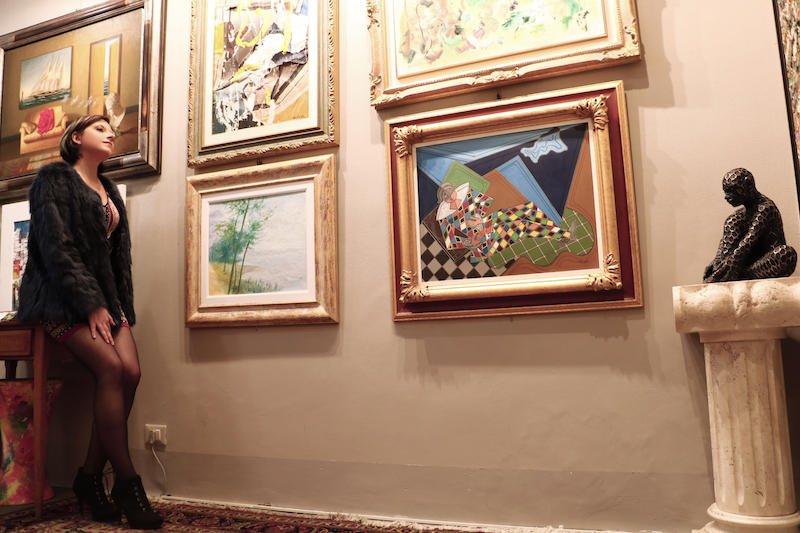
Deianira Tolema at Galleria D’Arte Merighi in Genova; photo credit and courtesy Francesca Ciri Capra
NB: What do you plan to gain from all of this?
KDH: After spending time in Miami for Art Basel this past December, I realized that looking at art really quiets my inner thoughts. There is something that in the process of looking allows me to be the best version of myself, or at least it feels that way! In regards to contemporary art, I always say that my goal is to look back before going forward. Observing and thinking about contemporary art would mean nothing if I wasn’t familiar with all the other movements that have come before. I love meeting people: gallerists, collectors, artists and other journalists. These interactions can be just as valuable as the art itself.
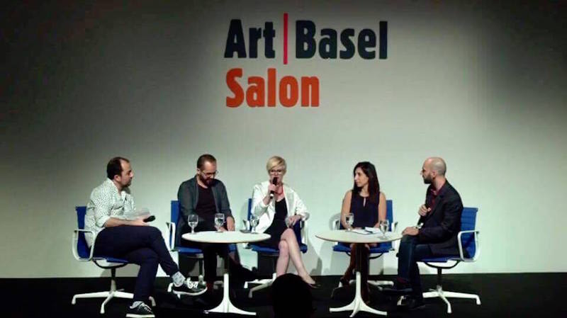
Katy Diamond Hamer speaks at Art Basel
DT: Well, first of all, honestly it’s fun! Nothing has ever made me happier than art, not even food. Mind you, in Italy food is considered a source of maximum pleasure – especially in the South. Also, I’d like to set an example for future generations with my work, not just to be remembered, but to contribute to the public dialogue with blunt criticism of conventional thinking and bad art. To make my little contribution to the evolution of humanity. I’m making a living working as a writer with artists, editors, and curators. It’s a 24/7 job, so I’m planning to acquire more money, and of course, more knowledge.
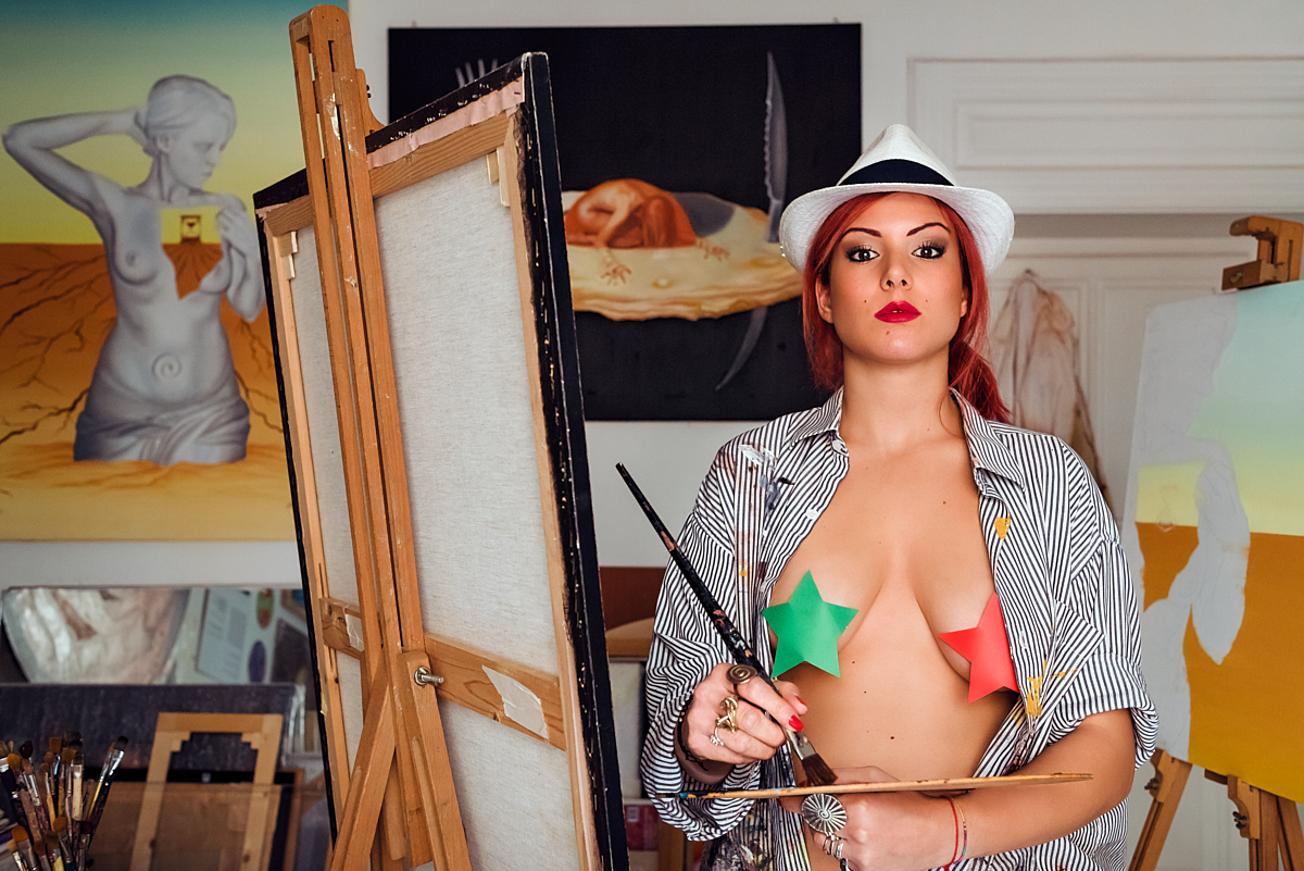
Artist Violetta Carpino for Italian Feminism in Contemporary Art (sneak preview). Photo credit and courtesy Luigi Ieluzzo. Image provided by Deianira Tolema.
NB: How do you know the difference between good art and bad art?
KDH: The world is full of art and New York in particular is nearly oversaturated. Typically, we can describe art in ‘good’ or ‘bad’ terms, yet I don’t think that is necessarily the end goal of the critic. Returning to what I said earlier about going back before going forward, I personally establish much of what I like or feel is culturally or historically relevant based on what has come before. Then of course there is the simple definition that could refer to the skill level of the artist and his or her particular pastry of a medium yet even with skill, art can be subpar.
DT: For me it’s very intuitive. I’ve always been obsessed with beauty and symmetry. Once, as a child, prior to an afternoon tea party at the home of my mother’s friend I was almost driven by a subconscious need to frantically grab all the teaspoons randomly positioned on a table and align them to one another diagonally in a way so perfect that another child freaked out. There was an awkward moment of silence in the room that lasted for a good ten minutes. Aesthetics is a subject that can be taught at school in such a way so by the end of the class most students will have a good understanding of the differences between good and bad art. But, there’s an innate element that very few people have – an aesthetic sensibility that can be learned with years of training.
NB: How can you tell the difference between good writers and bad writers?
KDH: I tend to link art and writing together. They are both practices that involve a multitude of components wherein the brush stroke could be compared to the linear quality of the lines that make up individual letters. Good art writers are able to successfully communicate thoughts and translate the visual language into the visual written language. It’s not an easy task as each writer must establish a particular sound while also adhering to rules of grammar, word count and importantly knowing when to stop. I also have a hard time when someone uses too many words to talk about something simple.
DT: Writing is, and should be, less intuitive. It has a lot to do with actually writing well, expressing concepts clearly, understanding grammar, creating text objectively, making logic structures that will lead readers through your maze-like argument or assessment. At least for me, there’s no space or time for subjectivity. It really just boils down to a combination of technical details and natural skill. I always try not to look at someone’s resume’ before reading their writing, so that my judgment is not influenced by a prejudice that might affect my opinion.
NB: Is art important in the face of all the distress and negativity in the world?
KDH: Art is everything. It can be about action in the political realm, love that brings people together or a place of respite in otherwise visual collision.
DT: Art can be a distraction from the distress of the world, or a way to investigate and defy negativity. I think there should be no obligation for artists to do anything deeper than than the decorative, so long as the expression is somehow meaningful.
NB: Do you see how artists and collectors are often opposing to each other politically?
DT: I do know what you mean. I think this is one of the many contradictions in how the art world works. In its guise of balancer of the opposites art has always conveyed the tension between antithetical elements that keep the universe dynamically static, or statically dynamic. On a less philosophical and more practical note, art has always manifested contrasting realities – imagined as colliding and blending with one another on the same existential plane. The artist/collector juxtaposition is an extension of this implicit quality of art. It is a moot point, as long as there’s no conflict between the artist’s ethics and the collectors’ demands.
KDH: Well, the question is fairly directive and leans towards this being something that you believe. Do you think they are opposing? Simply stated, artists are the creative force and collectors are those who support process, enjoy living with art objects and often play a role in the way that art is perceived at a later date. Artists can be collectors but it’s much rarer for collectors to also be artists.
NB: Is there anything positive you feel that you could do in our current political climate through your publishing platform and your writing?
DT: Talking about Italy and Europe, there is much more that artists could do. I think of what American artists have been doing, for instance, in the wake of their presidential election. Unfortunately, after hundreds of years of taboos reinforced by the church and the demonization of creativity, and the economic crisis, I feel that, with some rare exceptions, we do not easily embrace art as a form of protest in this area of the world. Paradoxically, some of the best politically charged contemporary art comes from Europe. I’m trying to use D/railed Magazine to to talk about useful subjects. It turns out it’s not easy to keep all the writers focused on one theme. They have different academic backgrounds and priorities and address our readers on provocative, socially challenging topics without forgoing art talk. I hope those who come across my magazine can follow my lead. As far as I know, I’m the first Southern-Italian woman to have broken so many gender, classism, and cross-cultural barriers with a contemporary art project with an international impact. I hope they follow my lead and fight male chauvinists and win by flying solo and proving them wrong about any leftover claim of intellectual superiority (which is a big deal in Southern Italy, where the heterogeneous culture has yet to produce a generation of self-thinking, ambitious and independent women so powerful that they can shake the planet with a single thought). Imagine an army of American-like Southern-Italian amazons marching to war. To finally witness something like that – so rebellious and even erotic – before I die would make my day for a long time. I also want to keep bringing my Italian/European perspective to other cultures in front of an increasingly international audience – to produce a butterfly-effect in the minds and souls of readers who come from entirely different cultural contexts (which makes me sound even more megalomaniacal than usual). So back to your question, the only thing I can do in this precarious political climate between Brexit and everything else, is to keep doing what I’m doing with the help of some of the top art writers in the world.
KDH: I’ve been thinking a lot about this in the last month and a half for obvious reasons. I had been concerned about Trump winning the Presidency but two weeks before Election Day those worries started to subside. Now that he will be taking the highest political office in the United States, I find that art and the art world need to be more important than ever. In 2017 I am planning on being much more aware of the marginalized, black and brown bodies, queerness and female artists. Those who feel repressed, need to be heard.
NB: Would you encourage other people to start writing and publishing about contemporary art?
DT: No, I wouldn’t. I’m actually encouraging all the high school students I know to not pursue a career in this field, unless they have a really special talent. It’s not for everyone.
KDH: Yes! While the web has changed since I started and is much more dynamically competitive, having one’s own online venue to develop, share and practice is a worthwhile venture. There is an entrepreneurial aspect and strength that comes with the freedom of being able to self-publish and I would encourage anyone with a desire to be seen and heard to take the bull by the horns and go for it.
 Katy Diaond Hamer
NB: Is there anything specific you have noticed that you want to share about your experience in the art world?
DT: There’s an aspect of it that concerns ‘judging a book by its cover’. That, in my opinion, is rather superficial and interferes with art’s poetic/spiritual potential.
KDH: The art world is smaller than one might imagine. For anyone initially starting out, it can seem scary and unwelcoming but can be penetrated with the right amount of effort and desire. If the passion is there, keep going. I’ve had ups and downs in my career but art is all I know. My advice is to never give up and never stop looking.

Author Noah Becker is a New York based painter and the publisher of Whitehot Magazine of Contemporary Art. Follow him @noahbeckerstudio, @whitehotmagazine.
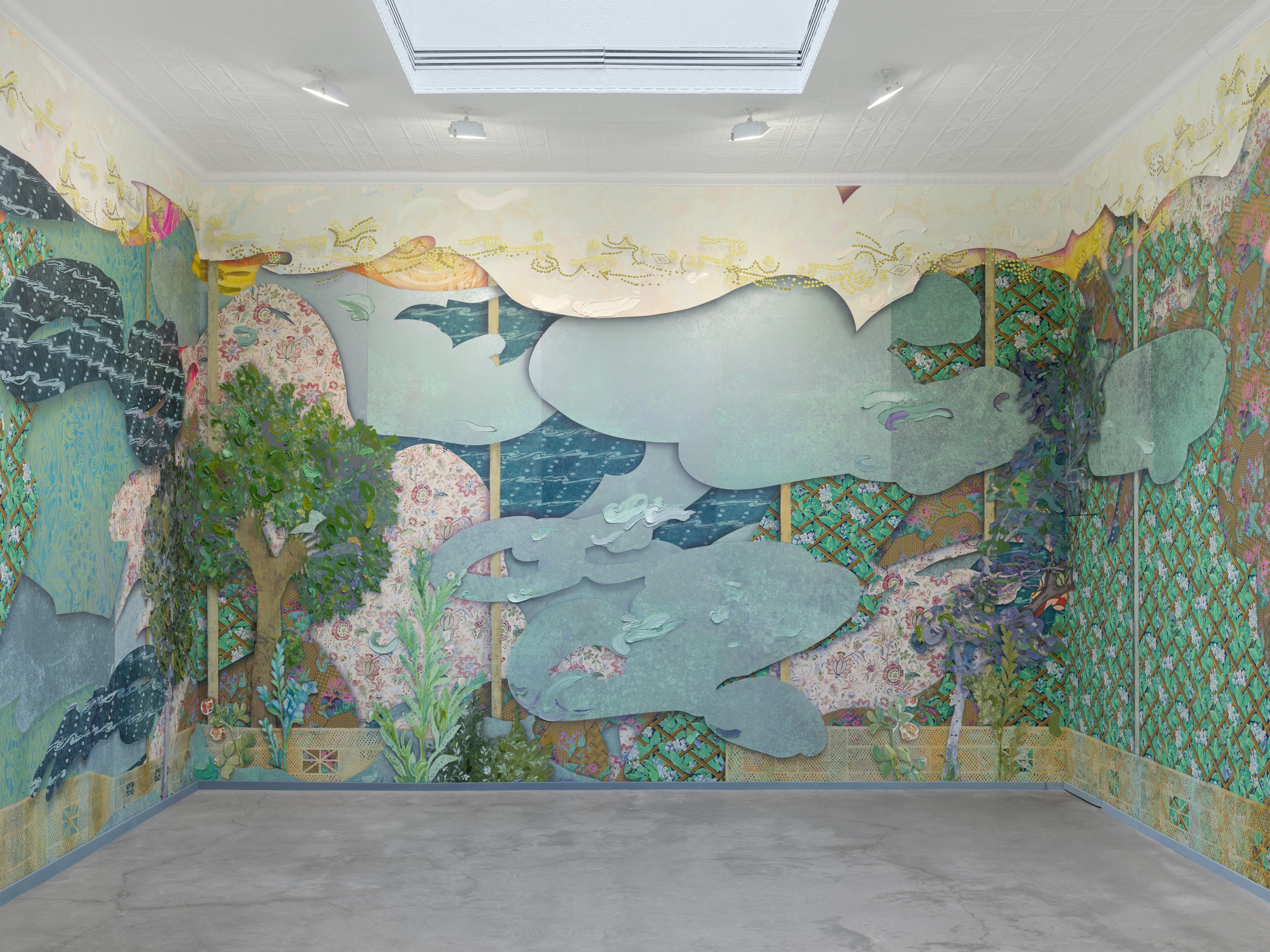


 John Torreano, “Sea Sky Gold,” 2018. Acrylic paint and gold leaf on plywood 45 x 180 inches. © John Torreano courtesy Lesley Heller Gallery.
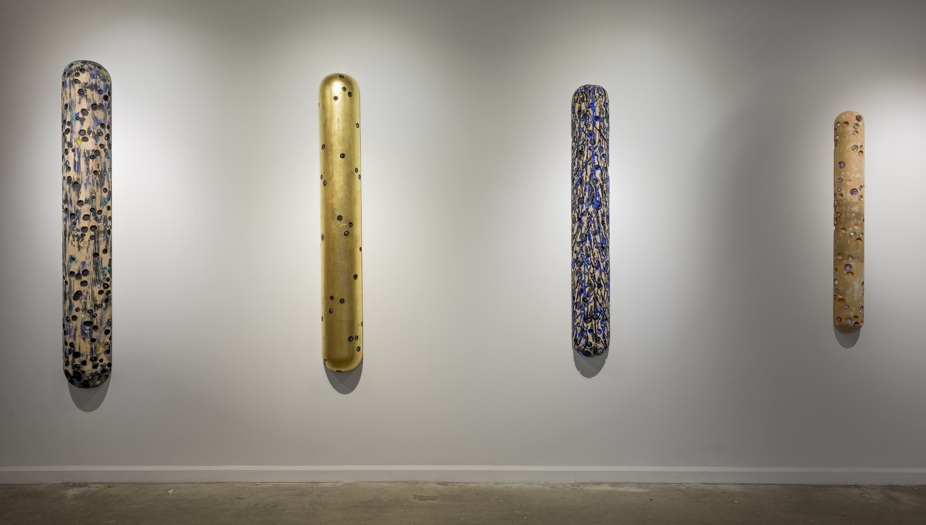 John Torreano: Dark Matters Without Time (installation view, Lesley Heller Gallery, New York, 2018). © John Torreano courtesy Lesley Heller Gallery.

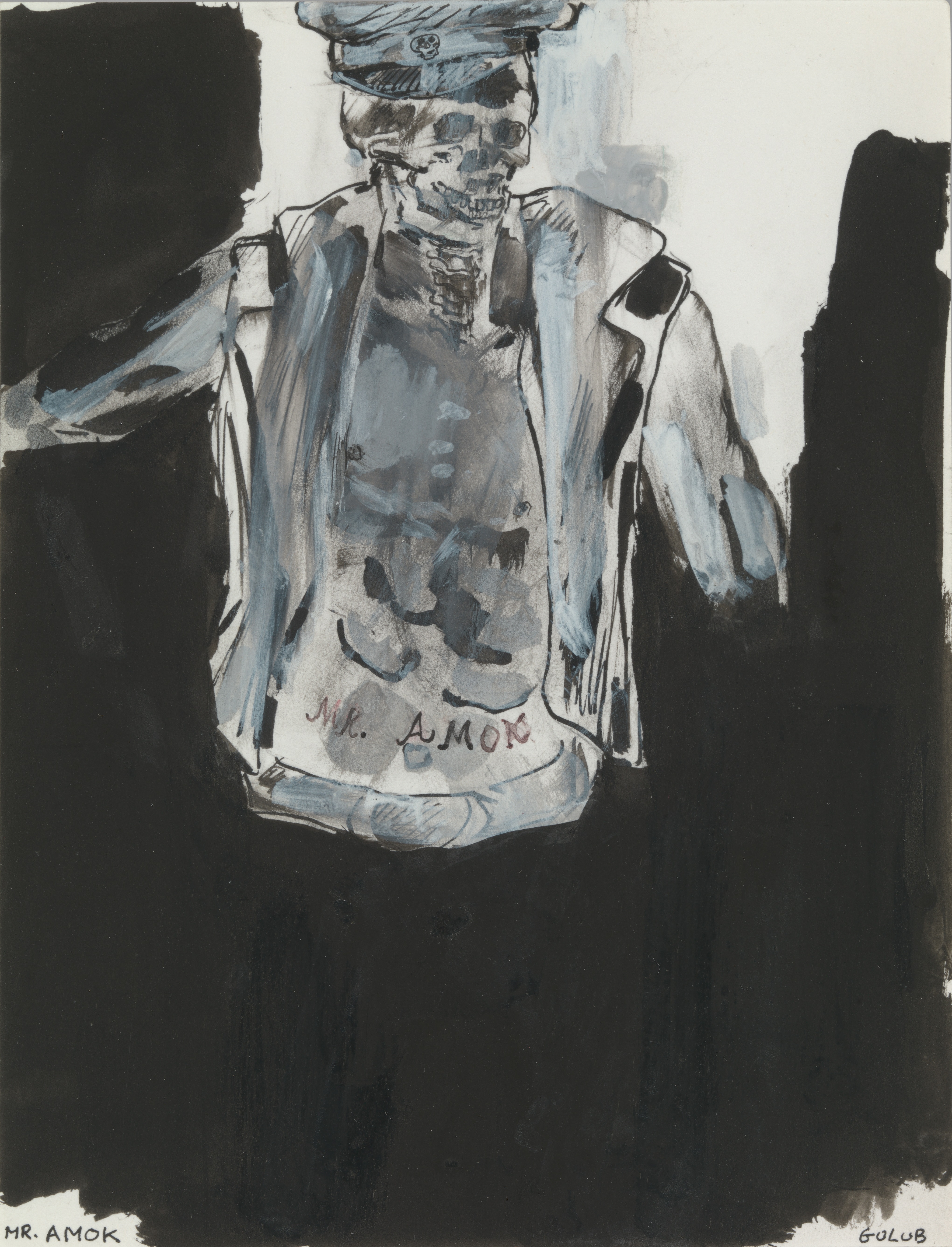

 Leon Golub. “Head,” 1988. Acrylic on canvas, 21 1/2 × 19 1/2 in. (54.6 × 49.5 cm). © The Nancy Spero and Leon Golub Foundation for the Arts/Licensed by VAGA, New York, NY.
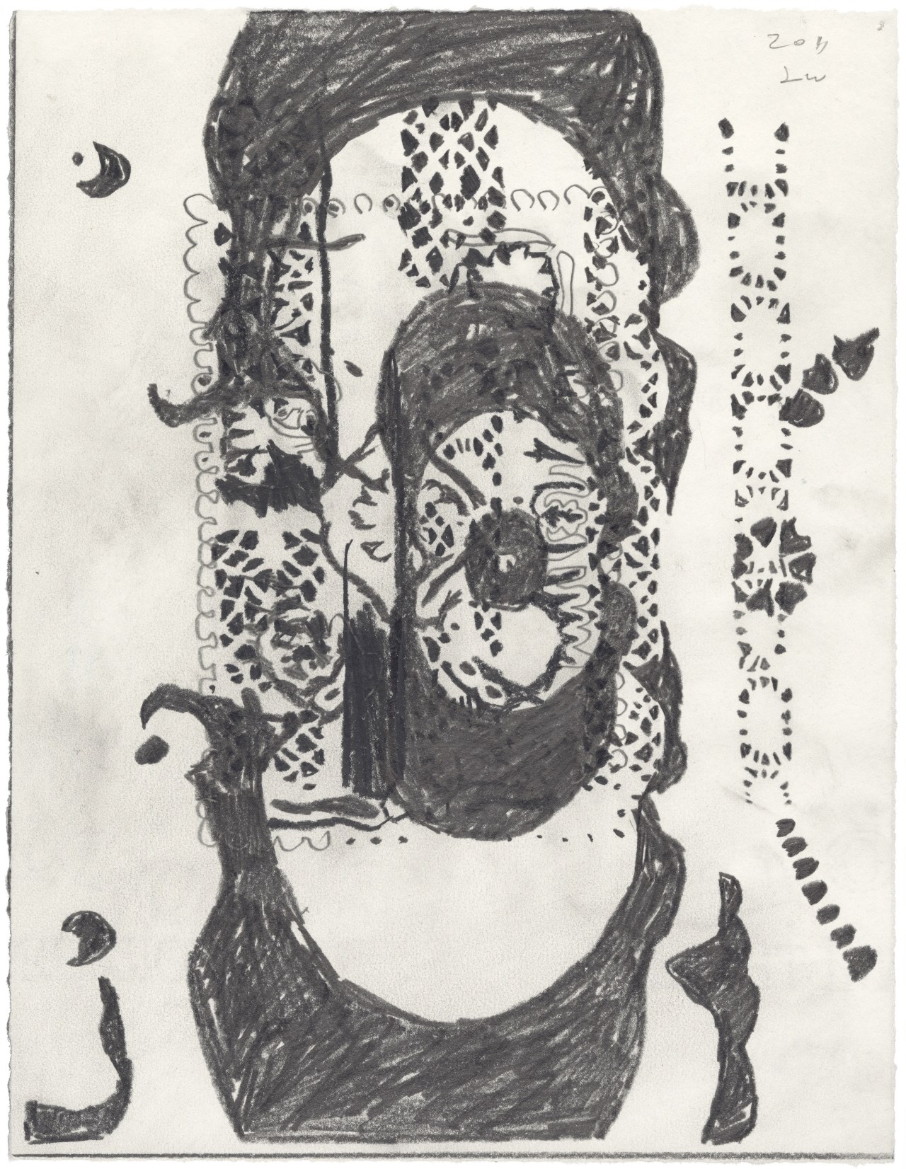
 Leon Golub. “Contemplating Pre-Columbian,” ca. 2000. Oil stick and acrylic on tracing paper, 10 × 8 in. (25.4 × 20.3 cm). © The Nancy Spero and Leon Golub Foundation for the Arts/Licensed by VAGA, New York, NY.
