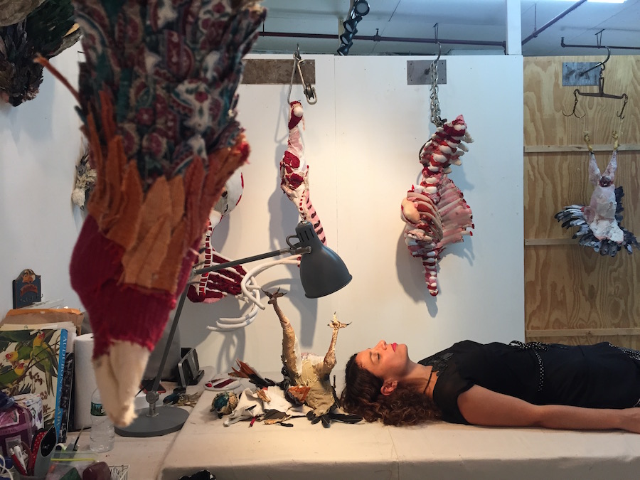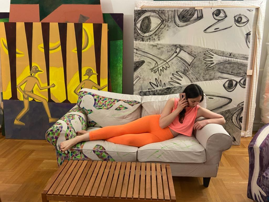
Above: Jaqueline Cedar in her studio. Image courtesy of Good Naked. Photo by Phoebe Berglund.
By Alexandra Goldman
After finishing her MFA at Columbia in 2009, LA-born and raised artist Jaqueline Cedar moved into a spacious apartment with her boyfriend in Ditmas Park. Like many artists at the time, she had studio space in Industry City in Sunset Park, but was priced out in 2012 as large design companies and startups moved in. “There was a mass exodus of artists from the neighborhood around that time,” she explained, “I thought about moving my studio to Long Island City or elsewhere in Queens, but none of the rent prices felt within range. Getting a studio seemed more expensive than renting an apartment.”

Painting by Jaqueline Cedar. Image courtesy of Good Naked.
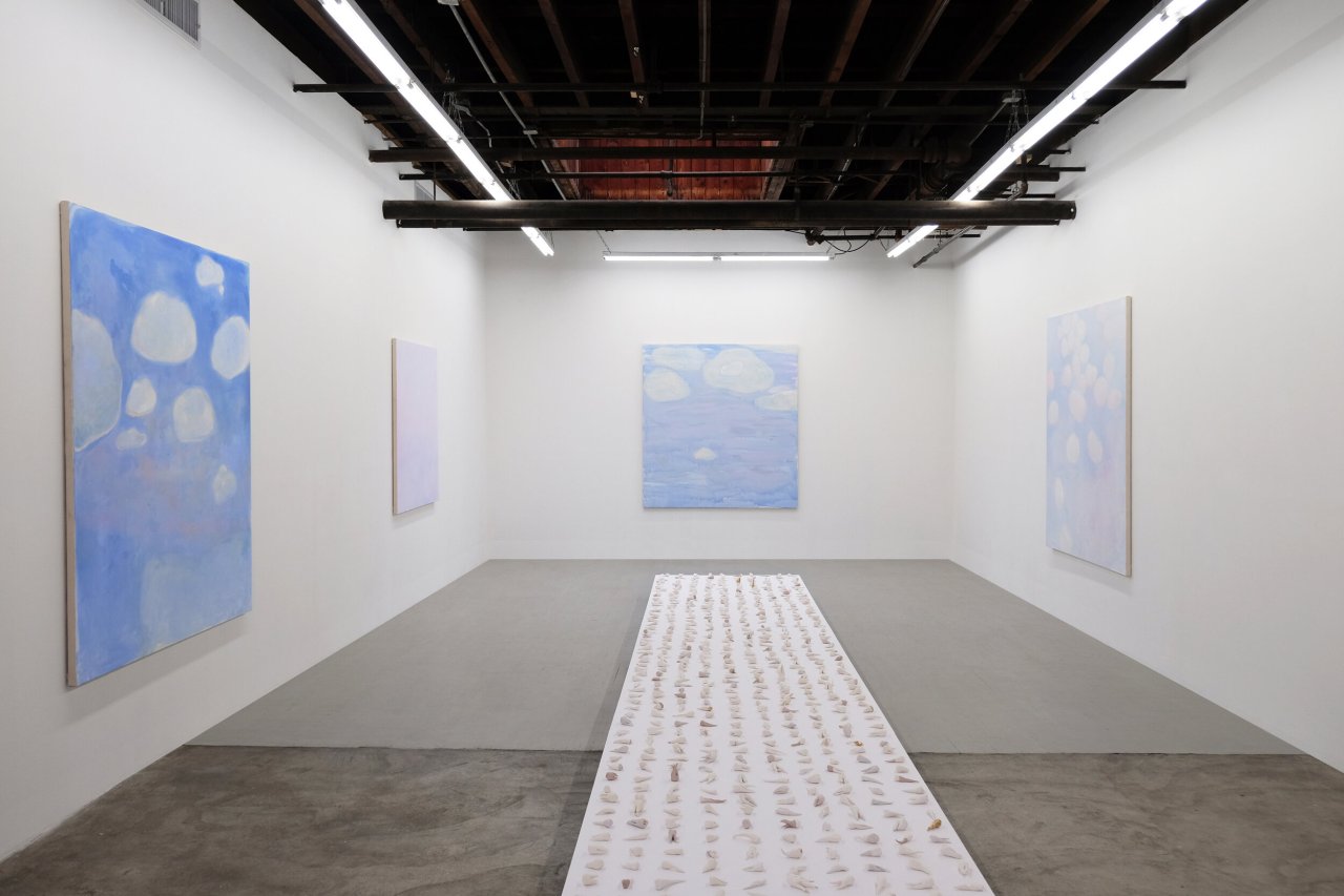
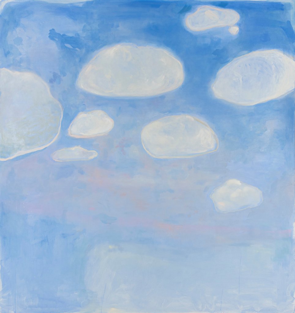
Cedar’s large empathic paintings focus on psychological interactions between otherworldly cartoon characters that are both familiar in a Popeye and Olive Oil sort of way, and simultaneously absurd and unknown. Her landed-on-mars color palette, combined with some apparent Bruce Nauman influence, use of nontraditional materials (she paints on neon foam and sports mesh), and fondness for placing three or four moons in any given sky, add up to a sophisticated brand of mindfuckery that reverberates throughout the oeuvre.


Paintings by Jaqueline Cedar. Images courtesy of Good Naked.
To continue to produce her work despite the financial difficulties of finding adequate studio space, Cedar’s boyfriend suggested that she move her studio into their home. She tried it and discovered that she loved how it allowed her to work whenever she wanted, even during all hours of the night. Then, in 2015, the relationship with her boyfriend ended. Cedar needed to get a roommate to pay the rent, and transitioned into a roommate lifestyle for the next four years.
In August 2019, when her then-roommate abruptly announced she was moving out, Cedar was nervous but saw a window for a different solution to her rent deficit. Instead of finding a replacement tenant, she took a risk and made the decision to transform the majority of her apartment into a commercial art gallery with a developed, rotating program of exhibiting artists. She had past experience organizing exhibitions at Crush Curatorial, and wanted to continue to explore this path. “I started all of the planning right away in August, as I knew I would need to turn a profit almost immediately in order to make this plan work,” she said. “If it didn’t work out, I thought, I could always get another roommate later.”

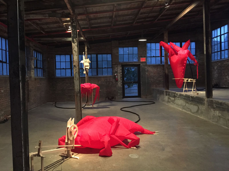
Installation view, “Go For Broke” at Good Naked Gallery. Image courtesy of Good Naked. Photo by Etienne Frossard.
For Cedar, the financial pressure was a motivating factor. “Some people crumble under that type of pressure, but for me, it was energizing.” To get things going, she began conceptualizing names for the gallery and exhibition titles, and started emailing and planning studio visits with artists she envisioned working with. An initial round of positive feedback from many of her top-choice artists encouraged her to hit the ground running. She decided on her quirky gallery name, “Good Naked,” based on a Seinfeld episode that jokes about walking around your apartment naked: a classic perk of not having a roommate.

Installation view, “Go For Broke” at Good Naked Gallery. Image courtesy of Good Naked. Photo by Etienne Frossard.
What began as something she saw as an experiment for one or two months turned into a longer-term success. Cedar has already had four shows, each with an opening party, closing, and an event in between. Her events are special and build community. At the first event, she created a drawing club where guests collaborated on exquisite corpse drawings. Subsequent events featured a comedy show of female artist-comedians doing stand-up, and a supper club where an artist prepared lasagna for the group. Cedar confessed, “at first, I was inviting each guest to the gallery individually and introducing attendees to one another. Now, many people show up to my events who I don’t even know, and I’m the one being introduced!”

Jaqueline Cedar and Zebadiah Keneally in Cedar’s studio. Photo by Artifactoid.

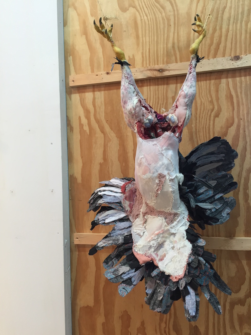
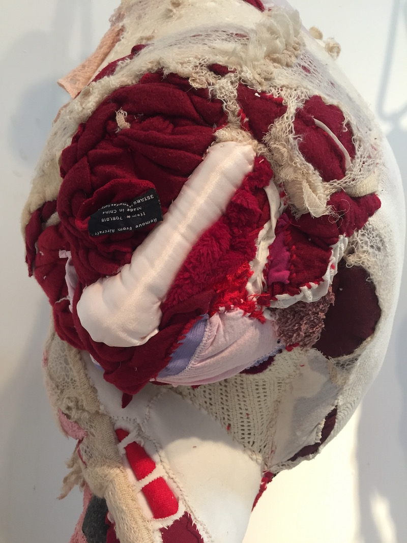
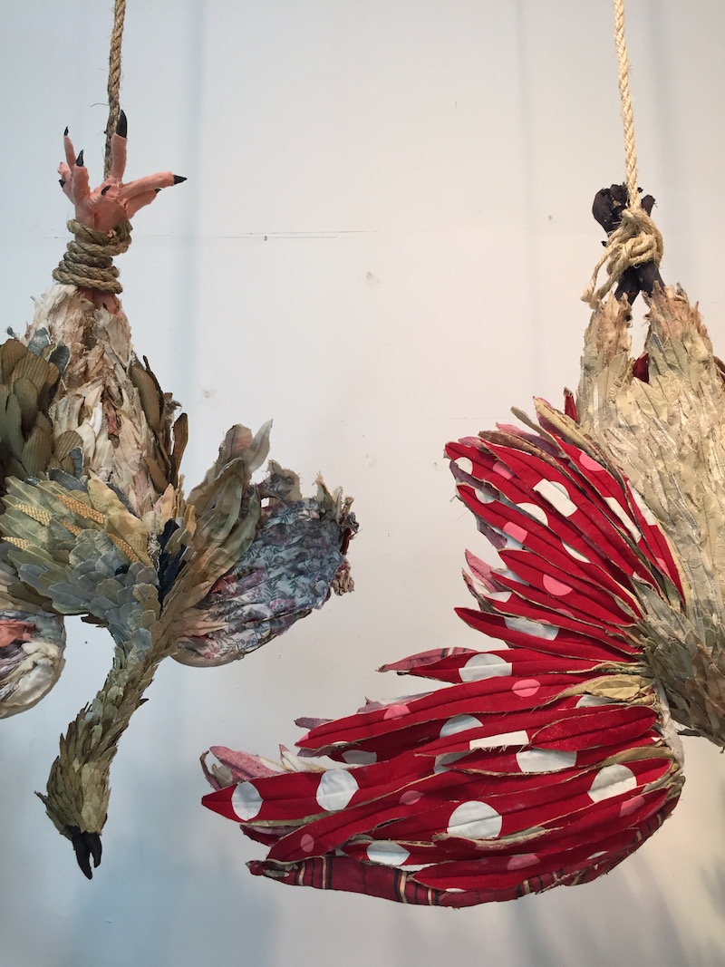
Zebadiah Keneally, installation view, “Go For Broke” at Good Naked Gallery. Image courtesy of Good Naked. Photo by Etienne Frossard.
One artist who recently showed at Good Naked is poignant comedic illustrator and performance artist Zebadiah Keneally. Keneally installed a floor to ceiling immersive, painted environment featuring multiple illustrations in the apartment’s central corridor. His videos are also hilarious, many featuring his alter-ego, Hamburger Vampire.

Phoebe Berglund, Freezer Still Life (Cabbage, Shrimp, Rye Bread), 2020
Digital C-Print, 8” x 12” Edition of 20. Image courtesy of Good Naked.
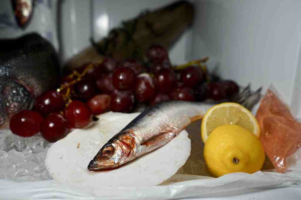
Phoebe Berglund, Freezer Still Life (Fish in Scallop Shell, Grapes, Sliced Lemon) 2020. Digital C-Print, 8” x 12” Edition of 20. Image courtesy of Good Naked.
Another recent Good Naked exhibiting artist is Phoebe Berglund. She took over the freezer in the Good Naked kitchen for two weeks to create a beautiful photography series called “Freezer Still Lives,” a memento mori to the ocean (in her words). Visitors could view the 17th century Dutch-reminiscent scene in person any time Phoebe was at the gallery, but since there were dead fish involved, Cedar explained, “it was stinking up the apartment.”
Good Naked’s upcoming exhibition “Talk Soup” opens next Friday, March 13 from 6-9pm, featuring works by Bill Adams, Jonathan DeDecker, Carl Durkow, Hyun Jung Jun, Griffin Mactavish, Rachel Jackson, and James English Leary.