The art scene in Bushwick is of the most thriving in New York, and it attracts artists that span the spectrum of early-career through well-established. David Baskin is an artist of the latter category. He is a conceptual sculptor who has exhibited at the Brooklyn Museum, Sculpture Center, and NYC’s Grace Building lobby (commissioned by Arts Brookfield), among other recognized institutions both in the US and internationally. While Baskin’s sculptures range from structures as ornate as antique chandeliers to hyper-simplified monochromatic mold-like forms, they all share the common thread of being comprised of recognizable everyday objects.
Following a v cool studio visit to Baskin’s Bushwick creative space, Artifactoid sits down with the artist to discuss his work in connection with the 17th century Dutch artistic traditions that inspired it, as well as its relevance in contemporary society, problematizing the relationship between human beings and material possessions throughout the ages.

What inspired you to work with the art historical idea of vanitas?
The Vanitas project began with the idea of using art historical models to address contemporary issues, specifically consumerism. Many of the Dutch vanitas paintings were made during the Dutch Golden Age, roughly spanning the 17th century. I saw a relevant connection between this period and our present day culture. The Dutch created the first modern market economy, which can be seen as a model for our capitalistic system. The East India Company was the first multinational corporation and was financed by shares that established the first modern stock exchange. To finance the growth of trade and the economy, the Bank of Amsterdam was established, a forerunner to the modern central bank.
Obviously, every work of art is a product of the time period in which it was created and I see the Vanitas paintings as having a particularly unique connection with the socio-economic climate of the Dutch Golden Age.
An abundance of commodities based on mercantile trade comprised much of the objects on display in these paintings. I saw this as having a direct relationship to our current consumer culture. One of the Flemish painters who exemplified this connection the most was Adriaen van Utrecht. His work depicted a sumptuous and abundant display of objects, ranging from exotic fruits, flowers, dead animals, glassware and foreign and local luxury items that were available in the 17th century Antwerp markets. These paintings, depicting a range of “consumer goods,” brought to mind retail stores and malls where a seemingly endless amount of products are on display to entice consumer desire. Clearly these historic works can be seen in a contemporary consumerist light.

(Above: Still Life with Bouquet and Skull by Adriaen van Utrecht)
Describe the connection between consumerism and vanitas present in your work– ideas of vanitas in our contemporary culture. How did the intersection of these concepts lead you to develop your different series of works, including your still life pieces and fountain?
I initially became interested in the notion of the “still life” through my interest in consumer culture and retail display strategies. Abundance is a central theme to the historical still life and it seemed to me that the notion of the contemporary “still life” was more relevant in a retail context than solely in an art historical context.
I also saw the 17th Century Calvinistic message to renounce earthly possessions as a kind of early consumer critique. The historical vanitas paintings represented a moral lesson that would have been understood by early Dutch viewers. The message had religious overtones that emphasized the transience of life and the need for moderation and temperance, particularly when it came to amassing wealth and possessions. The irony here was that many of the paintings were commissioned by the merchant class and became commodified and highly prized as valuable possessions in themselves. A kind of meta-fetishization occurred, reinforcing the idea that an artwork isn’t separate from a market economy.
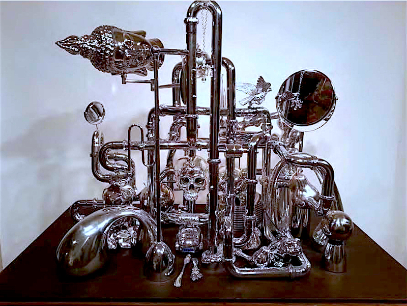
The “still life” sculptures that I make incorporate these ideas by bridging the historic model with our contemporary consumer culture. All of the objects in the sculptures were store bought and my active role, on one level, is as a consumer. I selected chromed objects to emphasis a false sense of desire and value, most items arranged in the sculptures are kitsch and ersatz products that are ubiquitous throughout the retail landscape.
The fountain sculpture is also an extension of the Vanitas project. Instead of chromed metal, all the objects on display are made of glass and crystal. I was thinking about the original purpose and function of a fountain as a source of drinking water for residents of villages and how now it can be seen as a symbol of personal and corporate wealth, power and excess.

What is your selection process like for the different items/elements that go into each of your still lives?
Some items directly reference objects and symbols that one would find in the historical work… a skull, flowers, and animals. But mostly, I was looking for a cross section of consumer goods that everybody could identify and relate to. Some items create vignettes within the larger group of objects and all were made either in China, Mexico, South East Asia and India, reflecting the current international manufacturing hubs based on globalization and free trade policies.
What led you to create the works, “Still Life (Cosmetic Bottles),” and “Dove Bottles?” What did you learn about consumer culture from creating this project, and in which ways was the result of the piece either different from or similar to your original imagining of the work?
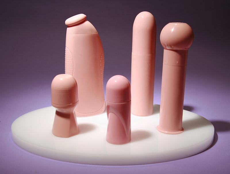
The sculpture “Still Life”(Cosmetic Bottles) was the first work of art I made that addressed the still life as subject. It comprises a selection of store bought cosmetic bottles that were cast in pigmented urethane rubber. A mold was made directly off of the original manufactured forms. By re-contextualizing the products in a fleshy colored rubber and by stripping them of their brand recognition, logos, or semiotic labeling, one begins to see the high aesthetic quality of these objects and what was once a latent eroticism now becomes quite overt. By revealing the “naked” forms of the bottles one can see the strategies and narratives designers incorporate to sell products and act upon the subconscious desires of consumers.
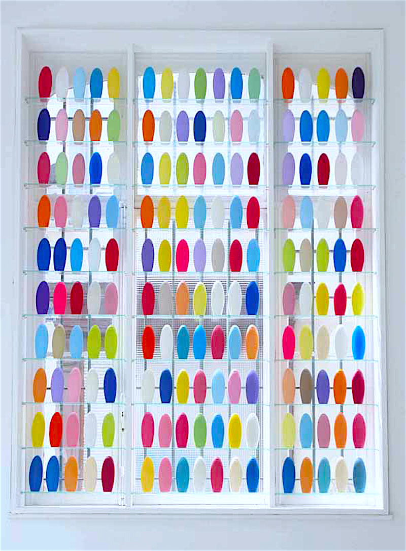
Similarly, the Dove Bottle piece follows the same strategies as “Still Life” (Cosmetic Bottles). A variety of colored cast resin Dove bottles were installed in the window of the gallery, Carriage Trade, NY, NY, for the exhibition: Market Forces, Consumer Confidence. As with retail shelving and window displays, the objects on view were meant to engage the viewer on a purely visual level. Referencing planned obsolescence and the endless quantity of consumer products the bottles also become stand-ins for minimalist sculptural strategies. The window installation inside the gallery intentionally set up a dialog with the external retail environment in Soho, once the center of New York City’s art world.
How did you decide to show your works inside display cases? How does this decision affect the experience of the work?
Once I began making the sculpture I was confronted with the issue of presentation. The objects in a traditional still life were always on a table or some sort of substrate and there was a great deal of attention paid to the arrangement and relationship between each item on display. It was a type of stage setting, a mise-en-scene that created a space of intentionality. I brought these ideas into my sculptures and decided a vitrine would be the best framing and display device. On one level, the pieces are a kind of Wunderkrammer or Cabinet of Curiosities. The vitrine creates a literal and conceptual border for the objects and artifacts. I also was very much aware of the role of the vitrine in institutional museum display and it’s relationship to retail window display. Each serve to heighten the intrinsic or aesthetic value of the object and can be seen to have a direct relationship to the shop window in the rise of commodity culture going as far back as Joseph Paxton’s Crystal Palace and the Parisian Arcades in Walter Benjamin’s theoretical writings.

If you are in the US, see Baskin’s work this fall in Brooklyn at Smack Mellon, “20yrs,” from November 12 -December 31, 2016, and if you are in Europe, at the MU Museum, “For Play,” from October 7th – November 30th in Eindhoven, Netherlands.
About David Baskin:
David Baskin received a BFA from The Cooper Union in 1987. Solo exhibitions include Arts Brookfield, Grace Building Lobby, NYC, Freight+Volume Gallery, NY, NY; Sculpture Center, NY, NY; Ingalls & Assoc., Miami, Fl and Black and White Gallery, Brooklyn, NY. Selected group exhibitions include the Brooklyn Museum of Art, Brooklyn, NY; Marianne Boesky Gallery, NY; Carolina Nitsch, NY, NY; Pavel Zoubok Gallery, NY,NY; Munson Williams Proctor Arts Institute, NY; Triennale Design Museum, Milan, Italy; Musée de Design et d’arts Appliqués Contemporains, Lausanne, Switzerland; Carriage Trade, NY, NY; Galerie Erna Hecey; Brussels, Belgium; Lesile Heller Gallery, NY, NY; Rudolf Budja Gallery, Vienna, Austria; Flag Art Foundation, NY, NY. Honors and awards include McDowell Fellowship, NH; Pollock-Krasner Foundation, Yaddo Fellowship, NY; Commission through Brookfield Properties for a lobby installation at the Grace Building, NY, NY. He has taught at the Cooper Union School of Art, New York Institute of Technology and was a visiting critic at the School of Visual and Arts, NY, NY; Pratt Institute, Brooklyn, NY, and the University of Buffalo, NY. David Baskin was one of the original members of the Brooklyn based non-profit art organization Smack Mellon and he lives and works in Brooklyn, NY.


 Iris van Herpen dress including polyurethane resin and iron fillings hand-sculpted with magnets, Autumn/Winter 2014
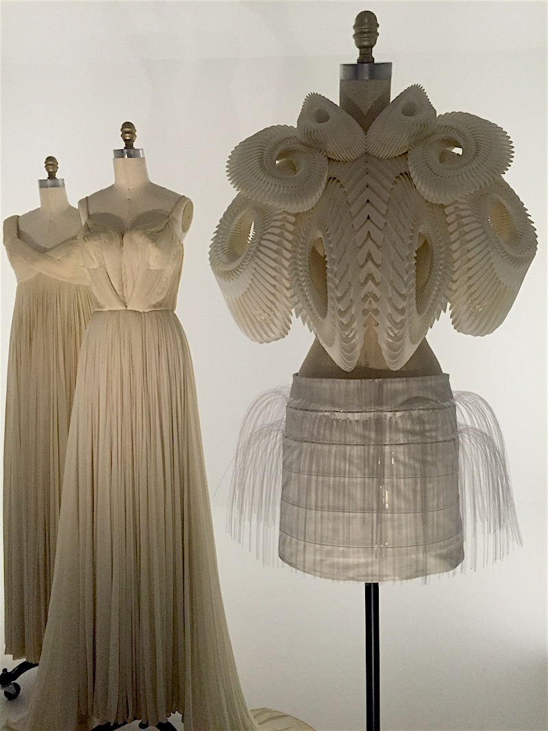
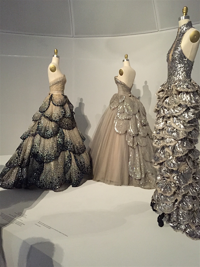 Gowns, Dior (left, center) and Alexander McQueen (right)


