By Alexandra Goldman
Pictured above: NYCCC 2nd Annual Benefit. Photo by Casey Kelbaugh/CKA and Ilya Savenok/CKA.
This article was originally published in Cultbytes.
Brothers Parker and Clayton Calvert, founders of NYC’s Culture Club (a 501c3 art nonprofit with a brick-and-mortar gallery component) do not only create and curate art; they curate people—warm, kind, and intelligent people spanning all areas of the art world from artists, to curators, to dealers, to critics, to auctioneers. For their spring benefit, a community of three hundred guests and committee members rallied around the Calverts and the NYC Culture Club to support their cause at 7 World Trade Center. I felt lucky to be in attendance this year; vibes were high.
The evening’s honorees were the author, curator, art critic, activist, and NYU professor Dr. Nicole Fleetwood, and the artist and educator teaching between New York and Florence, Italy, Salvatore Catalano. The benefit featured a silent auction and a live auction led by auctioneer Ruth Maudlin with work by fifteen artists Enzo Barracco, Gabe Aiello, John Black, Michael De Feo, Michael Sadowsky, Minku Kim, Michela Roman, Hope Buzzelli, Djordje Skendzic, David Hollier, Cavier Coleman, Faustin Adeniran, Michael Sadowsky, Ricardo Arango, and Natasha Blodgett. The auction lots looked beautiful against the backdrop of the New York City skyline from the fortieth floor.
Guests danced to a DJ set by Timo Weiland, and plentiful servings of champagne and caviar from brilliantly appointed sponsors Billecart-Salmon Champagne and Kaviari Caviar were enjoyed. In light of the success of the event, I sat down with Parker Calvert for an interview to discuss NYC Culture Club’s upcoming plans.

Alexandra Goldman: In your opinion, what is particularly important about nonprofits like New York City Culture Club right now, especially considering the current political climate and budget cuts affecting the arts?
Parker Calvert: Nonprofits like ours are critical to providing opportunities to artists and curators that otherwise don’t exist. Too often in the art world, the commercial viability of shows keeps certain exhibitions from being put on. This lack of risk-taking means lots of rotating exhibitions with established and already renowned artists. We believe that creating space where artists come together, regardless of if a show can sell out or not, creates organic opportunities for connection and discovery. This is even more important now than ever as the arts have been attacked at the highest level.
How did the idea to found the NYCCC nonprofit come about?
Clayton and I founded NYCCC during the pandemic, when we saw artists leaving NYC and empty retail locations. We felt like this project would be a great chance to contribute back to the NYC cultural scene by creating a community hub for talented artists, without the commercial pressures of having a sellout show.
Could you share some of your favorite recent artist-related highlights or success stories from your work with the organization?
Many of the artists we have exhibited have gone on to join great residency programs, exhibit in major galleries and have their work collected into major institutions. Rather than highlight specific artists, I think it would be great to note that many of the artists we have exhibited have gone on to residencies at Silver Art Projects, gotten their MFA’s at New York Academy of Art, taught at Pratt and Columbia, and exhibited with Jeffrey Deitch and Gagosian.
What are your plans for NYCCC in the coming year and in the longer term?
We plan to continue exhibition programming in more spaces, as well as to offer more residency opportunities. We love to connect the dots and bring together our community of artists—which at this point comprise more than 500 artists exhibited. We would love to continue to foster career development and help guide emerging artists in their careers.

In what specific ways are you looking forward to using the funds raised at the benefit to support artists in your community?
We plan to spend the funds raised on our operational budget. We have a very lean structure, as Clayton and I have volunteered for the last four years. Our budget is devoted to exhibition expenses and staffing exhibitions.
How can people view work by NYCCC artists this summer, and what are some ways they can continue to support the organization throughout the year?
We are focusing on our artists basketball tournament, Ball for Art, which features artists, gallerists, and art dealers playing basketball to support five arts nonprofits. This game is free and open to the public. All funds raised go directly to supporting: NYC Culture Club, ArtNoir, Silver Art Projects, Artolution, and ArtsConnection. Our exhibitions are on a summer break as we find a new gallery space. We will have more programming in place as soon as our next space is squared away.
What keeps you inspired and motivated in your work with NYCCC?
Seeing the direct impact of our programming both on the artists and the general public is very rewarding. We have seen many artists who needed a boost at just the right time to persevere through this difficult climate. It is very meaningful to be a part of a bigger NYC art community—especially in a way that values art for the creativity and expression, and not just the market value. We are actively seeking more ways to engage our community of artists, to create opportunities, and to spread the power of art.
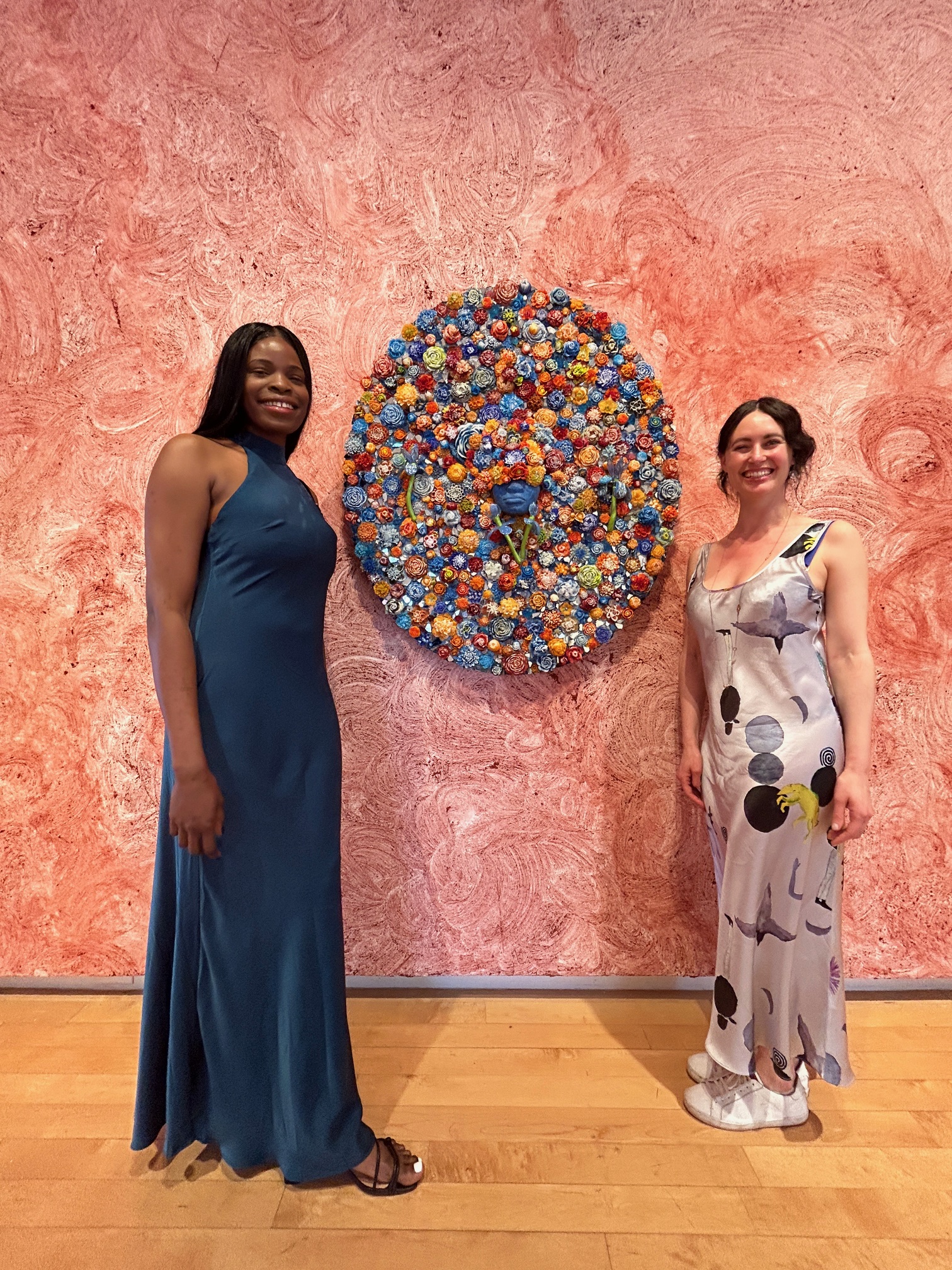
More Photos from the Benefit


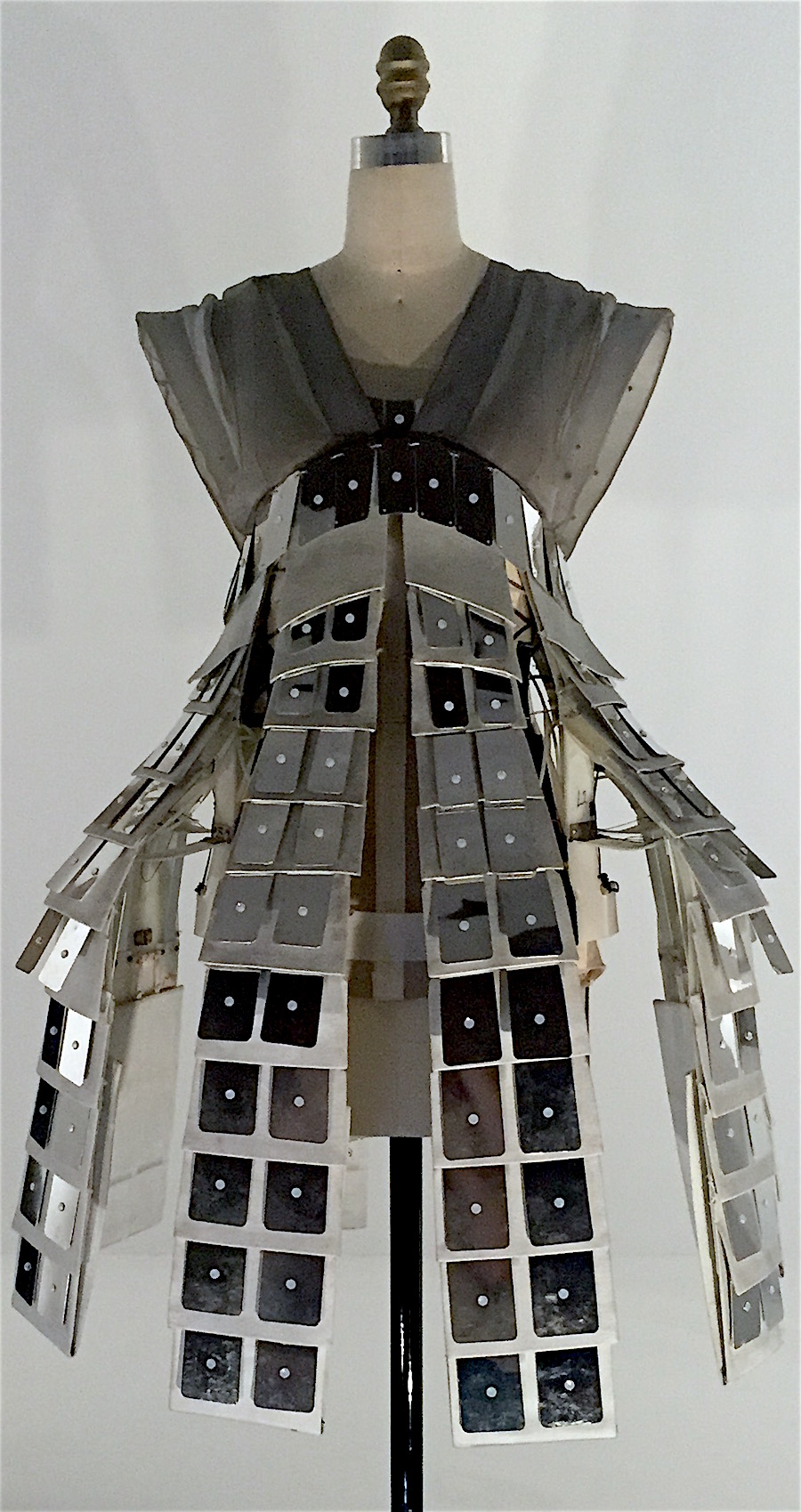

 Iris van Herpen dress including polyurethane resin and iron fillings hand-sculpted with magnets, Autumn/Winter 2014
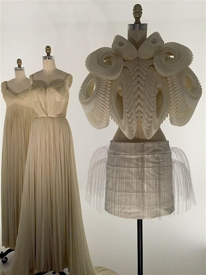
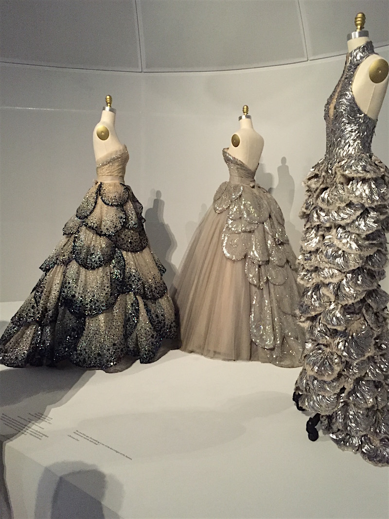 Gowns, Dior (left, center) and Alexander McQueen (right)