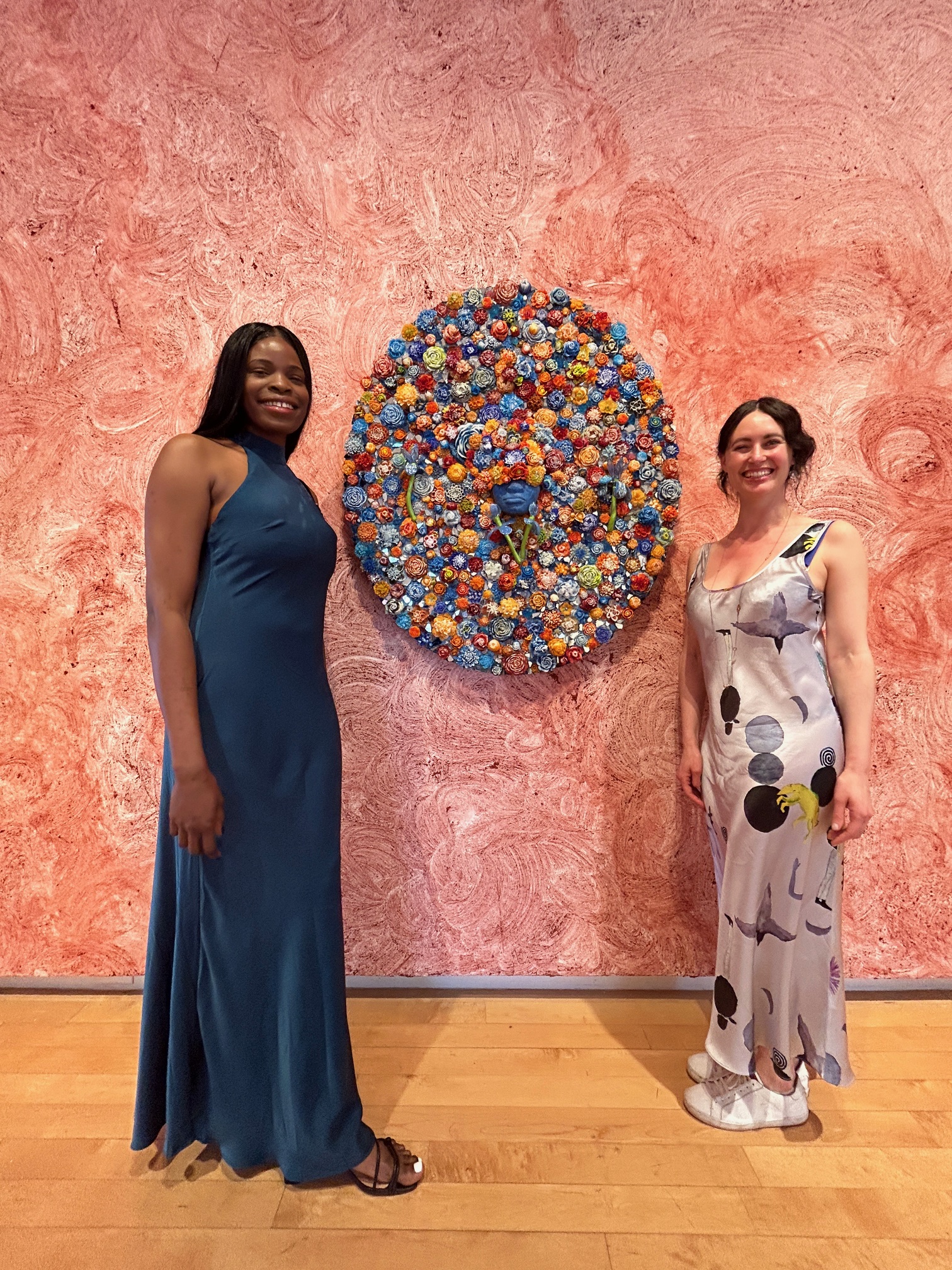
Pictured Above: Natasha Roberts Kay Photographed by Jeanne Paradiso for THE KNOW
As both New York’s Art Week and Fashion Week come to a close, a recent project came to mind that tastefully married the two worlds: A Room Just So, an exhibit of twenty international artists curated by Natasha Roberts Kay at Bergdorf Goodman.
Audrey Schilt, Behind the Scenes at Ralph Lauren (Claudia Being Fitted), Acrylic paint on canvas, 42 x 48 in. Courtesy of the curator.
Roberts Kay—a fashionista herself—wears many hats including curator, sought-after art advisor, new mom, and powerhouse publicist for the Public Art Fund. She can always be found pushing forward courageously with her vision, including regularly curating art exhibitions in New York City’s tallest skyscraper. While some in the art world shy away from embracing the connection between fine art and luxury retail, Roberts Kay orchestrates consonance between the two.
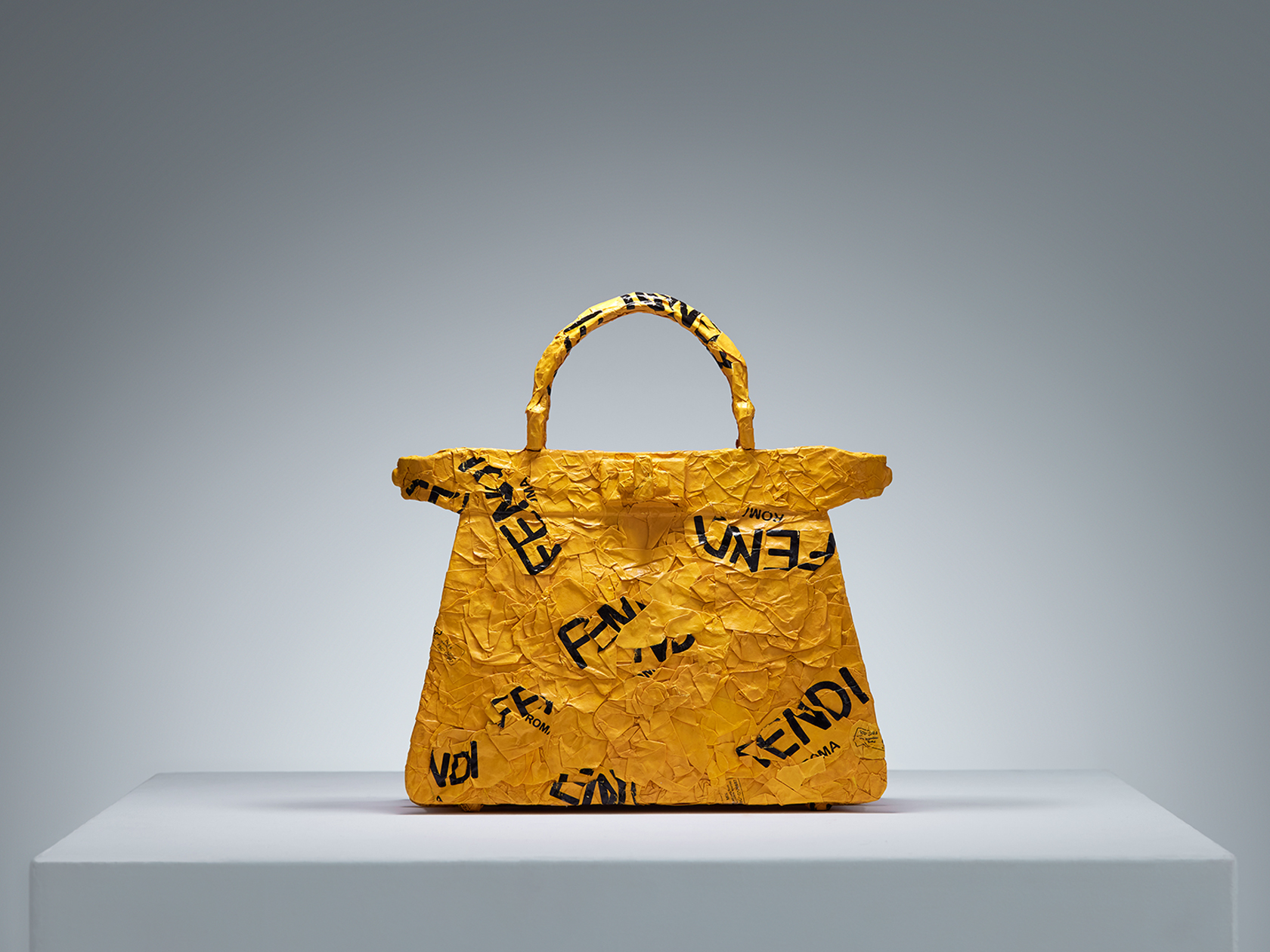
CHiNGLiSH WANG, CHiNGLiSH Brands (Fendi Peekaboo), Paper shopping bags and metal wire, 11 x 4.4 x 11.5 in. Courtesy of the curator.
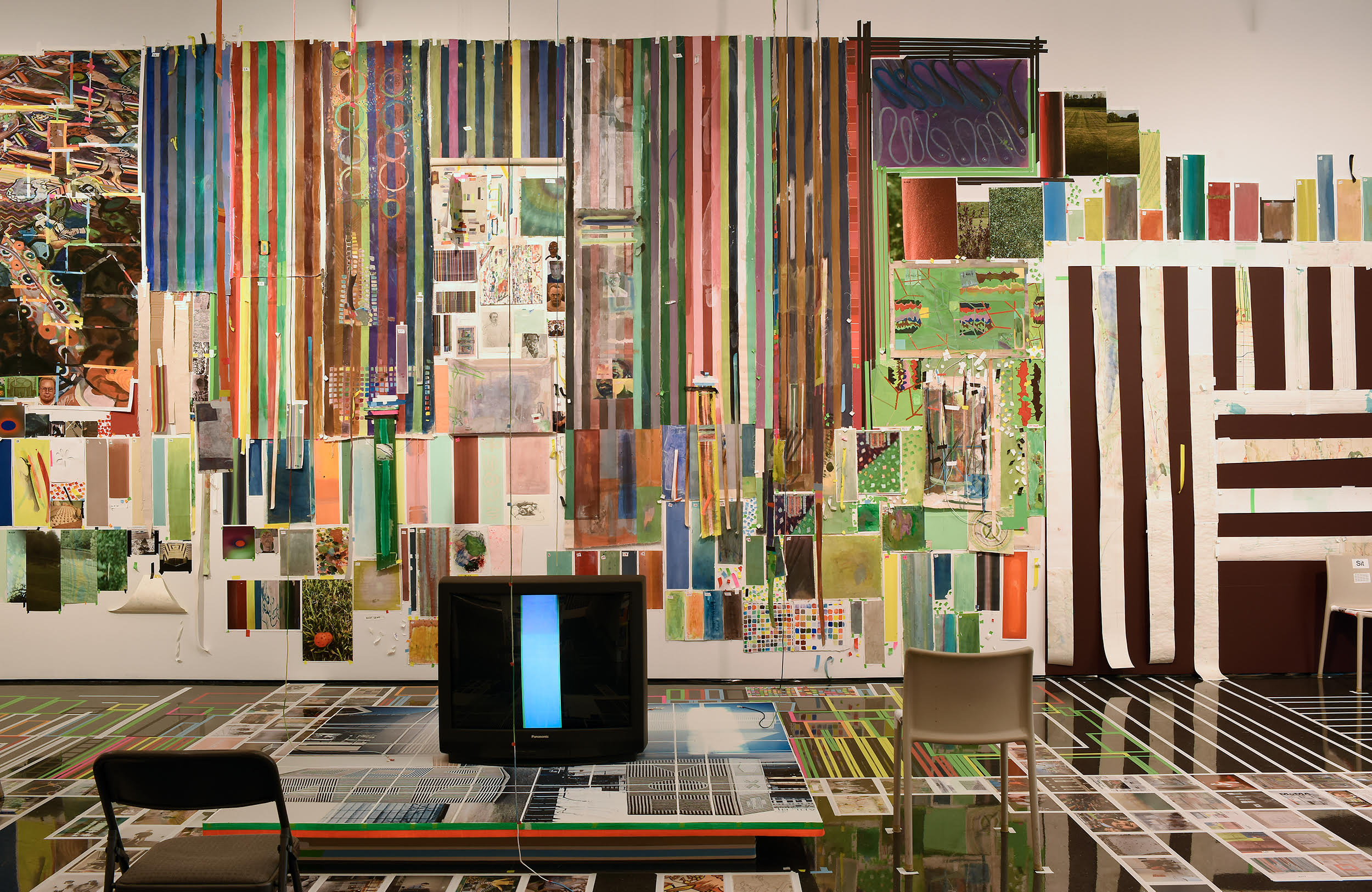
This was clear to me as soon as I stepped onto the seventh floor of Bergdorf Goodman to see Roberts Kay’s curated summer art exhibition, A Room Just So. Naturally, an environment like Bergdorf’s that successfully blurs the lines between retail and art is an inviting setting for the right exhibit. For A Room Just So, appropriately located on Bergdorf’s interior design floor, Roberts Kay “reimagined domestic spaces as living galleries, where paintings, sculpture, furniture, and design objects seamlessly intertwined with the art of home décor”.
Erin Kono, PersimmonI + II, Egg tempera on shaped board, 9.5 in. tondo each. Courtesy of the curator.
The exhibit, which included sixty sculptures, paintings, photography, textiles, and design objects by Alex Anderson, Vicky Barranguet, Edgard Barbosa, C.J. Chueca, Jane Dashley, Jen Dwyer, Kamiesha Garbadawala, Leia Genis, Manuela Gonzalez, Katie Hector, Erin Kono, Kouros Maghsoudi, Thérèse Mulgrew, Hannah Polskin, Gerardo Pulido, Audrey Schilt, Jeremy Silva, CHiNGLiSH WANG, Darryl Westly, and Avery Wheless, added new depth of creative storytelling to the department store’s seventh floor. The works, which ranged from abstraction, to surrealism, to figuration, to functionality, spoke to how art, design, and interior space have the capacity to shape our state of mind. Roberts Kay’s inclusion of thorough information about each artist on view with an impressive detailed audio guide elevated the show to the standards of a top commercial art gallery, while its setting at Bergdorf’s infused it with warmth by simulating living at home with the artworks. A Room Just So positioned the twenty artist’s works in a salable environment with exposure to new clientele, without diminishing their value as original works of art fit for a traditional gallery or museum.
Roberts Kay shared: “With the exhibition, my intention was to assemble a group of traditional artists who are stylish and fashion-forward. For example, Audrey Schilt started her career as Halston’s illustrator at Bergdorf’s—she even sketched Jackie Kennedy in a fitting for her iconic Pillbox hat—and now Schilt paints works inspired by her time in fashion, including her Behind the Scenes at Ralph Lauren series. Artists Leia Genis and Manuela Gonzalez works featured draped and woven textiles that were painted and dyed. CHiNGLiSH WANG sculpted iconic handbags using several major brands’ own shopping bags as material. Many of the works in A Room Just So directly demonstrated a relationship between fine art and design.”
Gerardo Pulido, Set of #25, Gouache, watercolor, and marker on paper, 12 x 9 in. Courtesy of the curator.
Anecdotally when I entered Bergdorf’s to see A Room Just So on a quiet Friday morning this summer, I overheard a shopper speaking on the phone in the jewelry section to my left, “Hi, I’m at Bergdorf’s,” she said, “…it’s really the last of the great department stores.” Hearing this, I thought to myself, wow, that really is true, isn’t it. Bergdorf Goodman is iconic; it has its own deeply-rooted historical weight as a bastion of elegance in New York City culture that allows it to seamlessly incorporate a foray into fine art that—with the right people like Roberts Kay on board—can be taken seriously.
Alex Anderson, Rose Vessel, Earthenware, glaze, gold luster, 10 x 12 x 12 in. Courtesy of the curator.
While A Room Just So has come to a close, currently on view in Bergdorf’s seventh floor gallery space is a new exhibit expertly organized by Tribeca-based art and design firm, Todd Merrill Studio, in partnership with de Gournay handpainted wallpaper. This new show features additional artists I love who cross over between the art and design spaces, including Andrea Marquis and Jamie Harris. Bergdorf Goodman’s seventh floor home decor space is open to view seven days a week.
Above: Lesley Bodzy in her NYC studio posing for Flaunt Magazine Interview, Photo by Milan Lazovski
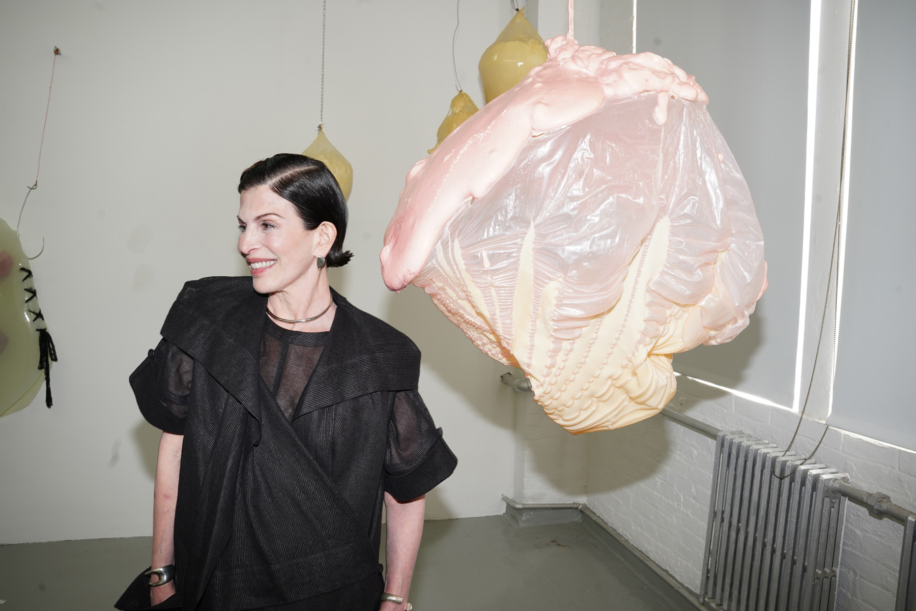
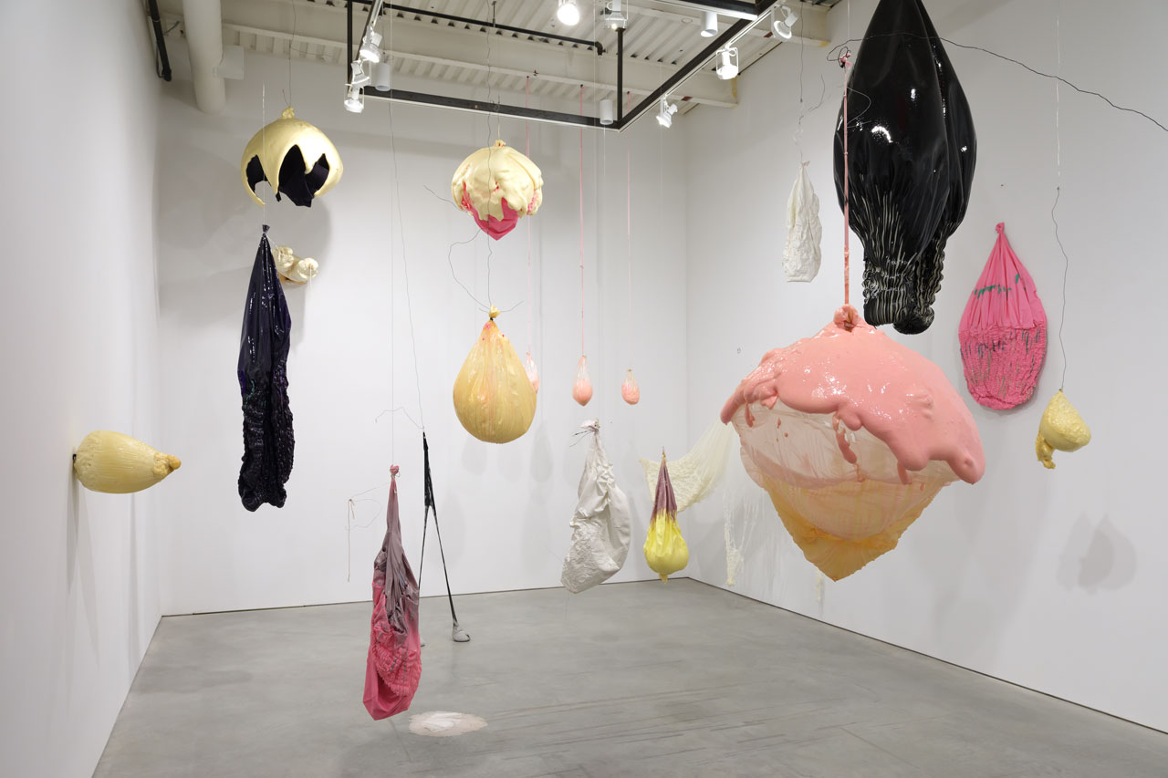
Lesley Bodzy is a mixed-media artist working in Chelsea, New York City and Houston, TX. During our recent studio visit, light pouring into her Chelsea studio bounced off and shined through her menagerie of colorful, translucent, biomorphic sculptures hanging from the ceiling, like giant jellyfish. The studio’s white walls were punctuated with abstract, bodily art objects large and small—some made of dried paint, some 3D printed, and some metallic, among other experimentations. In her sensuous environment that combined beauty with whimsy and the grotesque, it caught my attention that Bodzy had recently participated in a workshop with Judy Pfaff, a trailblazer for mixed media installation art. I noticed the visual and spatial dialogue between Bodzy’s abstract installation artwork on display in her studio, and Pfaff’s legacy. For example, we spoke of Bodzy’s decision to leave her artwork undefined as opposed to classifying it as feminist, even though it critiques patriarchal structures and the beauty industry. That was a decision Bodzy refined with Pfaff, an artist famous for denying narrative meaning to her work.
Bodzy strikes me as an impressive and curious lifelong learner, rigorously working on the refinement and development of her artistic practice. She is great at looking at herself critically, taking action, and growing. Her high level of physical production, innovation, and drive to making art in the studio rivals that of a recent MFA grad, and that’s because she is: she had a lifelong legal career as an attorney, and left it to pursue becoming a full-time visual artist in her sixties with studies at the Art Students League, Hunter College, and the Art Institute of Chicago.
In her studio—as in her exhibitions—Bodzy’s enviable, forever-youthful approach to life is on display alongside her sculpted forms. Following our energizing studio conversation and Bodzy’s immersive solo show, Levity and Depth presented by M. David & Co. at Art Cake, I sat down with the artist for an interview.
Alexandra Goldman: You’ve recently studied with the legendary installation artist and teacher, Judy Pfaff. What did you find most valuable about studying with Pfaff in terms of how she helped you develop your practice? Are there any memorable anecdotes you’re willing to share?
Lesley Bodzy: I was very lucky to work with Judy in 2024-2025 through the Yellow Chair program. She is just brilliant and has been making sculpture for a long time, so she has great insight into the work and the process of making. I was surprised by her down to earth, practical communication style. She treats everyone like a fellow artist and in that way is not intimidating and easy to learn from. She also did not try to make the students make work like hers but she found the key to each of us and worked with us at the level and aesthetic place we were at.
Lesley Bodzy, Levity and Depth, 2025, photo by Steven Probert
AG: In your spring solo exhibition, Levity and Depth curated by Michael David of M. David & Co. and presented at ArtCake (Cordy and Ethan Ryman’s art production, exhibition and events space in Sunset Park), your whimsical, organically shaped sculptures enveloped viewers in an immersive environment. What do you feel is most important about being “among” your works rather than looking “at” them?
LB: It was surprisingly fun to be among them and this was true for most viewers I think. They became embraceable and unexpected as you walked through them—a bit like the feeling of the installation of teamLab in Tokyo. They also moved in space and are not static.
Lesley Bodzy photographed for Flaunt Magazine, Photo by Milan Lazovski
AG: You seem to age in reverse! What is your secret, and what advice do you have for artists who struggle thinking about career success in relationship to age?
LB: Let it go. We are all aging and that is just he way it is. Best not to think too much about how much time you have left as one you can’t predict and two its not conducive to making art.
AG: Whether inflating and popping balloons, working with resin, foam, or metal, or sculpting with paint, you tend to have a unique and experimental approach to materiality in your practice. What does a day in the life of Lesley Bodzy experimenting with materials look like?
LB: It is generally fun. I typically try to have fun with the materials and it’s like a lab. I just don’t care if I make a mess or things don’t come out as hoped because when experimenting with new materials, things seldom go as planned.
Lesley Bodzy, studio in Houston, 2024
AG: What has making your artwork revealed to you about yourself that you didn’t know before?
LB: That things go better when they are not planned. This is just for me. You know I was an attorney and theres so much planning and detail involved in that. I am happy now to let all that go and just see what happens.
Lesley Bodzy, Levity and Depth, 2025, photo by Steven Probert
Alexandra Goldman is a writer, curator, and art dealer living in New York. She is Founder of the art publishing platform Artifactoid, and Managing Director of Barro New York, a contemporary art gallery with locations in New York and Buenos Aires. Goldman writes for Artifactoid, Whitehot Magazine, Cultbytes, ArteFuse, Vice-Versa, and Revista Jennifer. She received her M.A. in Art History from Hunter College and received her bachelor’s degree from NYU in Media, Culture, and Communications. Her Instagram is @Artifactoid.
Artists featured in this episode include:
Installation view, Monica Giron “Elemental Vortex” at Barro New York, 2023. Photo by Mikhail Mishin.
Maria Evelia Marmolejo, Anonymous 3, 1982. Performed on the polluted banks of the Cauca River, Valley Cauca, Colombia. Documentary photograph. Photo: Nelson Villegas. Courtesy of ArtNexus.
Installation view, “Alejandra Seeber: Interior with landscapes” on view at Americas Society, curated by Aimé Iglesias Lukin. Courtesy of Americas Society.
Catalina Schliebener Muñoz, Coloring Book Series, Minnie II, 2023, Vinyl, colored pencil and embroidery on mat board, 33 3/10 × 33 3/10 in | 84.6 × 84.6 cm. Courtesy of Barro New York.
Chellis Baird, Lady Danger II, 2021, Silk, acrylic, wire, birch panel, mahogany frame with black finish 28 x 20 x 4 inches 71.1 x 50.8 x 10.2 cm. Courtesy of the artist.
Me and Layo Bright with her sculptural glass artwork, now on view in her solo show “Dawn and Dusk” at The Aldrich Museum curated by Amy Smith-Stewart. Photo by Ferguson Amo.
This article was originallly published in Cultbytes.
Hanae Utamura. “Into the Light,” 2023. Acrylic on Paper. 57.5 x 42 inches. Courtesy of the artist.
In a life-changing instant—the sudden death of her husband—Japanese artist Hanae Utamura went from creating artwork that spoke to geopolitical collective memory in Japan, to exploring the realm of the personal through the body and the metaphysical. Her prior series of projects looked outward to the world and spoke to collective pain, suffering, death, loss, and trauma. Her newer work looks inward to our spiritual being, birth, grief, and the biological earthly entities that create us. Despite this challenge, Utamura is light-hearted and thoughtful. We met while welcoming El Salvadoran artist Beatriz Cortez’s time-based visual art project, Ilopango: The Volcano that Left: a Calder-stabile-like metal sculpture to Troy. In the shape of a volcano—a symbol in both Salvadoran culture and in Mesoamerican codices—it brings ideas of the Mayan underworld to the fore. In Troy, we participated in a ceremony to bless the Native American burial site with tobacco while Ilopango passed by us on the river.
Unbeknownst to Utamura’s recent loss, I was drawn to her bubbly and friendly nature and intrigued by her knowledge of indigenous practices. Perhaps it was our proximity to other realms that connected us—my mother lost her mother at a young age and has explored modes of communication with spirits, exposing me to conversation and practice surrounding energetic transitions. In recent years, spiritual art by women tracing back to modernist and proto-modernist abstraction is more widely known, facts that Jennifer Higgies writes about in her new surveyThe Other Side: A History of Women in Art and the Spirit World. As we offered tobacco to the land, Utamura invited me to visit her studio on the Rensselaer PoIytechnic Institute’s (RPI) nearby campus, where she is enrolled in a practice PhD program, and I accepted.
At her studio, Utamura told an unexpected and moving story about the recent transition in her artwork style. Her husband, Robert Phillips, was an American new music composer. They were an artistic couple who met in 2014 at Akademie Schloss Solitude, an international artist residency in Stuttgart, Germany. Within a very short period after the world entered the pandemic, Utamura experienced bringing life into the world, giving birth to their son, Kai, in 2021. Shortly thereafter, in 2023, she saw life leave the world with Robert’s death due to sudden illness. It was a devastating and unexpected tragedy for the young couple and their family.
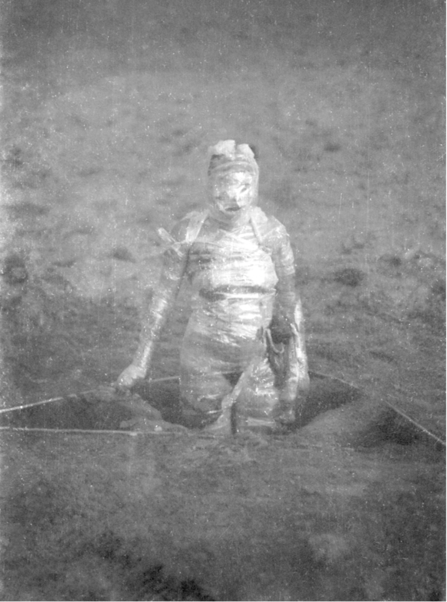
On the 49th day after Robert’s passing, which in Buddhist tradition marks the day when one’s spirit and energy are fully released, Utamura performed a ritual to honor him. She had saved the placenta from Kai’s birth (which is dried in the shape of a bowl), placed Robert’s hair inside the placenta, and buried both together beneath a tree. When Utamura and Robert spent their last moments with each other, they exchanged locks of hair. The placenta provides oxygen and nutrients to the child through the umbilical cord, which also brings waste products away. It is shaped like a brain, or as Utamura describes it, a “half-cut earth,” and symbolizes growth and birth. “Placenta is treated as medical waste after birth in the Western medical world, but many cultures have a sacred, spiritual relationship to the placenta,” she commented. The placenta is often referred to as the “tree of life” for the branch-like patterns made by its blood vessels. The site continues Robert and Utamura’s life together, as the placenta’s nutrients—parts of their DNA—enrich the grass and tree roots, and other, in her words, “non-human species.” And, Utamura’s ritual symbolized Kai protecting Robert’s spirit, and carrying him into spiritual transcendence, with the eternal protection of his son.
Maria Evelia Marmolejo. “Anónimo 4,” 1982. Performance. Photo by Nelson Villegas. Image courtesy of Maria Evelia Marmolejo.
Pioneering feminist artists from the early eighties also worked with the idea of the placenta as considered “medical waste” in Western medicine, while it is spiritual, such as Colombian artist Maria Evelia Marmolejo (who was included in the 2017-2018 exhibition Radical Women: Latin American Art 1960-1985 Hammer Museum and Brooklyn Museum). For Marmolejo’s 1982 performance, Anónimo 4, she dug a 1.5-meter triangular pit into the ground and filled it with sewer water and the placentas of all the babies born that day in hospitals near the performance site, in Cali, Colombia and Guayaquil, Ecuador. She wrapped her body in the placentas, and submerged herself in the hole, “embarking on a psychological and sociological self-exploration of the fear of being born in a society in which there is no guarantee of survival,” she explains in an interview. Artists like Marmolejo and Utamura observe the importance of the placenta by incorporating them into their performance rituals in meaningful, powerful, spiritual, and symbolic ways, whereas at the hospitals, they tend to be discarded.
Understandably, Utamura could not entirely let go of her partner. Because of these sudden extreme encounters with life and death, which now flow, in her words, “like the confluence of the river with raising Kai,” her perspective was instantaneously transformed, altering her artistic practice. Before Robert’s death, she created more geo-political artworks, often performances and films. One work Uncanny Valley – Study for Future Strata (see image below) raises questions around the dominant historical narrative of nuclear history by juxtaposing images of the elements that surrounded the atomic mushroom clouds of the bombing in Nagasaki, with the mining site in Congo where uranium was sourced for nuclear production – positioned above, and the military storage site near Niagara Falls where nuclear waste from the Manhattan Project was secretly disposed – positioned below. But, after she experienced the life-altering sequence of birth and death events, she felt compelled to turn inward to the body and spirit. Abstract painting helped her overcome “the unspeakable”—I immediately drew a parallel to the shift to abstraction in Western art after World War II. She believes in abstract painting as a powerful medium for channeling the energetic transitions relating to birth and death.
Hanae Utamura. “Uncanny Valley – Study for Future Strata,” 2022- Mixed Media. 21 x 16 inches. Courtesy of the artist.
“This has also very much been a collaborative process with Robert,” Utamura added, “Aur means ‘light’ in Hebrew. I feel that his symbolic composition, Aur, for string quartet and electronics, is the light that he transcended into. It transforms death into a departure. When painting, I hear his music inside my ear—his essence is expressed even more through his music in his physical absence. The music truly starts to live in eternity within me.” Having followed my mother’s journey to stay in touch with my grandmother after her death Utamura’s will to stay connected as a source of comfort resonated with my own experiences.
The first several paintings Utamura created exploring her feelings of grief were watery representations of a body, dissolving. After creating several of these more figurative paintings, she was invited to a séance by Tamar Gordon, a professor of Anthropology in the Communication and Media department at RPI, and a member of her doctoral committee. The séance would help her further shift her focus from grief to communication.
Hanae Utamura. “The Limb,” 2023. Acrylic on Paper. 24 x 18 inches. Courtesy of the artist.
At the séance, the physical medium Gary Mannion, headed a circle under controlled conditions, alternating between complete darkness and red light. Physical mediums, as opposed to mental mediums, produce materializations of spirits while mental mediums interpret and channel them. Physical mediums produce ectoplasms which are viscous manifestations of spirits that exude from their body taking on any form, including apparitions. Encircled by the participants and sitting in a cabinet, tied down to a chair, Mannion produced an ectoplasmic hand and invited members to touch and hold it. Utamura described the experience as having felt like “touching a wet hand.”
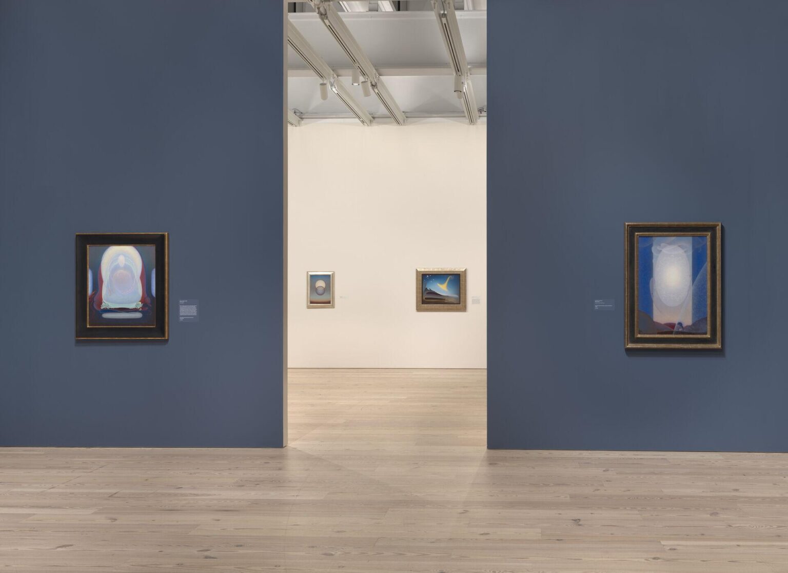
Installation view of “Agnes Pelton: Desert Transcendentalist” (Whitney Museum of American Art, New York, March 13–November 1, 2020). From left to right: Mother of Silence, 1933; Departure, 1952; Awakening (Memory of Father), 1943; Light Center, 1947-48. Photograph by Ron Amstutz. Courtesy of The Whitney Museum of American Art.
Séances were an American phenomenon popularized by the Spiritualist movement in the 1850s. They spread to Britain, other parts of Europe, Brazil, and Australia, and consisted of circles of sitters who gathered to channel the realm of spirits. Today, they are less common, but exist and Mannion is a leading figure in the field.
Utamura’s new work is also influenced by Shannon Taggart, a photographer and artist who authored a popular book depicting sitters in various states of transfiguration. Taggart recently had an exhibition of her work at the Opalka Gallery in Albany, NY. The two-day public opening included a dialogue between Taggart and Dr. Anne D. Braude, the director of Women’s Studies in Religion at Harvard Divinity School, and the author of the book,Radical Spirits: Spiritualism and Women’s Rights in Nineteenth-century America, which explores the close engagement of Spiritualism with the women’s rights movement. There is also a growing recognition in recent years of female artists like Hilma af Klint and Agnes Pelton, who employed art as a language to explore spirituality. Utamura considers her work as in alignment with these artists and thinkers.
Hanae Utamura. “Presence of Absence #3,” 2023. Acrylic on Paper. 24 x 18 inches. Courtesy of the artist.
After the séance with Mannion, Utamura created another series of paintings in which she began to depict the imaginary body that evolves to a more abstract state in its process, like energies and colors (rather than a dissolving figure), with rich, cosmic dark blues or brighter florals. Often she incorporates a bit of iridescent pigment “inspiring to channel, as it reflects light” she explains. The composition of Utamura’s new more abstract paintings on paper are vaginal and womb- or placenta-like. Some of these images incorporate a hand and a tree branch, perhaps referencing the tree under which she performed the ritual for Robert, or the sensation of touching a wet hand in the séance.
Serendipitously, a few months before Robert’s passing, she also found a book lying in a classroom at RPI titled The Perfect Medium: Photography and the Occult published by Yale University Press. It is the catalog from an exhibition in 2005 at the Metropolitan Museum of Art that showcased the history of photography on mediumship channeling with the spiritual realm, with imagery dating back to the nineteenth century. There is a page in the book that shows photography which captured ectoplasmic emissions, and the composition of these images have similarities to the composition of Utamura’s new paintings. She has a feeling that her spiritual involvement with the other realm was and is still being presented to her from many different angles.
Both of these newer series explore what comes before, what happens during, and what comes after, an extreme moment—global or personal. “We are living through dark times with a lot of death,” Utamura remarked sensitively in her studio, putting aside her personal loss and experience, knowing that this is going on all around us. “We’ve learned to accumulate, but we are not taught much about how to face loss. I think it is time for us to face this; exploring these spaces would also bring us more understanding of life in its complexity, and knowledge of how to nourish life. It will prepare us with strong grounds for the future to come. The more darkness that falls upon us, we also need light that illuminates our world.”
Still. Life., a strong solo exhibition of sizeable still life paintings by Australian artist Zoe Young, opened October 15th as the third successful exhibition collaboration between Gruin Gallery, founded by formerly New York-based gallerist Emerald Gruin, and domicile (n.), an innovative East Hollywood multi-modal artist project space created by Cyrus Etemad and curator Margot Ross. Still. Life., Young’s first breakout solo exhibition in the U.S., will remain on view at domicile (n.) in LA’s Merrick Building until November 22nd , 2021.
Zoe Young and Emerald Gruin met one another while studying together at the National Arts School in Sydney over a decade ago, and have since maintained a friendship and mutual appreciation for one another’s work. Still. Life. represents a consummation of their meaningful relationship over many years.
The title of the exhibition, Still. Life., is immediately sobering. Young created all the still life paintings in this exhibition during pandemic quarantine lockdown in Australia, isolated and alone in her studio. By breaking up the two words, it poses questions and presents thoughts about these words individually. What does it mean to be still? What does it mean to be alive? What does it mean to be separated, when you’re used to being together? And, most importantly, when and how does life still go on? These reflections are all embodied in each of Young’s still life paintings.
Australia had one of the world’s strictest pandemic travel regulations, only opening its borders for the first time after twenty months this week on November 1, 2021. Young’s artistic practice frequently included portraits and other figurative imagery of people prior to the pandemic, however in lockdown, she turned to the still life, focusing on the decadence and pleasure of objects in the absence of people.
Young is a multi-year finalist of Australia’s Archibald Prize, which is considered Australia’s most prestigious award for portraiture. When there are not people around to paint, what could better express the stories of people than their things? Young’s paintings in Still. Life. are in this way imagined portraits of people, showing evidence of their tastes and existence through books, cassette tapes, food, drink, and décor without revealing their physicality.
Zoe Young, Squid ink pasta for breakfast before breakfast at Tiffany’s, 2021, Acrylic on Belgian linen, 59 x 59 x 1 5/8 ” (150 x 150 x 4 cm). Courtesy of Gruin Gallery and domicile (n.).
Each painting details one of Young’s imagined fantasy dinner parties in Tinseltown, which she yearned for while in solitude. The artist had never been to LA, but always dreamed of going to experience its patina, glamour, and allure. The lengthy quarantine she weathered only heightened her desire to bring these fantasies to life through her art: both of traveling, and intermingling with people in the most basic of ways. There is a unique joy that comes from clinking glasses and sharing food off of the same plates as others, evident in Young’s paintings.
Formally, the works show off the artist’s hand with generously applied paint and visible brush strokes. Young’s soft, Francophile color palette is optimistic, with what feels like dappled sunlight pouring into each scene and highlighting the architecture of her objects. Young’s style of painting is reminiscent of Matisse, Alice Neel, and Wayne Thiebaud. Some moments in the paintings reveal Young’s affinity for French culture by way of certain wines, cheeses, Louis Vuitton, perfume, and even a tiny French flag on a toothpick, while others such as fish heads and lemons recall 17th century Dutch vanitas still lives. One of my favorite moments in the exhibition is how, in the work “Chablis, Surf shacks + Olives”, 2021, Young paints the reflection of a striped tablecloth refracting within a white wine glass, demonstrating her attention to detail and technical prowess.
The paintings also evoke a cross-continental playfulness and sense of humor. Young’s scenes often pretend to feature L.A. beaches, but as many Australians may recognize, actually depict Sydney’s Bondi Beach. Nods to surf culture from both California and Australia make appearances throughout the exhibition, and in an Oscar Wildian fashion, Young paints herself into her work fusing her own name onto one of her painted book covers.
Zoe Young, Bribery and corruption over brunch, 2021, Acrylic on Belgian linen, 68 1/8 x 88 1/4 x 1 3/8 ” (173 x 224 x 3.5 cm). Courtesy of Gruin Gallery and domicile (n.).
Finally, many of the fruits in young’s still life paintings are fabulously mythological and sexual, such as pomegranates, strawberries, pears, grapefruits, and avocadoes; a possible commentary on the desire for human touch, absent for many in isolation during the pandemic. Several of these fruits also grow in gardens in both Australia and California, linking the two geographic regions. Emerald Gruin holds gardening dear to her heart as gardening was her mother’s lifelong passion and exceptional talent. Therefore the heavy presence of flowers, fruits and vegetables throughout this exhibition is additionally an important connection between artist and gallerist.
Young was deeply saddened believing for a long time that due to the continued lockdown in Australia, she would not be able to make it to her own first ever U.S. exhibition in LA. However, because of the recent opening up of Australia’s travel restrictions on November 1st, Young will finally travel to Los Angeles. In her honor, Gruin Gallery and domicile (n.) extended the exhibition and will be hosting a real Hollywood dinner party for Young in the gallery space, surrounded by her paintings, with plans to have the real dinner mirror the aesthetics in the paintings. It seems for this powerful, manifesting artist, that fantasies do come true.
Zoe Young, Still. Life. is on view at Gruin Gallery x domicile (n.) in the Merrick Building, 4859 Fountain Avenue, Los Angeles, CA, from October 15 – November 22, 2021.
Above detail image courtesy of Alteronce Gumby and False Flag Gallery, New York, NY, 2021.
By Alexandra Goldman
I give and receive crystals as gifts. I believe in their energetic power for channeling different qualities into and out of our lives. Whether it’s love, openness, abundance, strength, clarity, protection, release…they’re magical.
What I hadn’t expected to see, was a profusion of crystals in contemporary art and its exhibitions culminating in one New York moment. By this I mean Art with a capital A, at major museums, art fairs, and galleries. My recent viewing experiences have led me to believe the moment for crystals in Art has arrived.
Medieval artists evoked divinity through religious art, magnificent cathedrals and stained glass windows. Romantic artists explored the sublime in nature. Later 19th and earlier 20th century painters like Hilma Af Klint and Agnes Pelton channeled spirituality through abstract forms.
It’s no wonder that following the apocalyptic despair of 2020, multiple artists today are either consciously or subconsciously eager to incorporate a material into their work that traditionally possesses properties for spiritual connectivity and otherworldly transcendence. While that overarching idea feels clear to me, each artist’s decision to include crystals in their work also has nuanced meaning specific to that work, so I encourage paying attention to what makes each unique in its context as well.
Within this past month, I came across four unrelated NYC-based art exhibitions that each incorporate crystals, which compelled me to take notice and write this brief article. The following is a photo essay of these beautiful – and wonderfully diverse – examples of artwork currently (or recently) on view featuring crystals in New York City. You can still catch many of them on view this week, for a serving of culture with a side of soul healing.
Alexandra Goldman sits down with artist Franklin Evans to discuss his two current exhibitions at Miles McEnery Gallery, fugitivemisreadings at 520 West 21st Street, and YOU AGAIN curated by Franklin Evans at 511 West 22nd Street, as well as his current museum show Franklin Evans: franklinsfootpaths at the Figge Art Museum in Davenport, Iowa.
FRANKLIN EVANS (b. in 1967 in Reno, NV) received his Bachelor of Arts degree from Stanford University in 1989 and his Master of Fine Arts degree from the University of Iowa in 1993. He has had numerous solo exhibitions, including “Franklinsfootpaths” at the Figge Art Museum, Davenport, IA; “fugitivemisreadings ” at Miles McEnery Gallery, New York, NY; “selfportraitas” at FL Gallery, Milan, Italy; and “timepaths” at the Nevada Museum of Art, Reno, NV. His work is included in many public and private collections including the Bronx Museum of the Arts, New York, NY, El Museo del Barrio, New York, NY, the Nevada Museum of Art, Reno, NV; the Orlando Museum of Art, Orlando, FL; the Pizzuti Collection, Columbus, OH, and the Yale University Art Gallery, New Haven, CT. He is a recipient of the 2017-18 Pollock-Krasner Foundation Grant, New York, NY; The Fountainhead Residency, Miami, FL in 2017; and was a National Endowment for the Arts Fellow at The MacDowell Colony, Peterborough, NH in 2016. Evans lives and works in New York, NY.
New York, NY: Miles McEnery Gallery, Franklin Evans: fugitivemisreadings, 24 June – 31 July 2021. Image: Christopher Burke Studio. Courtesy of the artist and Miles McEnery Gallery, New York, NY
Franklin Evans, misreadinglandscapeintoart, 2021, Acrylic on canvas, 53 1/2 x 49 1/4 inches, 135.9 x 125.1 cm. Courtesy of the artist and Miles McEnery Gallery, New York, NY.
Franklin Evans Studio, 2021, New York, NY. Image: Christopher Burke Studio. Courtesy of the artist and Miles McEnery Gallery, New York, NY.
Franklin Evans, titianatilt (detail), 2021, Acrylic on canvas, 79 1/2 x 68 3/4 inches, 201.9 x 174.6 cm. Courtesy of the artist and Miles McEnery Gallery, New York, NY.
Installation view: Franklin Evans: franklinsfootpaths at the Figge Art Museum, 19 June – 26 September 2021, Davenport, IA. Image courtesy of the Figge Art Museum.
Works by Ann Pibal, Elliott Green, Josephine Halvorson, and Tom McGrath in YOU AGAIN curated by Franklin Evans at Miles McEnery Gallery. New York, NY: Miles McEnery Gallery, ‘YOU AGAIN’ curated by Franklin Evans, 24 June – 31 July 2021. Image: Christopher Burke Studio. Courtesy of the artists and Miles McEnery Gallery, New York, NY.
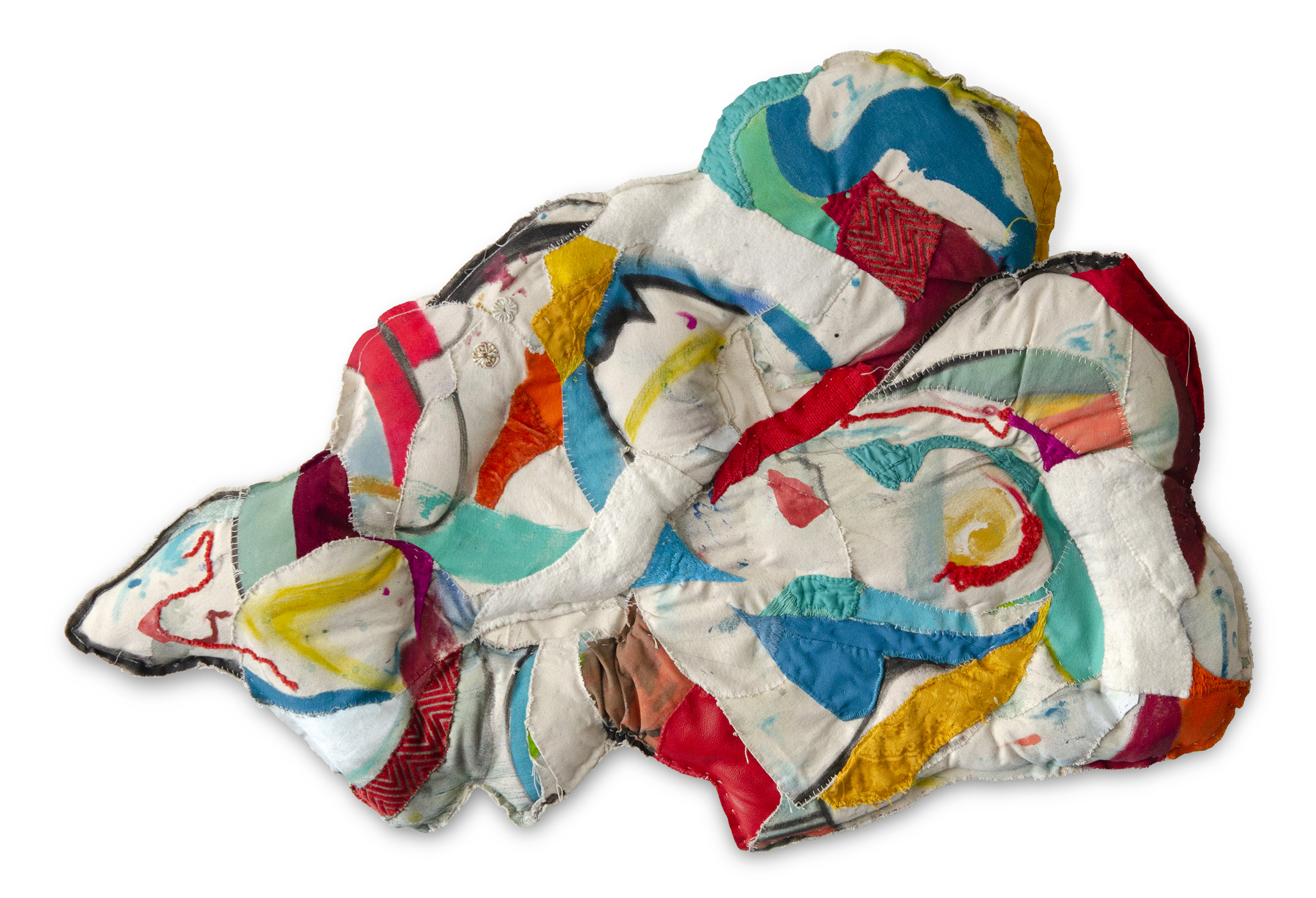
Above: Emma Balder, Harmony, 2020. Recycled fabrics, rope, bungee, paper, acrylic, and thread on canvas, 40 x 81 x 3″. Courtesy of the artist.Photo by Jay Marroquin.
By Alexandra Goldman
This month I was excited to be connected for a virtual studio visit with Houston-based artist Emma Balder by my friend, colleague, and mentor, Dr. Jose Falconi, Lecturer of Latin American art at Brandeis University.
Balder was born in Boston in 1990. She grew up curiously watching her mother sew costumes for her and her siblings, and as a young teen experimented with cutting up and sewing her own clothing. She later earned her BFA from SCAD with a background in painting, and has since shifted toward heavily incorporating sewing and fiber art into her practice using recycled materials.
Emma Balder’s studio, Houston, TX. Courtesy of the artist.
She began integrating textile waste into her practice during her formative year-long residency at the Vermont Studio Center, where she was given bags of the recycled scrap cloth material as a gift by a fellow resident who had an excess of it and couldn’t take it traveling overseas. Since then, Balder has continued to collect textile waste from seamstresses and fashion designers. “There is so much waste, and it bothered me, but I saw beauty in it,” Balder noted. Additional examples interesting artists who work with recycled textiles include Tamara Kostianovsky and Linda Friedman-Schmidt. The interpretations of the medium by these three artists is vastly different, showing off its vast potential.
Her colorful organically shaped works fall into two main categories: “Pinglets”, which are (often stuffed) three-dimensional wall pieces that Balder creates by completing a painting, cutting it up, and re-stitching it together in new compositions mixed with other recycled textiles, and “Fiber Paintings”, in which Balder “paints” on paper and panel with colorful thread, using the thread itself as the paint. A fervent environmentalist, working with recycled fiber materials is of utmost importance to Balder.
On her website, Balder notes, “The Pinglet project documents a process of regeneration. This project began with the physical deconstruction of one painting, the Ping. The disjuncture of parts were then rearranged and reconstructed with needle and thread to form small baby paintings, called Pinglets.” Pings are usually abstract landscapes of around 12 x 8 ft. Balder knows to cut up the Ping at the moment she is satisfied with it, believing the moment that you become complacent, it is time to catalyze change and reignite the creativity that comes from vulnerability.
Following our studio visit I’ve come to understand why Balder has named one of her main artwork styles a made up word such as a “Pinglet”: Balder is principally interested in creating artwork as a manifestation of her own world on her own terms: a place to escape to and live in; both a new world and a new home. In a Derridean sense, this logically begins with creating and defining her own language to refer to her new world without relying on preexisting terms. In her work she creates a beautiful synergy by deconstructing and reconstructing both the physical materials she is utilizing to create the works, and the language she uses to describe them.
Pinglets are filled with vibrant bursts of shape and color caught in a balancing act throughout the composition channeling an unlikely yet successful combination of Vasily Kandinsky and Howardena Pindell. The Pinglets look like stuffed animals in the shapes of clouds, human organs, puddles, or the symbols for hills in Aztec Codices. Balder’s work also visually recalls the legacy of Marta Minujín and her stuffed, bright hanging wall pieces that look like Fruit Stripe gum got into a pillow fight. The difference is that Balder’s gum is chewed.
Both Balder’s Pinglet and Fiber Painting abstractions appear to be dancing or blowing in the wind. They are free, and Balder found both freedom and home in the creation of her own combinations and interpretations of media that don’t stick to traditional definitions of painting or sculpture.
Interestingly, when asked about her main artistic inspiration or influence, Balder, without hesitation, mentioned that she is often thinking about and inspired by Catalan architect Antonio Gaudi. As a Barcelonaphile who has experienced Gaudi’s architecture in person, this resonated with me on multiple levels: bright playful colors, organic forms, structure, and the fact that architecture can be a site where art, home, and nature coalesce. Balder’s works are each like small architectures.
Through our conversation, I learned that Balder intends to generate the abstract feeling of home throughout her oeuvre. I asked her if she wouldn’t mind revealing the source of the importance of home in her work. She mentioned she moved around a few times as a child, and what she always missed most and returned to in her mind was her favorite place: the natural environment that surrounded her first house, where she would play amidst a cluster of trees, have secret meetings with friends or siblings, and carve into or decorate the tree trunks. She felt at home in nature, in these trees, more than the house itself. If you look at Balder’s Pinglets, they are formally reminiscent of horizontal slices of tree trunks.
Balder’s commitment to the environment has also attracted the attention of large brands. She was selected in 2019 by PepsiCo as one of the three environmentally-focused artists chosen to have their artwork featured on the series of 100% recycled plastic LIFEWTR water bottles. Sweeping visuals of Balder’s Fiber Paintings can still be found on the bottles today. The series marked a moment of transition for LIFEWTR to go from using regular plastic bottles to recycled ones. While it is still not good for the environment to have single-use plastics in circulation, the massive shift of a company like Pepsi to transition their bottles from new to recycled materials is a step in the right direction. Last week I serendipitously came across Balder’s LIFEWTR bottle at JFK Airport en route to Miami, and was thrilled to have the chance to take in the visual of it with in-depth insight into Balder’s practice, rather that looking at it as an image on a product without context.
LIFEWTR Series 9.3 “The Art of Recycling”, Emma Balder, Image courtesy of the artist.
Looking ahead as Balder continues to develop her practice, she desires to focus even more intently on creating space, and inviting viewers in. “I don’t know how much longer the wall is going to serve me. I have been playing around with sculpture, and I would really like to create an immersive space where the viewer can feel like they are part of that world, and feel that sense of coming home,” she revealed. I look forward to seeing the worlds Balder has in store.
For over four decades, I have visited New York’s annual art fairs — from ADAA to The Armory Show — along with many other fairs that showcase galleries’ best and most innovative artists. Artworks look even more exciting when contrasted with the stylish women of all ages (from gallerists, to collectors, to fashionistas who fill the piers, the Armory, lofts, and exhibition spaces) wearing distinctive attire that blends into colors and patterns displayed on the walls.
Artwork: Vanessa German at Pavel Zoubok Fine Art, ADAA 2020
The Armory Show 2020
Artwork: Luisa Rabbia at Peter Blum Gallery, The Armory Show 2020
Artwork: Jiro Takamatsu at Whitestone Gallery, The Armory Show 2020
Artwork: Timothy Curtis at Benda Gallery, The Armory Show 2020
Artwork: Viktor Popovic at C24 Gallery, The Armory Show 2020
Artwork: Amy Schissel at Patrick Michail Gallery, The Armory Show 2020
ADAA 2020
ADAA 2020
Artwork: Nina Chanel Abney at Pace Prints, ADAA 2020
Artwork: Vanessa German at Pavel Zoubok Fine Art, ADAA 2020
Rose Hartman. Photo by Marsin Digital.
For the past four decades, Rose Hartman has photographed the rich, the famous and the stylish in some of the most legendary settings of New York nightlife, from Studio 54 to the Metropolitan Museum’s Costume Institute Gala, fashion shows, and models backstage. Her arresting pictures have been published in countless international publications, including Vogue, Stern, Harper’s Bazaar, Vanity Fair, Panorama, the NY Times, New York, & Art & Auction. Hartman’s photos have been exhibited in international galleries from Beijing to Moscow. Her iconic photos are currently on view at the Morrison Hotel Gallery in SoHo and at The Brooklyn Museum in a group exhibition titled, “Studio 54: Night Magic,” open from March 13—July 5, 2020.
Above: Jaqueline Cedar in her studio. Image courtesy of Good Naked. Photo by Phoebe Berglund.
By Alexandra Goldman
After finishing her MFA at Columbia in 2009, LA-born and raised artist Jaqueline Cedar moved into a spacious apartment with her boyfriend in Ditmas Park. Like many artists at the time, she had studio space in Industry City in Sunset Park, but was priced out in 2012 as large design companies and startups moved in. “There was a mass exodus of artists from the neighborhood around that time,” she explained, “I thought about moving my studio to Long Island City or elsewhere in Queens, but none of the rent prices felt within range. Getting a studio seemed more expensive than renting an apartment.”
Painting by Jaqueline Cedar. Image courtesy of Good Naked.
Cedar’s large empathic paintings focus on psychological interactions between otherworldly cartoon characters that are both familiar in a Popeye and Olive Oil sort of way, and simultaneously absurd and unknown. Her landed-on-mars color palette, combined with some apparent Bruce Nauman influence, use of nontraditional materials (she paints on neon foam and sports mesh), and fondness for placing three or four moons in any given sky, add up to a sophisticated brand of mindfuckery that reverberates throughout the oeuvre.
Paintings by Jaqueline Cedar. Images courtesy of Good Naked.
To continue to produce her work despite the financial difficulties of finding adequate studio space, Cedar’s boyfriend suggested that she move her studio into their home. She tried it and discovered that she loved how it allowed her to work whenever she wanted, even during all hours of the night. Then, in 2015, the relationship with her boyfriend ended. Cedar needed to get a roommate to pay the rent, and transitioned into a roommate lifestyle for the next four years.
In August 2019, when her then-roommate abruptly announced she was moving out, Cedar was nervous but saw a window for a different solution to her rent deficit. Instead of finding a replacement tenant, she took a risk and made the decision to transform the majority of her apartment into a commercial art gallery with a developed, rotating program of exhibiting artists. She had past experience organizing exhibitions at Crush Curatorial, and wanted to continue to explore this path. “I started all of the planning right away in August, as I knew I would need to turn a profit almost immediately in order to make this plan work,” she said. “If it didn’t work out, I thought, I could always get another roommate later.”
Installation view, “Go For Broke” at Good Naked Gallery. Image courtesy of Good Naked.Photo by Etienne Frossard.
For Cedar, the financial pressure was a motivating factor. “Some people crumble under that type of pressure, but for me, it was energizing.” To get things going, she began conceptualizing names for the gallery and exhibition titles, and started emailing and planning studio visits with artists she envisioned working with. An initial round of positive feedback from many of her top-choice artists encouraged her to hit the ground running. She decided on her quirky gallery name, “Good Naked,” based on a Seinfeld episode that jokes about walking around your apartment naked: a classic perk of not having a roommate.
Installation view, “Go For Broke” at Good Naked Gallery. Image courtesy of Good Naked. Photo by Etienne Frossard.
What began as something she saw as an experiment for one or two months turned into a longer-term success. Cedar has already had four shows, each with an opening party, closing, and an event in between. Her events are special and build community. At the first event, she created a drawing club where guests collaborated on exquisite corpse drawings. Subsequent events featured a comedy show of female artist-comedians doing stand-up, and a supper club where an artist prepared lasagna for the group. Cedar confessed, “at first, I was inviting each guest to the gallery individually and introducing attendees to one another. Now, many people show up to my events who I don’t even know, and I’m the one being introduced!”
Jaqueline Cedar and Zebadiah Keneally in Cedar’s studio. Photo by Artifactoid.
Zebadiah Keneally, installation view, “Go For Broke” at Good Naked Gallery. Image courtesy of Good Naked.Photo by Etienne Frossard.
One artist who recently showed at Good Naked is poignant comedic illustrator and performance artist Zebadiah Keneally. Keneally installed a floor to ceiling immersive, painted environment featuring multiple illustrations in the apartment’s central corridor. His videos are also hilarious, many featuring his alter-ego, Hamburger Vampire.
Phoebe Berglund, Freezer Still Life (Cabbage, Shrimp, Rye Bread), 2020 Digital C-Print, 8” x 12” Edition of 20. Image courtesy of Good Naked.
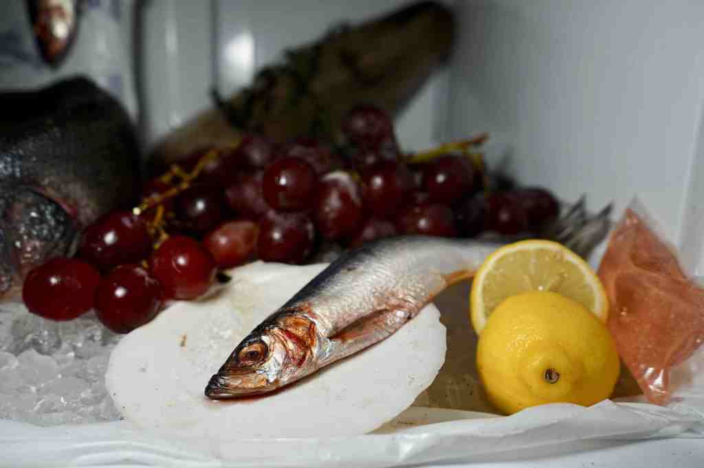
Phoebe Berglund, Freezer Still Life (Fish in Scallop Shell, Grapes, Sliced Lemon) 2020. Digital C-Print, 8” x 12” Edition of 20. Image courtesy of Good Naked.
Another recent Good Naked exhibiting artist is Phoebe Berglund. She took over the freezer in the Good Naked kitchen for two weeks to create a beautiful photography series called “Freezer Still Lives,” a memento mori to the ocean (in her words). Visitors could view the 17th century Dutch-reminiscent scene in person any time Phoebe was at the gallery, but since there were dead fish involved, Cedar explained, “it was stinking up the apartment.”
Good Naked’s upcoming exhibition “Talk Soup” opens next Friday, March 13 from 6-9pm, featuring works by Bill Adams, Jonathan DeDecker, Carl Durkow, Hyun Jung Jun, Griffin Mactavish, Rachel Jackson, and James English Leary.