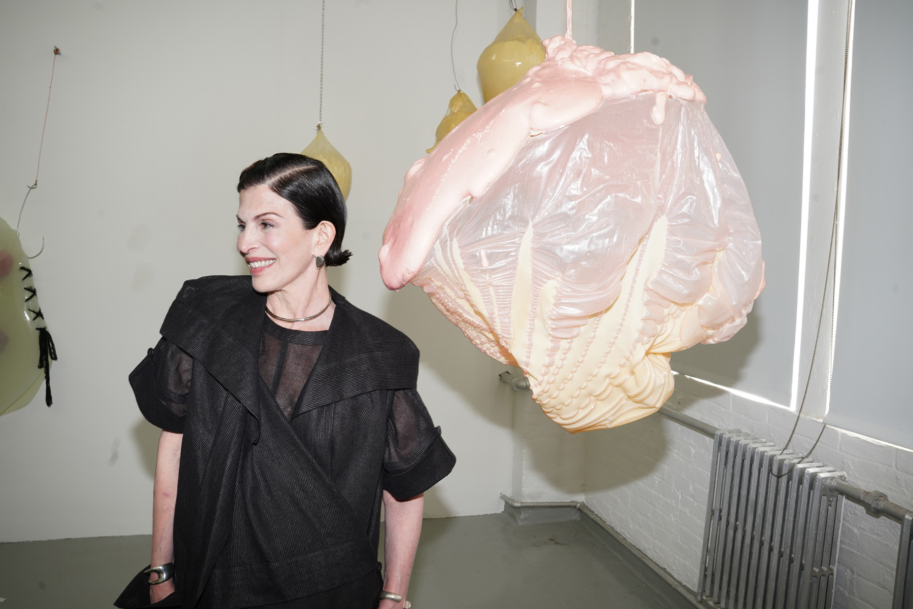
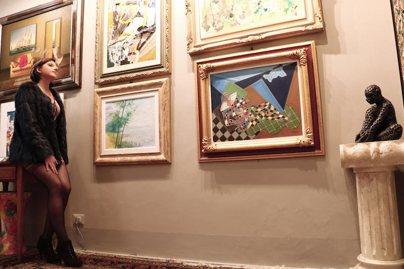
Above: Lesley Bodzy in her NYC studio posing for Flaunt Magazine Interview, Photo by Milan Lazovski
Lesley Bodzy is a mixed-media artist working in Chelsea, New York City and Houston, TX. During our recent studio visit, light pouring into her Chelsea studio bounced off and shined through her menagerie of colorful, translucent, biomorphic sculptures hanging from the ceiling, like giant jellyfish. The studio’s white walls were punctuated with abstract, bodily art objects large and small—some made of dried paint, some 3D printed, and some metallic, among other experimentations. In her sensuous environment that combined beauty with whimsy and the grotesque, it caught my attention that Bodzy had recently participated in a workshop with Judy Pfaff, a trailblazer for mixed media installation art. I noticed the visual and spatial dialogue between Bodzy’s abstract installation artwork on display in her studio, and Pfaff’s legacy. For example, we spoke of Bodzy’s decision to leave her artwork undefined as opposed to classifying it as feminist, even though it critiques patriarchal structures and the beauty industry. That was a decision Bodzy refined with Pfaff, an artist famous for denying narrative meaning to her work.
Bodzy strikes me as an impressive and curious lifelong learner, rigorously working on the refinement and development of her artistic practice. She is great at looking at herself critically, taking action, and growing. Her high level of physical production, innovation, and drive to making art in the studio rivals that of a recent MFA grad, and that’s because she is: she had a lifelong legal career as an attorney, and left it to pursue becoming a full-time visual artist in her sixties with studies at the Art Students League, Hunter College, and the Art Institute of Chicago.
In her studio—as in her exhibitions—Bodzy’s enviable, forever-youthful approach to life is on display alongside her sculpted forms. Following our energizing studio conversation and Bodzy’s immersive solo show, Levity and Depth presented by M. David & Co. at Art Cake, I sat down with the artist for an interview.
Alexandra Goldman: You’ve recently studied with the legendary installation artist and teacher, Judy Pfaff. What did you find most valuable about studying with Pfaff in terms of how she helped you develop your practice? Are there any memorable anecdotes you’re willing to share?
Lesley Bodzy: I was very lucky to work with Judy in 2024-2025 through the Yellow Chair program. She is just brilliant and has been making sculpture for a long time, so she has great insight into the work and the process of making. I was surprised by her down to earth, practical communication style. She treats everyone like a fellow artist and in that way is not intimidating and easy to learn from. She also did not try to make the students make work like hers but she found the key to each of us and worked with us at the level and aesthetic place we were at.
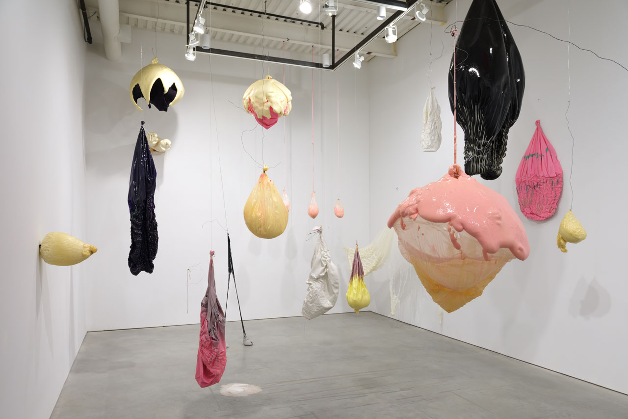
Lesley Bodzy, Levity and Depth, 2025, photo by Steven Probert
AG: In your spring solo exhibition, Levity and Depth curated by Michael David of M. David & Co. and presented at ArtCake (Cordy and Ethan Ryman’s art production, exhibition and events space in Sunset Park), your whimsical, organically shaped sculptures enveloped viewers in an immersive environment. What do you feel is most important about being “among” your works rather than looking “at” them?
LB: It was surprisingly fun to be among them and this was true for most viewers I think. They became embraceable and unexpected as you walked through them—a bit like the feeling of the installation of teamLab in Tokyo. They also moved in space and are not static.
Lesley Bodzy photographed for Flaunt Magazine, Photo by Milan Lazovski
AG: You seem to age in reverse! What is your secret, and what advice do you have for artists who struggle thinking about career success in relationship to age?
LB: Let it go. We are all aging and that is just he way it is. Best not to think too much about how much time you have left as one you can’t predict and two its not conducive to making art.
AG: Whether inflating and popping balloons, working with resin, foam, or metal, or sculpting with paint, you tend to have a unique and experimental approach to materiality in your practice. What does a day in the life of Lesley Bodzy experimenting with materials look like?
LB: It is generally fun. I typically try to have fun with the materials and it’s like a lab. I just don’t care if I make a mess or things don’t come out as hoped because when experimenting with new materials, things seldom go as planned.
Lesley Bodzy, studio in Houston, 2024
AG: What has making your artwork revealed to you about yourself that you didn’t know before?
LB: That things go better when they are not planned. This is just for me. You know I was an attorney and theres so much planning and detail involved in that. I am happy now to let all that go and just see what happens.
Lesley Bodzy, Levity and Depth, 2025, photo by Steven Probert
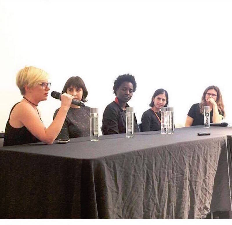
Pictured above: NYCCC 2nd Annual Benefit. Photo by Casey Kelbaugh/CKA and Ilya Savenok/CKA.
This article was originally published in Cultbytes.
Brothers Parker and Clayton Calvert, founders of NYC’s Culture Club (a 501c3 art nonprofit with a brick-and-mortar gallery component) do not only create and curate art; they curate people—warm, kind, and intelligent people spanning all areas of the art world from artists, to curators, to dealers, to critics, to auctioneers. For their spring benefit, a community of three hundred guests and committee members rallied around the Calverts and the NYC Culture Club to support their cause at 7 World Trade Center. I felt lucky to be in attendance this year; vibes were high.
The evening’s honorees were the author, curator, art critic, activist, and NYU professor Dr. Nicole Fleetwood, and the artist and educator teaching between New York and Florence, Italy, Salvatore Catalano. The benefit featured a silent auction and a live auction led by auctioneer Ruth Maudlin with work by fifteen artists Enzo Barracco, Gabe Aiello, John Black, Michael De Feo, Michael Sadowsky, Minku Kim, Michela Roman, Hope Buzzelli, Djordje Skendzic, David Hollier, Cavier Coleman, Faustin Adeniran, Michael Sadowsky, Ricardo Arango, and Natasha Blodgett. The auction lots looked beautiful against the backdrop of the New York City skyline from the fortieth floor.
Guests danced to a DJ set by Timo Weiland, and plentiful servings of champagne and caviar from brilliantly appointed sponsors Billecart-Salmon Champagne and Kaviari Caviar were enjoyed. In light of the success of the event, I sat down with Parker Calvert for an interview to discuss NYC Culture Club’s upcoming plans.
NYCCC 2nd Annual Benefit. (L to R Dr. Nicole Fleetwood, Parker Calvert). Photo by Casey Kelbaugh/CKA and Ilya Savenok/CKA.
Alexandra Goldman: In your opinion, what is particularly important about nonprofits like New York City Culture Club right now, especially considering the current political climate and budget cuts affecting the arts?
Parker Calvert: Nonprofits like ours are critical to providing opportunities to artists and curators that otherwise don’t exist. Too often in the art world, the commercial viability of shows keeps certain exhibitions from being put on. This lack of risk-taking means lots of rotating exhibitions with established and already renowned artists. We believe that creating space where artists come together, regardless of if a show can sell out or not, creates organic opportunities for connection and discovery. This is even more important now than ever as the arts have been attacked at the highest level.
How did the idea to found the NYCCC nonprofit come about?
Clayton and I founded NYCCC during the pandemic, when we saw artists leaving NYC and empty retail locations. We felt like this project would be a great chance to contribute back to the NYC cultural scene by creating a community hub for talented artists, without the commercial pressures of having a sellout show.
Could you share some of your favorite recent artist-related highlights or success stories from your work with the organization?
Many of the artists we have exhibited have gone on to join great residency programs, exhibit in major galleries and have their work collected into major institutions. Rather than highlight specific artists, I think it would be great to note that many of the artists we have exhibited have gone on to residencies at Silver Art Projects, gotten their MFA’s at New York Academy of Art, taught at Pratt and Columbia, and exhibited with Jeffrey Deitch and Gagosian.
What are your plans for NYCCC in the coming year and in the longer term?
We plan to continue exhibition programming in more spaces, as well as to offer more residency opportunities. We love to connect the dots and bring together our community of artists—which at this point comprise more than 500 artists exhibited. We would love to continue to foster career development and help guide emerging artists in their careers.
NYCCC 2nd Annual Benefit. Photo by Casey Kelbaugh/CKA and Ilya Savenok/CKA.
In what specific ways are you looking forward to using the funds raised at the benefit to support artists in your community?
We plan to spend the funds raised on our operational budget. We have a very lean structure, as Clayton and I have volunteered for the last four years. Our budget is devoted to exhibition expenses and staffing exhibitions.
How can people view work by NYCCC artists this summer, and what are some ways they can continue to support the organization throughout the year?
We are focusing on our artists basketball tournament, Ball for Art, which features artists, gallerists, and art dealers playing basketball to support five arts nonprofits. This game is free and open to the public. All funds raised go directly to supporting: NYC Culture Club, ArtNoir, Silver Art Projects, Artolution, and ArtsConnection. Our exhibitions are on a summer break as we find a new gallery space. We will have more programming in place as soon as our next space is squared away.
What keeps you inspired and motivated in your work with NYCCC?
Seeing the direct impact of our programming both on the artists and the general public is very rewarding. We have seen many artists who needed a boost at just the right time to persevere through this difficult climate. It is very meaningful to be a part of a bigger NYC art community—especially in a way that values art for the creativity and expression, and not just the market value. We are actively seeking more ways to engage our community of artists, to create opportunities, and to spread the power of art.
More Photos from the Benefit
NYCCC 2nd Annual Benefit. (L to R Chellis Baird, Josh Campbell). Photo by Casey Kelbaugh/CKA and Ilya Savenok/CKA.
NYCCC 2nd Annual Benefit. (L to R Jason Wallace, Jamel Robinson). Photo by Casey Kelbaugh/CKA and Ilya Savenok/CKA.
NYCCC 2nd Annual Benefit. (L to R Vajra Kingsley, Erica Boginsky, Esther Park). Photo by Casey Kelbaugh/CKA and Ilya Savenok/CKA.
NYCCC 2nd Annual Benefit. (L to R Anwarii Musa, Aiza Ahmed, Tariku Shiferaw). Photo by Casey Kelbaugh/CKA and Ilya Savenok/CKA.
Alexandra Goldman is a writer, curator, and art dealer living in New York. She is Founder of the art publishing platform Artifactoid, and Managing Director of Barro New York, a contemporary art gallery with locations in New York and Buenos Aires. Goldman writes for Artifactoid, Whitehot Magazine, Cultbytes, ArteFuse, Vice-Versa, and Revista Jennifer. She received her M.A. in Art History from Hunter College and received her bachelor’s degree from NYU in Media, Culture, and Communications. Her Instagram is @Artifactoid.
Artists featured in this episode include:
Installation view, Monica Giron “Elemental Vortex” at Barro New York, 2023. Photo by Mikhail Mishin.
Maria Evelia Marmolejo, Anonymous 3, 1982. Performed on the polluted banks of the Cauca River, Valley Cauca, Colombia. Documentary photograph. Photo: Nelson Villegas. Courtesy of ArtNexus.
Installation view, “Alejandra Seeber: Interior with landscapes” on view at Americas Society, curated by Aimé Iglesias Lukin. Courtesy of Americas Society.
Catalina Schliebener Muñoz, Coloring Book Series, Minnie II, 2023, Vinyl, colored pencil and embroidery on mat board, 33 3/10 × 33 3/10 in | 84.6 × 84.6 cm. Courtesy of Barro New York.
Chellis Baird, Lady Danger II, 2021, Silk, acrylic, wire, birch panel, mahogany frame with black finish 28 x 20 x 4 inches 71.1 x 50.8 x 10.2 cm. Courtesy of the artist.
Me and Layo Bright with her sculptural glass artwork, now on view in her solo show “Dawn and Dusk” at The Aldrich Museum curated by Amy Smith-Stewart. Photo by Ferguson Amo.
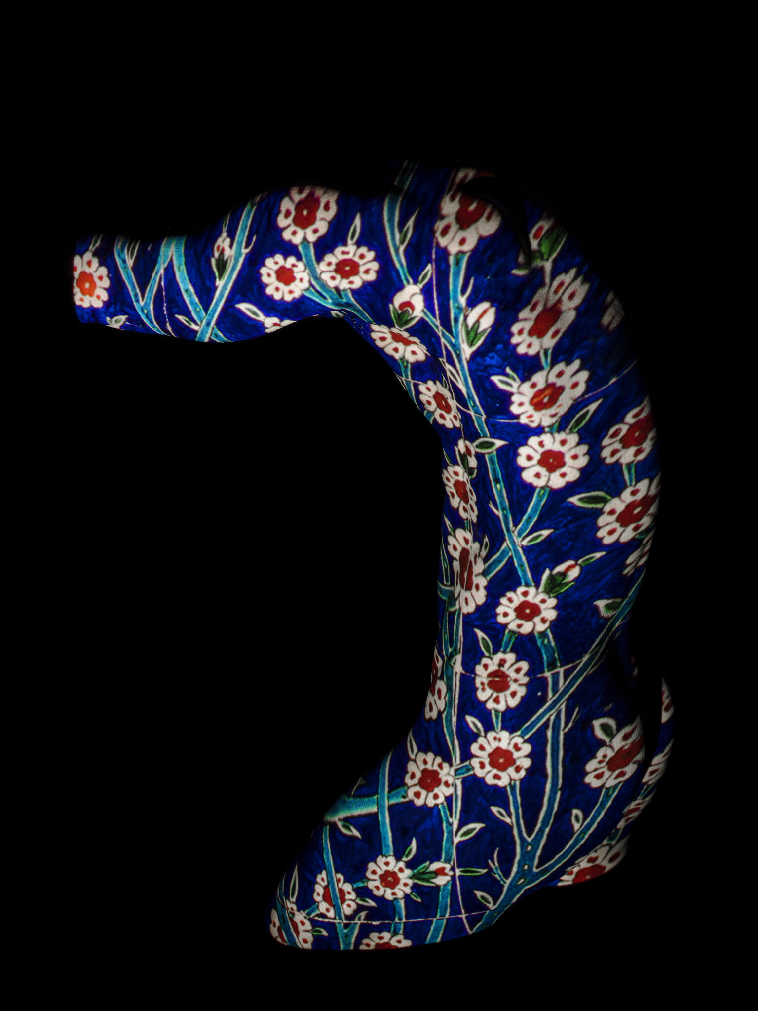
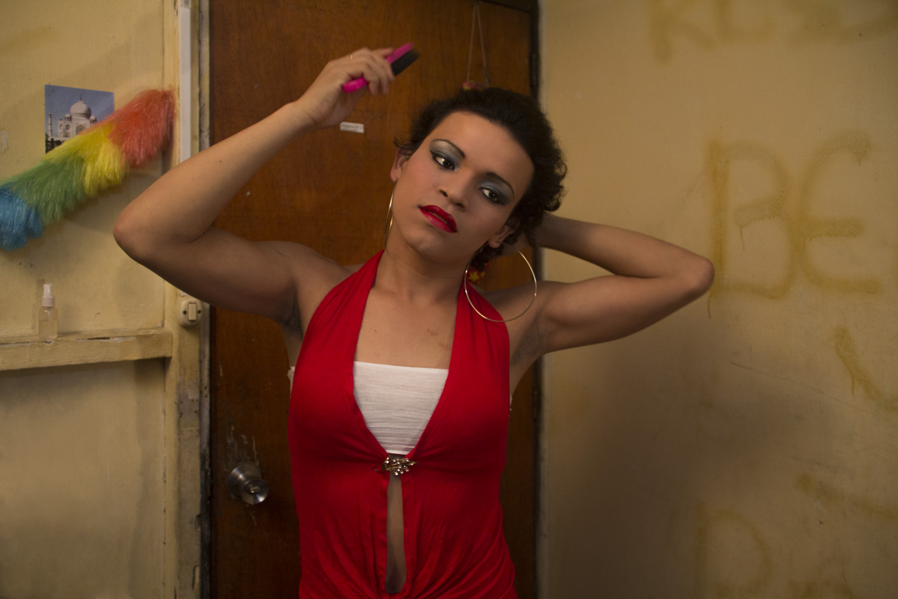
Turkish-French artist Sarp Kerem Yavuz loves photographing handsome men. His various bodies of work include sculptural photo-portraits of nude male models adorned with projected imagery of ornate Turkish Bathhouse tiles, sensuous, homoerotic photos of young American men convening in sports locker rooms (another homosocial space), and mixed media including neons, works on LED screens, and a functioning backgammon board created entirely out of Legos.
Sarp Kerem Yavuz, “Bahçivan,” 2022. Glicée print, 40 x 30 in. Courtesy of of the artist.
Thematically, Kerem Yavuz’s artwork is a reflection of himself: both Turkish and gay. These two elements haven’t historically been able to mix without conflict in his life, and he has always been interested in exploring those challenges. “For the last decade, I’ve been interested in deconstructing masculinity within an Islamic context. I often do this by queering (arguably already queer) orientalist imagery. My largest body of work to date, Maşallah, comprised of scanned Iznik tiles and later, scanned porcelain dinnerware, projected on male nudes to talk about the superimposition of conservative politics onto my generation. I would also periodically visit various Turkish baths to create cinematic scenes that were meant to imply the existence of broader, imagined, queer narratives unfolding in these traditional homo-social spaces. I guess I could say that I was always more interested in the story than the particular medium, although I am partial to photography.” Now that he lives and works in New York City, Kerem Yavuz is able to openly express these two important facets of his identity without suffering censorship from the Turkish government and death threats, among other significant challenges he has faced that many people may not have the courage to stand up to in the name of creative expression.
Sarp Kerem Yavuz. “Boğaz,” 2023. Polaroid. 4.2 x 3.4 in. Courtesy of the artist.
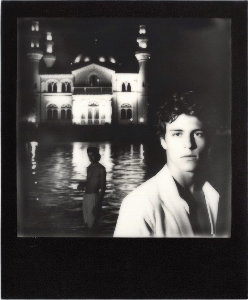
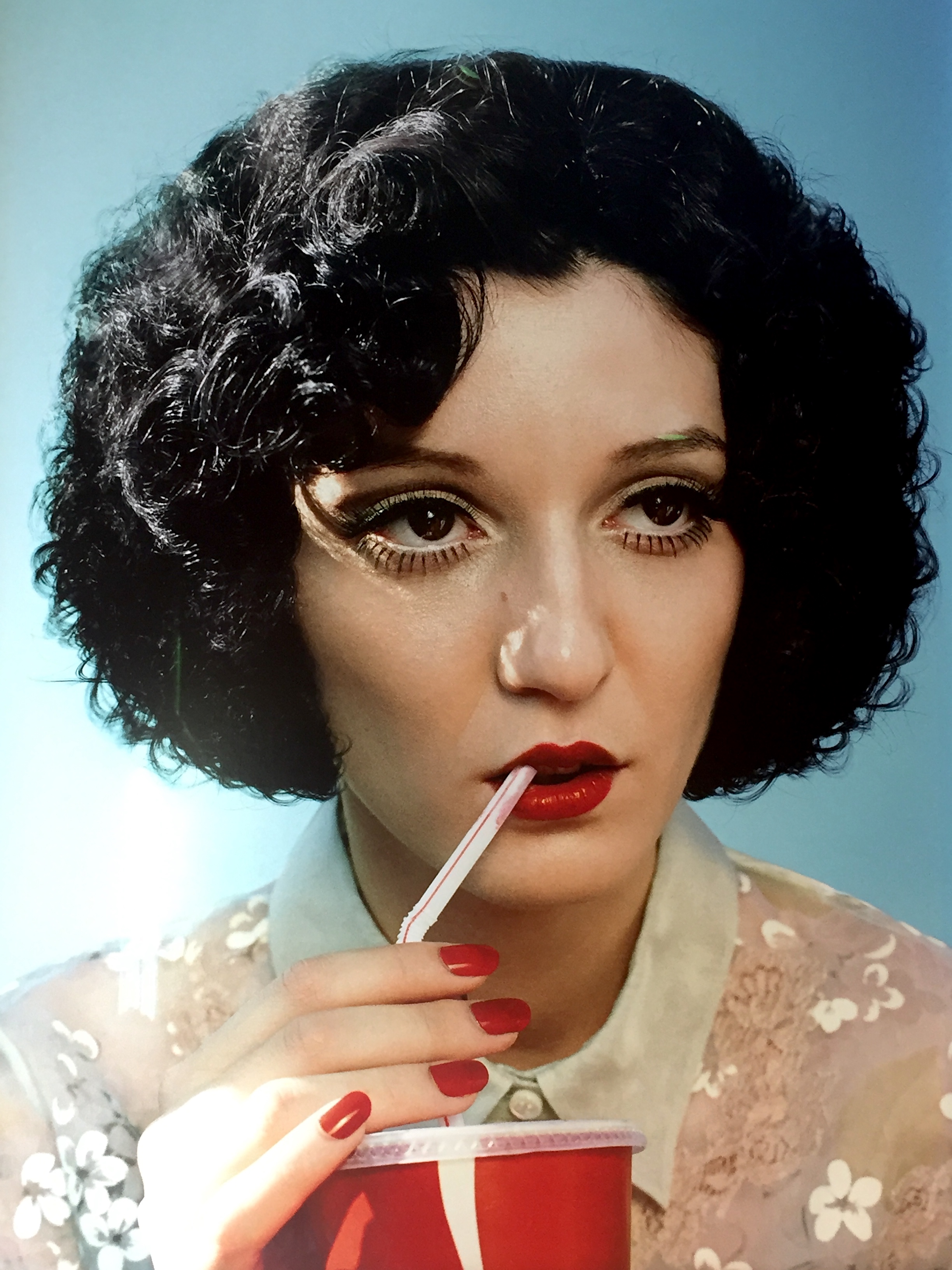
This year, he expanded upon his traditional art and photography practice by utilizing the AI software, Midjourney, to create AI-generated imagery for his latest series: Polaroids from the Ottoman Empire, currently on view at Palo gallery in NoHo. He discovered Midjourney “while looking into new digital art trends…its aesthetic capabilities felt more in line with my style than Dall-E.” The cinematic images on view in the exhibition Polaroids from the Ottoman Empire include images of two fit, ostensibly Turkish, shirtless men romantically gazing at the moonlight over a Mosque along the Bosphorus, a bejeweled drag queen making her grand entrance in an invented 1920s-style speakeasy nightclub in Istanbul, and bust-style portraits of handsome, turban-clad men gazing seductively at the viewer from inside a Hammam setting, among other fantasy, homoerotic, faux-vintage Turkish narratives.
The lighting in each of Kerem Yavuz’s AI-generated images is filmic and romantic, with mainly dark or jewel-tone color palettes. There are also a few black-and-white shots included in the series, which feel a bit out of place when thinking of traditional Polaroids. Some of Kerem Yavuz’s AI images are reminiscent of the style of a Jacques-Louis David painting, among other art-historical references and sources of stylistic inspiration. The Polaroid borders Kerem Yavuz chooses to print each image within – because no one likes to see a Polaroid without that iconic built-in bottom-heavy frame – are black, white, or gold. Before framing, Kerem Yavuz finally mounts each printed Polaroid on a mat, which represents a common color of velvet in traditional Ottoman interior decorating.
Importantly, Kerem Yavuz also shoots with real Polaroid film in a different series of his work, Shadows of the Empire, photographing staged scenes of his friends in Istanbul that comment on parallels between LGBTQ+ and women’s rights being taken away in both Turkey and the United States in recent years. “Shadows of the Empire” is currently on view at Zero Bond, where he is this month’s artist in residence via Apostrophe gallery. It is not easy to tell the difference between Kerem Yavuz’s real Polaroids and his AI-generated Polaroids. It’s clear Kerem Yavuz is using AI to mimic and expand upon his own photographic language, rather than copying another artist’s style: a major current plagiaristic danger of AI in the digital art space.
Sarp Kerem Yavuz. “Away,” 2022. Gold Frame Polaroid, 4.2 x 3.4 in. Courtesy of the artist.
For Kerem Yavuz, as both a traditional photographer and AI artist, the inevitable element of financial investment also comes into consideration. Kerem Yavuz elaborates, “I think most people who insist on traditional photography tend to forget how extraordinarily expensive high-end digital photo shoots are. Buying a decent medium format digital camera, which is what I have been using for the past decade, runs you between $10,000-$20,000. You can rent, but then you also need to get really good equipment insurance so that tends to be around $1000 for a week of shooting, just for a camera with a regular lens attached with a spare battery and some flash drives, (not including any lights, stands, sandbags to keep the stands where they are, portable batteries, backdrops, studio space if you need it etc.). Then, there is the additional cost of paying models, assistants, and the time cost of processing and editing the images, plus transportation if you are shooting on location. I have done all of these for years, and I have greatly enjoyed the process, but it is a costly endeavor, which often means you need commercial work to be able to afford to make artistic work. It is also incredibly time consuming. AI photography, at least in the way I have been engaging in it, feels a little more like street photography, where the production element is removed in favor of chance and spontaneity. It’s trickier to get what you want, since there is inevitably a lesser degree of control, but it does offer a greater degree of access to people without the means or the network to dive into photography as it is structured today.”
Whether shot in the flesh or rendered digitally, iconic gay male nude portrait photography can call to mind the explicitly sexual, stark, sensuous, and formidable black and whites by Robert Mapplethorpe, or perhaps the striking, colorful photography of nude or semi-nude male dancers and religious figures in fantastical staged scenes by David LaChapelle. Unlike Mapplethorpe’s homoerotic photography, Kerem Yavuz’s is understated in its eroticism. Unlike LaChapelle’s staged fantasy photography, Kerem Yavuz’s imaginary gay scenes incorporate an Ottoman visual language and color palette. Kerem Yavuz has his own visual language, and experiments with the reverse process using Midjourney to see how it categorizes his original images. “What is fascinating about Midjourney and other internet-based algorithms is that their ‘imagination’ is ultimately shaped by whatever dominates the web. Midjourney has a fun tool that allows you to upload your own images and have it describe them to you. With my photographs, it often says ‘in the style of Hasan Hajjaj’ which is flattering, as I love his work, but I was never inspired by his practice and our aesthetics are quite different. It just goes to show that online media and discourse around Middle Eastern imagery has a long way to go.”
Sarp Kerem Yavuz. “Sahilde,” 2023. Polaroid. 4.2 x 3.4 in. Courtesy of the artist.
The subtly erotic and Middle-Eastern qualities of Kerem Yavuz’s photography stem from his relationship with his father, or the idea of “the father-son relationship.” When Kerem Yavuz came out at age thirteen, his father did not accept his homosexuality and was consequently absent for most of his life. Today, the two are estranged. When asked if he knows other artists working with the idea of the father-son relationship, Kerem Yavuz replied that the father-son relationship is a very vulnerable topic, in almost a banal way. He commented, “Mapplethorpe’s hypersexualilty functioned almost as a protective armor – people don’t accept regular male vulnerability, which is what my work speaks to.”
Another through line in Kerem Yavuz’s artistic career is he is frequently ahead of the curve as an innovator, which, he commented, “can be lonely at times when no one yet understands [his] ideas.” AI is a contentious topic worldwide in industries spanning art, tech, medicine, politics, law, advertising, and many more. In photography specifically, it is already a topic that has entered the forefront of the conversation. Recently, German Photographer Boris Eldagsen won a photography award with his AI-generated photograph (created on Dall-E 2 software), The Electrician, at the Sony World Photography Awards, and declined to accept the award because of his concern for how AI will affect (and compete with) the photography world overall. That perspective is understandable, as the judges of the award were unable to discern his AI-generated photograph from real photographs in the competition.
Kerem Yavuz’s AI Polaroids and “real” Polaroids also look similar to one another. There is something about the people or settings in the AI-generated images that is a “little too perfect,” which can give them away upon close examination, but it’s not always obvious which are which. The catch is that none of the people or places in the AI-generated imagery are real, and they all appear to exist in an unknown, historical place and time in a Turkish, Ottoman past. They’re like memories from a homoerotic dream version of Istanbul during the Ottoman Empire, that never existed, nor would have been able to exist, because of the Ottoman Empire’s extreme homophobia. Kerem Yavuz commented on his inspiration for the series,“I loved the notion that in a parallel universe, I would have been traipsing around a present-day Ottoman Empire, photographing my queer friends in various places in Istanbul.”
Sarp Kerem Yavuz. “Banyo,” 2023. Polaroid. 4.2 x 3.4 in. Courtesy of the artist
Even though Kerem Yavuz’s AI-generated images look – in one way or another – “real”, with Kerem Yavuz’s title of the series, he “confesses” another hint into the photographs’ fictional origins: while the Ottoman Empire ended in World War I, Polaroids were not invented until World War II. Therefore through just his title, Kerem Yavuz lets viewers know his Polalroids from the Ottoman Empire are technical impossibilities.
For Kerem Yavuz, Polaroids from the Ottoman Empire is also about the “believability” of images in the current AI era. However, questioning the believability of photography, while now heightened due to AI, isn’t new. Falsified imagery in photography has been explored since Yves Klein’s 1960 Leap Into the Void, in which Klein created an early, analogue visual illusion to “document” a man jumping out of a window even though it never really happened. Edward Weston’s 1920s and ‘30s vegetable still lives, Peppers, look at first glance like black and white photo portraits of muscular male torsos, tricking the eye at first glance. With the eventual invention of Photoshop and an infinite array of postproduction effects and image-generating software, the notion of photography as solely a medium that documents reality is nearly a century gone. Kerem Yavuz’s decision to print his images on Polaroids is another layer of his trickery: “Polaroids bring a plausibility to the narrative because we are culturally conditioned to think of them as documents. No one thinks a Polaroid is faked, even though the technology to expose images onto a Polaroid digitally has existed for a decade,” he emphasized.
To create the AI Polaroids, Kerem Yavuz teaches Midjourney software how to make an image look gay, glamorous, exotic, romantic, antique, Ottoman, or express other features simultaneously, using his words. He even gets specific in the sense of telling the software, “make this image look like it was shot with a Nikon 110 millimeter lens,” or “give me an image of two men in front of a mosque in Istanbul in the style of Jodorowsky,” and the software generates that effect or visual. Through repeated processes of trial and error, Kerem Yavuz communicates different combinations of these key words to the software until he gets his desired imagery in return – a tedious practice that requires a lot of patience and nuanced communication between man and machine. Each time, the AI software transforms Kerem Yavuz’s permutations of adjectives into generated imagery based on other imagery it has been introduced to previously online. Kerem Yavuz explains, “In photography, we often shoot the same shot hundreds of times with small tweaks and iterations. This also applies to AI-generated imagery, where sometimes Midjourney will give me almost what I’m looking for, but not quite, so I will spend hours telling it to iterate on one specific thing. Sometimes, in both cases, the image just doesn’t work. Or you end up needing to edit in post.” As result of the collaboration between Kerem Yavuz and Midjourney (which actually lives on Discord – a platform he describes comically as “the unholy love child of Reddit and WhatsApp”), the scenarios in the imagery look, to some degree, believable.
A serious problem with this, that Kerem Yavuz recognizes and addresses, is Midjourney software’s inherent biases. He remarked that he has noticed, through his use of this software to create his imagery, that if he asks it for an image of “two handsome men,” it will most often provide images of two white men. If he asks for “two gay men,” it will similarly give him images of men covered in rainbow clothing, or holding Pride flags. It barely understands when he asks it for images of “two men kissing” and shows him images of two men pecking on the cheek rather than engaged in any type of romantic kissing. There is very obvious heterosexual, white, cisgender bias in this process that Kerem Yavuz continues to notice, critique, and do extra work to find ways around to get his desired image results, repeatedly putting the technology to the test.
Like artists and photographers working throughout history, Kerem Yavuz is working with the technology of his time. It’s not long ago that everyone was talking nonstop about NFTs – now, the new buzzword is AI. There’s inevitably a coalescence of the two as well. Many question if either of these two technologies have potential to exist on par with more traditional art forms. But, more than just buzzwords, there is real artistry in the conceptual aspect, detailed communication technique, choice of software, printing and exhibiting decisions, visual composition, color palette, light source simulation, and more that Kerem Yavuz employs to create his AI-generated imagery for his Polaroids from the Ottoman Empire.
Conversations today about AI – across industries and contexts – often involve sensationalist notions of “Is it good?” “Is it bad?” “Is it scary?” “Are we doomed?” What I think Kerem Yavuz is proving with Polaroids from the Ottoman Empire is that there is a way to authentically make original art using AI software as a tool. When executed thoughtfully and with the level of care and critique he uses, art creation becomes one of the technology’s positives. He concludes, “In its current form, I feel like AI is making poets of us all, and I find that delightful.”
Sarp Kerem Yavuz’s solo exhibition Polaroids from the Ottoman Empire is on view at Palo Gallery until July 1st, 2023 and Shadows of the Empire is on view at Zero Bond.
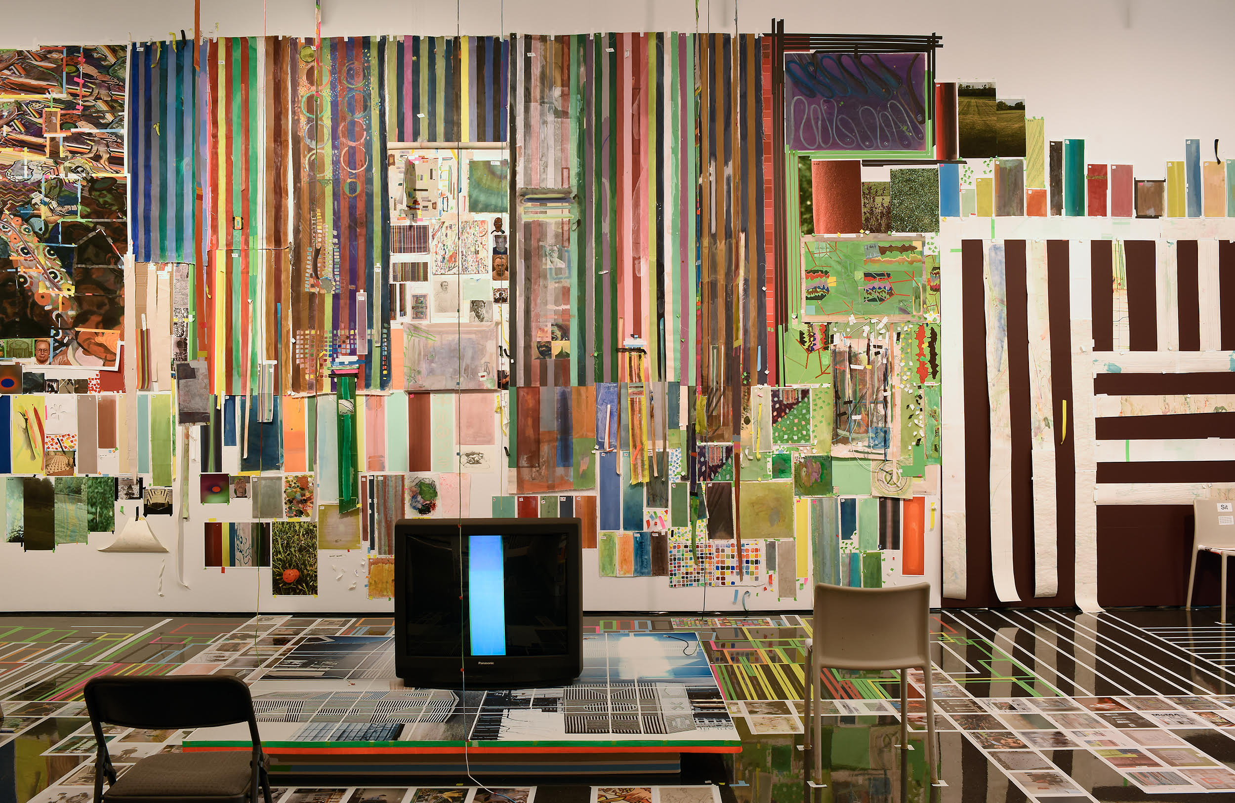
Alexandra Goldman sits down with artist Franklin Evans to discuss his two current exhibitions at Miles McEnery Gallery, fugitivemisreadings at 520 West 21st Street, and YOU AGAIN curated by Franklin Evans at 511 West 22nd Street, as well as his current museum show Franklin Evans: franklinsfootpaths at the Figge Art Museum in Davenport, Iowa.
FRANKLIN EVANS (b. in 1967 in Reno, NV) received his Bachelor of Arts degree from Stanford University in 1989 and his Master of Fine Arts degree from the University of Iowa in 1993. He has had numerous solo exhibitions, including “Franklinsfootpaths” at the Figge Art Museum, Davenport, IA; “fugitivemisreadings ” at Miles McEnery Gallery, New York, NY; “selfportraitas” at FL Gallery, Milan, Italy; and “timepaths” at the Nevada Museum of Art, Reno, NV. His work is included in many public and private collections including the Bronx Museum of the Arts, New York, NY, El Museo del Barrio, New York, NY, the Nevada Museum of Art, Reno, NV; the Orlando Museum of Art, Orlando, FL; the Pizzuti Collection, Columbus, OH, and the Yale University Art Gallery, New Haven, CT. He is a recipient of the 2017-18 Pollock-Krasner Foundation Grant, New York, NY; The Fountainhead Residency, Miami, FL in 2017; and was a National Endowment for the Arts Fellow at The MacDowell Colony, Peterborough, NH in 2016. Evans lives and works in New York, NY.
New York, NY: Miles McEnery Gallery, Franklin Evans: fugitivemisreadings, 24 June – 31 July 2021. Image: Christopher Burke Studio. Courtesy of the artist and Miles McEnery Gallery, New York, NY
Franklin Evans, misreadinglandscapeintoart, 2021, Acrylic on canvas, 53 1/2 x 49 1/4 inches, 135.9 x 125.1 cm. Courtesy of the artist and Miles McEnery Gallery, New York, NY.
Franklin Evans Studio, 2021, New York, NY. Image: Christopher Burke Studio. Courtesy of the artist and Miles McEnery Gallery, New York, NY.
Franklin Evans, titianatilt (detail), 2021, Acrylic on canvas, 79 1/2 x 68 3/4 inches, 201.9 x 174.6 cm. Courtesy of the artist and Miles McEnery Gallery, New York, NY.
Installation view: Franklin Evans: franklinsfootpaths at the Figge Art Museum, 19 June – 26 September 2021, Davenport, IA. Image courtesy of the Figge Art Museum.
Works by Ann Pibal, Elliott Green, Josephine Halvorson, and Tom McGrath in YOU AGAIN curated by Franklin Evans at Miles McEnery Gallery. New York, NY: Miles McEnery Gallery, ‘YOU AGAIN’ curated by Franklin Evans, 24 June – 31 July 2021. Image: Christopher Burke Studio. Courtesy of the artists and Miles McEnery Gallery, New York, NY.
During weekdays Maria Evelia Marmolejo is a therapist at a child psychotherapy clinic living in Jackson Heights. She’s also a mom, and a skilled salsa dancer. When I met up with her for our interview at a cafe in her neighborhood in December 2018, I felt like she was my fun aunt. We hadn’t seen each other in over a year, but immediately reconnected. I thought, what most people at this cafe probably don’t know, is thatshe is one of the most badass performance artists from the ’70s and ’80s! She was giving birth in a gallery before it was cool.
Installation view: Subverting the Feminine: Latin American (Re)marks on the Female Body curated by Isabella Villanueva at Y Gallery, 2016.Photo by Alexandra Goldman.
I first met Maria Evelia when I was a Director at Y Gallery and we hosted a historical group exhibition featuring her work, curated by Isabella Villanueva and titled, Subverting the Feminine: Latin American (Re)marks on the Female Body. The show included era-marking performances, video, drawings and photography such as “Integrations in Water” by Yeni y Nan (Jennifer Hackshaw and María Luisa González), “Madre por un día” by Polvo de Gallina Negra (one of the most famous projects by the duo comprising Maris Bustamante and Monica Mayer), “Hymenoplasty” by Regina José Galindo, which won the Golden Lion award at the 2005 Venice Biennial, video and drawings by Peruvian artist Elena Tejada-Herrera, and the video “Incision” by Teresa Margolles. The caliber of historical works in that exhibition was so high; it was like a museum, yet were in a small fifth-floor lower east side gallery space. The show was in November of 2016 and I still frequently think about it to this day.
Marmolejo’s works in Subverting the Feminine were “11 de Marzo” and “Anónimo 4,” both from 1982. These two works respectively spoke to abolishing the idea of menstruation as a taboo, and the tragedy of high infant mortality in several Latin American countries.
“11 de Marzo” debuted at Galería San Diego in Bogota. For this ritual Marmolejo lined the gallery floor with an L-shaped formation of white paper. The space was lit with a blacklight, and the sound of toilet flushing played on loop in the background. She then covered her body with feminine hygiene pads, and performed a dance along the L shaped paper, using her menstrual blood to mark the floor and walls. Marmolejo states, “In this performance I emphasize the pivotal role of womanhood in the origin of life and of her civil rights in the world.”
Maria Evelia Marmolejo, 11 de Marzo, 1982. Image courtesy of Maria Evelia Marmolejo. Photo by Camilo Gómez.
Maria Evelia Marmolejo, 11 de Marzo, 1982. Image courtesy of Maria Evelia Marmolejo. Photo by Nelson Villegas.
In “Anónimo 4,” Marmolejo drew attention to the fact that when babies enter into the world, the possibility of survival and peace is not always a certainty. For this, she dug a 1.5 meter triangular pit in the ground, about equal to her height, and three smaller triangular pits around it filled with sewer water. She wrapped her entire body with plastic wrap, and entered the hole, which she filled with the placentas of all the babies born that day in hospitals near the site of the performance: Cali, Colombia and Guayaquil, Ecuador. She covered herself with the placentas, and stayed submerged in the hole, in her words, “embarking on a psychological and sociological self-exploration of the fear of being born in a society in which there is no guarantee of survival.” The experience invoked her own extreme bodily reactions such as vomiting and crying.
Maria Evelia Marmolejo, Anónimo 4, 1982. Image courtesy of Maria Evelia Marmolejo. Photo by Nelson Villegas.
Maria Evelia Marmolejo, Anónimo 4, 1982. Image courtesy of Maria Evelia Marmolejo. Photo by Nelson Villegas.
Other works by Marmolejo speak to government violence, disappeared persons, and healing Mother Earth from human-inflicted pollution and damage – especially by symbolically giving back to Earth with the body in the style of nonviolent sacrifice.
In her performance Anónimo 3, Marmolejo went to the banks of the River Cauca in Colombia, which was being severely polluted. At this site she performed a 15-minute ritual in which she formed a 10-meter spiral using limestone dust, centered around a toilet bowl. She used a vaginal wash over the bowl, adhered surgical tape to her body, and walked around spiral allowing her organic fluids and body hair ripped out with the tape to fall into the earth. Through this process she created a compost as an act of healing and forgiveness offered to the planet.
Maria Evelia Marmolejo, Anónimo 3, 1982. image courtesy of Maria Evelia Marmolejo. Photo by Nelson Villegas.
Maria Evelia Marmolejo, Anónimo 3, 1982. Image courtesy of Maria Evelia Marmolejo. Photo by Nelson Villegas.
Marmolejo is a recipient of the CIFO Achievement Award, and multiple examples of her work were included in the esteemed 2017-2018 traveling exhibition, Radical Women: Latin American Art 1960-1985, which was presented at the Hammer Museum, the Brooklyn Museum, and the Pinacoteca de São Paolo. Below I am pleased to present an exclusive video interview with the artist:
EPILOGUE:
Now is a compelling time to revisit Marmolejo’s work, which often focuses on the fusion of the human body with the health of the planet Earth. The body and Earth are one. The power of the body, especially the feminine body, as a regenerative force, and as a power to protect Mother Earth, another feminine life giving force – our planet – that gives us the chance to exist.
In this time of Coronavirus wreaking havoc on the collective human body worldwide, there are murmurs of the virus as the planet’s retaliation against us for destroying it. Maybe not scientifically, but symbolically or spiritually.
I recently attended a panel at the CORE:Club with Judy Rifka, where I’d curated the fall exhibition. I’d never met Rifka before nor seen her speak but now that I have, I will never forget her captivating candid presence.
If you don’t yet know Rifka’s work, she is an historically relevant painter, video artist, sculptor and print maker who rose in the New York Colab and Fluxus scenes in the 1970s and ‘80s with resume highlights including two Whitney Biennials, Documenta 7, and the 1980 Times Square Art Show. In reading up on her in prior interviews I found it personally interesting that some of her abstract painting compositions were actually inspired by translational dance movements as she herself was studying dance. In the Fluxus period there were several artists combining ideas of dance and sculpture like Simone Forti but I hadn’t known of as many artists conceptually translating dance movement to painting.
When Rifka spoke, I felt like I was being taken on an unapologetic beeline journey into her psyche that gave me a loving slap when I arrived and left me wanting to come back for more. Around Judy, I knew I was in the presence of greatness.
Judy Rifka, IN SITU (L to R) UNTITLED, Acrylic with ink on linen 30 x 24 in & Parthenon Frieze (History of Sculpture), 1987, Acrylic with ink on linen, 30 x 24 in
The panel celebrated the release of the book, 50 Contemporary Women Artists, a volume comprising a refined selection of current and impactful artists in which Rifka is included. I admire the research conducted by John Gosslee and Heather Zises to compile the book. The foreword is by Elizabeth Sackler of the Brooklyn Museum’s Sackler Cernter for Feminist Art. Additional names in the book include sculptor and carver Barbara Segal and mixed media artist Stephanie Hirsch (selected artists on the CORE:Club panel), as well as Judy Chicago, and Teresita Fernandez, the first Latina woman to be appointed to the U.S. Commission of Fine Arts (an appointment decided by President Obama in 2011).
A solo exhibition of Rifka’s 1980s History of Sculpture acrylic abstract paintings was on view in an adjoining gallery space to the panel. The show is called Ionic Ironic: Mythos from the ‘80s presented by CORE:Club and LatchKey Gallery with support from Gregory de la Haba and will remain on view until March 29, 2019.
To kick off the evening, one of the first things Rifka said on the panel, when asked about the status of feminist art was, “I don’t know if there is such a thing as feminist art, but I believe that surviving being a woman and continuing to make art is feminist.”
In the following interview, Alexandra Goldman (Artifactoid) sits down with Rifka to continue to dig deeper into her ideas about gender dynamics in the art world in 2019.
Judy Rifka, IN SITU (L to R) Samothrace Frieze I, 1988, Acrylic on linen 36 x 132 in Labords Head I, 1988, Acrylic on linen, 30 1/4 x 24 in & Samothrace Frieze III, 1988, Acrylic on linen 36 x 132 in
Alexandra Goldman: What do you see as the main problem today of gender inequality in the art world?
Judy Rifka: The main problem is that everyone is left out, not just women. But that is, of course based on a general qualification on museums and galleries, and auction values. If you want to change the definition of what “is” is, to perhaps, networking posts in toto, it would democratize.
AG: What is something about gender dynamics in the art world that you see clearly only through your own experience?
JR: My own experience is that leaving female artists out , or treating them shabbily ruins the aggregate of visible art, and its historical and theoretical study.
AG: At the Core Club panel, you began to speak about an idea you had for a redistribution of funds: that when a work by a male artist sells for, as you humorously put it, “godzillions” of dollars, that a few of those godzillions should be allocated to a fund that supports development for women artists. Can you expand on this idea and how you see it playing out?
JR: If you have any interest or knowledge of John Rawls, A Theory of Justice (1971), “He is widely considered the most important political philosopher of the 20th century),” according to the Encyclopedia Brittanica.
Judy Rifka, IN SITU(L to R) Acroterion in Grey, Acrylic on linen 72 x 47 in & Acroterion in Taupe, Acrylic on linen 72 x 47 in
You can understand a guiding principal that has at times been applied to even up the inequities in inclusion of people of color into numerous spheres. It helped kickstart the elimination of a longtime series of inequalities in the playing field, which had seriously hindered their furthering of themselves to inclusion in our economy. That is affirmative action: a no-nonsense, this starts here, corrective.
I can see no reason, now that statistics bear us out, why women’s inclusion into a lopsided world of art pricing cannot then be facilitated, by redistributing a portion of those huge profits to women’s art institutions, and projects. It is not appropriate to simply shrug off these inequalities.
AG: Have you thought of any additional, unique ideas for leveling the playing field?
JR: Oh, I have.
AG: It’s known you’re interested in social media for sharing your artwork and studio practice. Are there some specific ways in which you’ve thought of utilizing social media to accomplish goals of furthering gender equity in the art world, apart from how they’re already helping democratize through the possibility of self-representation and heightened visibility?
JR: You have said it. How bout considering the aggregate of Social Media, or even Internet in general, as the art form itself.
Judy Rifka, Acroterion in Grey, Acrylic on linen, 72 x 47 in & detail of Acroterion in Grey
AG:Is there something you think that young artists (they don’t necessarily have to be women) today should know, that you wish you had known when you were starting out, that may be able to somehow benefit the future of the art world?
JR: What is the art world? Needs definition, a new one.
AG: How do you think the art world should be defined?
JR: Probably should say “art worlds“ at this point, any networking of art and its ideas, works, and practices.
AG: Will you add me as your Facebook friend?
JR: I’m at 5000 limit, but I will add you ASAP somehow. WM
When I traveled to Lima for the PARC art fair, I met interesting artists and explored key sites of Peru’s contemporary art world. I visited galleries like Revolver, Lucia de la Puente and Y Gallery Lima, as well as institutions like Proyecto AMIL.
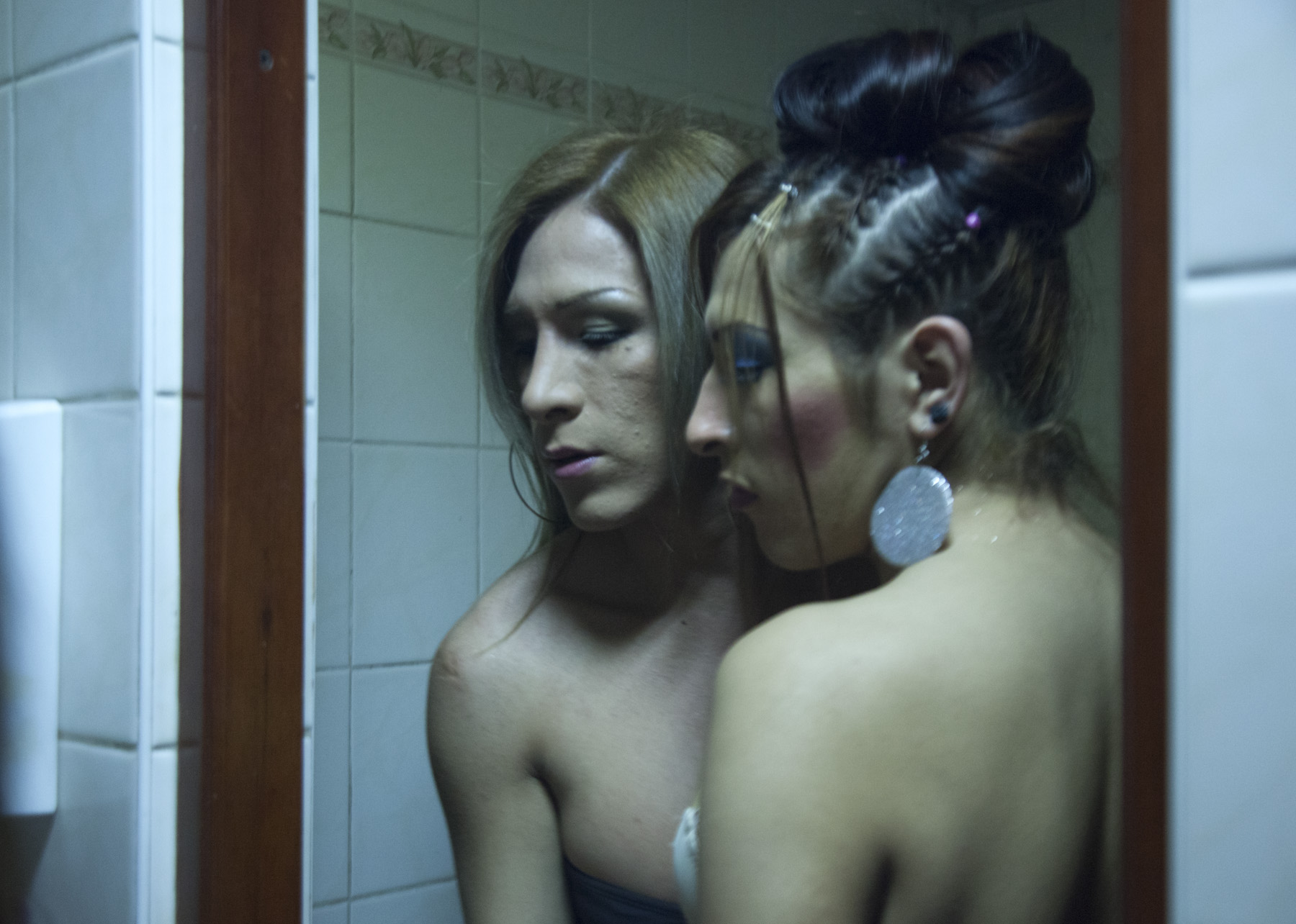
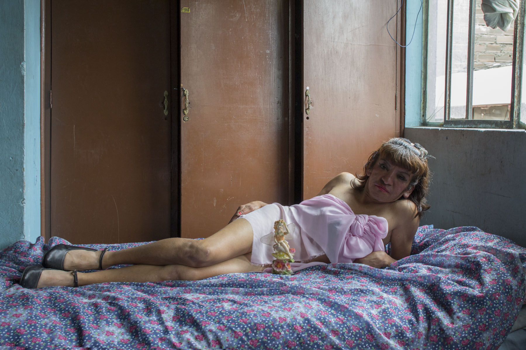
A project I discovered that interested me in particular was Lima Intrarrosa, a documentary photography series created by artist Teresa Bracamonte.
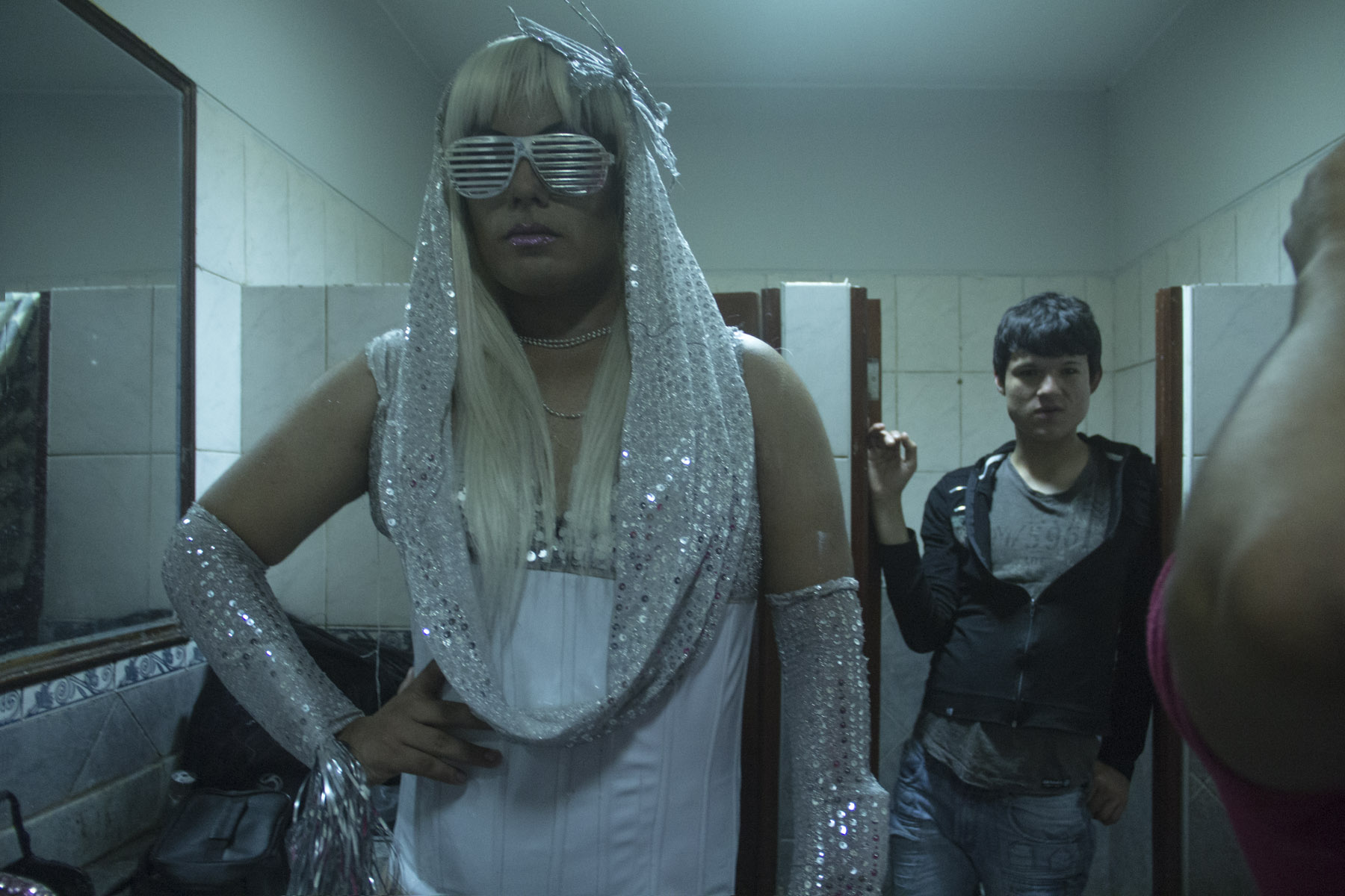
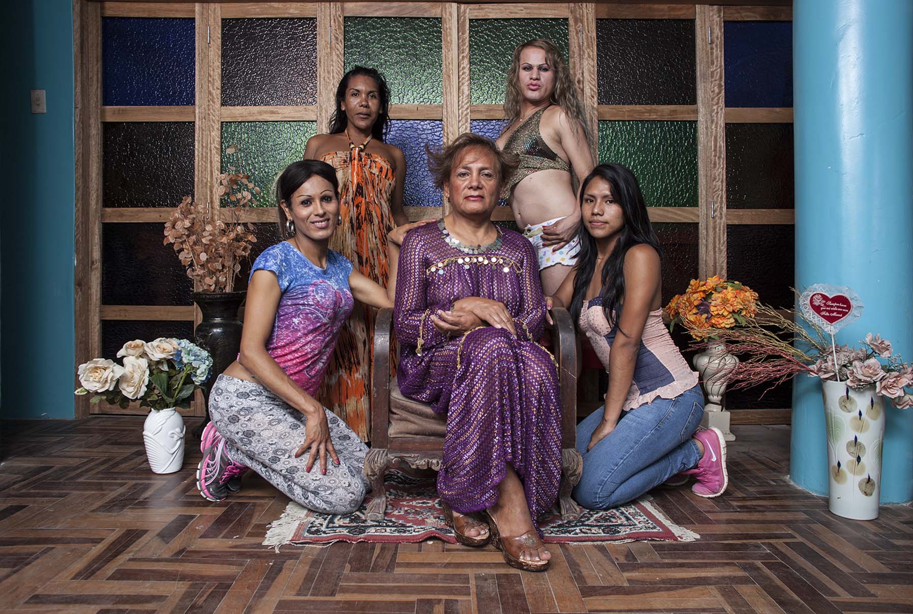
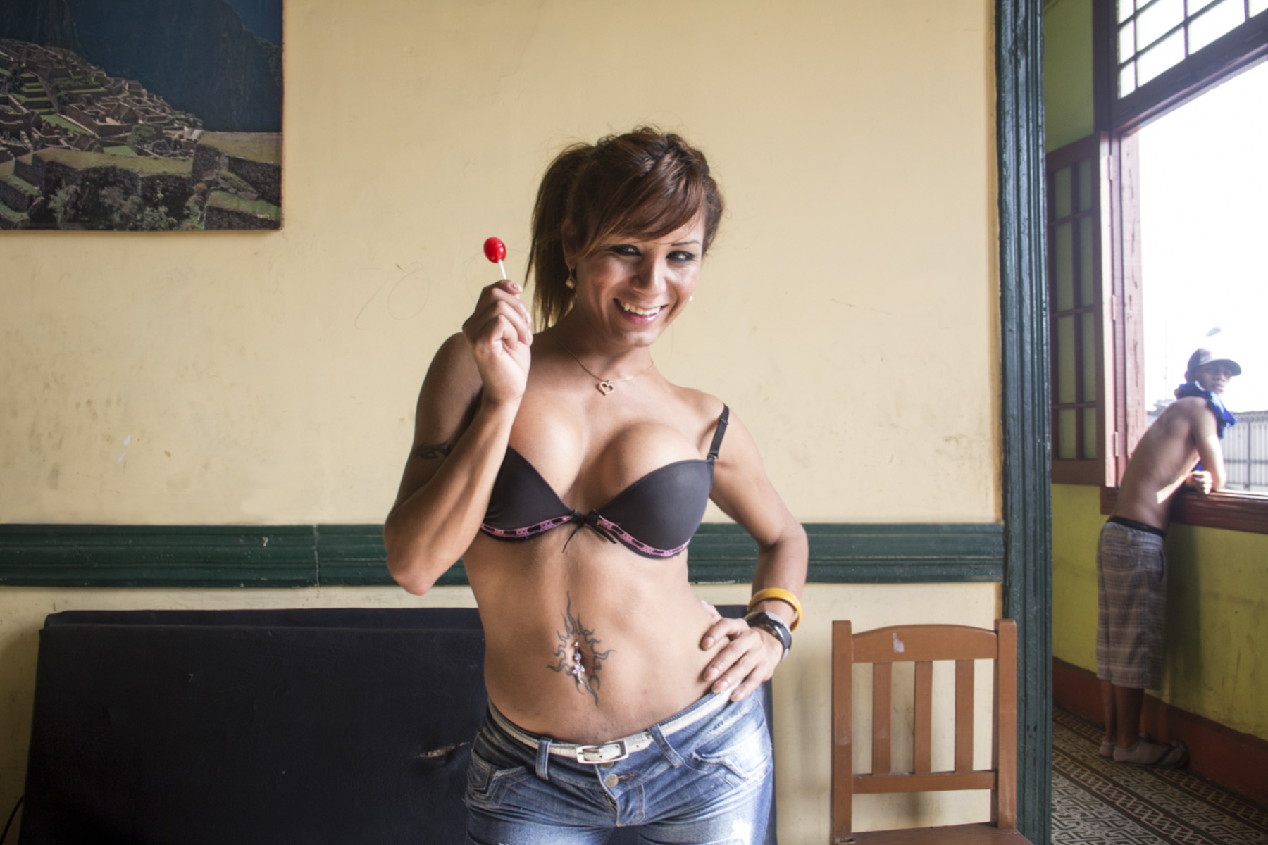
Before becoming a photographer Bracamonte was a painter, but her main career was as a high fashion model who also participant in numerous beauty pageants. During breakfast at her oceanside Barranco apartment, she told me that, one day a few years prior, she was watching TV and by chance saw a report of a transgender beauty pageant being broadcast. Upon seeing it, she had a strong, unexpected reaction of connectedness to the trans women: she saw herself reflected in them.
Drawn in by this experience, she embarked on a two-year-long documentary project during which she lived within the trans community in Lima. Instead of viewing the women through the lens as if they were from one world and she another, she became a member of their community and a part of the intimate family of the trans beauty pageant participants. Through this devoted technique she established her relationship with the subjects of her imagery.
Bracamonte’s work interested me because her choice to radically change her lifestyle from modeling for the sake of this first-time documentation of a different yet parallel world to hers is something I viewed as unusual and remarkable. Her work also interested me because as a novice to the medium, she dedicated herself fully to exposing a sensitive otherness with a high degree of respect in both her process and the result, instead of hastily approaching the theme in a voyeuristic manner.
In the following interview, Bracamonte sits down with Artifactoid to discuss her inspiration for the project, insights she learned in the process, and future projects she has in store.
Artifactoid: How did the project Lima Intrarrosa begin?
Teresa Bracamonte (TB): What initiated the project Lima Intrarrosa in 2012 was my discovery of the existence of the beauty pageants that were organized by the transgender community. This strongly called my attention because at that time I was dedicated to high fashion modeling, and had been called to participate in the Miss Perú pageant and other feminine beauty events.
I discovered these (transgender) competitions on a television report, where a journalist was interviewing the winner of that night’s contest, who later went on to show the conditions in which she was living and they were extremely humble.
Artifactoid: How did you see your own experiences within those of the people you documented?
TB: Lima Intrarrosa covers diverse aspects of the transgender community in Lima. I think that one aspect I most identified with were the beauty pageants. When I photographed all that was happening during the show, and backstage, there was the same euphoria that I experienced in backstages of fashion shows, just before heading out to walk on the runway. At that time my main source of income was coming from high fashion runway shows.
I believe that an artist always sees herself reflected, in one way or another, in that which she chooses to create a portrait of. Many times it is something unconscious; that the artist feels attracted toward a certain reality without being certain of why.
In my case, at the start, it was the beauty pageants and everything that they implied (the production of beautification, performance, etc). Later it became something deeper; I felt identified with the search for self-affirmation and the fight for being who you deeply want to be.
I am a fan of Pedro Almódovar, and in is film “Todo sobre mi madre” (“All About my Mother”), there is a line spoken by the character Agrado, played by Antonia San Juan, that goes, “The more one resembles what she has dreamt of herself, the more authentic she is.”
There is also an element of rebellion: during a time in my life, I questioned a lot about the culturally established binary roles. I wasn’t fully understanding them; they made me feel uncomfortable. It bothered me – the idea of having to comply with certain expectations or attitudes just because I was a woman. I felt that men had certain “permissions” that women didn’t have, and that I wanted to have those permissions, too. This made me question my own feminine role.
Artifactoid: What were the most important things you learned living within Lima’s trans community?
TB: The most important thing I learned while living for two years with the transgender community in Lima, was the survival system that they had developed to be able to move forward in their daily lives. One aspect that interested me deeply was the recreation of family ties: the majority, upon suffering exclusion from their nuclear families, constructed a new family amongst themselves. The links that they create are even stronger than blood. Another interesting characteristic is the resilience and the will to be. That force to dare to exteriorize who they feel that they are, despite prejudgements and exclusion (above all in a male chauvinist country like Peru), is what I admire in all of the transgender people. There is also the sad side, which is the reality that they face each day, of exclusion and extreme violence. Life expectancy is low, and access to basic rights is null.
Artifactoid: How does this project fit within your body of artistic work as a whole?
TB: Lima Intrarrosa was my first photographic project. I produced it over the course of 2012 and 2013. It marked the beginning of my trajectory as a photographer. Before that I generally used painting as my mode of expression. It was also the beginning of my line of work: I search to make visible groups of people and themes that our society hides, negates, disguises or masks. All of my projects can be viewed on my website. My starting point, as a visual artist, is to search for the beauty in what is considered grotesque, unacceptable or unchaste, and show it through images. My inspiration lies in awakening sensations through themes that we tend to reject or that make us feel uncomfortable.
All of my work revolves around this duality – the contrasts – of both concepts: the horrendous, and the beautiful, and the multifarious shades of each. I am on a constant search to provoke the spectator, and induce her to observe and question herself, but above all to submerge herself into realities that she might consider foreign to her.
Through my work I constantly take on the challenge to overthrow prejudices, ideas, and stereotypes that we have deeply rooted.
Artifactoid: Are you aware of other artists in Peru working with the theme of transgender life, like Giuseppe Campuzano? Were you influenced by them, and how?
TB: When I was developing Lima Intrarrosa, in 2012, the only Peruvian artist I knew at that time, and whose work affected me, was Giuseppe Campuzano. I met with him when I was beginning the project. I remember that I bought his book, El Museo Travesti del Perú. He advised me to visit the exhibition that he carried out at the gallery 80m2 Livia Benavides that year, where he created an installation based on newspaper cutouts that showed, over the longterm, how the media were treating the trans community in a denigrating and scandalous way.
Artifactoid: Tell me about the idea of “double perception,” related to trans women who migrate from Peru to Europe. Why is it important to reveal this concept in your photography?
TB: One aspect that called my attention upon creating Lima Intrarrosa, was the desire of almost all of the women in the transgender community to migrate to Europe. Those who achieve this are called triunfadoras (“winners”).
Apparently, the triunfadoras experience a complex situation once they live in Europe. The term “winner” becomes contradictory, and we find ourselves facing a paradox between the concept of what it means to be a triunfadora, connected with the idea of success and the positive, versus the difficult reality that the triunfadoras live once they arrive in Europe. At the same time, the population that surrounds them abroad doesn’t know what it means to be a Latin American transgender woman migrant in Europe, and above all they don’t know that that they left their country perceived as winners.
Therefore exists the “double perception:” they are two imaginaries of the same existence that are culturally opposite and contradict each other. Roland Barthes stated that, “The photo portrait is a palisade of forces. The imaginaries intersect, face each other, and deform.” I view this theory in relationship to the triunfadoras.
I presently live in Paris, where I am producing a photographic project comprised of portraits of transgender women migrants from Peru, and/or South Americans who live in the French capital.
It’s not a “documentary” project, as I seek to translate my subjective point of view about beauty onto it. I am doing this to show the protagonists of my series as impregnable and glorious, in a manner contrary to how they are generally represented.
Artifactoid: How did you arrive at your fascination for the objects of the people you documented, and why were they an important area of focus for this project?
TB: I realized that, through objects, I could show important aspects of the person I was developing a portrait of. I discovered that personal items give us information that is not evident when we only focus on the person. These things can communicate as much, or even more, than the physical body in and of itself. I believe that a portrait can be made through objects alone.
Artifactoid: Do you plan to explore working with the masculine transgender community in Peru?
TB: For now it doesn’t form a part of my plans, since I am developing other projects, but it seems interesting to me. I may explore it in another moment; an artist should always be open to different and diverse possibilities.
Artifactoid: What are some of your goals for this project?
TB: I have finished a photographic book of Lima Intrarrosa, curated by Jorge Villacorta, including some testimonials and reviews. My goal is to publish it in the near future, and I am currently seeking support to do that. The book can be viewed here.
Artifactoid: What do you plan to do next?
TB: Currently as mentioned I live in Paris. I came to do a Masters in Photography and Contemporary art at the University of Paris 8. I am developing artistic projects within my line of work, questioning stereotypes, and using codes of representation that interest me about certain themes and distorting them through art.
About the artist:
Teresa Bracamonte is a visual artist who was born in Lima, Peru, in 1989. She completed two years of General Art Studies at the Pontifical Catholic University of Peru. She finished her studies of Plastic Arts in the Alternating Current School, where she graduated. She obtained the title of Complementary Baccalaureate in Arts at the National University of San Marcos. Then she studied Photography at the Center of the Image, where she obtained the first prize of her group.
Teresa, at age 25, had her first solo show curated by Jorge Villacorta at the II Lima Photography Biennial: Lima Intrarrosa. Her second individual show was in the city of Trujillo (2016). Bracamonte has participated in several group exhibitions in different places of his country, such as Ricardo Palma Cultural Center; The Museum of the Nation; The Inka Garcilazo Cultural Center; Gallery of the French Alliance, Euroidiomas Foundation, Cultural Center of the University of Lima, among others. She has also had the opportunity to exhibit twice in Dubai, in 2016.
She currently resides in Paris, France, where she is studying a Masters of Photography and Contemporary Art at Paris 8, La Sorbonne.
Above: installation view, portion of Pat Bell’s art collection festive for the holiday season
Collectors play a critical role in the art world, not only as tastemakers and figures who help shape the global art market, but also as supporters of artists’ careers, donors to institutions and nonprofits that allow art to become more accessible to the public, and more. Some private art collections can be visited like museums.
Prominent art collector Pat Bell exemplifies an individual whose passion for art gives back to the arts community. Her New York Times-worthy collection is located in her whimsical Victorian South Orange, New Jersey home. Pat graciously welcomed me to take a tour of her collection and speak with her about how it is curated.
In this Artifactoid interview, Pat discusses her beginnings as an art collector, institutional giving, and what she loves most about living alongside art.
Artwork detail from the collection of Pat Bell
Artifactoid: When did you begin collecting art?
Pat Bell: I am going to tell you the story of my art collecting. My sister Pamela Bell was working for John Lee of now BravinLee Programs as an intern in the city. John asked me what I was doing with my extra money that I was making as a Financial Advisor at Merrill Lynch. I said buying stocks and bonds, he suggested looking at art. I said I knew nothing about it but I was willing to learn. He asked if I wanted to buy art I knew or art that was new, I said again that I knew nothing about art at all but new art of the day sounded more interesting to me. This was 1989.
Artwork detail from the collection of Pat Bell
Artifactoid: How did your collection start out? What inspired you to start collecting? Was there a defining moment?
PB: John took me around to art galleries in Soho at the time that is where the art scene was. The first day out I bought a piece by Dotty Attie, and the “Sex Series” by David Wojnarowicz. Both works spoke to me, and I realized that the thought of living with the artists’ work excited me. John took me around a number of other times, and then I became comfortable to go on my own.
Artwork detail from the collection of Pat Bell
Artifactoid: Who is your favorite artist?
PB: I have so many favorite artists. Modigliani, Francis Bacon, Lucian Freud, Lisa Yuskavage, Egon Schiele, there are so many more. I always thought that art works were just borrowed so that I do not have just one work that I just must have. It is easy for me to give them away. I do not become attached to them. I think I am a little different than many collectors in that respect.
Installation view, portion of Pat Bell’s art collection and home décor
Artifactoid: Do you have a “dream” piece to own? What would it be?
PB: I do not really have just one dream piece. I see new photography and I love it and then I see another one and I love it too. It is easy for me to fall in love; I just fall in love with the works all of the time.
Artwork detail from the collection of Pat Bell
Artifactoid: What are some of your favorite pieces that you own?
Artifactoid: You have donated a lot to institutions. Where are some places people can go and see pieces from your collection?
PB: I have given works to the Montclair Art Museum, about 65 works. They actually did a show of all the works that I gave back in 2013 it was wonderful. Usually anytime you visit the museum, there are works up that I have gifted. I also have given works to the Newark Museum, some really special pieces. There is usually something on view there as well. I recently have a work to the State Museum in Trenton by David Ambrose; he is a wonderful artist. I have also giving Aljira works for their auction over the last ten years. Really great works that always draw attention to the event. Hank Willis Thomas, Willie Cole and so many more.
Installation view, portion of Pat Bell’s art collection and home décor
Artifactoid: What would be your most important piece of advice for someone seriously thinking about beginning an art collection?
PB: I buy what I like not what I am told I should like. One thing that I have noticed in the art world as of late is that people buy names not works. I wonder if they end up with a collection that is full of spirit and inspiration then. I have always trusted my instincts and they have held me in good stead.
Artifactoid: How does collecting art enrich your life?
PB: I love art, it is like living with the souls of the artists; what a great gift.
When I started publishing about art in 2005, it felt like there were no art magazines on the web. But rather than stake a claim at being the founder of online contemporary art publishing, I’ll keep it an active playing field and let history do its thing. I’ve always been a successful oil painter, so my perspective as an artist and publisher has spoken to this generation of art interested readers in a voice they recognize. I’m also a Jazz saxophonist – I read and write music. This understanding of time-based art has assisted me a great deal in my writings. But when I say art magazines I mean the development of websites devoted to contemporary art (in the sense of) and presentation of a print magazine online. My favourite art website at the time I started publishing was Artnet.com, where writers like Jerry Saltz, Charlie Finch, Ana Finel Honigman and Walter Robinson wrote regular columns. Paul Laster was another regular Artnet contributor at that time. As some of you know, since 2005 and the founding of my magazine called Whitehot Magazine, I’ve published over 300 writers. Now there are numerous multiple contributor based platforms devoted to writing about art. School of Visual Arts even started an art writing program for young art writers.
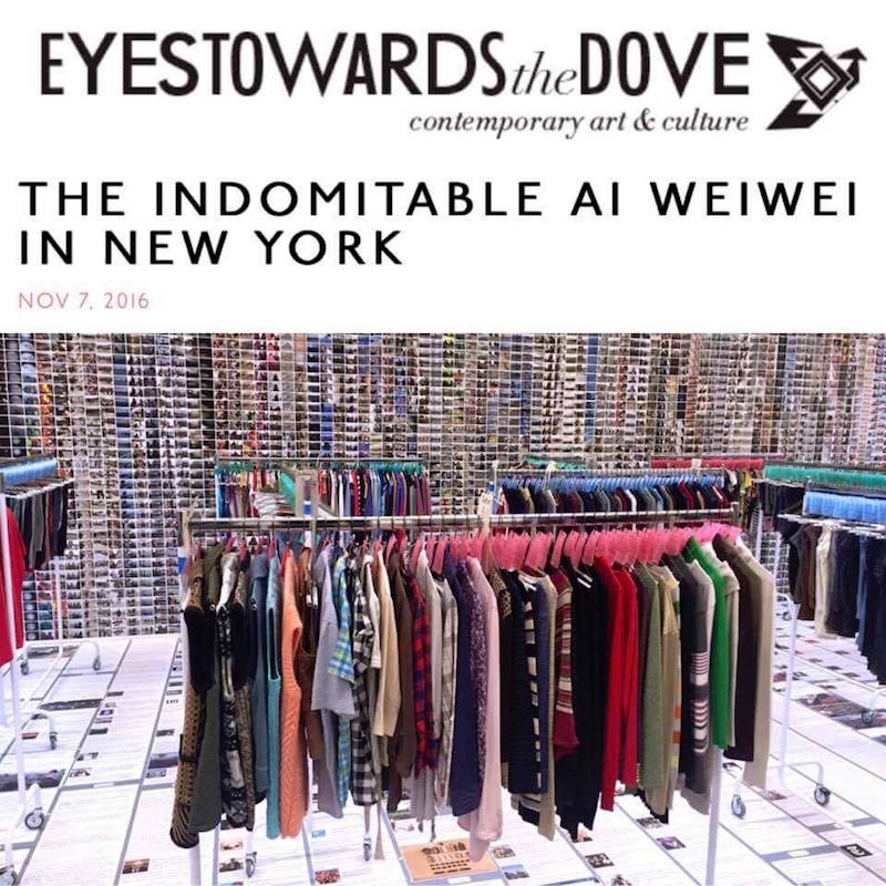
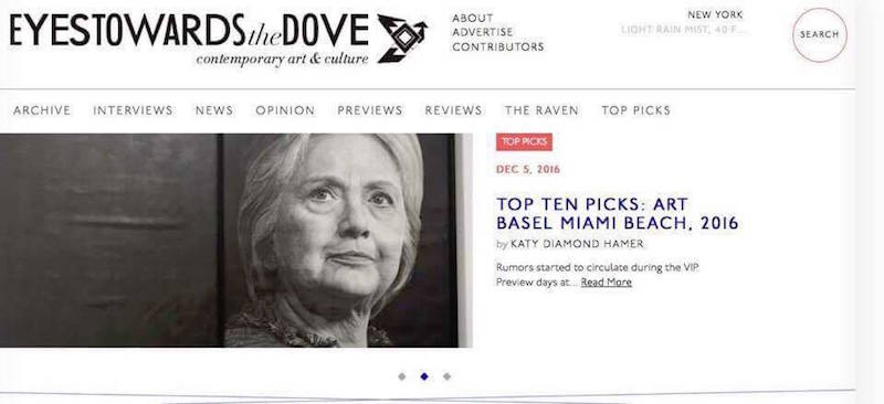
Some examples of semi-recent and long term platforms are: Art F City, Hyperallergic, Artnet, Artforum and so forth. Now in 2016, I find myself discovering new publishers who are dedicated to art and run their owns new platforms. Writer/publisher Katy Diamond Hamer and her site Eyestowardsthedove is worth looking at. Also publisher/writer Deianira Tolema with her site D/Railed is another that comes to mind.
My interest in their motivations for pursuing art publishing inspired me to speak with them for Artifactoid.
Noah Becker: Why do you write and publish about art?
Katy Diamond Hamer: I first started Eyes Towards the Dove in 2007 as a platform for my own writing and used it as a way to project my written voice into the global sphere. Not writing about art was never an option. Initially I used the space to write about my own art practice as well as the work of others. Self-publishing became a way for me to truly learn about my own text-based practice and in doing so informed my taste and understanding of contemporary art. Having a blog which has evolved into more of a magazine format, is the entry point that has catapulted my presence in the art world and without having to deal with restrictions put forth by others.
Ai WeiWei and Katy Diamond Hamer
Deianira Tolema: Art has been used as a reflection of hierarchical imperatives in relation to the concepts of luxury and power, to demarcate the social-economic and cultural differences between the upper and lower classes. Art, as we know from art history, started out about ten thousand years ago as a means to explore and understand reality. It started out on a more perceptual level, then developed into a the first social-political stratagems – perhaps the first forms of subliminal psychological manipulation of the masses, where the products to be sold were nothing more or less than false gods. High ranking members of society employed techniques of divination that anticipated what we now know as modern self-mythologizing. In this light, to answer your question, the main reason I write and publish about contemporary art is to offer art professionals and interested readers a broader perspective of what art can be and mean – regardless of current trends. Thus, my ultimate goal is to use critical skill to push beyond aesthetics, to analyze the role of art in contemporary society.
NB: When you started writing about art what was your inspiration to get involved?
KDH: Initially it was my own painting practice. One of my best friends at the time was writing for Artforum and spending time with him had an impact on my own fascination with the written word, descriptions of art –both two and three dimensional– and process of constructing a sentence.
DT: I started studying art, psychology, and sociology around age ten after reading many fairy tales and books about Italian poetry. Italy, my country of origin, is literally covered in archeological sites left by the Ancient Greeks, and the remains of the complex architecture that survived the fall of the Roman Empire. Imagine growing up walking among the ruins of temples and theaters from thousand of years ago. Academically, art history has always been one of my primary interests. Writing poems and essays about the art that surrounded me came naturally. Also, it must be said, I received a rather rigid education at home.
Deianira Tolema at Galleria D’Arte Merighi in Genova; photo credit and courtesy Francesca Ciri Capra
NB: What do you plan to gain from all of this?
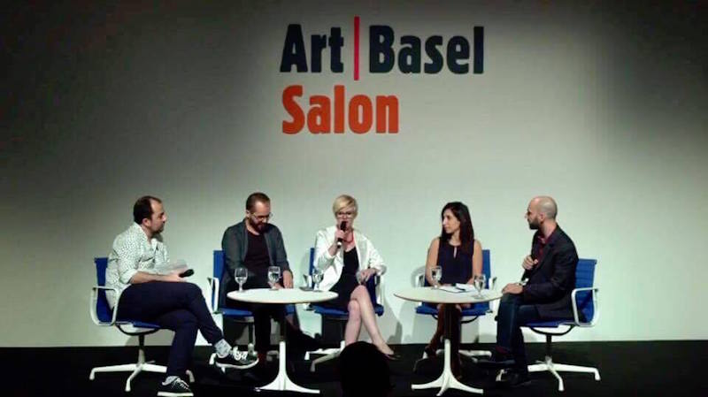
KDH: After spending time in Miami for Art Basel this past December, I realized that looking at art really quiets my inner thoughts. There is something that in the process of looking allows me to be the best version of myself, or at least it feels that way! In regards to contemporary art, I always say that my goal is to look back before going forward. Observing and thinking about contemporary art would mean nothing if I wasn’t familiar with all the other movements that have come before. I love meeting people: gallerists, collectors, artists and other journalists. These interactions can be just as valuable as the art itself.
Katy Diamond Hamer speaks at Art Basel
DT: Well, first of all, honestly it’s fun! Nothing has ever made me happier than art, not even food. Mind you, in Italy food is considered a source of maximum pleasure – especially in the South. Also, I’d like to set an example for future generations with my work, not just to be remembered, but to contribute to the public dialogue with blunt criticism of conventional thinking and bad art. To make my little contribution to the evolution of humanity. I’m making a living working as a writer with artists, editors, and curators. It’s a 24/7 job, so I’m planning to acquire more money, and of course, more knowledge.
Artist Violetta Carpino for Italian Feminism in Contemporary Art (sneak preview). Photo credit and courtesy Luigi Ieluzzo. Image provided by Deianira Tolema.
NB: How do you know the difference between good art and bad art?
KDH: The world is full of art and New York in particular is nearly oversaturated. Typically, we can describe art in ‘good’ or ‘bad’ terms, yet I don’t think that is necessarily the end goal of the critic. Returning to what I said earlier about going back before going forward, I personally establish much of what I like or feel is culturally or historically relevant based on what has come before. Then of course there is the simple definition that could refer to the skill level of the artist and his or her particular pastry of a medium yet even with skill, art can be subpar.
DT: For me it’s very intuitive. I’ve always been obsessed with beauty and symmetry. Once, as a child, prior to an afternoon tea party at the home of my mother’s friend I was almost driven by a subconscious need to frantically grab all the teaspoons randomly positioned on a table and align them to one another diagonally in a way so perfect that another child freaked out. There was an awkward moment of silence in the room that lasted for a good ten minutes. Aesthetics is a subject that can be taught at school in such a way so by the end of the class most students will have a good understanding of the differences between good and bad art. But, there’s an innate element that very few people have – an aesthetic sensibility that can be learned with years of training.
NB: How can you tell the difference between good writers and bad writers?
KDH: I tend to link art and writing together. They are both practices that involve a multitude of components wherein the brush stroke could be compared to the linear quality of the lines that make up individual letters. Good art writers are able to successfully communicate thoughts and translate the visual language into the visual written language. It’s not an easy task as each writer must establish a particular sound while also adhering to rules of grammar, word count and importantly knowing when to stop. I also have a hard time when someone uses too many words to talk about something simple.
DT: Writing is, and should be, less intuitive. It has a lot to do with actually writing well, expressing concepts clearly, understanding grammar, creating text objectively, making logic structures that will lead readers through your maze-like argument or assessment. At least for me, there’s no space or time for subjectivity. It really just boils down to a combination of technical details and natural skill. I always try not to look at someone’s resume’ before reading their writing, so that my judgment is not influenced by a prejudice that might affect my opinion.
NB: Is art important in the face of all the distress and negativity in the world?
KDH: Art is everything. It can be about action in the political realm, love that brings people together or a place of respite in otherwise visual collision.
DT: Art can be a distraction from the distress of the world, or a way to investigate and defy negativity. I think there should be no obligation for artists to do anything deeper than than the decorative, so long as the expression is somehow meaningful.
NB: Do you see how artists and collectors are often opposing to each other politically?
DT: I do know what you mean. I think this is one of the many contradictions in how the art world works. In its guise of balancer of the opposites art has always conveyed the tension between antithetical elements that keep the universe dynamically static, or statically dynamic. On a less philosophical and more practical note, art has always manifested contrasting realities – imagined as colliding and blending with one another on the same existential plane. The artist/collector juxtaposition is an extension of this implicit quality of art. It is a moot point, as long as there’s no conflict between the artist’s ethics and the collectors’ demands.
KDH: Well, the question is fairly directive and leans towards this being something that you believe. Do you think they are opposing? Simply stated, artists are the creative force and collectors are those who support process, enjoy living with art objects and often play a role in the way that art is perceived at a later date. Artists can be collectors but it’s much rarer for collectors to also be artists.
NB: Is there anything positive you feel that you could do in our current political climate through your publishing platform and your writing?
DT: Talking about Italy and Europe, there is much more that artists could do. I think of what American artists have been doing, for instance, in the wake of their presidential election. Unfortunately, after hundreds of years of taboos reinforced by the church and the demonization of creativity, and the economic crisis, I feel that, with some rare exceptions, we do not easily embrace art as a form of protest in this area of the world. Paradoxically, some of the best politically charged contemporary art comes from Europe. I’m trying to use D/railed Magazine to to talk about useful subjects. It turns out it’s not easy to keep all the writers focused on one theme. They have different academic backgrounds and priorities and address our readers on provocative, socially challenging topics without forgoing art talk. I hope those who come across my magazine can follow my lead. As far as I know, I’m the first Southern-Italian woman to have broken so many gender, classism, and cross-cultural barriers with a contemporary art project with an international impact. I hope they follow my lead and fight male chauvinists and win by flying solo and proving them wrong about any leftover claim of intellectual superiority (which is a big deal in Southern Italy, where the heterogeneous culture has yet to produce a generation of self-thinking, ambitious and independent women so powerful that they can shake the planet with a single thought). Imagine an army of American-like Southern-Italian amazons marching to war. To finally witness something like that – so rebellious and even erotic – before I die would make my day for a long time. I also want to keep bringing my Italian/European perspective to other cultures in front of an increasingly international audience – to produce a butterfly-effect in the minds and souls of readers who come from entirely different cultural contexts (which makes me sound even more megalomaniacal than usual). So back to your question, the only thing I can do in this precarious political climate between Brexit and everything else, is to keep doing what I’m doing with the help of some of the top art writers in the world.
KDH: I’ve been thinking a lot about this in the last month and a half for obvious reasons. I had been concerned about Trump winning the Presidency but two weeks before Election Day those worries started to subside. Now that he will be taking the highest political office in the United States, I find that art and the art world need to be more important than ever. In 2017 I am planning on being much more aware of the marginalized, black and brown bodies, queerness and female artists. Those who feel repressed, need to be heard.
NB: Would you encourage other people to start writing and publishing about contemporary art?
DT: No, I wouldn’t. I’m actually encouraging all the high school students I know to not pursue a career in this field, unless they have a really special talent. It’s not for everyone.
KDH: Yes! While the web has changed since I started and is much more dynamically competitive, having one’s own online venue to develop, share and practice is a worthwhile venture. There is an entrepreneurial aspect and strength that comes with the freedom of being able to self-publish and I would encourage anyone with a desire to be seen and heard to take the bull by the horns and go for it.
Katy Diaond Hamer
NB: Is there anything specific you have noticed that you want to share about your experience in the art world?
DT: There’s an aspect of it that concerns ‘judging a book by its cover’. That, in my opinion, is rather superficial and interferes with art’s poetic/spiritual potential.
KDH: The art world is smaller than one might imagine. For anyone initially starting out, it can seem scary and unwelcoming but can be penetrated with the right amount of effort and desire. If the passion is there, keep going. I’ve had ups and downs in my career but art is all I know. My advice is to never give up and never stop looking.
Author Noah Becker is a New York based painter and the publisher of Whitehot Magazine of Contemporary Art. Follow him @noahbeckerstudio, @whitehotmagazine.