Above: Sarp Kerem Yavuz. “Manço,” 2023. Polaroid, 4.2 x 3.4 in. Courtesy of the artist.
This article was originally published in Cultbytes on June 22, 2023.
By Alexandra Goldman
Turkish-French artist Sarp Kerem Yavuz loves photographing handsome men. His various bodies of work include sculptural photo-portraits of nude male models adorned with projected imagery of ornate Turkish Bathhouse tiles, sensuous, homoerotic photos of young American men convening in sports locker rooms (another homosocial space), and mixed media including neons, works on LED screens, and a functioning backgammon board created entirely out of Legos.
Sarp Kerem Yavuz, “Bahçivan,” 2022. Glicée print, 40 x 30 in. Courtesy of of the artist.
Thematically, Kerem Yavuz’s artwork is a reflection of himself: both Turkish and gay. These two elements haven’t historically been able to mix without conflict in his life, and he has always been interested in exploring those challenges. “For the last decade, I’ve been interested in deconstructing masculinity within an Islamic context. I often do this by queering (arguably already queer) orientalist imagery. My largest body of work to date, Maşallah, comprised of scanned Iznik tiles and later, scanned porcelain dinnerware, projected on male nudes to talk about the superimposition of conservative politics onto my generation. I would also periodically visit various Turkish baths to create cinematic scenes that were meant to imply the existence of broader, imagined, queer narratives unfolding in these traditional homo-social spaces. I guess I could say that I was always more interested in the story than the particular medium, although I am partial to photography.” Now that he lives and works in New York City, Kerem Yavuz is able to openly express these two important facets of his identity without suffering censorship from the Turkish government and death threats, among other significant challenges he has faced that many people may not have the courage to stand up to in the name of creative expression.

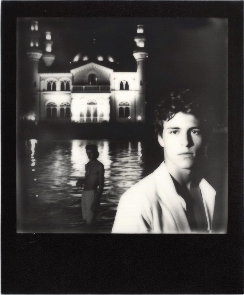
Sarp Kerem Yavuz. “Boğaz,” 2023. Polaroid. 4.2 x 3.4 in. Courtesy of the artist.
This year, he expanded upon his traditional art and photography practice by utilizing the AI software, Midjourney, to create AI-generated imagery for his latest series: Polaroids from the Ottoman Empire, currently on view at Palo gallery in NoHo. He discovered Midjourney “while looking into new digital art trends…its aesthetic capabilities felt more in line with my style than Dall-E.” The cinematic images on view in the exhibition Polaroids from the Ottoman Empire include images of two fit, ostensibly Turkish, shirtless men romantically gazing at the moonlight over a Mosque along the Bosphorus, a bejeweled drag queen making her grand entrance in an invented 1920s-style speakeasy nightclub in Istanbul, and bust-style portraits of handsome, turban-clad men gazing seductively at the viewer from inside a Hammam setting, among other fantasy, homoerotic, faux-vintage Turkish narratives.
The lighting in each of Kerem Yavuz’s AI-generated images is filmic and romantic, with mainly dark or jewel-tone color palettes. There are also a few black-and-white shots included in the series, which feel a bit out of place when thinking of traditional Polaroids. Some of Kerem Yavuz’s AI images are reminiscent of the style of a Jacques-Louis David painting, among other art-historical references and sources of stylistic inspiration. The Polaroid borders Kerem Yavuz chooses to print each image within – because no one likes to see a Polaroid without that iconic built-in bottom-heavy frame – are black, white, or gold. Before framing, Kerem Yavuz finally mounts each printed Polaroid on a mat, which represents a common color of velvet in traditional Ottoman interior decorating.
Importantly, Kerem Yavuz also shoots with real Polaroid film in a different series of his work, Shadows of the Empire, photographing staged scenes of his friends in Istanbul that comment on parallels between LGBTQ+ and women’s rights being taken away in both Turkey and the United States in recent years. “Shadows of the Empire” is currently on view at Zero Bond, where he is this month’s artist in residence via Apostrophe gallery. It is not easy to tell the difference between Kerem Yavuz’s real Polaroids and his AI-generated Polaroids. It’s clear Kerem Yavuz is using AI to mimic and expand upon his own photographic language, rather than copying another artist’s style: a major current plagiaristic danger of AI in the digital art space.

Sarp Kerem Yavuz. “Away,” 2022. Gold Frame Polaroid, 4.2 x 3.4 in. Courtesy of the artist.
For Kerem Yavuz, as both a traditional photographer and AI artist, the inevitable element of financial investment also comes into consideration. Kerem Yavuz elaborates, “I think most people who insist on traditional photography tend to forget how extraordinarily expensive high-end digital photo shoots are. Buying a decent medium format digital camera, which is what I have been using for the past decade, runs you between $10,000-$20,000. You can rent, but then you also need to get really good equipment insurance so that tends to be around $1000 for a week of shooting, just for a camera with a regular lens attached with a spare battery and some flash drives, (not including any lights, stands, sandbags to keep the stands where they are, portable batteries, backdrops, studio space if you need it etc.). Then, there is the additional cost of paying models, assistants, and the time cost of processing and editing the images, plus transportation if you are shooting on location. I have done all of these for years, and I have greatly enjoyed the process, but it is a costly endeavor, which often means you need commercial work to be able to afford to make artistic work. It is also incredibly time consuming. AI photography, at least in the way I have been engaging in it, feels a little more like street photography, where the production element is removed in favor of chance and spontaneity. It’s trickier to get what you want, since there is inevitably a lesser degree of control, but it does offer a greater degree of access to people without the means or the network to dive into photography as it is structured today.”
Whether shot in the flesh or rendered digitally, iconic gay male nude portrait photography can call to mind the explicitly sexual, stark, sensuous, and formidable black and whites by Robert Mapplethorpe, or perhaps the striking, colorful photography of nude or semi-nude male dancers and religious figures in fantastical staged scenes by David LaChapelle. Unlike Mapplethorpe’s homoerotic photography, Kerem Yavuz’s is understated in its eroticism. Unlike LaChapelle’s staged fantasy photography, Kerem Yavuz’s imaginary gay scenes incorporate an Ottoman visual language and color palette. Kerem Yavuz has his own visual language, and experiments with the reverse process using Midjourney to see how it categorizes his original images. “What is fascinating about Midjourney and other internet-based algorithms is that their ‘imagination’ is ultimately shaped by whatever dominates the web. Midjourney has a fun tool that allows you to upload your own images and have it describe them to you. With my photographs, it often says ‘in the style of Hasan Hajjaj’ which is flattering, as I love his work, but I was never inspired by his practice and our aesthetics are quite different. It just goes to show that online media and discourse around Middle Eastern imagery has a long way to go.”
Sarp Kerem Yavuz. “Sahilde,” 2023. Polaroid. 4.2 x 3.4 in. Courtesy of the artist.
The subtly erotic and Middle-Eastern qualities of Kerem Yavuz’s photography stem from his relationship with his father, or the idea of “the father-son relationship.” When Kerem Yavuz came out at age thirteen, his father did not accept his homosexuality and was consequently absent for most of his life. Today, the two are estranged. When asked if he knows other artists working with the idea of the father-son relationship, Kerem Yavuz replied that the father-son relationship is a very vulnerable topic, in almost a banal way. He commented, “Mapplethorpe’s hypersexualilty functioned almost as a protective armor – people don’t accept regular male vulnerability, which is what my work speaks to.”
Another through line in Kerem Yavuz’s artistic career is he is frequently ahead of the curve as an innovator, which, he commented, “can be lonely at times when no one yet understands [his] ideas.” AI is a contentious topic worldwide in industries spanning art, tech, medicine, politics, law, advertising, and many more. In photography specifically, it is already a topic that has entered the forefront of the conversation. Recently, German Photographer Boris Eldagsen won a photography award with his AI-generated photograph (created on Dall-E 2 software), The Electrician, at the Sony World Photography Awards, and declined to accept the award because of his concern for how AI will affect (and compete with) the photography world overall. That perspective is understandable, as the judges of the award were unable to discern his AI-generated photograph from real photographs in the competition.
Kerem Yavuz’s AI Polaroids and “real” Polaroids also look similar to one another. There is something about the people or settings in the AI-generated images that is a “little too perfect,” which can give them away upon close examination, but it’s not always obvious which are which. The catch is that none of the people or places in the AI-generated imagery are real, and they all appear to exist in an unknown, historical place and time in a Turkish, Ottoman past. They’re like memories from a homoerotic dream version of Istanbul during the Ottoman Empire, that never existed, nor would have been able to exist, because of the Ottoman Empire’s extreme homophobia. Kerem Yavuz commented on his inspiration for the series,“I loved the notion that in a parallel universe, I would have been traipsing around a present-day Ottoman Empire, photographing my queer friends in various places in Istanbul.”

Sarp Kerem Yavuz. “Banyo,” 2023. Polaroid. 4.2 x 3.4 in. Courtesy of the artist
Even though Kerem Yavuz’s AI-generated images look – in one way or another – “real”, with Kerem Yavuz’s title of the series, he “confesses” another hint into the photographs’ fictional origins: while the Ottoman Empire ended in World War I, Polaroids were not invented until World War II. Therefore through just his title, Kerem Yavuz lets viewers know his Polalroids from the Ottoman Empire are technical impossibilities.
For Kerem Yavuz, Polaroids from the Ottoman Empire is also about the “believability” of images in the current AI era. However, questioning the believability of photography, while now heightened due to AI, isn’t new. Falsified imagery in photography has been explored since Yves Klein’s 1960 Leap Into the Void, in which Klein created an early, analogue visual illusion to “document” a man jumping out of a window even though it never really happened. Edward Weston’s 1920s and ‘30s vegetable still lives, Peppers, look at first glance like black and white photo portraits of muscular male torsos, tricking the eye at first glance. With the eventual invention of Photoshop and an infinite array of postproduction effects and image-generating software, the notion of photography as solely a medium that documents reality is nearly a century gone. Kerem Yavuz’s decision to print his images on Polaroids is another layer of his trickery: “Polaroids bring a plausibility to the narrative because we are culturally conditioned to think of them as documents. No one thinks a Polaroid is faked, even though the technology to expose images onto a Polaroid digitally has existed for a decade,” he emphasized.
To create the AI Polaroids, Kerem Yavuz teaches Midjourney software how to make an image look gay, glamorous, exotic, romantic, antique, Ottoman, or express other features simultaneously, using his words. He even gets specific in the sense of telling the software, “make this image look like it was shot with a Nikon 110 millimeter lens,” or “give me an image of two men in front of a mosque in Istanbul in the style of Jodorowsky,” and the software generates that effect or visual. Through repeated processes of trial and error, Kerem Yavuz communicates different combinations of these key words to the software until he gets his desired imagery in return – a tedious practice that requires a lot of patience and nuanced communication between man and machine. Each time, the AI software transforms Kerem Yavuz’s permutations of adjectives into generated imagery based on other imagery it has been introduced to previously online. Kerem Yavuz explains, “In photography, we often shoot the same shot hundreds of times with small tweaks and iterations. This also applies to AI-generated imagery, where sometimes Midjourney will give me almost what I’m looking for, but not quite, so I will spend hours telling it to iterate on one specific thing. Sometimes, in both cases, the image just doesn’t work. Or you end up needing to edit in post.” As result of the collaboration between Kerem Yavuz and Midjourney (which actually lives on Discord – a platform he describes comically as “the unholy love child of Reddit and WhatsApp”), the scenarios in the imagery look, to some degree, believable.
A serious problem with this, that Kerem Yavuz recognizes and addresses, is Midjourney software’s inherent biases. He remarked that he has noticed, through his use of this software to create his imagery, that if he asks it for an image of “two handsome men,” it will most often provide images of two white men. If he asks for “two gay men,” it will similarly give him images of men covered in rainbow clothing, or holding Pride flags. It barely understands when he asks it for images of “two men kissing” and shows him images of two men pecking on the cheek rather than engaged in any type of romantic kissing. There is very obvious heterosexual, white, cisgender bias in this process that Kerem Yavuz continues to notice, critique, and do extra work to find ways around to get his desired image results, repeatedly putting the technology to the test.
Like artists and photographers working throughout history, Kerem Yavuz is working with the technology of his time. It’s not long ago that everyone was talking nonstop about NFTs – now, the new buzzword is AI. There’s inevitably a coalescence of the two as well. Many question if either of these two technologies have potential to exist on par with more traditional art forms. But, more than just buzzwords, there is real artistry in the conceptual aspect, detailed communication technique, choice of software, printing and exhibiting decisions, visual composition, color palette, light source simulation, and more that Kerem Yavuz employs to create his AI-generated imagery for his Polaroids from the Ottoman Empire.
Conversations today about AI – across industries and contexts – often involve sensationalist notions of “Is it good?” “Is it bad?” “Is it scary?” “Are we doomed?” What I think Kerem Yavuz is proving with Polaroids from the Ottoman Empire is that there is a way to authentically make original art using AI software as a tool. When executed thoughtfully and with the level of care and critique he uses, art creation becomes one of the technology’s positives. He concludes, “In its current form, I feel like AI is making poets of us all, and I find that delightful.”
Sarp Kerem Yavuz’s solo exhibition Polaroids from the Ottoman Empire is on view at Palo Gallery until July 1st, 2023 and Shadows of the Empire is on view at Zero Bond.


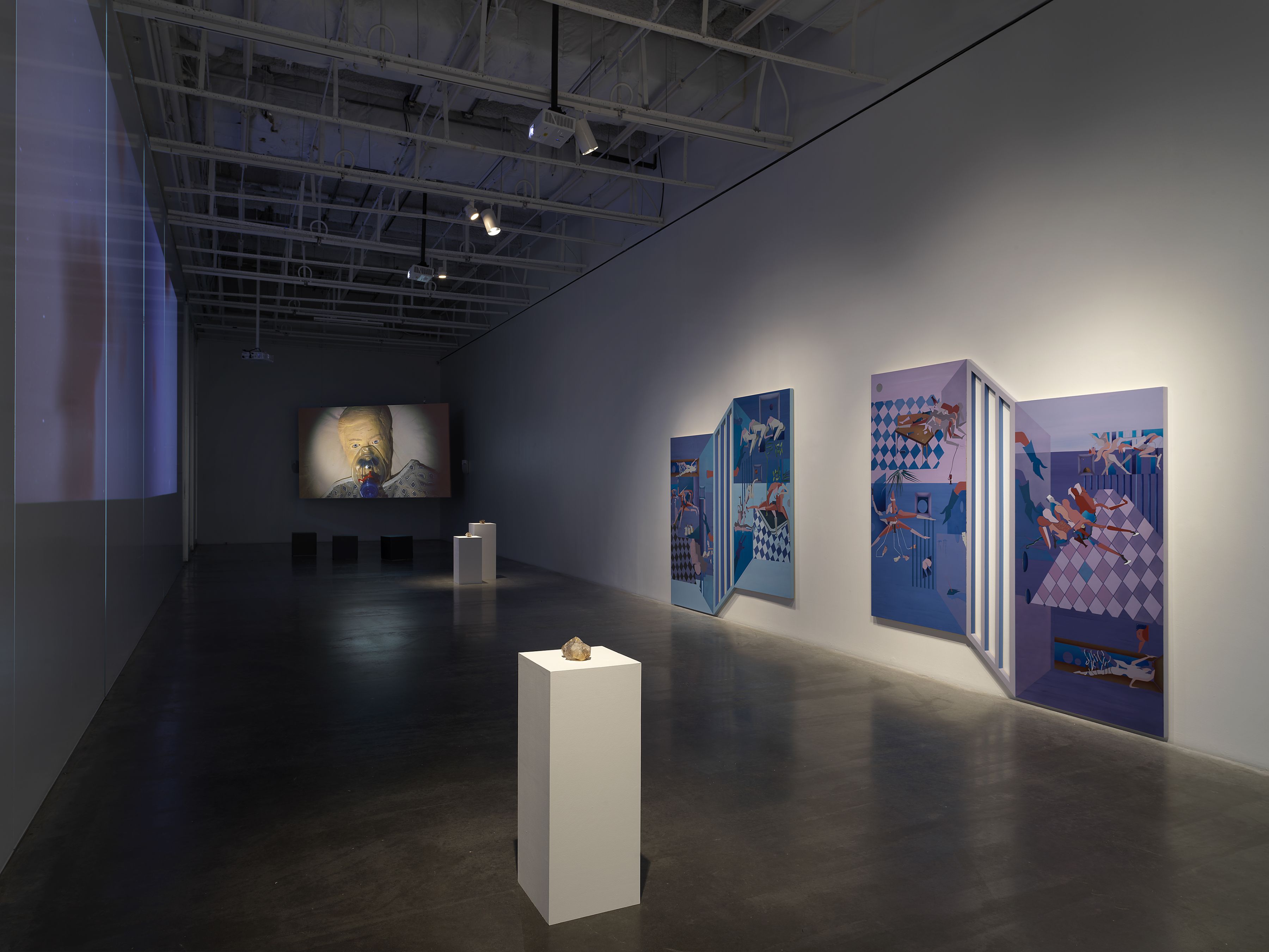


 John Torreano, “Sea Sky Gold,” 2018. Acrylic paint and gold leaf on plywood 45 x 180 inches. © John Torreano courtesy Lesley Heller Gallery.
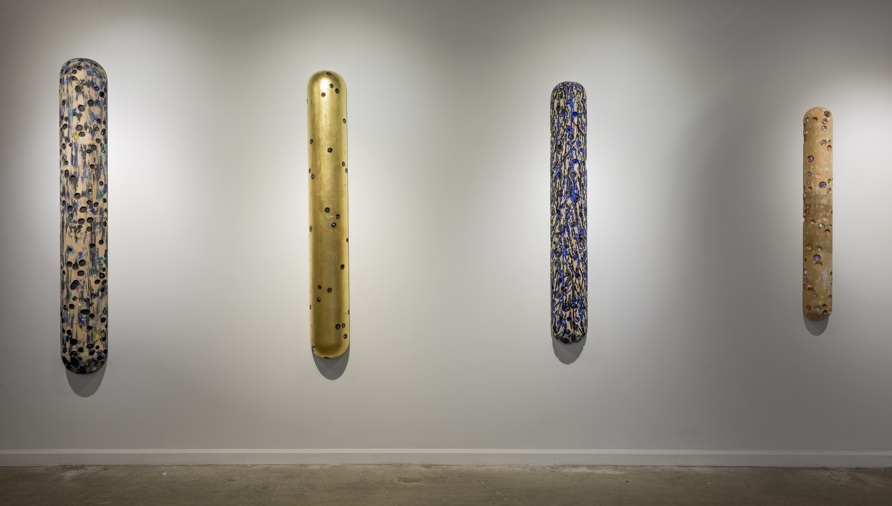 John Torreano: Dark Matters Without Time (installation view, Lesley Heller Gallery, New York, 2018). © John Torreano courtesy Lesley Heller Gallery.