Pictured Above: Natasha Roberts Kay Photographed by Jeanne Paradiso for THE KNOW
As both New York’s Art Week and Fashion Week come to a close, a recent project came to mind that tastefully married the two worlds: A Room Just So, an exhibit of twenty international artists curated by Natasha Roberts Kay at Bergdorf Goodman.
Audrey Schilt, Behind the Scenes at Ralph Lauren (Claudia Being Fitted), Acrylic paint on canvas, 42 x 48 in. Courtesy of the curator.
Roberts Kay—a fashionista herself—wears many hats including curator, sought-after art advisor, new mom, and powerhouse publicist for the Public Art Fund. She can always be found pushing forward courageously with her vision, including regularly curating art exhibitions in New York City’s tallest skyscraper. While some in the art world shy away from embracing the connection between fine art and luxury retail, Roberts Kay orchestrates consonance between the two.
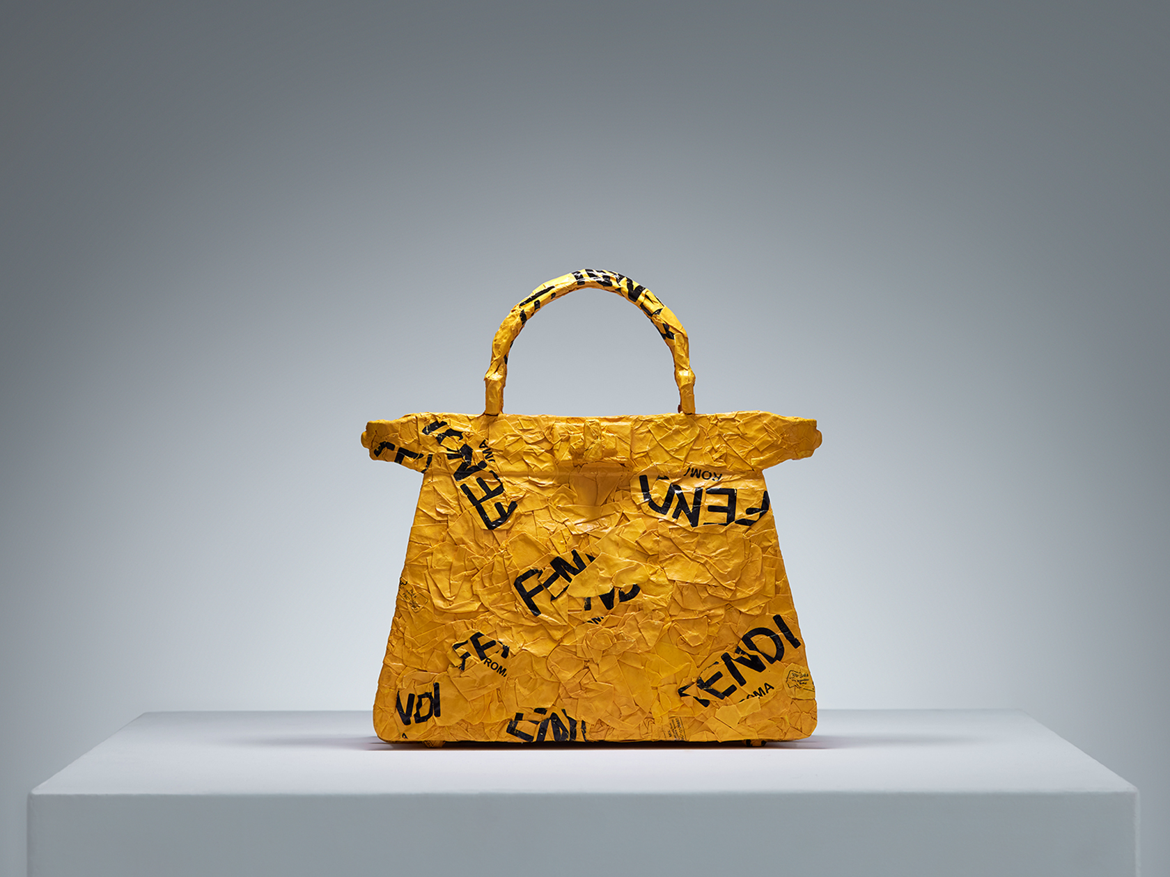
CHiNGLiSH WANG, CHiNGLiSH Brands (Fendi Peekaboo), Paper shopping bags and metal wire, 11 x 4.4 x 11.5 in. Courtesy of the curator.
This was clear to me as soon as I stepped onto the seventh floor of Bergdorf Goodman to see Roberts Kay’s curated summer art exhibition, A Room Just So. Naturally, an environment like Bergdorf’s that successfully blurs the lines between retail and art is an inviting setting for the right exhibit. For A Room Just So, appropriately located on Bergdorf’s interior design floor, Roberts Kay “reimagined domestic spaces as living galleries, where paintings, sculpture, furniture, and design objects seamlessly intertwined with the art of home décor”.
Erin Kono, PersimmonI + II, Egg tempera on shaped board, 9.5 in. tondo each. Courtesy of the curator.
The exhibit, which included sixty sculptures, paintings, photography, textiles, and design objects by Alex Anderson, Vicky Barranguet, Edgard Barbosa, C.J. Chueca, Jane Dashley, Jen Dwyer, Kamiesha Garbadawala, Leia Genis, Manuela Gonzalez, Katie Hector, Erin Kono, Kouros Maghsoudi, Thérèse Mulgrew, Hannah Polskin, Gerardo Pulido, Audrey Schilt, Jeremy Silva, CHiNGLiSH WANG, Darryl Westly, and Avery Wheless, added new depth of creative storytelling to the department store’s seventh floor. The works, which ranged from abstraction, to surrealism, to figuration, to functionality, spoke to how art, design, and interior space have the capacity to shape our state of mind. Roberts Kay’s inclusion of thorough information about each artist on view with an impressive detailed audio guide elevated the show to the standards of a top commercial art gallery, while its setting at Bergdorf’s infused it with warmth by simulating living at home with the artworks. A Room Just So positioned the twenty artist’s works in a salable environment with exposure to new clientele, without diminishing their value as original works of art fit for a traditional gallery or museum.
Roberts Kay shared: “With the exhibition, my intention was to assemble a group of traditional artists who are stylish and fashion-forward. For example, Audrey Schilt started her career as Halston’s illustrator at Bergdorf’s—she even sketched Jackie Kennedy in a fitting for her iconic Pillbox hat—and now Schilt paints works inspired by her time in fashion, including her Behind the Scenes at Ralph Lauren series. Artists Leia Genis and Manuela Gonzalez works featured draped and woven textiles that were painted and dyed. CHiNGLiSH WANG sculpted iconic handbags using several major brands’ own shopping bags as material. Many of the works in A Room Just So directly demonstrated a relationship between fine art and design.”
Gerardo Pulido, Set of #25, Gouache, watercolor, and marker on paper, 12 x 9 in. Courtesy of the curator.
Anecdotally when I entered Bergdorf’s to see A Room Just So on a quiet Friday morning this summer, I overheard a shopper speaking on the phone in the jewelry section to my left, “Hi, I’m at Bergdorf’s,” she said, “…it’s really the last of the great department stores.” Hearing this, I thought to myself, wow, that really is true, isn’t it. Bergdorf Goodman is iconic; it has its own deeply-rooted historical weight as a bastion of elegance in New York City culture that allows it to seamlessly incorporate a foray into fine art that—with the right people like Roberts Kay on board—can be taken seriously.
Alex Anderson, Rose Vessel, Earthenware, glaze, gold luster, 10 x 12 x 12 in. Courtesy of the curator.
While A Room Just So has come to a close, currently on view in Bergdorf’s seventh floor gallery space is a new exhibit expertly organized by Tribeca-based art and design firm, Todd Merrill Studio, in partnership with de Gournay handpainted wallpaper. This new show features additional artists I love who cross over between the art and design spaces, including Andrea Marquis and Jamie Harris. Bergdorf Goodman’s seventh floor home decor space is open to view seven days a week.
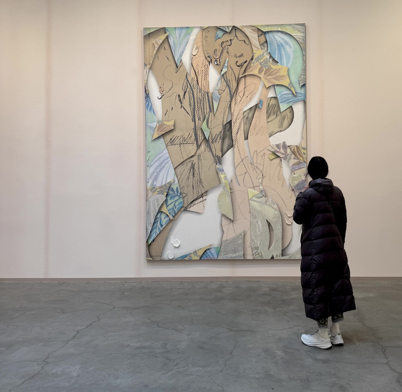
Above image: Installation view of Laura Owens, Matthew Marks Gallery, New York, February 13 – April 19, 2025. Photo by Bailey Coleman.
By Bailey Coleman
“Have you seen Laura Owens yet?”
Opening the door to the gallery I am welcomed by a nearly manic energy. Gallery goers are thrilled with themselves that they have finally made it to Chelsea to see the show everyone is talking about. Laura Owen’s eponymous exhibition at Matthew Marks has been widely lauded as a tour-de force of art making and I was just as excited as those around me to see what all the fuss was about. There is a swarm of people hovering around the gallery attendant’s desk with anticipation as the artist casts her first spell. An older woman with a fresh, blonde, blowout squeals with excitement, as a roll of tape magically moves across the desk. Suddenly, a drawer opens when her friend removes a pen from its holder. Having been witness to these moments of fantasy, we are baptized and free to pass through to the magical world of Laura Owens in her first solo show in New York City since her 2017 mid-career survey at The Whitney.
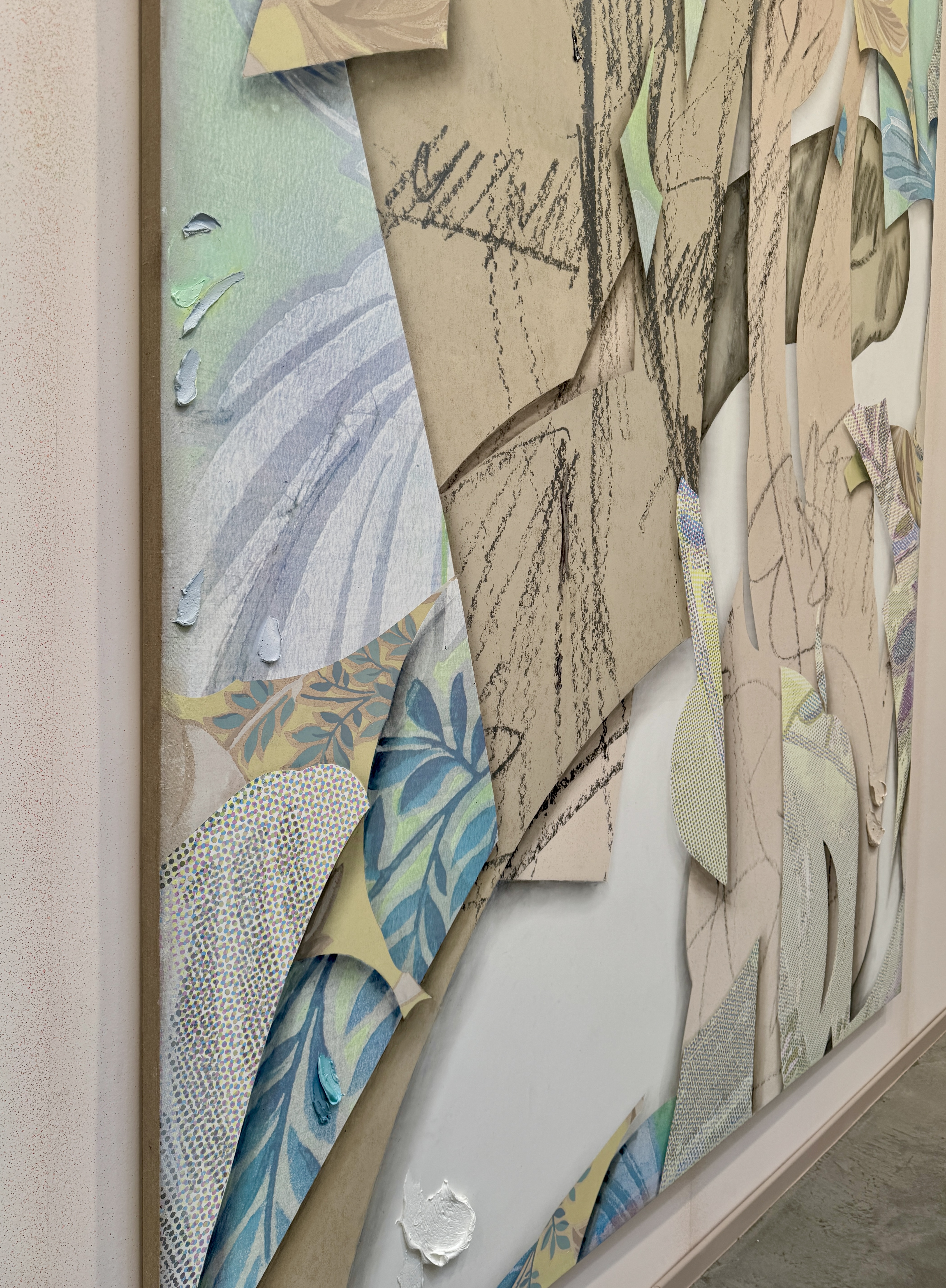
Laura Owens, Untitled (Detail), 2025, Oil, pastel, charcoal, graphite, and silkscreened Flashe on linen, 130 x 90 inches. Photo by Bailey Coleman.
In the first gallery, ten-foot tall vertical pastel paintings hang in effigy of Laura Owens. Though not intended to burn in sacrifice, these impressive works on canvas are singular retrospectives of Laura Owens’s unique style. Collage, digital media, hand-made silk screen prints and heavy daubs of oil paint compete and complement one another in an effort to excavate the nature of contemporary abstraction. Articulated in light teal cubist forms, the painting on the gallery’s farthest wall is a combustive battleground of style and technique. The result is a soft pixelation of abstracted shapes that superimpose each other and create the illusion of material layering. Her work has been likened to artists such as Picasso and de Kooning by The New York Times and others. These artists were interested in the integrity of the picture plane and celebrating the medium specific flatness inherent to its two-dimensionality. Owens, of course, adheres to these Greenbergian ideals, however, her degloving of the picture plane goes one step further. By outlining formal elements of her composition in shadow, Owens emphasizes that these shapes, designs, and motifs are, indeed, painted, suggesting that qualities that contribute to the illusion of three-dimensional painting can extend to elements usually thought of as contributing to flatness.
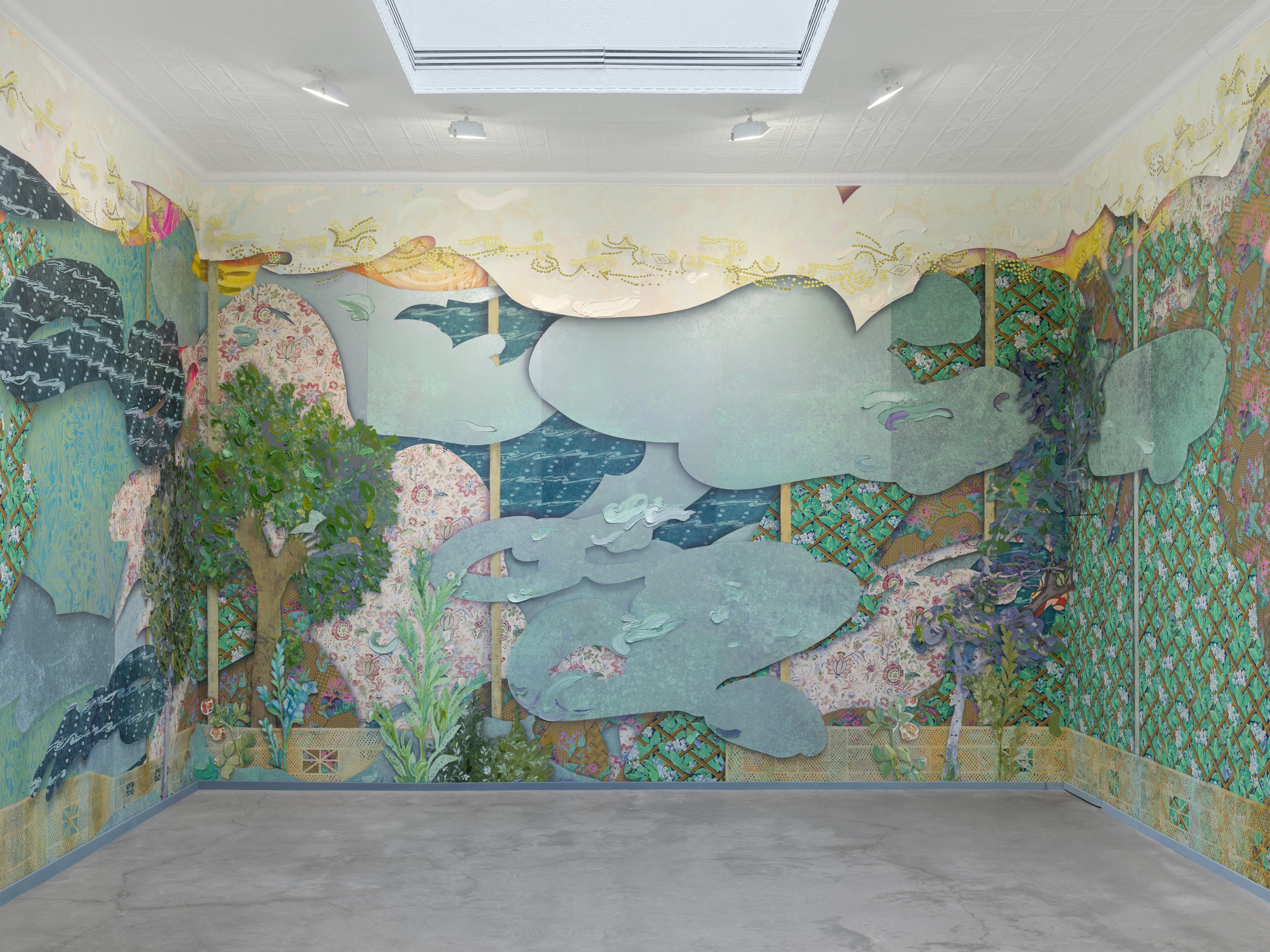
Once ushered through the large vault-like doors at the rear of the first gallery, I entered into what appeared to be a secret garden with hide-and-seek mechanical pop-outs that reveal small paintings. This exhibition is a surprise departure from Owens’s previous solo shows in many ways. Owens’s 2017 Whitney mid-career retrospective featured her impressive paintings on typical white walls. Now, at Matthew Marks, Laura Owens invites the viewer into an immersive environment that the artist herself has dictated. Floor to ceiling aluminum panels boast one hundred and fifty layers of her silkscreen prints, oil painting, and clay-coated paper that showcases a complex botanical motif with a lattice gate and overflowing greenery. The intricacy of the design layers and subtle shifts in depth perspective become an enveloping environment of the artist’s imagination. Suddenly, a gallery attendant opens a final hidden door to reveal a video installation in a dark, tiny, 3 x 4′ closet-like room. Craning my head upwards in the claustrophobic cinema, I watch as two black crows wax philosophical on the fall of the Roman empire and the prevalence of misogyny throughout ancient history – acting as a subtext of sorts. It felt like type of fever-dream talk show I’ve always craved, but never realized was missing from my life until I saw it.
After a moment of surreal and comedic bird-watching, I exited the principal gallery space and went next door to the annex to catch the exhibition’s final act. There, large boxes with handles, pulls, and knobs hold books and other curios. Fingering through the objects, the printed matter tells a narrative of existential exploration and metaphysical interest beyond the scientific. To my nostalgic delight, I am reminded of show-and-tell in elementary school, sharing memories tied to objects. Overall, the exhibition affirms Laura Owens as an alchemist of painting. She melds painterly skill, an eagerness to adapt unique technologies, art history, and humor, to create something entirely new and wholly her own.
“Laura Owens” is on view at Matthew Marks Gallery through April 19th, 2025.
Bailey Coleman
Bailey Coleman is a contributing writer to Artifactoid and is the founder of her own art publication: Bin Day Art. She is an art advisor and writer based in New York working with clients to curate private collections that speak to both individual desire and market interest. She received her MA in the History of Art & Curating from the University of London and her BA in Art History from Barnard College of Columbia University.
This article was originallly published in Cultbytes.
Hanae Utamura. “Into the Light,” 2023. Acrylic on Paper. 57.5 x 42 inches. Courtesy of the artist.
In a life-changing instant—the sudden death of her husband—Japanese artist Hanae Utamura went from creating artwork that spoke to geopolitical collective memory in Japan, to exploring the realm of the personal through the body and the metaphysical. Her prior series of projects looked outward to the world and spoke to collective pain, suffering, death, loss, and trauma. Her newer work looks inward to our spiritual being, birth, grief, and the biological earthly entities that create us. Despite this challenge, Utamura is light-hearted and thoughtful. We met while welcoming El Salvadoran artist Beatriz Cortez’s time-based visual art project, Ilopango: The Volcano that Left: a Calder-stabile-like metal sculpture to Troy. In the shape of a volcano—a symbol in both Salvadoran culture and in Mesoamerican codices—it brings ideas of the Mayan underworld to the fore. In Troy, we participated in a ceremony to bless the Native American burial site with tobacco while Ilopango passed by us on the river.
Unbeknownst to Utamura’s recent loss, I was drawn to her bubbly and friendly nature and intrigued by her knowledge of indigenous practices. Perhaps it was our proximity to other realms that connected us—my mother lost her mother at a young age and has explored modes of communication with spirits, exposing me to conversation and practice surrounding energetic transitions. In recent years, spiritual art by women tracing back to modernist and proto-modernist abstraction is more widely known, facts that Jennifer Higgies writes about in her new surveyThe Other Side: A History of Women in Art and the Spirit World. As we offered tobacco to the land, Utamura invited me to visit her studio on the Rensselaer PoIytechnic Institute’s (RPI) nearby campus, where she is enrolled in a practice PhD program, and I accepted.
At her studio, Utamura told an unexpected and moving story about the recent transition in her artwork style. Her husband, Robert Phillips, was an American new music composer. They were an artistic couple who met in 2014 at Akademie Schloss Solitude, an international artist residency in Stuttgart, Germany. Within a very short period after the world entered the pandemic, Utamura experienced bringing life into the world, giving birth to their son, Kai, in 2021. Shortly thereafter, in 2023, she saw life leave the world with Robert’s death due to sudden illness. It was a devastating and unexpected tragedy for the young couple and their family.
On the 49th day after Robert’s passing, which in Buddhist tradition marks the day when one’s spirit and energy are fully released, Utamura performed a ritual to honor him. She had saved the placenta from Kai’s birth (which is dried in the shape of a bowl), placed Robert’s hair inside the placenta, and buried both together beneath a tree. When Utamura and Robert spent their last moments with each other, they exchanged locks of hair. The placenta provides oxygen and nutrients to the child through the umbilical cord, which also brings waste products away. It is shaped like a brain, or as Utamura describes it, a “half-cut earth,” and symbolizes growth and birth. “Placenta is treated as medical waste after birth in the Western medical world, but many cultures have a sacred, spiritual relationship to the placenta,” she commented. The placenta is often referred to as the “tree of life” for the branch-like patterns made by its blood vessels. The site continues Robert and Utamura’s life together, as the placenta’s nutrients—parts of their DNA—enrich the grass and tree roots, and other, in her words, “non-human species.” And, Utamura’s ritual symbolized Kai protecting Robert’s spirit, and carrying him into spiritual transcendence, with the eternal protection of his son.
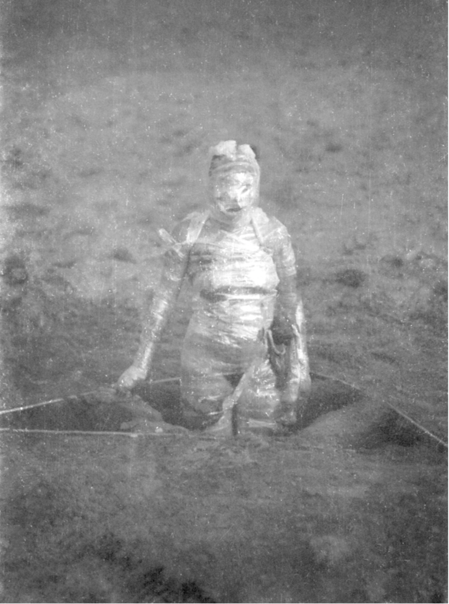
Maria Evelia Marmolejo. “Anónimo 4,” 1982. Performance. Photo by Nelson Villegas. Image courtesy of Maria Evelia Marmolejo.
Pioneering feminist artists from the early eighties also worked with the idea of the placenta as considered “medical waste” in Western medicine, while it is spiritual, such as Colombian artist Maria Evelia Marmolejo (who was included in the 2017-2018 exhibition Radical Women: Latin American Art 1960-1985 Hammer Museum and Brooklyn Museum). For Marmolejo’s 1982 performance, Anónimo 4, she dug a 1.5-meter triangular pit into the ground and filled it with sewer water and the placentas of all the babies born that day in hospitals near the performance site, in Cali, Colombia and Guayaquil, Ecuador. She wrapped her body in the placentas, and submerged herself in the hole, “embarking on a psychological and sociological self-exploration of the fear of being born in a society in which there is no guarantee of survival,” she explains in an interview. Artists like Marmolejo and Utamura observe the importance of the placenta by incorporating them into their performance rituals in meaningful, powerful, spiritual, and symbolic ways, whereas at the hospitals, they tend to be discarded.
Understandably, Utamura could not entirely let go of her partner. Because of these sudden extreme encounters with life and death, which now flow, in her words, “like the confluence of the river with raising Kai,” her perspective was instantaneously transformed, altering her artistic practice. Before Robert’s death, she created more geo-political artworks, often performances and films. One work Uncanny Valley – Study for Future Strata (see image below) raises questions around the dominant historical narrative of nuclear history by juxtaposing images of the elements that surrounded the atomic mushroom clouds of the bombing in Nagasaki, with the mining site in Congo where uranium was sourced for nuclear production – positioned above, and the military storage site near Niagara Falls where nuclear waste from the Manhattan Project was secretly disposed – positioned below. But, after she experienced the life-altering sequence of birth and death events, she felt compelled to turn inward to the body and spirit. Abstract painting helped her overcome “the unspeakable”—I immediately drew a parallel to the shift to abstraction in Western art after World War II. She believes in abstract painting as a powerful medium for channeling the energetic transitions relating to birth and death.
Hanae Utamura. “Uncanny Valley – Study for Future Strata,” 2022- Mixed Media. 21 x 16 inches. Courtesy of the artist.
“This has also very much been a collaborative process with Robert,” Utamura added, “Aur means ‘light’ in Hebrew. I feel that his symbolic composition, Aur, for string quartet and electronics, is the light that he transcended into. It transforms death into a departure. When painting, I hear his music inside my ear—his essence is expressed even more through his music in his physical absence. The music truly starts to live in eternity within me.” Having followed my mother’s journey to stay in touch with my grandmother after her death Utamura’s will to stay connected as a source of comfort resonated with my own experiences.
The first several paintings Utamura created exploring her feelings of grief were watery representations of a body, dissolving. After creating several of these more figurative paintings, she was invited to a séance by Tamar Gordon, a professor of Anthropology in the Communication and Media department at RPI, and a member of her doctoral committee. The séance would help her further shift her focus from grief to communication.
Hanae Utamura. “The Limb,” 2023. Acrylic on Paper. 24 x 18 inches. Courtesy of the artist.
At the séance, the physical medium Gary Mannion, headed a circle under controlled conditions, alternating between complete darkness and red light. Physical mediums, as opposed to mental mediums, produce materializations of spirits while mental mediums interpret and channel them. Physical mediums produce ectoplasms which are viscous manifestations of spirits that exude from their body taking on any form, including apparitions. Encircled by the participants and sitting in a cabinet, tied down to a chair, Mannion produced an ectoplasmic hand and invited members to touch and hold it. Utamura described the experience as having felt like “touching a wet hand.”
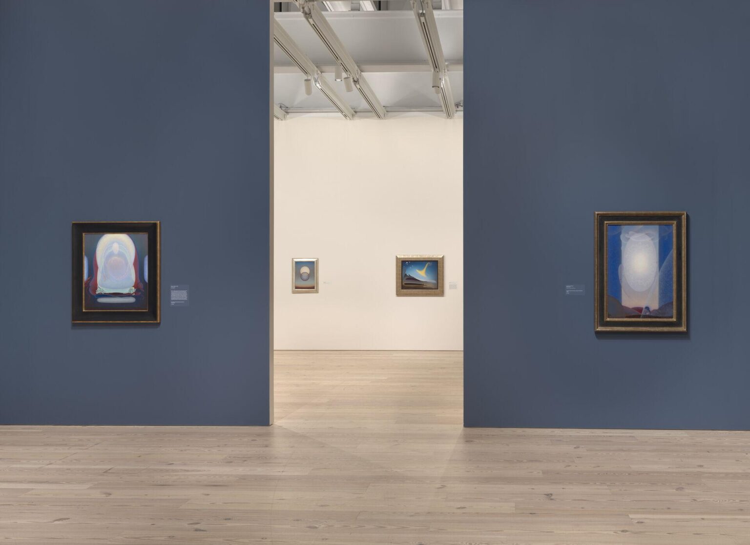
Installation view of “Agnes Pelton: Desert Transcendentalist” (Whitney Museum of American Art, New York, March 13–November 1, 2020). From left to right: Mother of Silence, 1933; Departure, 1952; Awakening (Memory of Father), 1943; Light Center, 1947-48. Photograph by Ron Amstutz. Courtesy of The Whitney Museum of American Art.
Séances were an American phenomenon popularized by the Spiritualist movement in the 1850s. They spread to Britain, other parts of Europe, Brazil, and Australia, and consisted of circles of sitters who gathered to channel the realm of spirits. Today, they are less common, but exist and Mannion is a leading figure in the field.
Utamura’s new work is also influenced by Shannon Taggart, a photographer and artist who authored a popular book depicting sitters in various states of transfiguration. Taggart recently had an exhibition of her work at the Opalka Gallery in Albany, NY. The two-day public opening included a dialogue between Taggart and Dr. Anne D. Braude, the director of Women’s Studies in Religion at Harvard Divinity School, and the author of the book,Radical Spirits: Spiritualism and Women’s Rights in Nineteenth-century America, which explores the close engagement of Spiritualism with the women’s rights movement. There is also a growing recognition in recent years of female artists like Hilma af Klint and Agnes Pelton, who employed art as a language to explore spirituality. Utamura considers her work as in alignment with these artists and thinkers.
Hanae Utamura. “Presence of Absence #3,” 2023. Acrylic on Paper. 24 x 18 inches. Courtesy of the artist.
After the séance with Mannion, Utamura created another series of paintings in which she began to depict the imaginary body that evolves to a more abstract state in its process, like energies and colors (rather than a dissolving figure), with rich, cosmic dark blues or brighter florals. Often she incorporates a bit of iridescent pigment “inspiring to channel, as it reflects light” she explains. The composition of Utamura’s new more abstract paintings on paper are vaginal and womb- or placenta-like. Some of these images incorporate a hand and a tree branch, perhaps referencing the tree under which she performed the ritual for Robert, or the sensation of touching a wet hand in the séance.
Serendipitously, a few months before Robert’s passing, she also found a book lying in a classroom at RPI titled The Perfect Medium: Photography and the Occult published by Yale University Press. It is the catalog from an exhibition in 2005 at the Metropolitan Museum of Art that showcased the history of photography on mediumship channeling with the spiritual realm, with imagery dating back to the nineteenth century. There is a page in the book that shows photography which captured ectoplasmic emissions, and the composition of these images have similarities to the composition of Utamura’s new paintings. She has a feeling that her spiritual involvement with the other realm was and is still being presented to her from many different angles.
Both of these newer series explore what comes before, what happens during, and what comes after, an extreme moment—global or personal. “We are living through dark times with a lot of death,” Utamura remarked sensitively in her studio, putting aside her personal loss and experience, knowing that this is going on all around us. “We’ve learned to accumulate, but we are not taught much about how to face loss. I think it is time for us to face this; exploring these spaces would also bring us more understanding of life in its complexity, and knowledge of how to nourish life. It will prepare us with strong grounds for the future to come. The more darkness that falls upon us, we also need light that illuminates our world.”
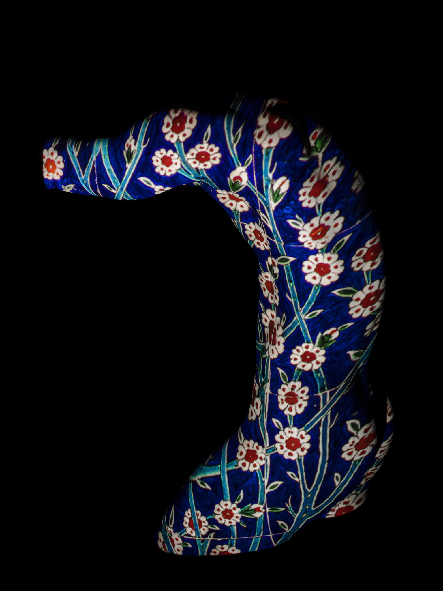
Turkish-French artist Sarp Kerem Yavuz loves photographing handsome men. His various bodies of work include sculptural photo-portraits of nude male models adorned with projected imagery of ornate Turkish Bathhouse tiles, sensuous, homoerotic photos of young American men convening in sports locker rooms (another homosocial space), and mixed media including neons, works on LED screens, and a functioning backgammon board created entirely out of Legos.
Sarp Kerem Yavuz, “Bahçivan,” 2022. Glicée print, 40 x 30 in. Courtesy of of the artist.
Thematically, Kerem Yavuz’s artwork is a reflection of himself: both Turkish and gay. These two elements haven’t historically been able to mix without conflict in his life, and he has always been interested in exploring those challenges. “For the last decade, I’ve been interested in deconstructing masculinity within an Islamic context. I often do this by queering (arguably already queer) orientalist imagery. My largest body of work to date, Maşallah, comprised of scanned Iznik tiles and later, scanned porcelain dinnerware, projected on male nudes to talk about the superimposition of conservative politics onto my generation. I would also periodically visit various Turkish baths to create cinematic scenes that were meant to imply the existence of broader, imagined, queer narratives unfolding in these traditional homo-social spaces. I guess I could say that I was always more interested in the story than the particular medium, although I am partial to photography.” Now that he lives and works in New York City, Kerem Yavuz is able to openly express these two important facets of his identity without suffering censorship from the Turkish government and death threats, among other significant challenges he has faced that many people may not have the courage to stand up to in the name of creative expression.
Sarp Kerem Yavuz. “Boğaz,” 2023. Polaroid. 4.2 x 3.4 in. Courtesy of the artist.
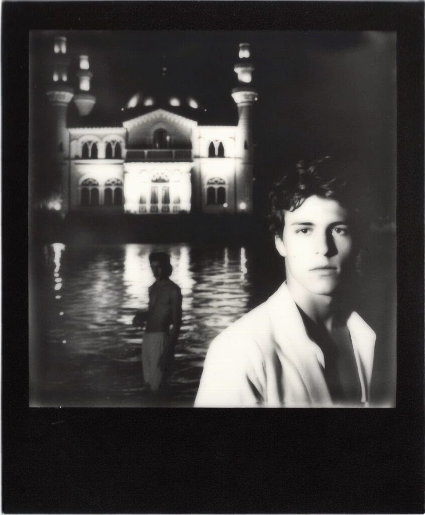
This year, he expanded upon his traditional art and photography practice by utilizing the AI software, Midjourney, to create AI-generated imagery for his latest series: Polaroids from the Ottoman Empire, currently on view at Palo gallery in NoHo. He discovered Midjourney “while looking into new digital art trends…its aesthetic capabilities felt more in line with my style than Dall-E.” The cinematic images on view in the exhibition Polaroids from the Ottoman Empire include images of two fit, ostensibly Turkish, shirtless men romantically gazing at the moonlight over a Mosque along the Bosphorus, a bejeweled drag queen making her grand entrance in an invented 1920s-style speakeasy nightclub in Istanbul, and bust-style portraits of handsome, turban-clad men gazing seductively at the viewer from inside a Hammam setting, among other fantasy, homoerotic, faux-vintage Turkish narratives.
The lighting in each of Kerem Yavuz’s AI-generated images is filmic and romantic, with mainly dark or jewel-tone color palettes. There are also a few black-and-white shots included in the series, which feel a bit out of place when thinking of traditional Polaroids. Some of Kerem Yavuz’s AI images are reminiscent of the style of a Jacques-Louis David painting, among other art-historical references and sources of stylistic inspiration. The Polaroid borders Kerem Yavuz chooses to print each image within – because no one likes to see a Polaroid without that iconic built-in bottom-heavy frame – are black, white, or gold. Before framing, Kerem Yavuz finally mounts each printed Polaroid on a mat, which represents a common color of velvet in traditional Ottoman interior decorating.
Importantly, Kerem Yavuz also shoots with real Polaroid film in a different series of his work, Shadows of the Empire, photographing staged scenes of his friends in Istanbul that comment on parallels between LGBTQ+ and women’s rights being taken away in both Turkey and the United States in recent years. “Shadows of the Empire” is currently on view at Zero Bond, where he is this month’s artist in residence via Apostrophe gallery. It is not easy to tell the difference between Kerem Yavuz’s real Polaroids and his AI-generated Polaroids. It’s clear Kerem Yavuz is using AI to mimic and expand upon his own photographic language, rather than copying another artist’s style: a major current plagiaristic danger of AI in the digital art space.
Sarp Kerem Yavuz. “Away,” 2022. Gold Frame Polaroid, 4.2 x 3.4 in. Courtesy of the artist.
For Kerem Yavuz, as both a traditional photographer and AI artist, the inevitable element of financial investment also comes into consideration. Kerem Yavuz elaborates, “I think most people who insist on traditional photography tend to forget how extraordinarily expensive high-end digital photo shoots are. Buying a decent medium format digital camera, which is what I have been using for the past decade, runs you between $10,000-$20,000. You can rent, but then you also need to get really good equipment insurance so that tends to be around $1000 for a week of shooting, just for a camera with a regular lens attached with a spare battery and some flash drives, (not including any lights, stands, sandbags to keep the stands where they are, portable batteries, backdrops, studio space if you need it etc.). Then, there is the additional cost of paying models, assistants, and the time cost of processing and editing the images, plus transportation if you are shooting on location. I have done all of these for years, and I have greatly enjoyed the process, but it is a costly endeavor, which often means you need commercial work to be able to afford to make artistic work. It is also incredibly time consuming. AI photography, at least in the way I have been engaging in it, feels a little more like street photography, where the production element is removed in favor of chance and spontaneity. It’s trickier to get what you want, since there is inevitably a lesser degree of control, but it does offer a greater degree of access to people without the means or the network to dive into photography as it is structured today.”
Whether shot in the flesh or rendered digitally, iconic gay male nude portrait photography can call to mind the explicitly sexual, stark, sensuous, and formidable black and whites by Robert Mapplethorpe, or perhaps the striking, colorful photography of nude or semi-nude male dancers and religious figures in fantastical staged scenes by David LaChapelle. Unlike Mapplethorpe’s homoerotic photography, Kerem Yavuz’s is understated in its eroticism. Unlike LaChapelle’s staged fantasy photography, Kerem Yavuz’s imaginary gay scenes incorporate an Ottoman visual language and color palette. Kerem Yavuz has his own visual language, and experiments with the reverse process using Midjourney to see how it categorizes his original images. “What is fascinating about Midjourney and other internet-based algorithms is that their ‘imagination’ is ultimately shaped by whatever dominates the web. Midjourney has a fun tool that allows you to upload your own images and have it describe them to you. With my photographs, it often says ‘in the style of Hasan Hajjaj’ which is flattering, as I love his work, but I was never inspired by his practice and our aesthetics are quite different. It just goes to show that online media and discourse around Middle Eastern imagery has a long way to go.”
Sarp Kerem Yavuz. “Sahilde,” 2023. Polaroid. 4.2 x 3.4 in. Courtesy of the artist.
The subtly erotic and Middle-Eastern qualities of Kerem Yavuz’s photography stem from his relationship with his father, or the idea of “the father-son relationship.” When Kerem Yavuz came out at age thirteen, his father did not accept his homosexuality and was consequently absent for most of his life. Today, the two are estranged. When asked if he knows other artists working with the idea of the father-son relationship, Kerem Yavuz replied that the father-son relationship is a very vulnerable topic, in almost a banal way. He commented, “Mapplethorpe’s hypersexualilty functioned almost as a protective armor – people don’t accept regular male vulnerability, which is what my work speaks to.”
Another through line in Kerem Yavuz’s artistic career is he is frequently ahead of the curve as an innovator, which, he commented, “can be lonely at times when no one yet understands [his] ideas.” AI is a contentious topic worldwide in industries spanning art, tech, medicine, politics, law, advertising, and many more. In photography specifically, it is already a topic that has entered the forefront of the conversation. Recently, German Photographer Boris Eldagsen won a photography award with his AI-generated photograph (created on Dall-E 2 software), The Electrician, at the Sony World Photography Awards, and declined to accept the award because of his concern for how AI will affect (and compete with) the photography world overall. That perspective is understandable, as the judges of the award were unable to discern his AI-generated photograph from real photographs in the competition.
Kerem Yavuz’s AI Polaroids and “real” Polaroids also look similar to one another. There is something about the people or settings in the AI-generated images that is a “little too perfect,” which can give them away upon close examination, but it’s not always obvious which are which. The catch is that none of the people or places in the AI-generated imagery are real, and they all appear to exist in an unknown, historical place and time in a Turkish, Ottoman past. They’re like memories from a homoerotic dream version of Istanbul during the Ottoman Empire, that never existed, nor would have been able to exist, because of the Ottoman Empire’s extreme homophobia. Kerem Yavuz commented on his inspiration for the series,“I loved the notion that in a parallel universe, I would have been traipsing around a present-day Ottoman Empire, photographing my queer friends in various places in Istanbul.”
Sarp Kerem Yavuz. “Banyo,” 2023. Polaroid. 4.2 x 3.4 in. Courtesy of the artist
Even though Kerem Yavuz’s AI-generated images look – in one way or another – “real”, with Kerem Yavuz’s title of the series, he “confesses” another hint into the photographs’ fictional origins: while the Ottoman Empire ended in World War I, Polaroids were not invented until World War II. Therefore through just his title, Kerem Yavuz lets viewers know his Polalroids from the Ottoman Empire are technical impossibilities.
For Kerem Yavuz, Polaroids from the Ottoman Empire is also about the “believability” of images in the current AI era. However, questioning the believability of photography, while now heightened due to AI, isn’t new. Falsified imagery in photography has been explored since Yves Klein’s 1960 Leap Into the Void, in which Klein created an early, analogue visual illusion to “document” a man jumping out of a window even though it never really happened. Edward Weston’s 1920s and ‘30s vegetable still lives, Peppers, look at first glance like black and white photo portraits of muscular male torsos, tricking the eye at first glance. With the eventual invention of Photoshop and an infinite array of postproduction effects and image-generating software, the notion of photography as solely a medium that documents reality is nearly a century gone. Kerem Yavuz’s decision to print his images on Polaroids is another layer of his trickery: “Polaroids bring a plausibility to the narrative because we are culturally conditioned to think of them as documents. No one thinks a Polaroid is faked, even though the technology to expose images onto a Polaroid digitally has existed for a decade,” he emphasized.
To create the AI Polaroids, Kerem Yavuz teaches Midjourney software how to make an image look gay, glamorous, exotic, romantic, antique, Ottoman, or express other features simultaneously, using his words. He even gets specific in the sense of telling the software, “make this image look like it was shot with a Nikon 110 millimeter lens,” or “give me an image of two men in front of a mosque in Istanbul in the style of Jodorowsky,” and the software generates that effect or visual. Through repeated processes of trial and error, Kerem Yavuz communicates different combinations of these key words to the software until he gets his desired imagery in return – a tedious practice that requires a lot of patience and nuanced communication between man and machine. Each time, the AI software transforms Kerem Yavuz’s permutations of adjectives into generated imagery based on other imagery it has been introduced to previously online. Kerem Yavuz explains, “In photography, we often shoot the same shot hundreds of times with small tweaks and iterations. This also applies to AI-generated imagery, where sometimes Midjourney will give me almost what I’m looking for, but not quite, so I will spend hours telling it to iterate on one specific thing. Sometimes, in both cases, the image just doesn’t work. Or you end up needing to edit in post.” As result of the collaboration between Kerem Yavuz and Midjourney (which actually lives on Discord – a platform he describes comically as “the unholy love child of Reddit and WhatsApp”), the scenarios in the imagery look, to some degree, believable.
A serious problem with this, that Kerem Yavuz recognizes and addresses, is Midjourney software’s inherent biases. He remarked that he has noticed, through his use of this software to create his imagery, that if he asks it for an image of “two handsome men,” it will most often provide images of two white men. If he asks for “two gay men,” it will similarly give him images of men covered in rainbow clothing, or holding Pride flags. It barely understands when he asks it for images of “two men kissing” and shows him images of two men pecking on the cheek rather than engaged in any type of romantic kissing. There is very obvious heterosexual, white, cisgender bias in this process that Kerem Yavuz continues to notice, critique, and do extra work to find ways around to get his desired image results, repeatedly putting the technology to the test.
Like artists and photographers working throughout history, Kerem Yavuz is working with the technology of his time. It’s not long ago that everyone was talking nonstop about NFTs – now, the new buzzword is AI. There’s inevitably a coalescence of the two as well. Many question if either of these two technologies have potential to exist on par with more traditional art forms. But, more than just buzzwords, there is real artistry in the conceptual aspect, detailed communication technique, choice of software, printing and exhibiting decisions, visual composition, color palette, light source simulation, and more that Kerem Yavuz employs to create his AI-generated imagery for his Polaroids from the Ottoman Empire.
Conversations today about AI – across industries and contexts – often involve sensationalist notions of “Is it good?” “Is it bad?” “Is it scary?” “Are we doomed?” What I think Kerem Yavuz is proving with Polaroids from the Ottoman Empire is that there is a way to authentically make original art using AI software as a tool. When executed thoughtfully and with the level of care and critique he uses, art creation becomes one of the technology’s positives. He concludes, “In its current form, I feel like AI is making poets of us all, and I find that delightful.”
Sarp Kerem Yavuz’s solo exhibition Polaroids from the Ottoman Empire is on view at Palo Gallery until July 1st, 2023 and Shadows of the Empire is on view at Zero Bond.
Still. Life., a strong solo exhibition of sizeable still life paintings by Australian artist Zoe Young, opened October 15th as the third successful exhibition collaboration between Gruin Gallery, founded by formerly New York-based gallerist Emerald Gruin, and domicile (n.), an innovative East Hollywood multi-modal artist project space created by Cyrus Etemad and curator Margot Ross. Still. Life., Young’s first breakout solo exhibition in the U.S., will remain on view at domicile (n.) in LA’s Merrick Building until November 22nd , 2021.
Zoe Young and Emerald Gruin met one another while studying together at the National Arts School in Sydney over a decade ago, and have since maintained a friendship and mutual appreciation for one another’s work. Still. Life. represents a consummation of their meaningful relationship over many years.
The title of the exhibition, Still. Life., is immediately sobering. Young created all the still life paintings in this exhibition during pandemic quarantine lockdown in Australia, isolated and alone in her studio. By breaking up the two words, it poses questions and presents thoughts about these words individually. What does it mean to be still? What does it mean to be alive? What does it mean to be separated, when you’re used to being together? And, most importantly, when and how does life still go on? These reflections are all embodied in each of Young’s still life paintings.
Australia had one of the world’s strictest pandemic travel regulations, only opening its borders for the first time after twenty months this week on November 1, 2021. Young’s artistic practice frequently included portraits and other figurative imagery of people prior to the pandemic, however in lockdown, she turned to the still life, focusing on the decadence and pleasure of objects in the absence of people.
Young is a multi-year finalist of Australia’s Archibald Prize, which is considered Australia’s most prestigious award for portraiture. When there are not people around to paint, what could better express the stories of people than their things? Young’s paintings in Still. Life. are in this way imagined portraits of people, showing evidence of their tastes and existence through books, cassette tapes, food, drink, and décor without revealing their physicality.
Zoe Young, Squid ink pasta for breakfast before breakfast at Tiffany’s, 2021, Acrylic on Belgian linen, 59 x 59 x 1 5/8 ” (150 x 150 x 4 cm). Courtesy of Gruin Gallery and domicile (n.).
Each painting details one of Young’s imagined fantasy dinner parties in Tinseltown, which she yearned for while in solitude. The artist had never been to LA, but always dreamed of going to experience its patina, glamour, and allure. The lengthy quarantine she weathered only heightened her desire to bring these fantasies to life through her art: both of traveling, and intermingling with people in the most basic of ways. There is a unique joy that comes from clinking glasses and sharing food off of the same plates as others, evident in Young’s paintings.
Formally, the works show off the artist’s hand with generously applied paint and visible brush strokes. Young’s soft, Francophile color palette is optimistic, with what feels like dappled sunlight pouring into each scene and highlighting the architecture of her objects. Young’s style of painting is reminiscent of Matisse, Alice Neel, and Wayne Thiebaud. Some moments in the paintings reveal Young’s affinity for French culture by way of certain wines, cheeses, Louis Vuitton, perfume, and even a tiny French flag on a toothpick, while others such as fish heads and lemons recall 17th century Dutch vanitas still lives. One of my favorite moments in the exhibition is how, in the work “Chablis, Surf shacks + Olives”, 2021, Young paints the reflection of a striped tablecloth refracting within a white wine glass, demonstrating her attention to detail and technical prowess.
The paintings also evoke a cross-continental playfulness and sense of humor. Young’s scenes often pretend to feature L.A. beaches, but as many Australians may recognize, actually depict Sydney’s Bondi Beach. Nods to surf culture from both California and Australia make appearances throughout the exhibition, and in an Oscar Wildian fashion, Young paints herself into her work fusing her own name onto one of her painted book covers.
Zoe Young, Bribery and corruption over brunch, 2021, Acrylic on Belgian linen, 68 1/8 x 88 1/4 x 1 3/8 ” (173 x 224 x 3.5 cm). Courtesy of Gruin Gallery and domicile (n.).
Finally, many of the fruits in young’s still life paintings are fabulously mythological and sexual, such as pomegranates, strawberries, pears, grapefruits, and avocadoes; a possible commentary on the desire for human touch, absent for many in isolation during the pandemic. Several of these fruits also grow in gardens in both Australia and California, linking the two geographic regions. Emerald Gruin holds gardening dear to her heart as gardening was her mother’s lifelong passion and exceptional talent. Therefore the heavy presence of flowers, fruits and vegetables throughout this exhibition is additionally an important connection between artist and gallerist.
Young was deeply saddened believing for a long time that due to the continued lockdown in Australia, she would not be able to make it to her own first ever U.S. exhibition in LA. However, because of the recent opening up of Australia’s travel restrictions on November 1st, Young will finally travel to Los Angeles. In her honor, Gruin Gallery and domicile (n.) extended the exhibition and will be hosting a real Hollywood dinner party for Young in the gallery space, surrounded by her paintings, with plans to have the real dinner mirror the aesthetics in the paintings. It seems for this powerful, manifesting artist, that fantasies do come true.
Zoe Young, Still. Life. is on view at Gruin Gallery x domicile (n.) in the Merrick Building, 4859 Fountain Avenue, Los Angeles, CA, from October 15 – November 22, 2021.
Above, L to R: Gabriela Rangel and Pedro Zylbersztajn at Americas Society.
This article was originally published in Arte Fuse.
I love to give a work of art the benefit of the doubt that I normally wouldn’t; when something seems so obscure that I can’t figure it out. It reminds me of my first post ever on Artifactoid, and my initial purpose for art writing: to break boundaries, expand thought, contribute to the active dialogue of the field, and hone taste and values upon which to better understand both art and humanity. I recently experienced a work of performance art at Americas Society that returned me to this original idea. The performance was brickwork (2017) by Pedro Zylbersztajn, a Brazilian artist who works with technology, sound, publishing, and other media. brickwork is defined as “a physical record of the process of re/construction of language.”
When I first arrived at Americas Society for the performance, I was handed a four-page pamphlet with sections of ambiguous poetic text printed in black ink on black pages. It was difficult both to visually read and comprehend.
I then walked to the room in which the performance was being held. The performance was unintelligible, like the pamphlet. It entailed the artist sitting at a desk in the center of a room. Viewers lined the surrounding walls, looking in. There was a record player placed upon the desk, and for about 15 minutes, the artist deejayed transparent, white records on it, playing the sound of words being spoken with extremely low sound quality, almost as if the voice being sounded aloud was under water.
Witnessing this was a perplexing and frustrating experience. The words sounded aloud on the records were the artist inaudibly vocalizing the illegible text written on the pamphlet.
Zylbersztajn continued to swap out one record disc for the next in silence, until all the text had been sounded aloud in scratchy, low quality. When he placed the final disc on the player, it played the first line that the audience could hear: “this will not be my last sentence,” over and over again, until it stopped. The performance had ended. My reaction was a hope that the Q & A to follow would provide a thorough explanation, because I didn’t know how to feel after witnessing it.
Thankfully the Q & A, led by Americas Society Chief Curator and Director of Visual Arts Gabriela Rangel, revealed many intricacies of Zylbersztajn’s brickwork and contextualized it within his body of work as a whole. Rangel shared that she discovered his work while conducting studio visits at the MIT Art, Culture and Technology program, from which Zylbersztajn commenced the following day.
brickwork has to do with the process of re/construction of language. For Zylbersztajn, this relates to his “interest in the perpetual shifts and slippages in the use of language, an object [he assumes] to be individually and socially constructed and reconstructed with every new utterance, which is where this metaphor of language as a permanent building site comes from.” Words are like bricks, which can be both building blocks and political weapons. Zylbersztajn also notes that “the text references the Tower of Babel quite a lot, and this relationship of building, bricks, mortar, and language is very present in this story.”
Zylbersztajn’s idea of the black pamphlets printed with black ink as difficult to read, and his idea of the bad quality of the records as difficult to audibly process, were intentional choices. These step-by-step blockages of comprehension, via different media, each in relation to distinct senses, were part of a structured process created by the artist.
This structure (order, reception, method, execution) and texture (printing quality, recording quality) in each part of the performance were two of brickworks‘s core elements. Zylbersztajn noted that the Brazilian poet João Cabral de Mello Neto once said, “we’re people of much texture and little structure” (referring to Brazilians). It is interesting that this quote was a factor that inspired Zylbersztajn to create an equivocal artwork that isolates structure and texture.
Additionally, the audience’s discomfort, related to both the inability to read the text and the inability to hear the recorded sound well, is representative of the artist’s emphasis on the idea of opacity, another central element of the piece. Opacity has a tradition in poetry, and it is also a political concept. It was the element that created a tension in the performance. Zylbersztajn notes, “opacity, illegibility, and the borders/limits of language are very much in the center of this work and my practice in general.” Conceptually, brickwork confronts the importance of opacity in an age of transparency, in which we are all publishing our lives via data sharing. We are accustomed to living transparently in 2018, and brickwork demands another type of interaction.
An unexpected note that Rangel’s Q & A revealed was, that the final repetition of the last line of the text, “this will not be my last sentence,” was a much more profound choice for the artist than initially perceptible. This line was inspired by a poem that the artist read following 9/11 about the tragedy’s victims, by the Polish poet Wislawa Szymborska, called “Photograph from September 11,” which ends with the stanza:
I can do only two things for them—
describe this flight and not add a last line.
According to Zylbersztajn, “this sense of impossibility and futility in that statement, which is technically a paralipsis, was something I was thinking about when I wrote my own ‘not-last-line’ or ‘not-last-sentence.’”
The artist’s choice to study at MIT also had a specific influence on brickwork. The artist custom created the records using a laser cutting technique developed by fellow MIT student, Amanda Ghassaei. Zylbersztajn explains that “regular records are made by cutting the grooves onto a wax plate, in an analog process of translating the sound to movement. Zylbersztajn explains that “regular records are made by cutting the grooves onto a wax plate, in an analog process of translating the sound to movement. This plate is then used as a matrix to create vinyl copies that have the same grooves which can be ‘read’ by the player’s needle. The process that I used, which was developed by Ghassaei, converts digital audio into lines that simulate the movements of the analog grooves, and these lines are then laser etched into a surface. The needle reads it in the same way, but the material, the definition and the digital-analog conversion don’t allow for hi-fidelity, and there are some other interesting quirks, such as the fact I explored of the decaying sound quality in function of the radial dimension of the record.” Zylbersztajn decided to utilize Ghassaei’s records for this performance piece as the vehicle to play his own voice recording of the text in the pamphlet in an indecipherable and degenerative way. This comments on the materiality of the records, and presents them as objects that mediate communication. Also a professional publisher in Brazil for many years, Zylbersztajn is interested in abstract forms of publishing, and the giving and receiving of information through the manipulation of various media.
brickwork conveys Zylbersztajn as thinker, publisher, DJ, poet, and researcher. This performance piece comprehensively showcased the artist’s ability to create something unique and challenging. Regarding his future endeavors, Zylbersztajn also mentioned that he is particularly interested in the concept of “art as research” and “research as art,” which is emphasized in his MIT program.
Above: Terry Winters, Untitled (Page), 2011, Graphite on paper, 11 x 8 1/2 inches. Courtesy of the artist and Matthew Marks Gallery, New York.
By Jonathan Goodman
Terry Winters, one of our very best abstract artists, quietly achieves a genuine difference in effect in his works on paper, beautifully on show now at The Drawing Center. It is quite difficult to characterize this bit of originality available in the works, which manage to be both geometric and organic at the same time. Perhaps it has to do with an organizing intellectual principle that shows up regularly in the the body of work. This has been remarked upon before; the design, then, of the images tends to read rationally even more than we see the pattern as an intuitive construction. Working like this, generally within the idiom of the New York School, makes Winters look analytically perceptive in a field that doesn’t always take such a point of view to heart. At the same time, this body of work brings up conceptual notions of pattern and organization that we don’t associate at all with the expressive abstraction that has come, more or less, to take over much of the recognized image-making available in New York. Indeed, it is best to understate the long arm of the New York School, which, tentacle-like, has established a domain that many may feel constrained by. This has nothing to do with the genuine achievements of the style, but its current ubiquity has a lot to say about the vagaries of the market, which everyone downplays but no one can afford to ignore.
But, even so, even if we acknowledge the unusually strong achievement by an artist like Winters–and we should do so–we also need to recognize the need for a new idiom, one that would neither supplant nor replace what we already have, but would rather add to the tightening conditions that have resulted from the obligation to promote sales and maintain the market. What the details of this new style might be seems impossible to imagine ahead of its time; one might argue for a hybrid recognition of figuration and abstract insight. But this is only a guess, and our chief focus here is the very good work of Winters, whose combinations of styles and patterned phenomena begin an argument for difference–even when we acknowledge his late stage of lyric abstraction. This kind of work, like all the abstraction we see today, has its origins in the consequences of modernism and its investigations into a language that would resist realism yet be visually stimulating within the innate paradigms of the genre: color, shape, line. Winters’ work is so very good it can be thoroughly enjoyed even though it is not committed, on a conscious level, to a visual idiom that repeats thinking in love with the past, nor does it demand social equity, the major focus of much art today.
The task facing the New York art community–artists, curators, gallerists, and viewers–is to engender a language that will not plummet in the face of already established visual vernaculars. The same is true in poetry–which offers a sorely needed expressiveness that is ignored because of its inability to generate assets that could yield profits greater than the high two figures! We are all more or less in a standstill in the arts, but that doesn’t mean imagery and language can’t continue to develop. Still, it is extremely hard to cut a path out of so deep, and so monetarily oriented, a forest. Some work making use of comic-book imagery, as happens in the art of Robert Williams, offers an alternative to the stranglehold of gestural abstraction, and it is also true that ambitious artists such as Nicole Eisenman and Dana Schutz are establishing a striking, if also highly idiosyncratic, style whose rawness rejects almost all historically established approaches in realism. In counterpoint, Winters clearly seems content to work out a point of view that is both intuitive and analytic, with a conceptual edge directing the overarching design he submits his individual elements to. It is the conceptual edge–a form of analytic intelligence–that saves Winters from the vapid repetition characterizing so much contemporary abstraction. It is clear he is smart, and it is clear that his intelligence saves him from a romantic emotionalism–now, sadly, keyed to the bank.
Terry Winters, Untitled (Page), 2011, Graphite on paper, 11 x 8 1/2 inches. Courtesy of the artist and Matthew Marks Gallery, New York.
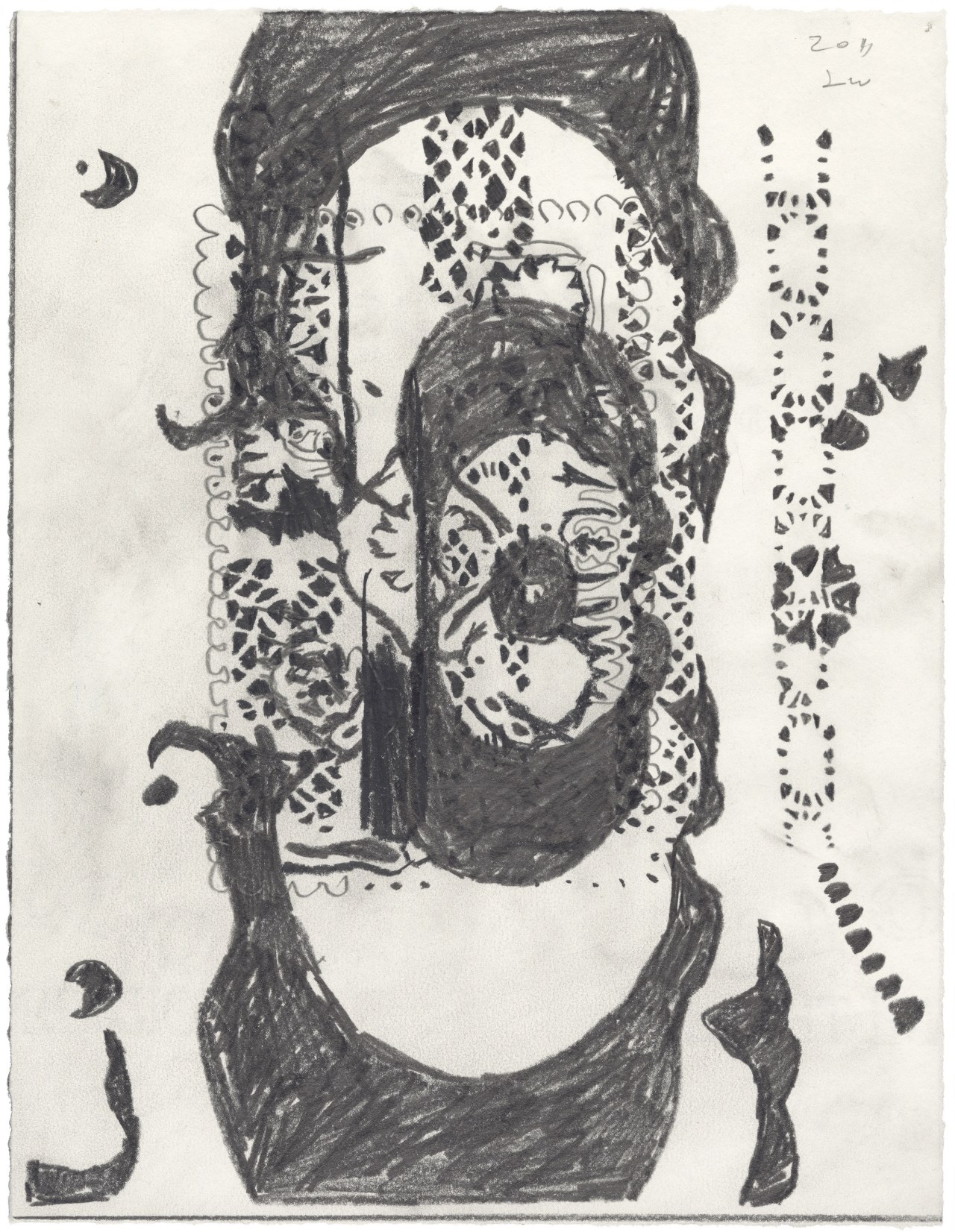
In one 2011 work, Untitled (Page), consisting of graphite on paper, the patterns are particularly evident. Looking overall like a flower, the image is composed of small diamond-shaped forms arranged in slightly curving rows. They elaborate an image of true elegance and vibrancy; the center of the bloom bulges slightly, giving the image its three-dimensional cast. This kind of drawing is deliberately arranged, so that its composition relates to systems theory as well as natural phenomena, like a beehive, that present an ordered facade. Images such as this one play with differing means of organization, both tight and free. In many of these drawings, Winters does lean toward imagistic cohesion resulting from an organized architecture. Usually, we think of lyric abstraction as something intended to be emotionally free–even liberating for a studious audience. But good art can also belong to rational procedure, which can stabilize emotion so that it does not turn wild. Perhaps we can build a point of view that serves as an opposition to the supposed liberation of feelings focused on alone. In this case, the imagery would be influenced by moderation and restraint–virtues that are suggested, if not overly weighted, in Winters’ art.
Terry Winters, Schema (57), 1985–86. Graphite and watercolor on paper, 12 x 8 1/2 inches. Private collection.
But the argument for a rational outlook can only be taken so far. It is as much a wish as it is a perception; the extravagance of feeling often seen in art of the New York School cannot be evaded in the way Winters works. In one recent drawing, Schema 57 (1985-86), we see a dark sphere whose surface is covered with equally spaced, darker holes. Above it is a quincunx of sorts–five dots, each a different color, surround an outline of a circle. There is little overarching organization–merely a suite of dots just above a rough ball of an image. We are hesitant to openly determine meaning in this case, or in the rest of works on paper. Visual abstraction, fervent or muted, cannot have its message unpacked like a symbolist poem. It exists on its own terms, without a visible social reality accompanying it. Critics can try to socialize the conditions of formalism, but it looks like this movement is best considered on its own terms, rather than being politically contextualized.
Terry Winters, Untitled (2), 1999, Gouache on paper, 44 1/4 x 30 1/2 inches. Private collection.
The last image to be discussed in this review is Untitled (2) (1999), a stack of four horizontally oriented lozenges, outlined and partially filled with thin lines that are drawn on a monotone ground. It is a fine, resolutely nonabstract image–one that asserts the primacy of esthetic independence. Maybe Winters’ autonomy underlies the strength of his art; he is not easily joined to other artists’ styles. The best art both reflects and transcends the Zeitgeist, and perhaps this is the case with regard to the work we see here. To summarize, Winters is important to contemporary art, but his competence–indeed, his excellence–also indicates how stuck we have become in the protracted pursuit of a style that, like all styles, is constrained by a limited trajectory. If this point has been repeated a bit too often, it is because the need to move on is reflected in the history of the New York School–Sean Scully’s merger of abstract expressionism and minimalism is a good example of a painter’s refusal to walk the same terrain. So it can be done. Winters looks original still, but within a history we know exceedingly well. We may have had too long a romance with newness for its own sake, but this is the demand we currently place on the imagination. Winters’ very fine show demonstrates the real need to make use of a language that not only looks backward but ahead.
Jonathan Goodman is an art writer based in New York. For more than thirty years he has written about contemporary art for such publications as Art in America, Sculpture, and fronterad (an Internet publication based in Madrid). His special interests have been the new art of Mainland China and sculpture. He currently teaches contemporary art writing and thesis essay writing at Pratt Institute in Brooklyn.
I love artwork by Louise Bourgeois. Her recent show at the MoMA was beautiful and you can see her sculptures in the permanent collection at Dia: Beacon. Up to and following her death in 2010, her dark, sensuous surrealism (consciously or not) continues to influence a new generation of artists. While not always as heavy nor activist as Bourgeois in their subject matter, these artists each reference certain elements of her style in original ways. Here are four that are remarkable.
Rita Ponce de Leon‘s (b. Lima, 1982) work comprises surreal drawings and sculptures that gain power from their delicate intimacy. She works with pen on ink, clay, and Papier-mâché among other media. Last year I saw her beautiful installation at Proyecto AMIL in Lima that showcased many of her techniques, including heated sculptures to hold in your hands and drawings directly on the wall that scaled from floor to ceiling in the ample exhibition salon. Ponce de Leon is represented by Galeria 80m2 Livia Benavides based in Lima, Peru.
Geng Xue‘s (b. China, 1983) visceral ceramics captivate the imagination and bring us closer to our humanness. Attuned to sensory experience, Geng Xue often incorporates elements such as sound into the works, as in the above pictured piece, “Oceans Roar.” Geng Xue also creates animations that bring the pieces to life.
C.J. Chueca (b. Lima, 1977) grew up moving nomadically between Perú and México, where she frequently came into contact with homeless people, nursing home residents, and psychiatric patients. According to a 2016 exhibition essay on her work authored by critic Eleanor Heartney, these experiences “stoked a deep sympathy for the dispossessed” in Chueca. Chueca’s porcelain wall reliefs are portraits of homeless men and women from her memory, modeled after assemblages of found objects.
Jasmine Little (b. Virginia, 1984) is a technically gifted surrealist painter and sculptor whose works draw from emotion, memory and nostalgia rather than physicality. While most often related to Chagall or Matisse, there is something about the visual style and sensitivity of the pieces that recalls Bourgeois for me. Little is currently having a solo show, Hoodoos, at Johannes Vogt Gallery on the Lower East Side through April 28th, 2018.
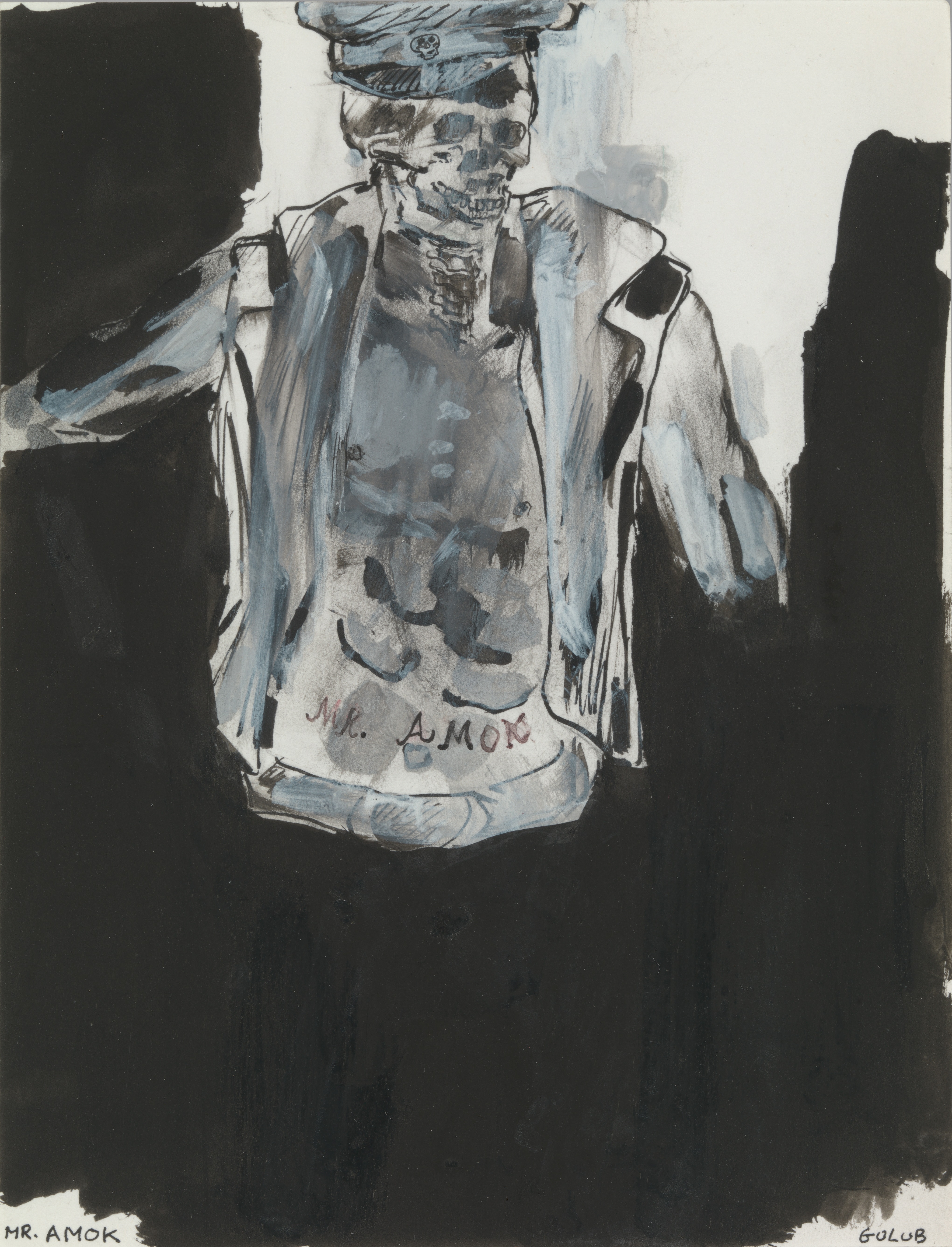
Leon Golub’s show at the Met Breuer shows him to be an allegorical artist working by way of polemics, although he cannot be faulted for cynical, self-aggrandizing intentions. Formally, his work is problematic. It is often muddy and unclear. This lack of clarity holds sway over the subject matter as well–it is not clear what unhappy situation Golub is referring to, although, generally speaking, we know the paintings are about torture and murder in Latin America, as well as racial contestations in South Africa. But we know these things from outside information; they are not available in the paintings themselves; this historical vagueness exists in contrast to the great political painting, whose outrage can always be dated to a specific event. Witness Goya’s The Third of May 1808, which documents Spanish resistance to Napoleon’s army during the Peninsular War. A similar particularity is not found in Golub’s art.
I am not trying to undermine Golub’s intentions, which are entirely honorable. Instead, I am criticizing the American penchant for casual political internationalism at a time when so much here in the States is so very wrong. The well-known and well-regarded poet Carolyn Forché traveled to El Salvador to document the political suffering there in the 1980s. Many see this as a noble attempt at social empathy, but I wish to counter that opinion by suggesting there is something unreal about the writer’s decision to concentrate on political events outside her culture. It is clear that Forché’s motives are of the highest kind, and it is also true that artists and intellectuals have often shown international solidarity with causes not directly affecting them–witness the extraordinary example of the British-born, American-based classicist Bernard Knox, who fought in both the Spanish Civil War and the Second War. But, even if we recognize the intensity of moral purpose in Forche’s poetry and Golub’s paintings, the implications of their supposedly empathic response to suffering so far away from them cannot survive in full trust.
Why is this so? First, it is clear that other cultures are much better than American culture in addressing political suffering. Think of Pablo Neruda, from Chile, or Cesar Vallejo, from Peru. These artists managed to produce writing whose political effect is authentic. But, in America, while poetry readings given in opposition to the Vietnam War were certainly earnest, I cannot remember a single poem whose art rose to the level of work by the Spanish-speaking writers I mentioned. As for Golub–it goes without saying that his sympathies were genuine. But it is also true that his paintings of mercenaries don’t ring as being entirely believable. The paintings cannot be fully trusted–as good as they are!–because our manner of life here is both comfortable and socially autonomous, making it impossible to free ourselves from the trappings of privilege. Gigantomachy II (1966), a huge painting facing the elevators of the Met Breuer, continues our penchant for an imagined connectedness with trouble, on a mythic level. The word “gigantomachy” refers to the battle between the giants and Olympian gods in Greek mythology, and Golub portrays the conflict in epic style. Two groups of figures, all of them naked, fill the dark-brown background. Painted as if their skin had been flayed from their body, the combatants grip and lunge and push each other in some obscure conflict, a close-to-mad attempt to establish dominance.
It is clear that Golub has painted an arresting, if murky, tale of violence by men toward other men–a theme he returns to again and again. Man’s inhumanity to man is regularly lamented, but we won’t break free of the wish to overpower our opponents. Gigantomachy II owes its power to our recognition of the conflict, but its mythic origins lie at the center of the painting. In the later works, based on actual history and places, Golub loses mythic power but gains in realism. Almost always, Golub’s audience must read the wall plaques to gain a sense of the situation being referred to. In the painting Two Black Women and a White Man (1986), two black women sit on a bench against a yellow wall. They are old and poor; both wear hats, and the woman on the left holds a cane. On the right, a vigorous white male, in his forties, looks away from the women; his gaze goes beyond the confines of the painting. He is wearing a red, short-sleeved shirt and khaki pants; as a male figure at the top of his game, he is young and powerful and seemingly indifferent to anyone’s complaint, the black women next to him included.
The man’s overt lack of feeling is both a report and a judgment. He doesn’t give exact details, so we assume it is a work reporting on conditions where segregation, or at least profound prejudice, exists–perhaps South Africa. One might argue that not knowing the painting’s circumstances helps the artist convey the general banality of evil, but the fact remains that our inability to pinpoint the situation is disturbing enough to result in a false first step in interpreting the composition. The elements of the painting seem to be at cross purposes with each other; none of the three figures interacts with the other two. There is an implicit loss of faith from the start. Whatever the particulars of this composition may be, it is clear that the main atmosphere in which the three figures are engulfed is just shy of overt hostility.
It may be that the best art contains a realism based on experience and a more imaginative view of that experience. But what if the violence is indescribable in its extent and quality? Maybe Golub is leaning toward the allegorical because a truthful report would be so troubling as to do away with its esthetic potential. The aggression in Golub’s paintings is usually indirect–although also truthful enough in its report for his viewers to be able to imagine the aggression clearly. It is true enough that art cannot match real life, but it can embellish–and deepen–our understanding of things.
Golub was also interested in depicting inequalities of power in gender relations. The painting discussed implies but does not directly address gender inequalities. In Horsing Around IV (1983)–the “Horsing Around” series is based on photos of mercenaries from Africa and Central America (Golub often worked from photos)–shows a white man, with a hideous face, grinning, holding a bottle of liquor, and pulling at the white blouse of a black prostitute with short, straightened hair. The woman’s dark-brown dress ends above her thighs, and she is laughing as well, although her seeming happiness is clearly being paid for.
The prostitute sits on a bar stool, her breast revealed. Golub is making an open connection between political and sexual violence. As takes place in most of Golub’s paintings, the violence is implied rather than actual. In general, this show reveals Golub’s disgust with the behavioral excesses of power, both public and private. He is telling us that the mercenaries are more than dead souls; they are active perpetrators of malevolence. But the problem of generalization in his art remains. Violence is never generic but always specific–a particular person is doing something to a particular person. If the details are left out, the visual narrative becomes allegorical and symbolic. Despite Golub’s claim on our sympathy, true empathy is not achieved. These works portray images meant to introduce sympathy in a nearly stereotyped manner; Golub reports more than empathizes.
But reportage, a journalistic rather than an imaginative endeavor, usually results in intellectual insight rather than empathic identification. This is the problem facing all of us who have had the good luck to evade the kinds of tragedies Golub paints. It may be that good fortune, in the form of material comfort, gets in the way of our ability to sympathize with the poor and the disenfranchised. In the last painting discussed, Contemplating Pre-Columbian (no date), we see a full skeleton drawn in red chalk. The figure is in a sitting position, bent over, and with its arms bent at the elbows but also rising upward. Beneath the skeleton is a pre-Columbian skull, with a full set of teeth. The image is distraught, though there is no way of telling so. Perhaps Golub is acknowledging his own frailties: advancing age and death.
Golub feels like a major artist, but a narrow one. He is uncommonly brave to direct so much attention to worldwide injustice, as well as paying attention to the long historical ascendancy of the male gender. But even so, criticism of his political vagueness seems justified in light of our need to know who did what to whom. His paintings are sometime too generalized. Golun evoked a feeling we don’t come across much in American art–a commitment to the portrayal of injustice on an international level. If Golub’s global politics prevents him from a precise demonstration of evil, it also provides him with the space to amplify the point that, these days, morality is heavily damaged everywhere. We now find acceptable, everywhere, what was once condemned. Golub even looks at the politics of gender relations, moving from the public to the private sphere. His outrage may be slightly too generic to be absolutely convincing, but his emphasis on the consequences of violence–physical, emotional, and mental–makes him an artist of high merit.
View Leon Golub: Raw Nerve on view at the Met Breuer through May 27, 2018.
Jonathan Goodman is an art writer based in New York. For more than thirty years he has written about contemporary art for such publications as Art in America, Sculpture, and fronterad (an Internet publication based in Madrid). His special interests have been the new art of Mainland China and sculpture. He currently teaches contemporary art writing and thesis essay writing at Pratt Institute in Brooklyn.


 Leon Golub. “Head,” 1988. Acrylic on canvas, 21 1/2 × 19 1/2 in. (54.6 × 49.5 cm). © The Nancy Spero and Leon Golub Foundation for the Arts/Licensed by VAGA, New York, NY.
 Leon Golub. “Contemplating Pre-Columbian,” ca. 2000. Oil stick and acrylic on tracing paper, 10 × 8 in. (25.4 × 20.3 cm). © The Nancy Spero and Leon Golub Foundation for the Arts/Licensed by VAGA, New York, NY.