
Above image: Olek installing Project B in 2010. Image courtesy of Olek on Vimeo.
By Alexandra Goldman
If you never saw it in person, you’ve probably seen an image of Project B at least once. The original guerrilla art installation was only up for a few hours before it was taken down by the city, but its viral visuals live forever online. For the ten-year anniversary of Project B this Christmas, I’ve decided to take a closer look at the project and the person who created it, the Polish artist Olek, née Agata Oleksiak, (b. 1978, Staszow, Poland). I’ve found it is a story about ritual, iconoclasm, and two different New York-based immigrant artists who wanted to see the United States doing well. It’s also strongly connected to Olek’s Polish roots.
Charging Bull has become a known site of protest on its own in New York and the subject of several acts of iconoclasm, especially since the 2011 Occupy Wall Street movement. It has had paint doused on it in 2017, and had dye poured on it, and its head bashed with a spiked banjo in 2019, for causes ranging from anti-financial corruption, to protecting the environment, to anti-Trump demonstrations. Because of this, there is a current conversation about relocating it. Olek’s wrapping of the bull with yarn has been the most peaceful form of altering the statue while still having a big impact. It is similar to how the artist Dustin Klein created a light projection of a portrait of Breonna Taylor to project onto the controversial statue of Robert E. Lee in Richmond in July 2020 as part of the BLM movement. Both yarn and light can be used as peaceful strategies for acts of iconoclasm on monuments.

Olek installing Project B in 2010. Image courtesy of Olek on Vimeo.
For background, in 1989, Italian immigrant sculptor Arturo Di Modica (b. Sicily, 1941) originally installed Charging Bull on Wall Street at Christmas time. He had a studio on Crosby street, and without city permission he and a group of friends delivered by truck the self-funded sculpture in front of the New York Stock Exchange. He intended the sculpture of the known market symbol as a “Christmas gift” to the city symbolizing “the strength and power of the American people”, two years after the October 19, 1987 stock market crash known as “Black Monday” (the worst crash since 1929). Within hours, Charging Bull was removed by the city and taken to a warehouse for storage, before it was later legally relocated to Bowling Green.
Twenty-one years later, at around 2:00 am on Christmas Day 2010, without city permission, Olek wrapped Di Modica’s sixteen-foot, 3.5-ton, bronze Charging Bull with bright pink (with hints of purple, teal and gray), camouflage-pattern, hand-crocheted yarn that they created without assistance. Olek titled the guerrilla intervention Project B or Project B (Wall Street Bull), which is actually absent from the majority of articles about the project.
Replicating Di Modica’s timing, two years after the severe 2008 market crash and also at Christmas time, Olek revived Di Modica’s original guerrilla intervention through Project B by wrapping Charging Bull with their camouflage crocheted yarn. Similar to Di Modica, Olek considered Project B their “Christmas gift” to the city or a “Christmas sweater” for the bull, in effort to uplift the country following the most recent financial crisis. According to the artist, Project B was a symbolic public gift for all those who couldn’t afford holiday presents that year or were unable to visit their families. Olek’s strategic reenactment of Di Modica’s timing (both after the financial crash and time of year), guerrilla-style action, and gift-intention categorize Project B an act of ritual. Olek later confirmed that it was a ritual, and prior to wrapping Charging Bull with yarn, they carried out a series of Polish Christmas rituals: “Christmas eve is a special day for Polish hearts. That night, animals speak human voice. I cooked a traditional dinner, and went to pasterka (midnight mass),” they explained.
The idea of revitalizing statues through ritualistic actions such as wrapping them with colored cloth is not new. It even dates back to Ancient Egypt, during which kings and priests would drape colored cloths around statues of deities during their daily offering ritual ceremonies to the gods to revive their ka, or, inner spirit. In Ancient Egypt, the colors of the cloths during the daily ritual had specific meanings for the ceremony to either refresh the deity (green cloth) or reaffirm its holiness (red cloth).
Olek’s use of the color pink for ritual cloth statue wrapping, when combined with the historically feminine medium of crochet, has given cause for some to consider Project B a political, iconoclastic act by the artist amidst Wall Street’s hyper-masculine environment. While noting Olek prefers to avoid the limitations of categorizing their art as “yarn bombing”, yarn bombing (street art involving yarn), is historically rooted in third-wave feminism during which domestic arts were celebrated. Project B is therefore on one hand, Olek’s public critique of the imbalance of the hyper-masculine environment of Wall Street and the failures of power imbalance.
However, rather than pitting the genders at war with one another through Project B, Olek was expressing maternal caretaking, the need for balance, the importance of self-love, and love of others. Olek, an immigrant from a formerly communist country, felt the need to symbolically take care of a failing capitalist system and lift it back up. Olek created a Yin-Yang duality whereas before there was only Yang energy.
Olek also believes all art is a self-portrait. Through spiritual exploration, Olek identified in recent years as gender nonbinary and considers themself to be a “two-spirit being”, fully male and fully female simultaneously. Wrapping the masculine, muscular, bronze bull with the feminine, soft, pink, crochet resulted in the temporary creation of a powerful, mirroring, two-spirit being in the public space of NYC’s Financial District.

Olek hugging Project B. Image courtesy of Olek on Vimeo.
Furthermore when I first met Olek at Art Basel Miami Beach last year, I became interested in their work because it immediately felt very Polish to me, and I was interested in the fact that none of the articles I was reading about Olek’s work spoke about how Polish it was. I have Polish heritage, and traveled to Poland in 2009.
I was driving from Czestochowa to Krakow in 2009, and noticed all the buildings were Brutalist gray rectangles or squares. However, every so often some stretches of buildings, that seemed to be apartment complexes, were painted over with wide, vertically striped swathes of rainbow colors. I asked my Polish friend why some of the buildings were painted over like this. She replied that after communism fell some cities and towns celebrated by painting buildings bright colors since the government didn’t allow any deviation from uniformity during communism. Similarly, Olek’s art intervention tactic of using a bright burst of color in homogenous gray public space with Project B represents their Polish way of expressing freedom from oppression.
The idea of combining the media of fiber art and sculpture also has roots in Poland. The artist Magdalena Abakanowicz (b. 1930) is a famous Polish sculptor who works with fibrous materials. According to the MoMA, “Abakanowicz and many artists of the Eastern Bloc were drawn to craft and textile traditions as expressive mediums less regulated by Soviet censorship.” When Olek first came to the U.S. with no money in 2000, their sculpture professor at La Guardia Community College also encouraged them to begin sculpting using any material, including yarn.
In our recent Zoom interview, Olek explained that while growing up in communist Poland, being an artist – or expressing individuality of any kind – was highly discouraged, and art galleries and museums were reserved for the elite. Olek believes they never could have fully become who they are as an artist, or individual, if they had stayed in Poland and not made the courageous decision to emigrate to New York. While Olek critiqued the failing power imbalance that Charging Bull came to represent with Project B, Project B was also Olek’s renewal of Di Modica’s celebration of possibilities and resilience available in a capitalist country, presented by an immigrant artist who couldn’t have had their career without its benefits. Their own experience of feeling excluded from art institutions while growing up poor in Poland led to their dedication to public art that can be accessed by anyone.


 Leon Golub. “Head,” 1988. Acrylic on canvas, 21 1/2 × 19 1/2 in. (54.6 × 49.5 cm). © The Nancy Spero and Leon Golub Foundation for the Arts/Licensed by VAGA, New York, NY.
 Leon Golub. “Contemplating Pre-Columbian,” ca. 2000. Oil stick and acrylic on tracing paper, 10 × 8 in. (25.4 × 20.3 cm). © The Nancy Spero and Leon Golub Foundation for the Arts/Licensed by VAGA, New York, NY.
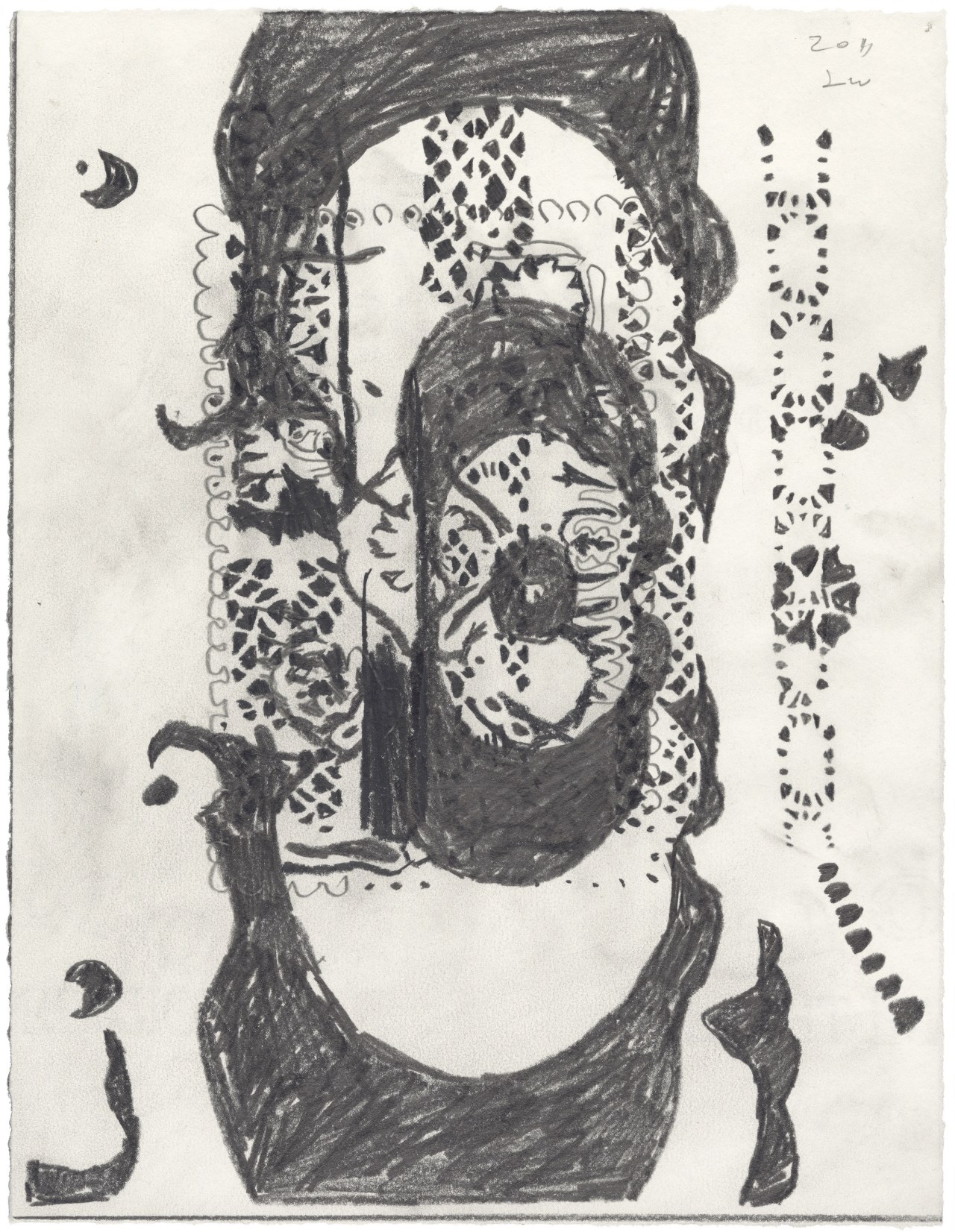

 Installation view, “Tabaimo: Clue to Utsushi,” James Cohan, New York, 2018. Photo: Phoebe d’Heurle.
 Still from “Shinju Trail” by Tabaimo at James Cohan, New York, 2018. Image © Tabaimo. Photo: Artifactoid.
 Round-corner wood-hinged Cabinets (GUI), 16th Century, Chinese, that inspired the work “Two” by Tabaimo. Image © Seattle Art Museum.
 Image of an artifact that inspired the below animation, “Crow” by Tabaimo. © Seattle Art Museum.