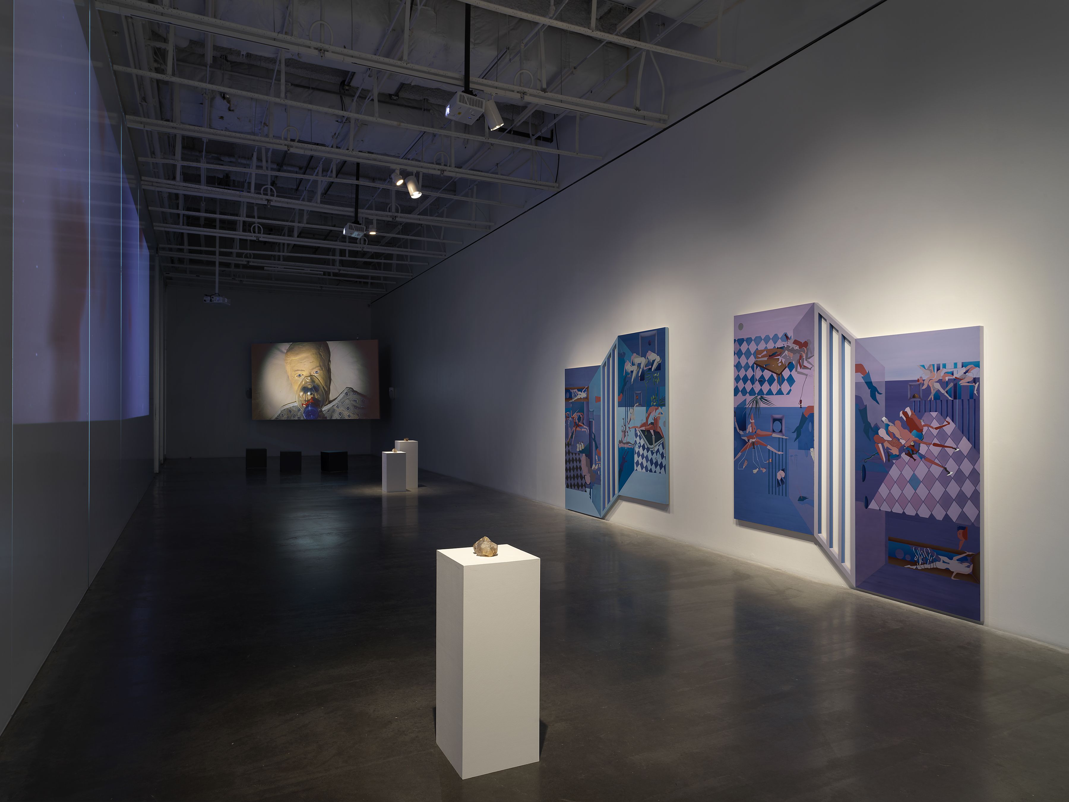
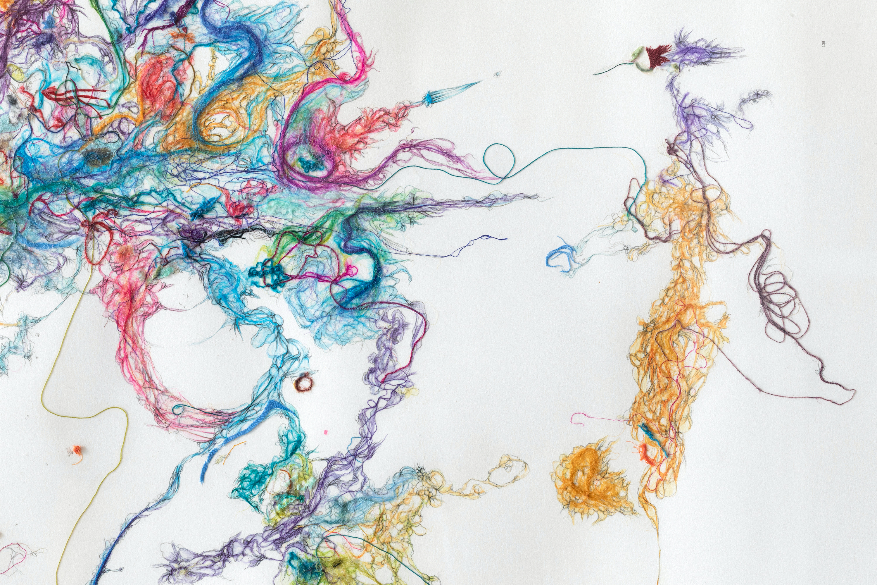
Above detail image courtesy of Alteronce Gumby and False Flag Gallery, New York, NY, 2021.
By Alexandra Goldman
I give and receive crystals as gifts. I believe in their energetic power for channeling different qualities into and out of our lives. Whether it’s love, openness, abundance, strength, clarity, protection, release…they’re magical.
What I hadn’t expected to see, was a profusion of crystals in contemporary art and its exhibitions culminating in one New York moment. By this I mean Art with a capital A, at major museums, art fairs, and galleries. My recent viewing experiences have led me to believe the moment for crystals in Art has arrived.
Medieval artists evoked divinity through religious art, magnificent cathedrals and stained glass windows. Romantic artists explored the sublime in nature. Later 19th and earlier 20th century painters like Hilma Af Klint and Agnes Pelton channeled spirituality through abstract forms.
It’s no wonder that following the apocalyptic despair of 2020, multiple artists today are either consciously or subconsciously eager to incorporate a material into their work that traditionally possesses properties for spiritual connectivity and otherworldly transcendence. While that overarching idea feels clear to me, each artist’s decision to include crystals in their work also has nuanced meaning specific to that work, so I encourage paying attention to what makes each unique in its context as well.
Within this past month, I came across four unrelated NYC-based art exhibitions that each incorporate crystals, which compelled me to take notice and write this brief article. The following is a photo essay of these beautiful – and wonderfully diverse – examples of artwork currently (or recently) on view featuring crystals in New York City. You can still catch many of them on view this week, for a serving of culture with a side of soul healing.
Above image: Anastasia Sosunova, Agents, 2020 (still). Video, color, sound; 14:57 min. Courtesy the artist. Video commissioned for “Roots to Routes,” 2020, curated by Juste Kostikovaite, Maija Rudovska and Merilin Talumaa, with the support of the Baltic Culture Fund.
The Screens Series, “a platform for the presentation of new video works by emerging contemporary artists,” is a hidden gem tucked in the basement of The New Museum. Its current iteration, “Screens Series: Anastasia Sosunova” curated by Gary Carrion-Murayari, comprises three videos by Sosunova (b. 1993, Ignalia, Lithuania). Her 14:26 minute video titled, “Agents”, 2020, looks critically at the idea of tradition, questions reality, and considers the role of the artist as filmmaker, philosopher, craftsperson, and creator of tradition.
The New Museum notes, “Sousnova’s recent works have explored popular folk traditions, post-Soviet national identity, and the tension between public and private space in the Covid-era, among many other topics. [Her videos] mix historical research and creative fiction to examine tenuously constructed feelings of community and belonging.” With “Agents”, Sosunova channels universal ideas through a hyper-local scenario.
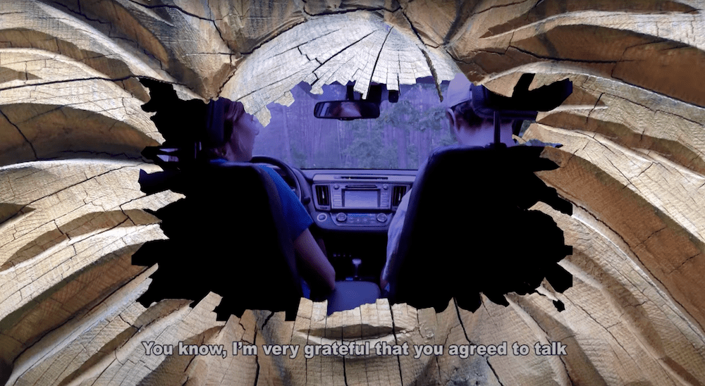
“Agents” opens with a scene of a woman and man driving a car slowly into the woods. They park amidst the trees, as if in a horror movie. The two engage in whispering a conversation in what I’d imagine is Lithuanian, with English subtitles. The conversation is noted at the start of the film to have been scripted for artistic purposes. Viewers find out later in the film that the forest was one of the only places people were allowed to go outside during Covid-19 quarantine in Lithuania. Music is playing.
Anastasia Sosunova, Agents, 2020 (still). Video, color, sound; 14:57 min. Courtesy the artist. Video commissioned for “Roots to Routes,” 2020, curated by Juste Kostikovaite, Maija Rudovska and Merilin Talumaa, with the support of the Baltic Culture Fund.
“We should turn it off, otherwise, we’ll scare them,” the woman says. While watching, I imagined the woman, who is in the driver’s seat, to be Sosunova. The man in the passenger’s seat seems to be a Lithuanian folk sculptor (or an actor playing one) – in other words, it could be argued that, in this filmed conversation, he, the craftsperson, is the “artist”, while the artist, Sosunova, is the “interviewer”. The woman continues, “You know, I’m very grateful that you agreed to talk in these circumstances. I thought at some point the things we create live their own lives, one can even say they come to life, and I begin to think of folk art conspiratorially.”
Anastasia Sosunova, Agents, 2020 (still). Video, color, sound; 14:57 min. Courtesy the artist. Video commissioned for “Roots to Routes,” 2020, curated by Juste Kostikovaite, Maija Rudovska and Merilin Talumaa, with the support of the Baltic Culture Fund.
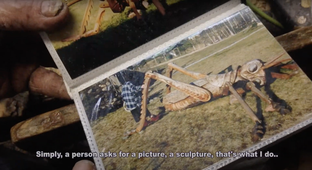
Sosunova immediately places the viewer in a cinematic vantage point mediated by fantasy, inducing a required suspension of disbelief. The protagonists are shot through what looks like a blasted hole in the middle of a strange animated wooden totem face framing their Socratic conversation. Both protagonists remain fairly anonymous throughout the duration of the film, as they are only shot with one camera angle from behind, revealing the backs of their heads and a slight profile at most, creating a disorienting effect. Viewers of the film get to know these characters mostly through their voices, dialogue, the deliberateness with which they speak, and their mutual respect for the conversation at hand. Viewers also get to know the sculptor through alternating camera shots of his weathered hands and dirty fingernails, that have surely been carving wood for decades, flipping through old photo albums of crafts and sculptures he either has created or references for inspiration.
Anastasia Sosunova, Agents, 2020 (still). Video, color, sound; 14:57 min. Courtesy the artist. Video commissioned for “Roots to Routes,” 2020, curated by Juste Kostikovaite, Maija Rudovska and Merilin Talumaa, with the support of the Baltic Culture Fund.
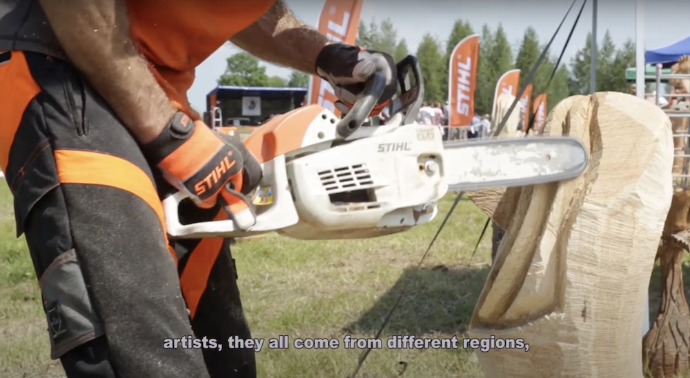
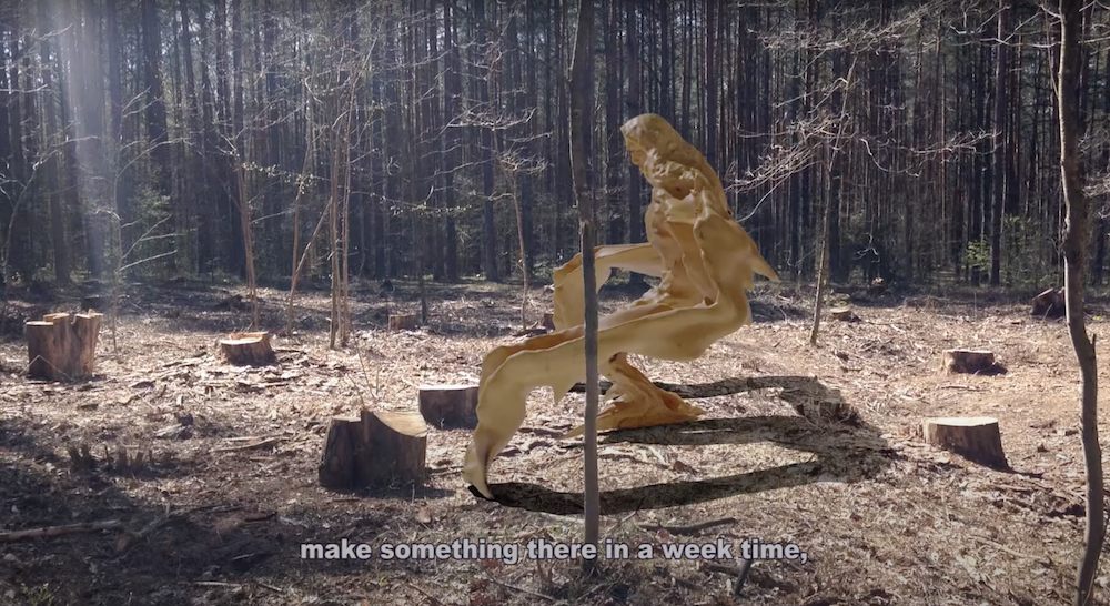
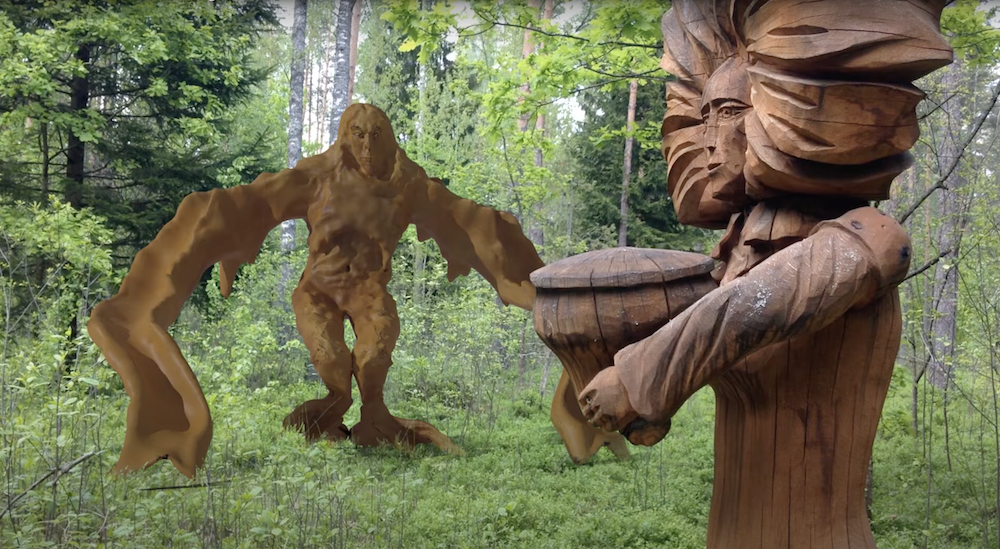
In the car, the pair seems intent on encountering what Sosunova describes as a “Golem” or “Cyclopse-like” living version of Lithuanian wooden folk sculpture: the embodiment of tradition taking on a life of its own after it is created. According to the sculptor, the original inanimate wooden folk sculptures are left in the forest every year following a week-long festival for which people come from all different regions to carve traditional wooden folk sculptures in the shapes of different woodland creatures, religious figures, or folkloric characters, and have them judged. After the festival they are abandoned in the forest, and because of this tradition, the forest is now filled with mythical man-made creatures.
But, is tradition good or bad? The interviewer (assumed to be Sosunova) proposes, “I am interested, you know, in learning how much we can give up primary meanings that are in these images, and how much the symbols themselves control us if we use them thoughtlessly…for instance, Ancient Greek legends about Cyclops were born after the Greeks found old elephant skulls who used to inhabit that peninsula, and thought those were one-eyed giants that actually lived there. This is how I also thought about the Lithuanian tradition of devil depiction, it is so mystified, but in fact it is for the most part an iconography of anti-Semitism. What should we do with those images?” The film examines where both religious and secular symbols come from, who is creating what, why, when, and for whom.
Anastasia Sosunova, Agents, 2020 (still). Video, color, sound; 14:57 min. Courtesy the artist. Video commissioned for “Roots to Routes,” 2020, curated by Juste Kostikovaite, Maija Rudovska and Merilin Talumaa, with the support of the Baltic Culture Fund.
Later in the script, the sculptor shares a more vulnerable side of himself, adding another layer of openness and universality to the video. He comments, “Well, a few hundred years ago, when creating those folk sculptures, no one thought about traditions, a person did something from the heart. If a person creates a thing from the heart today, then after a few years there will be a tradition of some sort. The most important thing to do is make it from the heart. In the past, I was more critical, when I was younger, but now I think – let people make what they need. Sure, I don’t like it when people fool around, when it starts being all about fooling around it’s irritating. But otherwise, let the people do their thing, not my business, whatever people like should exist.” There is a relatable realness and resignation in this statement that rings very true after (and arguably unfortunately still during) the global pandemic, like a prophecy of the post(?)-pandemic art world: “Sure, I don’t like it when people fool around, [but]…whatever people like should exist,” with haunting simplicity.
The cloudy atmosphere and muted color palette of the setting of the video evoke an overall greyness, which reminds me of the abundance of grey architecture in Eastern Europe and the lingering evidence of communism and former Soviet control. However, with “Agents”, Sosunova emphasizes there is magic emerging within this greyish environment. What is unknown is if it is light or dark magic. To what extent are Sosunova’s CGI golems of tradition benign or treacherous? And what is the artist’s responsibility in the face of them?
The overall feeling of not being able to know what time of day it is in the video is also compelling. The setting seems to transition at different points from morning to afternoon, to twilight, in no particular order. There’s an oneiric sense of space and time throughout the film, enhanced by the abrupt stopping and starting of hypnotic video game music featuring tracks by Sro and Blear Moon.
Visitors to The New Museum will note Sosunova’s CV to date comprises mostly exhibitions in Lithuania, Estonia, and Latvia. It’s incredible to see great emerging art like Sosunova’s from other global regions, here New York. The experience of this video is at once very familiar and an immersion into Lithuanian subconscious.
“Agents”, 2020 by Anastasia Sosunova is on view at The New Museum from 30 June – 22 August, 2021. WM
Anastasia Sosunova, Agents, 2020 (still). Video, color, sound; 14:57 min. Courtesy the artist. Video commissioned for “Roots to Routes,” 2020, curated by Juste Kostikovaite, Maija Rudovska and Merilin Talumaa, with the support of the Baltic Culture Fund.
Alexandra Goldman sits down with artist Franklin Evans to discuss his two current exhibitions at Miles McEnery Gallery, fugitivemisreadings at 520 West 21st Street, and YOU AGAIN curated by Franklin Evans at 511 West 22nd Street, as well as his current museum show Franklin Evans: franklinsfootpaths at the Figge Art Museum in Davenport, Iowa.
FRANKLIN EVANS (b. in 1967 in Reno, NV) received his Bachelor of Arts degree from Stanford University in 1989 and his Master of Fine Arts degree from the University of Iowa in 1993. He has had numerous solo exhibitions, including “Franklinsfootpaths” at the Figge Art Museum, Davenport, IA; “fugitivemisreadings ” at Miles McEnery Gallery, New York, NY; “selfportraitas” at FL Gallery, Milan, Italy; and “timepaths” at the Nevada Museum of Art, Reno, NV. His work is included in many public and private collections including the Bronx Museum of the Arts, New York, NY, El Museo del Barrio, New York, NY, the Nevada Museum of Art, Reno, NV; the Orlando Museum of Art, Orlando, FL; the Pizzuti Collection, Columbus, OH, and the Yale University Art Gallery, New Haven, CT. He is a recipient of the 2017-18 Pollock-Krasner Foundation Grant, New York, NY; The Fountainhead Residency, Miami, FL in 2017; and was a National Endowment for the Arts Fellow at The MacDowell Colony, Peterborough, NH in 2016. Evans lives and works in New York, NY.
New York, NY: Miles McEnery Gallery, Franklin Evans: fugitivemisreadings, 24 June – 31 July 2021. Image: Christopher Burke Studio. Courtesy of the artist and Miles McEnery Gallery, New York, NY
Franklin Evans, misreadinglandscapeintoart, 2021, Acrylic on canvas, 53 1/2 x 49 1/4 inches, 135.9 x 125.1 cm. Courtesy of the artist and Miles McEnery Gallery, New York, NY.
Franklin Evans Studio, 2021, New York, NY. Image: Christopher Burke Studio. Courtesy of the artist and Miles McEnery Gallery, New York, NY.
Franklin Evans, titianatilt (detail), 2021, Acrylic on canvas, 79 1/2 x 68 3/4 inches, 201.9 x 174.6 cm. Courtesy of the artist and Miles McEnery Gallery, New York, NY.
Installation view: Franklin Evans: franklinsfootpaths at the Figge Art Museum, 19 June – 26 September 2021, Davenport, IA. Image courtesy of the Figge Art Museum.
Works by Ann Pibal, Elliott Green, Josephine Halvorson, and Tom McGrath in YOU AGAIN curated by Franklin Evans at Miles McEnery Gallery. New York, NY: Miles McEnery Gallery, ‘YOU AGAIN’ curated by Franklin Evans, 24 June – 31 July 2021. Image: Christopher Burke Studio. Courtesy of the artists and Miles McEnery Gallery, New York, NY.
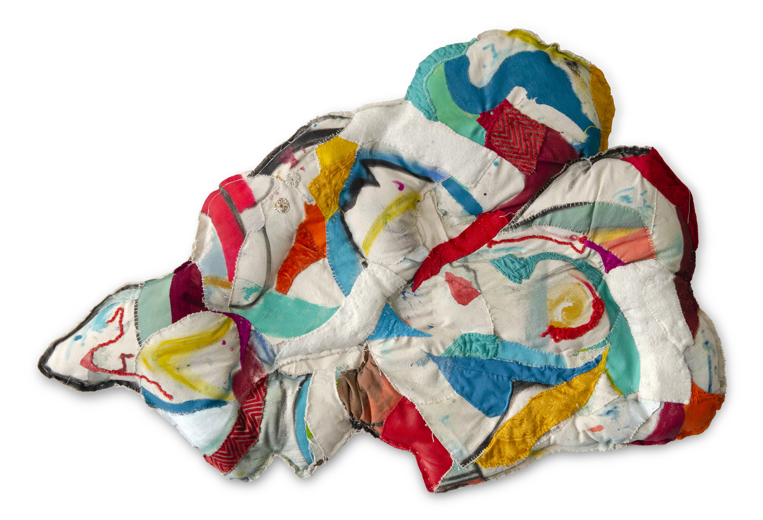
Above: Emma Balder, Harmony, 2020. Recycled fabrics, rope, bungee, paper, acrylic, and thread on canvas, 40 x 81 x 3″. Courtesy of the artist.Photo by Jay Marroquin.
By Alexandra Goldman
This month I was excited to be connected for a virtual studio visit with Houston-based artist Emma Balder by my friend, colleague, and mentor, Dr. Jose Falconi, Lecturer of Latin American art at Brandeis University.
Balder was born in Boston in 1990. She grew up curiously watching her mother sew costumes for her and her siblings, and as a young teen experimented with cutting up and sewing her own clothing. She later earned her BFA from SCAD with a background in painting, and has since shifted toward heavily incorporating sewing and fiber art into her practice using recycled materials.
Emma Balder’s studio, Houston, TX. Courtesy of the artist.
She began integrating textile waste into her practice during her formative year-long residency at the Vermont Studio Center, where she was given bags of the recycled scrap cloth material as a gift by a fellow resident who had an excess of it and couldn’t take it traveling overseas. Since then, Balder has continued to collect textile waste from seamstresses and fashion designers. “There is so much waste, and it bothered me, but I saw beauty in it,” Balder noted. Additional examples interesting artists who work with recycled textiles include Tamara Kostianovsky and Linda Friedman-Schmidt. The interpretations of the medium by these three artists is vastly different, showing off its vast potential.
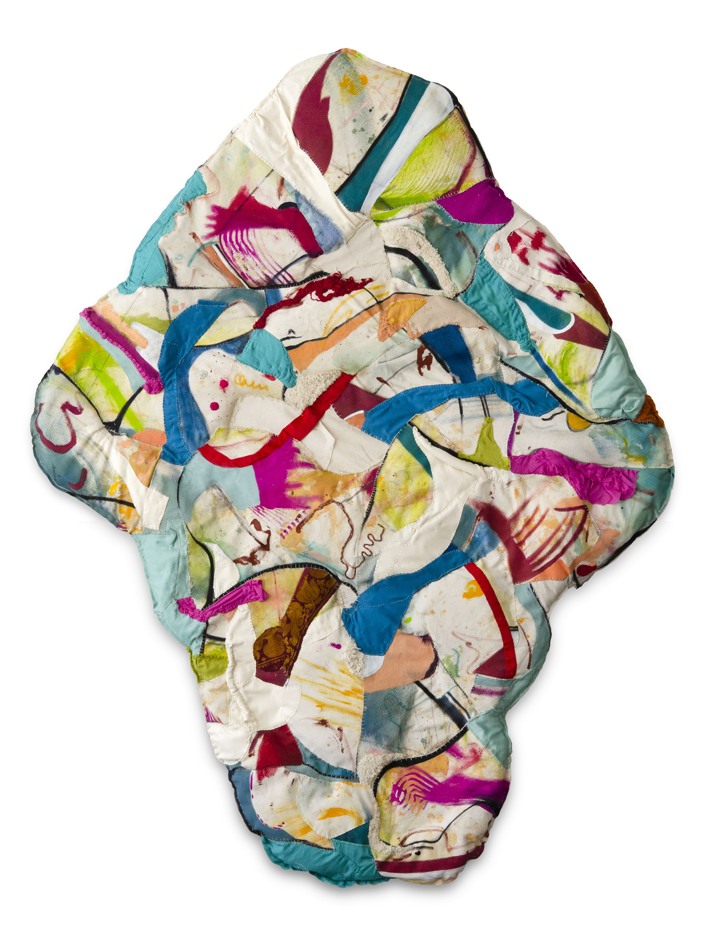
Her colorful organically shaped works fall into two main categories: “Pinglets”, which are (often stuffed) three-dimensional wall pieces that Balder creates by completing a painting, cutting it up, and re-stitching it together in new compositions mixed with other recycled textiles, and “Fiber Paintings”, in which Balder “paints” on paper and panel with colorful thread, using the thread itself as the paint. A fervent environmentalist, working with recycled fiber materials is of utmost importance to Balder.
On her website, Balder notes, “The Pinglet project documents a process of regeneration. This project began with the physical deconstruction of one painting, the Ping. The disjuncture of parts were then rearranged and reconstructed with needle and thread to form small baby paintings, called Pinglets.” Pings are usually abstract landscapes of around 12 x 8 ft. Balder knows to cut up the Ping at the moment she is satisfied with it, believing the moment that you become complacent, it is time to catalyze change and reignite the creativity that comes from vulnerability.
Following our studio visit I’ve come to understand why Balder has named one of her main artwork styles a made up word such as a “Pinglet”: Balder is principally interested in creating artwork as a manifestation of her own world on her own terms: a place to escape to and live in; both a new world and a new home. In a Derridean sense, this logically begins with creating and defining her own language to refer to her new world without relying on preexisting terms. In her work she creates a beautiful synergy by deconstructing and reconstructing both the physical materials she is utilizing to create the works, and the language she uses to describe them.
Pinglets are filled with vibrant bursts of shape and color caught in a balancing act throughout the composition channeling an unlikely yet successful combination of Vasily Kandinsky and Howardena Pindell. The Pinglets look like stuffed animals in the shapes of clouds, human organs, puddles, or the symbols for hills in Aztec Codices. Balder’s work also visually recalls the legacy of Marta Minujín and her stuffed, bright hanging wall pieces that look like Fruit Stripe gum got into a pillow fight. The difference is that Balder’s gum is chewed.
Both Balder’s Pinglet and Fiber Painting abstractions appear to be dancing or blowing in the wind. They are free, and Balder found both freedom and home in the creation of her own combinations and interpretations of media that don’t stick to traditional definitions of painting or sculpture.
Interestingly, when asked about her main artistic inspiration or influence, Balder, without hesitation, mentioned that she is often thinking about and inspired by Catalan architect Antonio Gaudi. As a Barcelonaphile who has experienced Gaudi’s architecture in person, this resonated with me on multiple levels: bright playful colors, organic forms, structure, and the fact that architecture can be a site where art, home, and nature coalesce. Balder’s works are each like small architectures.
Through our conversation, I learned that Balder intends to generate the abstract feeling of home throughout her oeuvre. I asked her if she wouldn’t mind revealing the source of the importance of home in her work. She mentioned she moved around a few times as a child, and what she always missed most and returned to in her mind was her favorite place: the natural environment that surrounded her first house, where she would play amidst a cluster of trees, have secret meetings with friends or siblings, and carve into or decorate the tree trunks. She felt at home in nature, in these trees, more than the house itself. If you look at Balder’s Pinglets, they are formally reminiscent of horizontal slices of tree trunks.
Balder’s commitment to the environment has also attracted the attention of large brands. She was selected in 2019 by PepsiCo as one of the three environmentally-focused artists chosen to have their artwork featured on the series of 100% recycled plastic LIFEWTR water bottles. Sweeping visuals of Balder’s Fiber Paintings can still be found on the bottles today. The series marked a moment of transition for LIFEWTR to go from using regular plastic bottles to recycled ones. While it is still not good for the environment to have single-use plastics in circulation, the massive shift of a company like Pepsi to transition their bottles from new to recycled materials is a step in the right direction. Last week I serendipitously came across Balder’s LIFEWTR bottle at JFK Airport en route to Miami, and was thrilled to have the chance to take in the visual of it with in-depth insight into Balder’s practice, rather that looking at it as an image on a product without context.
LIFEWTR Series 9.3 “The Art of Recycling”, Emma Balder, Image courtesy of the artist.
Looking ahead as Balder continues to develop her practice, she desires to focus even more intently on creating space, and inviting viewers in. “I don’t know how much longer the wall is going to serve me. I have been playing around with sculpture, and I would really like to create an immersive space where the viewer can feel like they are part of that world, and feel that sense of coming home,” she revealed. I look forward to seeing the worlds Balder has in store.
Above image: Olek installing Project B in 2010. Image courtesy of Olek on Vimeo.
By Alexandra Goldman
If you never saw it in person, you’ve probably seen an image of Project B at least once. The original guerrilla art installation was only up for a few hours before it was taken down by the city, but its viral visuals live forever online. For the ten-year anniversary of Project B this Christmas, I’ve decided to take a closer look at the project and the person who created it, the Polish artist Olek, née Agata Oleksiak, (b. 1978, Staszow, Poland). I’ve found it is a story about ritual, iconoclasm, and two different New York-based immigrant artists who wanted to see the United States doing well. It’s also strongly connected to Olek’s Polish roots.
Charging Bull has become a known site of protest on its own in New York and the subject of several acts of iconoclasm, especially since the 2011 Occupy Wall Street movement. It has had paint doused on it in 2017, and had dye poured on it, and its head bashed with a spiked banjo in 2019, for causes ranging from anti-financial corruption, to protecting the environment, to anti-Trump demonstrations. Because of this, there is a current conversation about relocating it. Olek’s wrapping of the bull with yarn has been the most peaceful form of altering the statue while still having a big impact. It is similar to how the artist Dustin Klein created a light projection of a portrait of Breonna Taylor to project onto the controversial statue of Robert E. Lee in Richmond in July 2020 as part of the BLM movement. Both yarn and light can be used as peaceful strategies for acts of iconoclasm on monuments.
Olek installing Project B in 2010. Image courtesy of Olek on Vimeo.
For background, in 1989, Italian immigrant sculptor Arturo Di Modica (b. Sicily, 1941) originally installed Charging Bull on Wall Street at Christmas time. He had a studio on Crosby street, and without city permission he and a group of friends delivered by truck the self-funded sculpture in front of the New York Stock Exchange. He intended the sculpture of the known market symbol as a “Christmas gift” to the city symbolizing “the strength and power of the American people”, two years after the October 19, 1987 stock market crash known as “Black Monday” (the worst crash since 1929). Within hours, Charging Bull was removed by the city and taken to a warehouse for storage, before it was later legally relocated to Bowling Green.
Twenty-one years later, at around 2:00 am on Christmas Day 2010, without city permission, Olek wrapped Di Modica’s sixteen-foot, 3.5-ton, bronze Charging Bull with bright pink (with hints of purple, teal and gray), camouflage-pattern, hand-crocheted yarn that they created without assistance. Olek titled the guerrilla intervention Project B or Project B (Wall Street Bull), which is actually absent from the majority of articles about the project.
Replicating Di Modica’s timing, two years after the severe 2008 market crash and also at Christmas time, Olek revived Di Modica’s original guerrilla intervention through Project B by wrapping Charging Bull with their camouflage crocheted yarn. Similar to Di Modica, Olek considered Project B their “Christmas gift” to the city or a “Christmas sweater” for the bull, in effort to uplift the country following the most recent financial crisis. According to the artist, Project B was a symbolic public gift for all those who couldn’t afford holiday presents that year or were unable to visit their families. Olek’s strategic reenactment of Di Modica’s timing (both after the financial crash and time of year), guerrilla-style action, and gift-intention categorize Project B an act of ritual. Olek later confirmed that it was a ritual, and prior to wrapping Charging Bull with yarn, they carried out a series of Polish Christmas rituals: “Christmas eve is a special day for Polish hearts. That night, animals speak human voice. I cooked a traditional dinner, and went to pasterka (midnight mass),” they explained.
The idea of revitalizing statues through ritualistic actions such as wrapping them with colored cloth is not new. It even dates back to Ancient Egypt, during which kings and priests would drape colored cloths around statues of deities during their daily offering ritual ceremonies to the gods to revive their ka, or, inner spirit. In Ancient Egypt, the colors of the cloths during the daily ritual had specific meanings for the ceremony to either refresh the deity (green cloth) or reaffirm its holiness (red cloth).
Olek’s use of the color pink for ritual cloth statue wrapping, when combined with the historically feminine medium of crochet, has given cause for some to consider Project B a political, iconoclastic act by the artist amidst Wall Street’s hyper-masculine environment. While noting Olek prefers to avoid the limitations of categorizing their art as “yarn bombing”, yarn bombing (street art involving yarn), is historically rooted in third-wave feminism during which domestic arts were celebrated. Project B is therefore on one hand, Olek’s public critique of the imbalance of the hyper-masculine environment of Wall Street and the failures of power imbalance.
However, rather than pitting the genders at war with one another through Project B, Olek was expressing maternal caretaking, the need for balance, the importance of self-love, and love of others. Olek, an immigrant from a formerly communist country, felt the need to symbolically take care of a failing capitalist system and lift it back up. Olek created a Yin-Yang duality whereas before there was only Yang energy.
Olek also believes all art is a self-portrait. Through spiritual exploration, Olek identified in recent years as gender nonbinary and considers themself to be a “two-spirit being”, fully male and fully female simultaneously. Wrapping the masculine, muscular, bronze bull with the feminine, soft, pink, crochet resulted in the temporary creation of a powerful, mirroring, two-spirit being in the public space of NYC’s Financial District.
Olek hugging Project B. Image courtesy of Olek on Vimeo.
Furthermore when I first met Olek at Art Basel Miami Beach last year, I became interested in their work because it immediately felt very Polish to me, and I was interested in the fact that none of the articles I was reading about Olek’s work spoke about how Polish it was. I have Polish heritage, and traveled to Poland in 2009.
I was driving from Czestochowa to Krakow in 2009, and noticed all the buildings were Brutalist gray rectangles or squares. However, every so often some stretches of buildings, that seemed to be apartment complexes, were painted over with wide, vertically striped swathes of rainbow colors. I asked my Polish friend why some of the buildings were painted over like this. She replied that after communism fell some cities and towns celebrated by painting buildings bright colors since the government didn’t allow any deviation from uniformity during communism. Similarly, Olek’s art intervention tactic of using a bright burst of color in homogenous gray public space with Project B represents their Polish way of expressing freedom from oppression.
The idea of combining the media of fiber art and sculpture also has roots in Poland. The artist Magdalena Abakanowicz (b. 1930) is a famous Polish sculptor who works with fibrous materials. According to the MoMA, “Abakanowicz and many artists of the Eastern Bloc were drawn to craft and textile traditions as expressive mediums less regulated by Soviet censorship.” When Olek first came to the U.S. with no money in 2000, their sculpture professor at La Guardia Community College also encouraged them to begin sculpting using any material, including yarn.
In our recent Zoom interview, Olek explained that while growing up in communist Poland, being an artist – or expressing individuality of any kind – was highly discouraged, and art galleries and museums were reserved for the elite. Olek believes they never could have fully become who they are as an artist, or individual, if they had stayed in Poland and not made the courageous decision to emigrate to New York. While Olek critiqued the failing power imbalance that Charging Bull came to represent with Project B, Project B was also Olek’s renewal of Di Modica’s celebration of possibilities and resilience available in a capitalist country, presented by an immigrant artist who couldn’t have had their career without its benefits. Their own experience of feeling excluded from art institutions while growing up poor in Poland led to their dedication to public art that can be accessed by anyone.
During weekdays Maria Evelia Marmolejo is a therapist at a child psychotherapy clinic living in Jackson Heights. She’s also a mom, and a skilled salsa dancer. When I met up with her for our interview at a cafe in her neighborhood in December 2018, I felt like she was my fun aunt. We hadn’t seen each other in over a year, but immediately reconnected. I thought, what most people at this cafe probably don’t know, is thatshe is one of the most badass performance artists from the ’70s and ’80s! She was giving birth in a gallery before it was cool.
Installation view: Subverting the Feminine: Latin American (Re)marks on the Female Body curated by Isabella Villanueva at Y Gallery, 2016.Photo by Alexandra Goldman.
I first met Maria Evelia when I was a Director at Y Gallery and we hosted a historical group exhibition featuring her work, curated by Isabella Villanueva and titled, Subverting the Feminine: Latin American (Re)marks on the Female Body. The show included era-marking performances, video, drawings and photography such as “Integrations in Water” by Yeni y Nan (Jennifer Hackshaw and María Luisa González), “Madre por un día” by Polvo de Gallina Negra (one of the most famous projects by the duo comprising Maris Bustamante and Monica Mayer), “Hymenoplasty” by Regina José Galindo, which won the Golden Lion award at the 2005 Venice Biennial, video and drawings by Peruvian artist Elena Tejada-Herrera, and the video “Incision” by Teresa Margolles. The caliber of historical works in that exhibition was so high; it was like a museum, yet were in a small fifth-floor lower east side gallery space. The show was in November of 2016 and I still frequently think about it to this day.
Marmolejo’s works in Subverting the Feminine were “11 de Marzo” and “Anónimo 4,” both from 1982. These two works respectively spoke to abolishing the idea of menstruation as a taboo, and the tragedy of high infant mortality in several Latin American countries.
“11 de Marzo” debuted at Galería San Diego in Bogota. For this ritual Marmolejo lined the gallery floor with an L-shaped formation of white paper. The space was lit with a blacklight, and the sound of toilet flushing played on loop in the background. She then covered her body with feminine hygiene pads, and performed a dance along the L shaped paper, using her menstrual blood to mark the floor and walls. Marmolejo states, “In this performance I emphasize the pivotal role of womanhood in the origin of life and of her civil rights in the world.”
Maria Evelia Marmolejo, 11 de Marzo, 1982. Image courtesy of Maria Evelia Marmolejo. Photo by Camilo Gómez.
Maria Evelia Marmolejo, 11 de Marzo, 1982. Image courtesy of Maria Evelia Marmolejo. Photo by Nelson Villegas.
In “Anónimo 4,” Marmolejo drew attention to the fact that when babies enter into the world, the possibility of survival and peace is not always a certainty. For this, she dug a 1.5 meter triangular pit in the ground, about equal to her height, and three smaller triangular pits around it filled with sewer water. She wrapped her entire body with plastic wrap, and entered the hole, which she filled with the placentas of all the babies born that day in hospitals near the site of the performance: Cali, Colombia and Guayaquil, Ecuador. She covered herself with the placentas, and stayed submerged in the hole, in her words, “embarking on a psychological and sociological self-exploration of the fear of being born in a society in which there is no guarantee of survival.” The experience invoked her own extreme bodily reactions such as vomiting and crying.
Maria Evelia Marmolejo, Anónimo 4, 1982. Image courtesy of Maria Evelia Marmolejo. Photo by Nelson Villegas.
Maria Evelia Marmolejo, Anónimo 4, 1982. Image courtesy of Maria Evelia Marmolejo. Photo by Nelson Villegas.
Other works by Marmolejo speak to government violence, disappeared persons, and healing Mother Earth from human-inflicted pollution and damage – especially by symbolically giving back to Earth with the body in the style of nonviolent sacrifice.
In her performance Anónimo 3, Marmolejo went to the banks of the River Cauca in Colombia, which was being severely polluted. At this site she performed a 15-minute ritual in which she formed a 10-meter spiral using limestone dust, centered around a toilet bowl. She used a vaginal wash over the bowl, adhered surgical tape to her body, and walked around spiral allowing her organic fluids and body hair ripped out with the tape to fall into the earth. Through this process she created a compost as an act of healing and forgiveness offered to the planet.
Maria Evelia Marmolejo, Anónimo 3, 1982. image courtesy of Maria Evelia Marmolejo. Photo by Nelson Villegas.
Maria Evelia Marmolejo, Anónimo 3, 1982. Image courtesy of Maria Evelia Marmolejo. Photo by Nelson Villegas.
Marmolejo is a recipient of the CIFO Achievement Award, and multiple examples of her work were included in the esteemed 2017-2018 traveling exhibition, Radical Women: Latin American Art 1960-1985, which was presented at the Hammer Museum, the Brooklyn Museum, and the Pinacoteca de São Paolo. Below I am pleased to present an exclusive video interview with the artist:
EPILOGUE:
Now is a compelling time to revisit Marmolejo’s work, which often focuses on the fusion of the human body with the health of the planet Earth. The body and Earth are one. The power of the body, especially the feminine body, as a regenerative force, and as a power to protect Mother Earth, another feminine life giving force – our planet – that gives us the chance to exist.
In this time of Coronavirus wreaking havoc on the collective human body worldwide, there are murmurs of the virus as the planet’s retaliation against us for destroying it. Maybe not scientifically, but symbolically or spiritually.
For over four decades, I have visited New York’s annual art fairs — from ADAA to The Armory Show — along with many other fairs that showcase galleries’ best and most innovative artists. Artworks look even more exciting when contrasted with the stylish women of all ages (from gallerists, to collectors, to fashionistas who fill the piers, the Armory, lofts, and exhibition spaces) wearing distinctive attire that blends into colors and patterns displayed on the walls.
Artwork: Vanessa German at Pavel Zoubok Fine Art, ADAA 2020
The Armory Show 2020
Artwork: Luisa Rabbia at Peter Blum Gallery, The Armory Show 2020
Artwork: Jiro Takamatsu at Whitestone Gallery, The Armory Show 2020
Artwork: Timothy Curtis at Benda Gallery, The Armory Show 2020
Artwork: Viktor Popovic at C24 Gallery, The Armory Show 2020
Artwork: Amy Schissel at Patrick Michail Gallery, The Armory Show 2020
ADAA 2020
ADAA 2020
Artwork: Nina Chanel Abney at Pace Prints, ADAA 2020
Artwork: Vanessa German at Pavel Zoubok Fine Art, ADAA 2020
Rose Hartman. Photo by Marsin Digital.
For the past four decades, Rose Hartman has photographed the rich, the famous and the stylish in some of the most legendary settings of New York nightlife, from Studio 54 to the Metropolitan Museum’s Costume Institute Gala, fashion shows, and models backstage. Her arresting pictures have been published in countless international publications, including Vogue, Stern, Harper’s Bazaar, Vanity Fair, Panorama, the NY Times, New York, & Art & Auction. Hartman’s photos have been exhibited in international galleries from Beijing to Moscow. Her iconic photos are currently on view at the Morrison Hotel Gallery in SoHo and at The Brooklyn Museum in a group exhibition titled, “Studio 54: Night Magic,” open from March 13—July 5, 2020.
Above: Jaqueline Cedar in her studio. Image courtesy of Good Naked. Photo by Phoebe Berglund.
By Alexandra Goldman
After finishing her MFA at Columbia in 2009, LA-born and raised artist Jaqueline Cedar moved into a spacious apartment with her boyfriend in Ditmas Park. Like many artists at the time, she had studio space in Industry City in Sunset Park, but was priced out in 2012 as large design companies and startups moved in. “There was a mass exodus of artists from the neighborhood around that time,” she explained, “I thought about moving my studio to Long Island City or elsewhere in Queens, but none of the rent prices felt within range. Getting a studio seemed more expensive than renting an apartment.”
Painting by Jaqueline Cedar. Image courtesy of Good Naked.
Cedar’s large empathic paintings focus on psychological interactions between otherworldly cartoon characters that are both familiar in a Popeye and Olive Oil sort of way, and simultaneously absurd and unknown. Her landed-on-mars color palette, combined with some apparent Bruce Nauman influence, use of nontraditional materials (she paints on neon foam and sports mesh), and fondness for placing three or four moons in any given sky, add up to a sophisticated brand of mindfuckery that reverberates throughout the oeuvre.
Paintings by Jaqueline Cedar. Images courtesy of Good Naked.
To continue to produce her work despite the financial difficulties of finding adequate studio space, Cedar’s boyfriend suggested that she move her studio into their home. She tried it and discovered that she loved how it allowed her to work whenever she wanted, even during all hours of the night. Then, in 2015, the relationship with her boyfriend ended. Cedar needed to get a roommate to pay the rent, and transitioned into a roommate lifestyle for the next four years.
In August 2019, when her then-roommate abruptly announced she was moving out, Cedar was nervous but saw a window for a different solution to her rent deficit. Instead of finding a replacement tenant, she took a risk and made the decision to transform the majority of her apartment into a commercial art gallery with a developed, rotating program of exhibiting artists. She had past experience organizing exhibitions at Crush Curatorial, and wanted to continue to explore this path. “I started all of the planning right away in August, as I knew I would need to turn a profit almost immediately in order to make this plan work,” she said. “If it didn’t work out, I thought, I could always get another roommate later.”
Installation view, “Go For Broke” at Good Naked Gallery. Image courtesy of Good Naked.Photo by Etienne Frossard.
For Cedar, the financial pressure was a motivating factor. “Some people crumble under that type of pressure, but for me, it was energizing.” To get things going, she began conceptualizing names for the gallery and exhibition titles, and started emailing and planning studio visits with artists she envisioned working with. An initial round of positive feedback from many of her top-choice artists encouraged her to hit the ground running. She decided on her quirky gallery name, “Good Naked,” based on a Seinfeld episode that jokes about walking around your apartment naked: a classic perk of not having a roommate.
Installation view, “Go For Broke” at Good Naked Gallery. Image courtesy of Good Naked. Photo by Etienne Frossard.
What began as something she saw as an experiment for one or two months turned into a longer-term success. Cedar has already had four shows, each with an opening party, closing, and an event in between. Her events are special and build community. At the first event, she created a drawing club where guests collaborated on exquisite corpse drawings. Subsequent events featured a comedy show of female artist-comedians doing stand-up, and a supper club where an artist prepared lasagna for the group. Cedar confessed, “at first, I was inviting each guest to the gallery individually and introducing attendees to one another. Now, many people show up to my events who I don’t even know, and I’m the one being introduced!”
Jaqueline Cedar and Zebadiah Keneally in Cedar’s studio. Photo by Artifactoid.
Zebadiah Keneally, installation view, “Go For Broke” at Good Naked Gallery. Image courtesy of Good Naked.Photo by Etienne Frossard.
One artist who recently showed at Good Naked is poignant comedic illustrator and performance artist Zebadiah Keneally. Keneally installed a floor to ceiling immersive, painted environment featuring multiple illustrations in the apartment’s central corridor. His videos are also hilarious, many featuring his alter-ego, Hamburger Vampire.
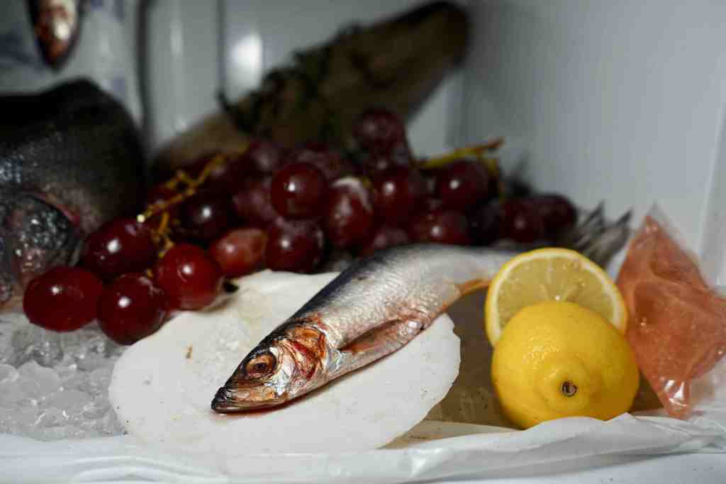
Phoebe Berglund, Freezer Still Life (Cabbage, Shrimp, Rye Bread), 2020 Digital C-Print, 8” x 12” Edition of 20. Image courtesy of Good Naked.
Phoebe Berglund, Freezer Still Life (Fish in Scallop Shell, Grapes, Sliced Lemon) 2020. Digital C-Print, 8” x 12” Edition of 20. Image courtesy of Good Naked.
Another recent Good Naked exhibiting artist is Phoebe Berglund. She took over the freezer in the Good Naked kitchen for two weeks to create a beautiful photography series called “Freezer Still Lives,” a memento mori to the ocean (in her words). Visitors could view the 17th century Dutch-reminiscent scene in person any time Phoebe was at the gallery, but since there were dead fish involved, Cedar explained, “it was stinking up the apartment.”
Good Naked’s upcoming exhibition “Talk Soup” opens next Friday, March 13 from 6-9pm, featuring works by Bill Adams, Jonathan DeDecker, Carl Durkow, Hyun Jung Jun, Griffin Mactavish, Rachel Jackson, and James English Leary.
“I paint with my left hand,” Brooklyn-based Canadian artist Krista Louise Smith explained, after telling me about chronic pain that she experiences in her dominant right hand due to a rare nerve condition. Rather than feeling discouraged that her pain makes it difficult for her to paint righty, Smith has instead embraced the soft, childlike freedom that for her, could only have emerged with her less controlled, left hand painting. “With my right hand, I tended to be neurotic, second-guessing every brushstroke. With my left, I don’t impose those same judgments on myself, and let the paintings unfold more organically.”
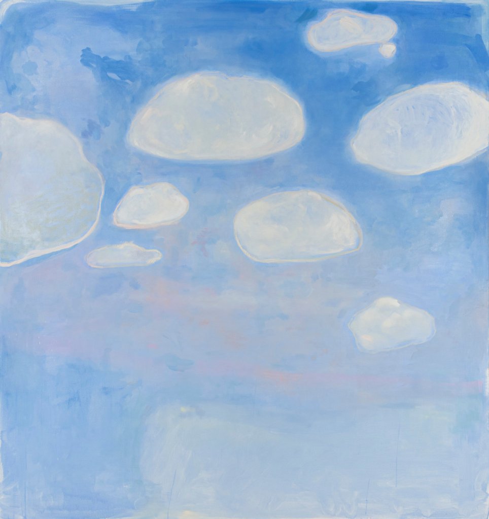
Krista Louise Smith, Blue Dream, 2019. Oil and acrylic on canvas, 72 x 68 inches.
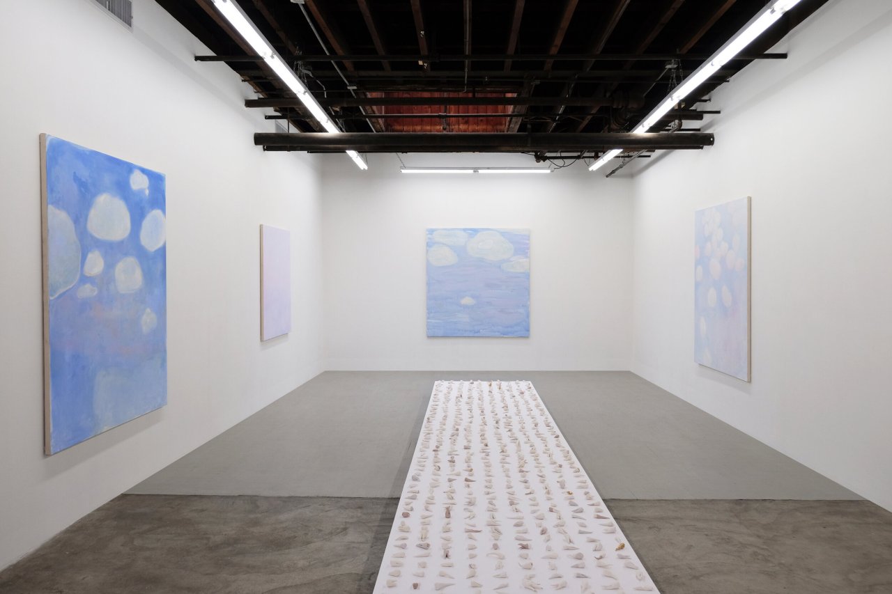
Softness is arguably an important quality when depicting clouds, Smith’s chosen subject matter for her newest body of work. Her older work tended toward more realistic paintings and sculptures that represented the human figure. The new paintings feature mostly perky, individual clouds in layered, glowing cotton candy atmospheres, that exist somewhere between a cartoon realm and an idea of a cloud in the mind’s eye rather than a photorealistic cloud or background of a Turner painting. “I paint with colors that I like and naturally gravitate toward, like baby blues and pinks,” Smith said, reaffirming the self-judgment-free nature of her current artistic process. The exhibition title, Sonnets of the Subconscious, in which the paintings are now on view at Carvalho Park in East Williamsburg, reinforces the idea that the works don’t necessarily depict the literal physical world.
Krista Louise Smith, Lavender Night, 2020. Oil and acrylic on canvas, 56 x 54 inches.
In Smith’s painting Lavender Night, a glowing tiny moon and subtle surrounding stars peek through a layer of whitewashed ultraviolet altostrati. She creates a sublime creamy world like that in Matthew Wong’s 2019 painting Morning Mist on view earlier this winter at Karma Gallery.
Krista Louise Smith, Float, 2019. Oil and acrylic on canvas, 72 x 68 inches.
In a recent studio visit with Smith, she shared that the only components of each painting she pre-plans are the general composition, and her color palette, which she assembles in advance by collaging paint swatches and pinning them to the wall. “The color palette I choose sets my parameters for each painting and it’s how I create cohesion in the piece as opposed to working with line.”
Krista Louise Smith, Dayglow, 2020. Oil and acrylic on canvas, 72 x 68 inches.
Dayglow is a good example of one of Smith’s paintings in which she uses oil crayon and pink/blue color layering to create texture and depth. While her brushstrokes are visible, the work doesn’t rely on the bravado of the gesture for its strength. Instead her hand creates a believable atmosphere, like a thick pastel humidity that you can breathe in.
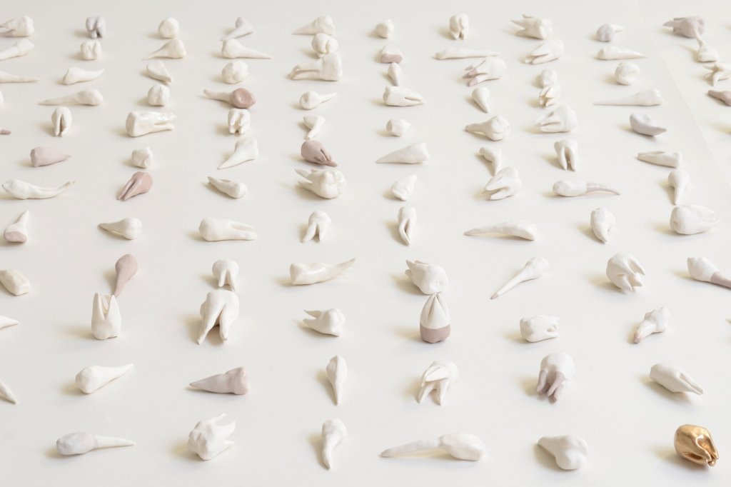
Krista Louise Smith, Bad Dreams (detail), 2018 – 2020. 680 ceramic sculptures, dimensions variable.
In the center of the gallery, enveloped by Smith’s transcendent womb of cloud paintings, rests a floating plinth that supports Bad Dreams, a choreographed grid of 600 ceramic sculptures of abstracted teeth. The sculptures look like little living organisms that are about to jump up and begin dancing a tooth ballet the moment no one is watching. “I was going to the dentist a lot, and had teeth on my mind,” Smith explained. There is a refreshing purity, simplicity and directness that Smith translates into her artistic decisions.
Krista Louise Smith, Bad Dreams (detail), 2018 – 2020. 680 ceramic sculptures, dimensions variable.
Smith’s teeth and clouds also strangely resemble each other. The tops of some of the ceramic teeth look like little clouds, and some of Smith’s clouds looked like molars in the sky. Each ceramic tooth sculpture is unconventionally painted with acrylic paint made for porous surfaces rather than traditional glaze, which gives them a silky smooth pottery quality. As in the artist’s own mouth, there are a few gold teeth that punctuate her sculpted dental display.
Sonnets of the Subconscious is on view at Carvalho Park until March 15.
All images in this article courtesy of Carvalho Park.
Thoughts about Brian Whiteley’s Mid-Career Retrospective, “I Know What You Did Last Summer” Now on View at Hashimoto Contemporary
By Alexandra Goldman
Performance Artist Brian Whiteley’s bizarre multidisciplinary works come across as very genuine and lack self-consciousness. Whether it’s his performance, video, painting, sculpture or installation, Whiteley’s work is usually either highly politically charged, related to mortality, about clowns, or a combination of all three elements. When I walked into his mid-career retrospective at Hashimoto Contemporary earlier this month, I saw his highly publicized Trump-engraved tombstone, a very well done oil portrait of Vladimir Putin sitting in front of the White House in the style of a traditional U.S. presidential portrait, and a pair of giant, spinning conehead clowns/Lucha Libre fighters that looked like Nick Cave sculptures made out of craft materials from a party supply store. I’ve never been a fan of clown art, but it’s growing on me.
Installation view, I Know What You Did Last Summer
As one may be able to quickly recognize, Whiteley isn’t a fan of the 45th president, but his parents are. He told me that he’s had to seriously struggle with an irreconcilable divide in his nuclear family because of these differences of opinion. His isn’t the only family broken up by this highly polarizing situation.
As much as you don’t like someone, is it “wrong” to make a tombstone for them? After speaking with Whiteley about the project, I realized that his intention wasn’t a death wish, but rather a call for the President to recognize his own mortality. Whiteley told me that he had a personal moment canoeing upstate in which “a wave of intense thinking about his own mortality rushed over him,” after which the thought remained a bit obsessively on his mind. When he saw Trump campaigning for President in 2016, he perceived his attitude as one of immortality and a lack of awareness of how his actions affect others. That is why he had a real tombstone created engraved with the words “TRUMP, Made America Hate Again,” and anonymously abandoned it in Central Park leading to major controversy and his placement on the U.S. Secret Service watchlist. Whiteley is now permanently legally banned from attending any political rallies in the U.S.
I found that seeing a photo of the tombstone is much different than experiencing in person. When I saw a photo of it I thought, “ok, that’s cheeky, we all hate Trump, I get it.” But, when I was at the exhibition and felt the tombstone with my hand (you can touch it), I felt its weight (500 lbs to be exact) and gravity. It’s so stable and solid. It became clear that to have it made was a serious commitment. The tactile memory sucked me directly into a time tunnel and sent me straight back to the last time I touched my own grandparents’ tombstones in in Queens. It was the moment when I realized that what Brian had on display wasn’t a prop or a replica or joke of any kind, it’s the real thing and it’s creepy.
This also isn’t Whiteley’s only project related to mortality. He also dressed up as a clown, and paraded around a graveyard. When you get onto the homepage of his website, the cursor symbol is a hand holding a cigarette, in 2020, a well-known death wish of sorts. Not only that, but I immediately found the idea of a “Mid-Career Retrospective” to be morbid. For example the last couple retrospectives I saw at MoMA PS1… Vito Acconci…Carolee Schneemann…they both died within the year after their retrospectives ended. Calling his show a “Mid-Career Retrospective” immediately registered to me that Whiteley actively has his own lifespan on his mind.
View of Whiteley’s portrait of Vladimir Putin hanging in a Washington DC Trump Hotel suite
Whiteley is a highly committed artist in general. That’s why I’m intrigued by his work. For example, not only is his relatively large presidential oil painting of Putin technically impressive (it is evident that he is a trained, talented figurative painter), but he then went the extra mile and utilized that painting – which is already intrinsically a work of conceptual art – for a high-risk performative action. While the painting is good, it doesn’t necessarily stand on its own, but the thing about Whiteley as an artist is I think he knew that, and he pushed himself to the limit. After completing the painting he stealthily hung it in the Pennsylvania Avenue suite of a Trump Hotel in Washington DC, where it remained on the wall for a full month without anyone noticing that it wasn’t a part of the intended hotel room decor.
With such a focus on politics and mortality in Brian’s work, I thought, where do clowns fit in? If his works aren’t physically depicting clowns, they are in a way all clown-like pranks. He’s the class clown and the world is his schoolhouse. We’re also now unfortunately used to the phrase, “The Clown in the Whitehouse,” or even regarding life in general, common phrases like “Man plans, God laughs” give some sort of hint that we’re all court jesters or buffoons here in one way or another. I did ask Whiteley on the phone, trying to hold back my own laughter, why clowns? And in a very clownlike fashion, he began the story as, “Well, when I was going through puberty, my parents sent me to summer camp…” But in all seriousness, he continued, “my parents were really hoping that at camp, I would choose activities like different team sports, but in reality I chose to sign up for art classes and clown class. I liked the way that being a clown allowed me to become a different character and play a role.”
Installation view, I Know What You Did Last Summer
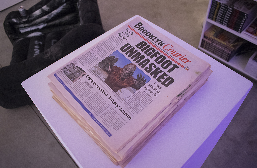
Brian’s lifelong interest in clown work has manifested in even more of his diverse projects, including one in which he did extensive long-term research on believers in Bigfoot and Bigfoot sightings. He used his findings to accurately dress up and roleplay as Bigfoot roaming around Central Park, uncannily in character, contributing to more “sightings” and examining the Bigfoot myth. In his Mid-Career Retrospective, several of Whiteley’s small paintings and mixed media wall pieces based on clown imagery were also on display, along with his video “Clown’s Night Out II,” based on the artist’s imagined scenario of what a clown might do after a long day working kids’ birthday parties. His answer? The clown goes to a gogo bar with a male dancer (played by Whiteley). The awkwardly transfixing film was a big hit at the 2019 Spring Break art fair.
Speaking of art fairs, Whiteley also is the Founding Director of the Satellite Art Show, which I visited during Art Basel Miami week this year. Taking an anti-market stance in all that he does in the art world, Whiteley’s model of the Satellite Art Show is different from traditional commercial art fairs. Since its founding in 2015, Whiteley annually finds different affordable, nontraditional abandoned spaces like pharmacies or old shopping centers located in the vicinity of the main fair of a given city, and rents out booths to artists at very affordable rates that they can easily recuperate. For example, while a gallery may easily spend upwards of $30,000 on fair participation (with several thousand on just the booth rental alone), some of Whiteley’s booths have rented for only $700. Whiteley said that participants have been happy with their results and return on investment, including gallery representation and institutional acquisitions.
Installation view, Satellite Art Show 2019
Whiteley intends for Satellite to provide an antidote to what he views as the market-tested, overly distilled art that is on view at main fairs due to galleries’ pressure to sell to make back the money invested (which he doesn’t blame them for). Whiteley is creating an alternative space to feature a plurality of emerging artistic voices that otherwise may not have the chance to be seen or heard during fair weeks, due to these financial realities that many people in the art world don’t want to admit are such a huge factor in what is seen and heard when it comes to contemporary art today, at least in the U.S. I have experienced that there is more room for this type of experimentation in Latin America where, for example, rent of space may be less astronomically priced. I was personally really interested in Satellite because it reminded me of certain great Latin American art spaces like Proyecto AMIL in Lima that traditionally has a big opening during the PARC and Art Lima fair week. The next activation of Satellite is set to take place in Austin, TX, March 13-16 in tandem with SXSW 2020.
Installation view, Satellite Art Show 2019
Throughout all of Whiteley’s work both as an artist and Director of Satellite, his anti-market stance has not been immune to consistent pushback from institutions, fairs, and galleries. When he created the Trump tombstone in 2016 while Trump was on the campaign trail, the Queens Museum was interested in acquiring the piece for their sculpture garden. When Trump was actually elected that fall, the museum dropped the acquisition because, Whiteley believes, when it became real that Trump was President, the piece became too potentially controversial to certain major museum financial donors of theirs who may support him. Another example is when in 2018, the Art Basel Miami main fair sent Whiteley a cease and desist letter in response to his use hashtag “#NotBasel” to describe the Satellite Art Show on social media. Their argument was that people might confuse it to think that Satellite is or is connected directly with the Basel fair somehow. However, Whiteley explained that the cease and desist was sent suspiciously in tandem with the main fair’s interest in adding more installation-based and experiential art to their own program, and Satellite was on the rise a growing threat. Because of that cease and desist letter, Satellite can no longer take place during Miami Art Week in South Beach, which is why Whiteley relocated the fair to Wynwood.
Installation view, Satellite Art Show 2019
Finally, Whiteley even admitted that Hashimoto Contemporary told him that his mid-career retrospective could be a financial risk for them, since his pieces aren’t particularly what most galleries would deem sellable. However, I’m glad they hosted it, because Whiteley is an interesting artist, it’s a different kind of show for the Lower East Side, and if you haven’t seen it, I hope you catch the final day tomorrow, Saturday, February 1.
All images and videos featured in this article are courtesy of Brian Whiteley.