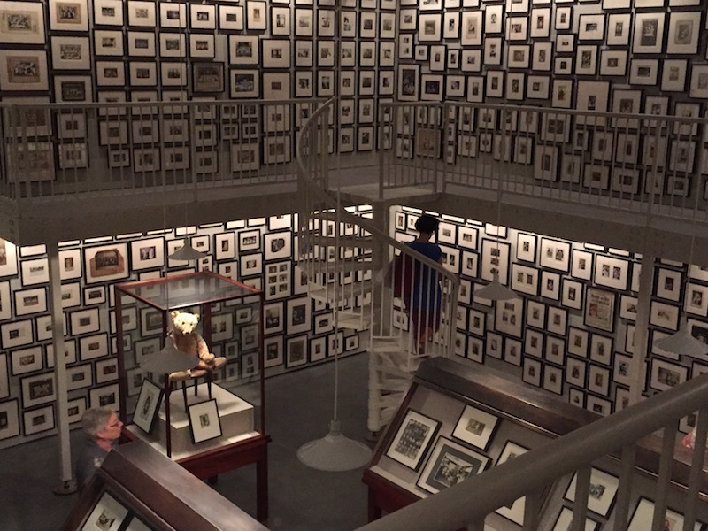
When I was based in Buenos Aires during the fall of 2011, there was a time when nearly every Saturday night I would go to the Universidad Torcuato de Di Tella for the weekly opening nights at the Beca Kuitca, an artist residency founded by Argentine artist Guillermo Kuitca in Buenos Aires in 1991. Many of the artists who were participating in the Beca Kuitca at that moment are incredible creators who I feel lucky to know, including Eduardo Basualdo, Florencia Rodriguez-Giles, Juan Tessi, and Nicolas Mastracchio, among others. It is beautiful to think about how Guillermo Kuitca, aside from being a hauntingly skilled artist who is included in the TATE and MET collections, developed this amazing, influential program to give back, and provide more growth opportunities to some of the premier rising artistic talents in Argentina today.
Eric Shiner, Senior Vice President of Fine Art at Sotheby’s and former Director of the Andy Warhol Museum in Pittsburgh, shares my reverence for Kuitca, and below, I am pleased to publish excerpts and photographs from my recent tour with Mr. Shiner for Artifactoid of the Guillermo Kuitca solo exhibition he curated, Terra Nullius, featuring works by the artist from the early 1990s through 2010. Below, Shiner shares his curatorial concept, his expertise on pieces from several of Kuitca’s most important series, as well as fascinating details about the artist’s life.

“I was really thinking about doing an exhibition about being lost, prior to the U.S. presidential election, because I think so many of us were just completely aimless, tired, frustrated; all of the many things that come up when you are heading into such a momentous period and momentous occasion with so many repercussions tied to it. So I wanted to do a show about being lost, and I immediately thought of Kuitca because I loved his work for ever and he’s such a phenomenal artist and has always been just below the radar even though he should be well on the radar, or above it in so many ways. And of course he’s had such an incredible exhibition history with the things at MoMa, project space show at MoMA in 1991, to the Sao Paolo Biennale in 1989, and on and on and on. So I thought that that would be a good thing to do and because his work is very much about being lost, and it’s about displacement, about migration, immigration, persecution, psychology, and the way humans navigate space and think about space. It seemed that that would be a good topic at this precise moment in time. So, I decided to call the show, “Terra Nullius,” in Latin, (“No Man’s Land” is the English translation), to really capture that idea of not really knowing where we are, feeling displaced, and perhaps, with certain political implications, people rethinking their own geographies based on the result. One way or another, depending on who won [the election], one group of people was going to feel displaced, disconnected, and that’s ultimately what I wanted this show to reflect.”
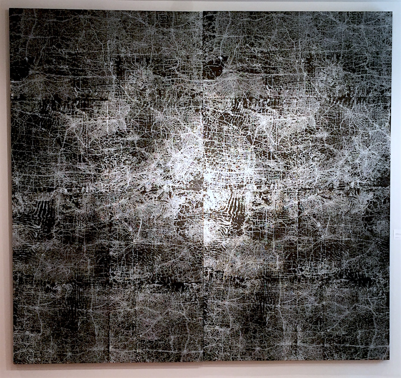
 Guillermo Kuitca, “Everything,” Mixed media in two parts on canvas, 120 1/8 x 65 in. ea., 2003
“In this huge two-panel work (above), which is just exceptionally beautiful, Kuitca does exactly that with the maps in that they make no sense whatsoever. You’ll have Wilkes-Barre, Pennsylvania next to Ottowa, Canada, for example. So they’re not actual maps, but there are some semblances of reality within it that you’ll also see. In addition to a bird’s-eye view of the road system, there’s also a topographic map blended into the piece – you could read weather map patterns into it – it’s just a complete combination of all of the many layers through which we view our world; and that’s why I just absolutely love this piece; in that it’s so complex, and also, strangely, for me at least, a lot of the work is incredibly meditative and calming — that this is something you can stand in front of and stare at, and for me it’s an incredibly calming thing, but maybe for others it has a completely different vibe.”

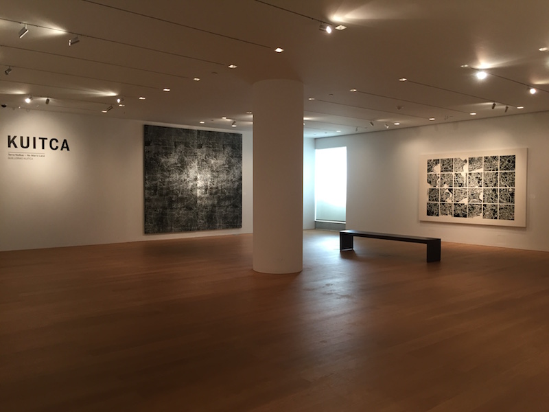
“I wanted to put together this main gallery space, and then the two wings on either side. I wanted to focus on maps and floor plans here, and then in one side space, put two paintings from the “Crown of Thorns” series, and in the other side space, two pieces from the “Beds” series. I also wanted to mix it up in terms of the different ways that Kuitca looks at maps: some very crisp and clean, some bordering on abstract. And of course, include this work (below) which is a complete ode to cubism.”
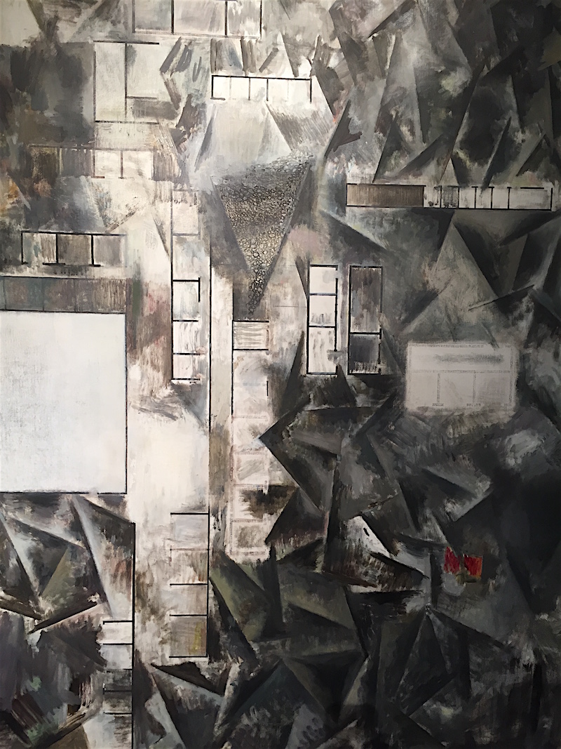
 Guillermo Kuitca, “Lontano,” Oil on linen, 76 7/8 x 64 1/2 in., 2010
 Guillermo Kuitca, “Untitled,” Acrylic on canvas, 76 x 117 3/8 in., 1990
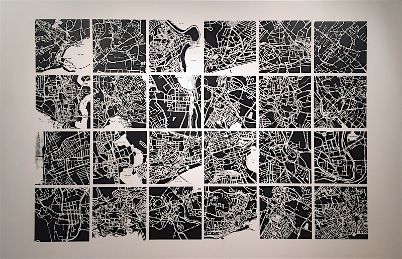
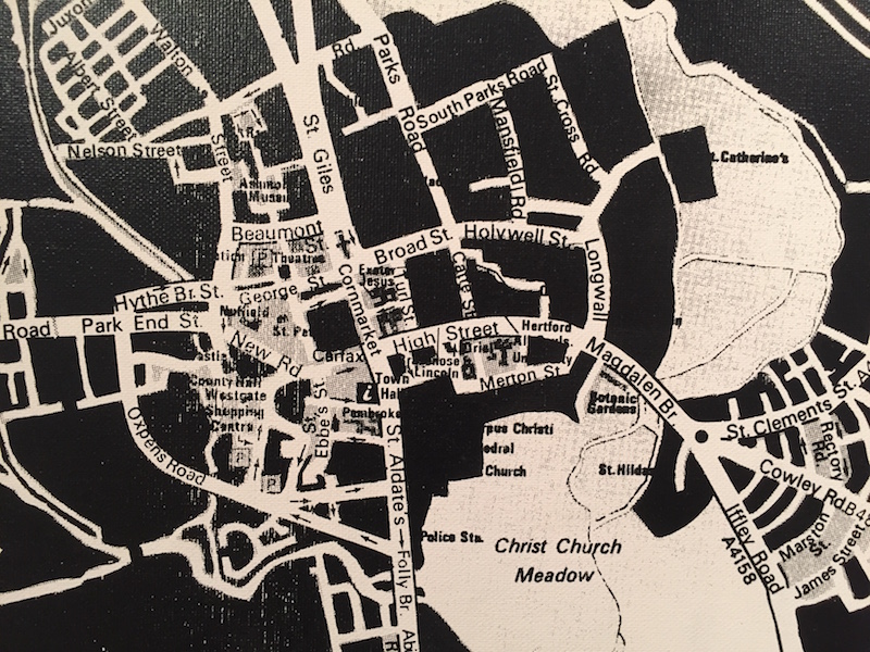
“This one (above) is twenty-four different grids of maps based on real places in some cases, and in other cases, not. I love that the zoom is different in terms of how high up you are looking into the space, so the scale is completely different from square to square. Here, you are much closer, and here, you are further out, and again here further out, and further out. I just absolutely love the way he’s thinking about the veins and the arteries of a city – of a space – and the way that water, rivers, or other areas become blank. It’s just a great piece – and again for me, very meditative.”
 “Untitled,” detail
“I was speaking with a group of architects from Brazil about this work, and one of them brought up the fact that today, we understand geography in our world in a completely new way through technology. In the old days you actually had to have the physical map that you would unfold – a paper map – and that was how you would chart your course; you would figure it out or probably write it down, and either memorize it or figure out how to navigate that way – left here, right there; landmarks, etcetera. Whereas now, all we do is turn on our phone, plug in the address, hit “go,” and follow its lead without really paying any attention to where we’re going; we just know that we’ll get there. It was such an interesting conversation to have, because that’s the reality of what we’re doing right now.”
“And of course, it goes without saying that Kuitca has a huge map collection. He collects vintage maps and atlases, and he uses these things as his inspiration and as his guide.”
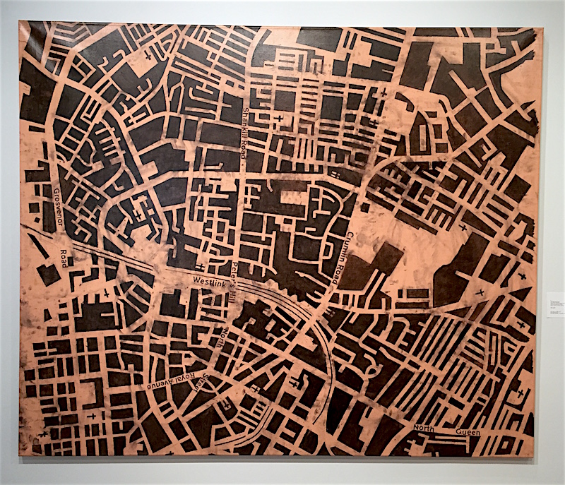
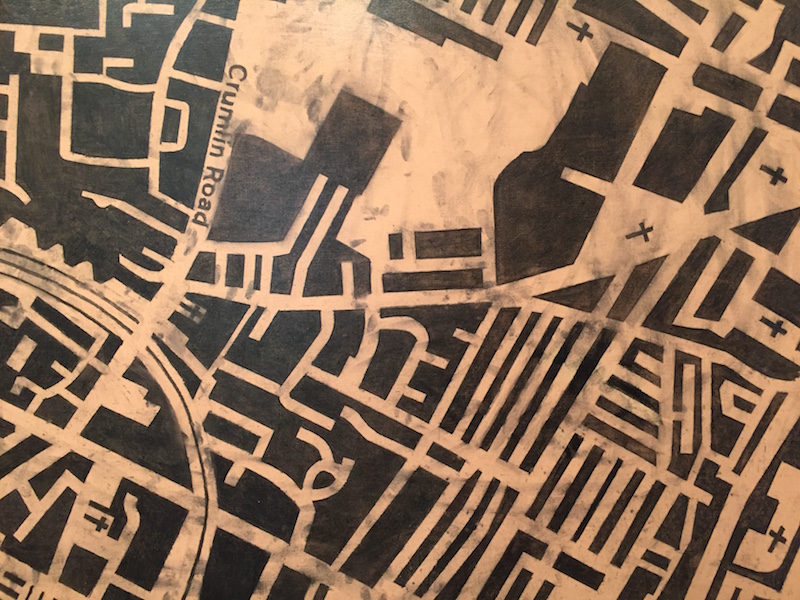
 Guillermo Kuitca, “Crumlin Road,” Acrylic and charcoal on canvas, 59 1/8 x 70 7/8 in., 1993
“This painting (above) is of Belfast. It is fantastic. It’s on a terra-cotta ground, painted with a very terra cotta color, smudged, so it’s abstract in the background, and the map is superimposed on top of that. This is Belfast in Ireland, and it shows the dividing line between the Protestant side of town and the Catholic side of town. So, even though it’s only a road [Crumlin Road], it is the dividing line, and a site of war and conflict. The thing that I love about this work is that every church is demarcated.”
 “Crumlin Road,” detail
“Kuitca obviously has a very conflicted view of religion. Growing up third-generation Eastern European Jewish in Latin America (an otherwise Catholic place), I’m sure has a lot to do with his feeling displaced, lost, and not horribly religious – so how do you factor all of these things in? Both of Kuitca’s parents were psychotherapists, so you can just imagine how they (and he in turn) thus had to deal with religion and human psychology, their place in the world, being intellectuals in Buenos Aires, and all of the things that come along with that.”
“It’s very interesting to think about how Kuitca grew up, and of course, to remember that he was a child prodigy as well. As a young man, well, as a little boy, he showed huge talent in painting and could copy anything, and really was a star painter right out of the chute. It’s interesting that someone with such huge talent chose not to be a representational, or even an abstract, painter, but instead, to do something based not in painting, but in geography, cartography, and concept. And obviously, his hand is so incredibly skilled.”
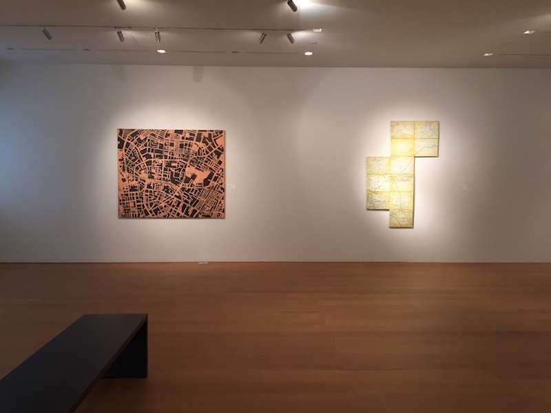
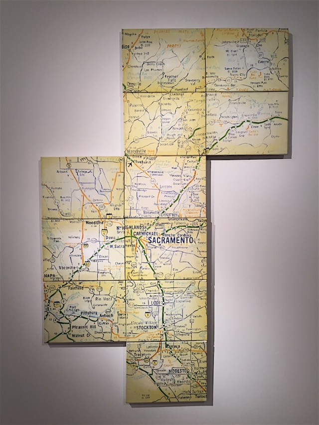 Guillermo Kuitca, “Sacramento,” Oil on canvas, 72 x 36 in., 1990
“This is Sacramento. It’s a really lovely work. It’s based on a map company that Kuitca particularly liked, which was prevalent in the ‘60s and ‘70s. He loved the color palette, with their yellows and their green major highways. As you can see, it’s fractured into 11 canvases, so here Kuitca is literally fracturing the landscape through the use of these small canvases as opposed to doing it on one big one. Then you have the void, where it’s not filled in what’s going on in these spaces, and it may or may not actually be real as to where these roads really go. Often times, in Kuitca’s works you can see that a road leads to the same place, or to absolutely nowhere if you really start to analyze.”
“Why did he choose to work with this particular map? One may ask. It’s really just a matter of what maps Kuitca comes across; now this one [Sacramento] could be read as the epicenter of California; Sacramento is the state capital, and it’s the title of the work. It’s obviously also a Spanish name of an American capital, and could deal with the things that play off the “sacred” and the implications of “sacra-“ in terms of the root of the word in a sacred lexicon. But, Kuitca is focused on areas all over the world, and there’s no rhyme or reason, except in a painting like Belfast where Belfast is very specific. The painting around the corner of Mexico City (below) is also very specific.”
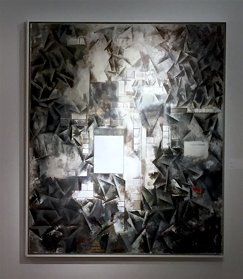
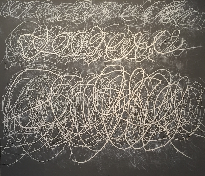
 Guillermo Kuitca, “Idea de una pasión,” Acrylic on canvas, 78 5/8 x 75 in., 1991
“This is Mexico City, and it is just absolutely phenomenal. Here Kuitca takes his map, based on Mexico City but again not exacting at all, and all of a sudden, the roads turn into thorns and brambles of thorns. Then you read the idea of violence, persecution, and bloodletting into this, and of course, sadly, Mexico City has the stereotypical view of being a dangerous place, even though for those of us who go there often, we are aware that that danger is unlikely. It’s just like any other city in the world where everyone is careful, but otherwise it’s not that dangerous. In addition, the imposition of Christianity on indigenous culture – I’m very convinced – is present in this work. Indigenous religions are very very different from Christianity, and the Spaniards came and put Christianity on top of Mexico. I think obviously with the implication of the crown of thorns, that’s very much there.”
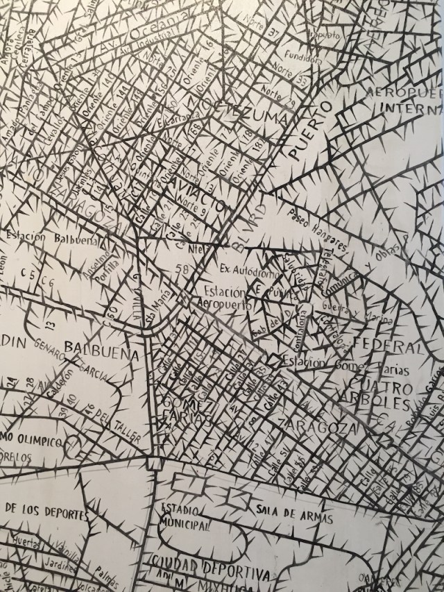 “Idea de una pasión,” detail
“To note I love this particular area of the painting (shown above), which is not a real place, but instead becomes a spider web or what could be read as a roll of barbed wire, so it’s like a trap.”
 Guillermo Kuitca, “Corona de Espinas,” Oil on canvas, 60 1/8 x 70 3/8 in., 1994
“And this is Kuitca’s homage to Cy Twombly, of course, but instead of it just being a free-spirited release in form and space, here, Kuitca is very carefully hand-painting all of these brambles of thorns. And again it is obvious that this could be Christ’s crown of thorns or it could just as easily be a reference to barbed wire and persecution, to concentration camps, to genocide, to all of those things; it’s all very wrapped up here.”
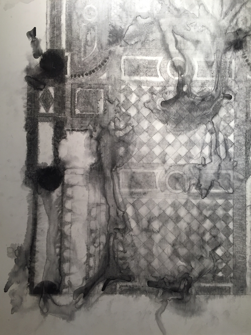
 Guillermo Kuitca, “Untitled,” (Marble flooring plan of the sanctuary and part of the choir of the Cathedral of Notre Dame in Paris), Graphite and ink on linen, 77 1/2 x 63 in., 1999
“This one (above) is graphite on canvas, and it is Notre Dame in Paris. It is from Kuitca’s series of church floor plans. The image is first laid down in graphite, and then Kuitca uses an emulsion with water and some chemical agents to get the graphite to blur. He moves the canvas around so that it bleeds and blurs and stains, and I see this as the Shroud of Turin in many ways. This is the idea of the body of Christ represented in the architectural form of the church, bleeding, melting – either into the architecture, into Paris, into the city, it’s just so beautiful.”
 “Untitled” detail
“The image is also a very powerful sculptural form in and of itself. It is as if it is both a floor plan and something achieving actual elevation at the same time.”
 “Lontano,” detail
“This painting (above) is exceptionally good. It’s based on cubism, the history of art, and the history of painting. Kuitca fuses this with another very central tenet, which is his inclusion of the floor plans of apartments or domestic space. As you know, Kuitca started off doing floor plans of his own apartment, and then just started playing with that form, that cube, of our lived environment, which is a formal element in the painting. I love that in this work the floor plans are very rigid, rectangular or square – very straight edged, straightforward – but are then surrounded by chaos.”
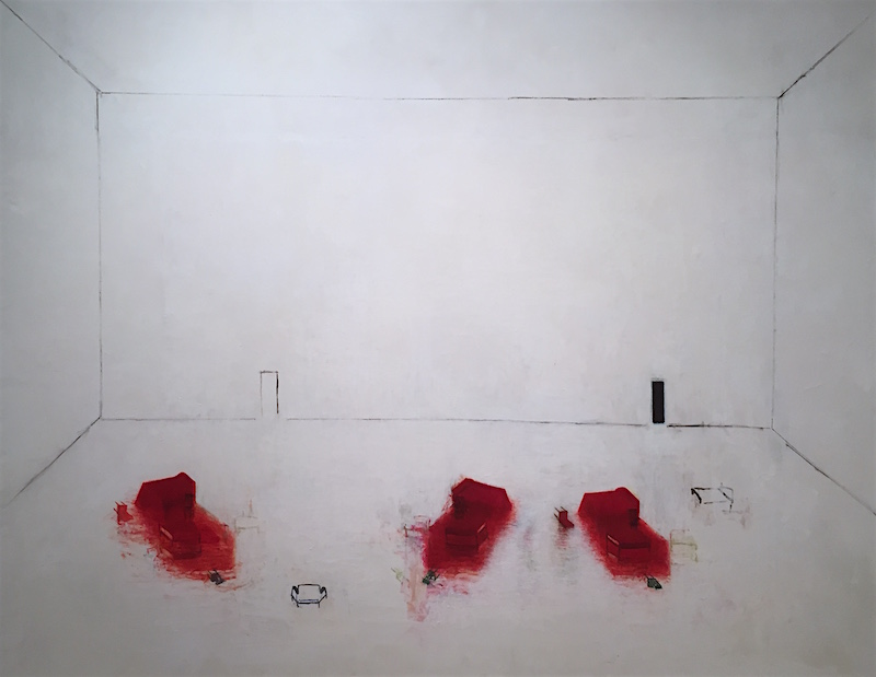
 Guillermo Kuitca, “Untitled,” Oil on canvas, 75 x 96 in., 1995
“And this (above) is from Kuitca’s “beds in rooms” series, and it is so – well – you can really tell that his parents were psychoanalysts when you look at a painting like this! It just becomes theatrical in many, many ways. We brought a group of school kids in last week to show them this, and they immediately said, “Somebody got murdered there!” because of the blood red and the overturned furniture.”
“If you take a look at the doors in the painting, it’s as if the painting asks, which door do you choose? It really forces you to think about which way you go. Through the black door, or, is that a white door? Or is it a closed door? Is it good or is it evil? What lies behind? It’s also interesting that Kuitca was very good friends with Pina Bausch the choreographer. They collaborated often on her stage sets; she was a huge influence on him and he on her. So when you think about Pina’s stage sets, they’re very much like this: simple, stark, just a few pieces of furniture – and just in doing research for this show, I came across this one little essay explaining that relationship and it was like, oh okay, of course! This makes total and complete sense.”
“Also Guillermo of course literally has painted on mattresses, and has hung those on a wall or has made them sculptures or bed sculptures. The bed is a site of ‘human psychogeography,’ and obviously our beds are very very important to us in terms of where we sleep or rest, have sex, enact our lives, where we have insomnia – I mean the bed is both site of trauma and absolute calm. So it’s interesting that several artists have honed in on that.”
 Guillermo Kuitca, “Untitled,” Oil on canvas, 72 1/2 x 108 in., 1998
“And in the work here (above), it’s a reflection of the same space, but also laid on top of an incredibly complex abstract work; just in terms of the staining and the mark-making that’s going on. When you start to look into it, things are more or less matching, yet completely blurred and nothing like the others at all, so is this a reflection in water? Is it a reflection in space, with the overturned beds again going on? And yet, either way it’s not a perfect reflection, because in one place, the chair is upright, in another, upside down and, in another it’s turned over on its side. So beautiful. The color palette is just incredible.”
 “Untitled” detail
“So ultimately, I was very happy with this show. It’s beautiful, and also, sadly, even more timely than I ever expected it to be. Now that we’re facing a totally new direction in our country, and the implications of what’s to come – with immigration, and ideas of walls, and architecture – from that angle, these things will take on very new meaning. But again, based on one’s politics, some people are elated and thrilled, whereas others are scared and miserable, and I mean I guess that’s always the human condition. And in many ways, when an artist is looking very specifically at how we navigate space, how we inhabit space,and how we position our own identities within it, I thought that they don’t get any better than this.” -Eric Shiner, SVP Fine Art, Sotheby’s
Many thanks to Mr. Shiner from Artifactoid for this thoughtful tour. Unfortunately this exhibit is no longer up, but please stay tuned for more beautiful upcoming shows at the Sotheby’s S|2 Gallery!
 Carolee Schneemann, Vulva’s Morphia, 1995. Image © Artifactoid.


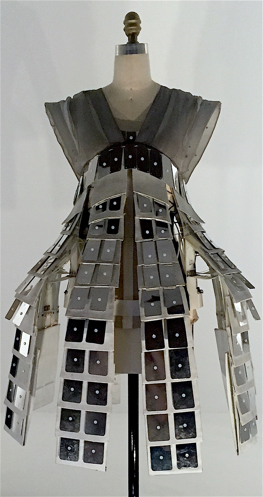

 Iris van Herpen dress including polyurethane resin and iron fillings hand-sculpted with magnets, Autumn/Winter 2014
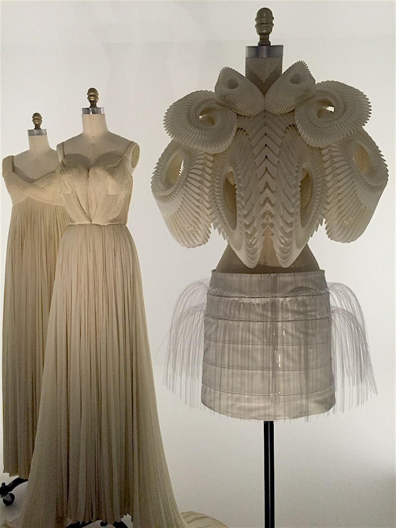
 Gowns, Dior (left, center) and Alexander McQueen (right)